| Active TopicsSearchRegisterLogin |
| WIP (Work In Progress) | |
| |
  |
| Author | Message |
|
HAZman
Seaman 
Joined: 26 June 2009 Online Status: Offline Posts: 3 |
  Topic: Guy Fox Mask WIP Topic: Guy Fox Mask WIPPosted: 29 June 2009 at 6:22pm |
|
Hey everyone, I'm new to Pixel Joint, and I've been working on my first submission. I'm doing a Guy Fox mask pixel, and I already have a couple revisions. Here's what I have so far.
  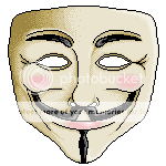 You can see how the image has progressed, mainly in the shading. I've never used the checkerboard-like shading before, so if it looks a bit awkward in the third image, that's why. Anyways, I'd love some advice from some pixel artists more wise and experienced than myself! What methods could I use to improve the shading and coloring? Also, is it too late to add anti-aliasing to the image? Thanks in advance for any help! |
|
 IP Logged IP Logged |
|
|
Hatch
Admiral 
Joined: 05 August 2015 Online Status: Offline Posts: 1387 |
Posted: 29 June 2009 at 6:55pm |
|
Hey HAZman, looks like you're off to a great start.
I'd like to correct your terminology a bit if I may: the checkerboard pattern you're doing is called dithering, not shading. Dithering is pixel-art-specific technique primarily used to smooth the transition between shades, or to create new shades altogether (though that's really two definitions of the same thing). Shading, on the other hand, is capturing the volumes and shapes of your subject based on how it's receiving light, and it's used in almost all forms of visual art. I don't mean to be pedantic, and I'm really sorry if I sound condescending, but it's important to keep in mind that dither is optional, shading is not. If you have your shading right, most pieces will work with or without dither. DeadHorse.flog(); Anyway! I'd suggest removing as many of the internal black lines as you can--define your forms with shading instead. And it's never too late to antialias. Go for it. In fact, it's usally one of the last things you should do anyway. Also, it's usually considered more visually interesting to shift in hue as well as lightness along your color gradients. For example, your tan midtone might shift into reds/purples as it moves into shadow. I know it doesn't sound like it makes much sense, but play with it for a bit and you'll see what I mean. Shadows tend to be more blue, highlights tend to be more yellow. Please let me know if any of this is unclear, I have a bad habit of being a bit jargon-y. Welcome to PixelJoint. |
|
|
IP Logged |
|
|
HAZman
Seaman
Joined: 26 June 2009 Online Status: Offline Posts: 3 |
Posted: 29 June 2009 at 7:02pm |
|
Thank you for the advice Hatch! I'm working on the picture right now with the noobtorials open to get a feel for anti-aliasing (I've never actually done it before ^_^). I'll take a shot at changing the hue in my shading. Hopefully I'll have some progress to show by later tonight or tomorrow. Thanks again; this place has already been a treasure trove for me. Some of my friends thought I was weird/crazy for enjoying pixel art, now I know I'm not the only one, haha.
|
|
|
IP Logged |
|
|
HAZman
Seaman
Joined: 26 June 2009 Online Status: Offline Posts: 3 |
Posted: 29 June 2009 at 8:09pm |
|
Here's an update using the advice I received on shading. I need to work on the colors a bit, but otherwise I'm liking how it's looking. I've also done a bit of anti-aliasing, mainly on the right half of the image.
 |
|
|
IP Logged |
|
|
Hatch
Admiral
Joined: 05 August 2015 Online Status: Offline Posts: 1387 |
Posted: 29 June 2009 at 9:02pm |
|
There's was something bugging me about this and I couldn't put my finger on it until a moment ago. You're underusing your lightest shade:

(very rough edit) See how much more depth that gives it? I also modified the palette a little because your contrast between neighboring shades was a tad extreme. That's an especially big problem with all the dithering you've got going on because it makes it look like a gritty texture. Only other thing I'll say is don't antialias to the outside. It'll look silly on dark BGs. Also, the antialiasing in the upper-left corner does not work at all--your antialiasing colors are lighter than both of the colors they're trying to smooth out, making it even more jagged. I can nitpick your other AA as well, but it's quite an advanced technique, and it really just takes practice. You're doing well. :D |
|
|
IP Logged |
|
| |
||
Forum Jump |
You cannot post new topics in this forum You cannot reply to topics in this forum You cannot delete your posts in this forum You cannot edit your posts in this forum You cannot create polls in this forum You cannot vote in polls in this forum |
|
