| Active TopicsSearchRegisterLogin |
| WIP (Work In Progress) | |
| |
  |
| Author | Message |
|
AdamF
Midshipman 
Joined: 27 December 2024 Location: United States Online Status: Offline Posts: 43 |
  Topic: yggdrasil Topic: yggdrasilPosted: 25 November 2009 at 11:51pm |
|
i don't post in the forum much, i really need to change that!!! (again)
anyways, i've been working on this WIP for like a day or two and wanted to know what you guys think so far: 
it's my visual representation of the tree 'Yggdrasil' from norse mythology. the statues kind of stand out a tad too much now, but after refining they won't. they're supposed to signify the 'holiness' of the area. the darker half is meant to represent the norse representation of 'hell,' so i wasn't sure if i should include statues there too. anyways, c+c! :) Edited by Dex - 26 November 2009 at 12:33am |
|
|
http://www.pixelxcore.net
|
|
 IP Logged IP Logged |
|
|
Odinod
Seaman 
Joined: 25 November 2009 Online Status: Offline Posts: 20 |
Posted: 26 November 2009 at 12:10am |
|
Man, I don't know nuthin' about nuthin' when it comes to pixel art, but I can tell you that that is a damn pretty picture.
And, since I don't want to be completely useless and tell you something you already know, might I suggest putting some broken statues or something of the sort on the "hell" side? I think that would make it more symmetrical, while at the same time showing the differences between the two sides. |
|
|
IP Logged |
|
|
Pumpkinbot
Commander 
Joined: 05 May 2009 Online Status: Offline Posts: 202 |
Posted: 26 November 2009 at 1:02am |
|
*sniff* Smells like a Hall of Fame piece. :U
|
|
|
IP Logged |
|
|
Anoniguy
Seaman
Joined: 17 May 2009 Online Status: Offline Posts: 37 |
Posted: 26 November 2009 at 1:48am |
|
Instead of statues on the lower half, you could always heap on an extra helping of mythology, and add the serpent that was coiled around the roots of the tree, strangling it. I think that was how it goes.My knowledge of norse myth = zilch.
Finish it, astonish us. :D |
|
|
IP Logged |
|
|
dpixel
Commander
Joined: 03 February 2015 Online Status: Offline Posts: 564 |
Posted: 26 November 2009 at 6:12am |
|
Very nice Dex. Without knowing anything about the concept, the roots look like another tree...more like a reflection. I'm pretty sure that's what you're going for though.
Also, maybe not center the group of rocks between the trees. Everything else look great. Can't wait to see this develop. |
|
|
|
|
|
IP Logged |
|
|
Dhr. Bosch
Commander
Joined: 01 February 2016 Location: Netherlands Online Status: Offline Posts: 215 |
Posted: 26 November 2009 at 7:13am |
|
Originally posted by Anoniguy Instead of statues on the lower half, you could always heap on an extra helping of mythology, and add the serpent that was coiled around the roots of the tree, strangling it. I think that was how it goes.My knowledge of norse myth = zilch. Finish it, astonish us. :D not entirely flawed. there was a snake around midgard. which i do not think you could see on this representation, and there was a dragon (Níðhöggr or Nidhogg for those who care to know) nibling at it's roots, which i think should be shown on this piece. also there is an (unnamed) eagle perched on top of the tree whit a hawk sitting between it's eyes (the hawk is called Veðrfölnir) and a squirrel that runs up and down the tree to pass messegas between the two. not that i'm an expert on norse/germanic mythology, but i read a childrens translation of the edda when i was a kid and i've always preffered them and their stories over those of the greek pantheon. |
|
|
Vanitas, vanitatum omnia vanitas
|
|
|
IP Logged |
|
|
Reo
Rear Admiral 
Joined: 07 April 2021 Online Status: Offline Posts: 679 |
Posted: 26 November 2009 at 8:13am |
|
Nice work so far man!
I definitely think you should ditch the statues if you intend to make it about norse mytholigy, the statues are very typicaly greek and the art in scandinavia at that time looked like this: 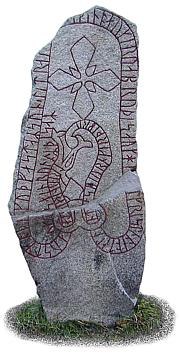 (This one in particular is located around my hometown). (This one in particular is located around my hometown).But maybe you're trying to make some sort of meltdown of different religions/cultures , wich could be quite cool. As for other crits, I often find that the rocks you make seem a bit flat/the same sometimes(dunno if you get what i mean :P) and if you're going to keep the norse theme you could change the fruits for the golden apples wich the gods ate to stay forever young. Anyway keep it up, I'll be back with more thougthful crits later lol Edited by Reo - 26 November 2009 at 8:13am |
|
|
IP Logged |
|
|
jalonso
Admiral 
Joined: 29 November 2022 Online Status: Offline Posts: 13537 |
Posted: 28 November 2009 at 9:12am |
|
At this stage I'm finding the colors too soft and pretty.
|
|
|
|
|
|
IP Logged |
|
|
ellie-is
Commander
Joined: 12 September 2021 Online Status: Offline Posts: 706 |
Posted: 28 November 2009 at 10:26am |
|
Awesome. The tree was supposed to be huge, and it looks kinda small but I dont think thats such a big issue.
Roots are too big though. I remember reading somewhere that the roots of a tree are as big as the trunk. Not sure if all trees are like that though. |
|
|
IP Logged |
|
|
AdamF
Midshipman
Joined: 27 December 2024 Location: United States Online Status: Offline Posts: 43 |
Posted: 28 November 2009 at 1:27pm |
|
oh wow everyone thanks for all the comments!
i'll see if i can respond accordingly: jalonso: what did you have in mind? i'm going for a certain level of emotion here, so color choice is important! reo: i get what you mean about the rocks; i'll experiment with some different textures and see what fits the best. i could also change the statues to stones, but yggdrasil was from what i've read the tree that contained every heaven and hell of all cultures, so maybe i could integrate ruins AND statues? :) lucas: thanks man. the roots are supposed to resemble another tree, so they had to be somewhat big. the trunk is a tad too thick though, i'll fix that! Bosch and Anoni: great ideas. a serpent would add to this scene, i believe. thanks for the backstory, it helps to have knowledgeable people comment on historical art! :) dpixel: you're exactly right! thanks. Odinod: good ideas as well! thanks Pumpkinbot: thanks ;D you're all great. the more feedback the better. at this point i'll take edits, paintovers, what not, anything to improve upon this piece. i'll post an update later! thanks! |
|
|
http://www.pixelxcore.net
|
|
|
IP Logged |
|
|
jalonso
Admiral
Joined: 29 November 2022 Online Status: Offline Posts: 13537 |
Posted: 28 November 2009 at 5:51pm |
|
I don't know that I can pinpoint colors but it would seem to me that a Norse themed piece should have dirtier colors than these bright happy ones you have going on. These are not cold/wintery enough for me to read Norse. Maybe hue shift to a duller or more desaturated scheme?
The statues are to a certain extent an important element so the roots and tree canopy could be dulled back so no matter what you do about colors. Of course, I too agree that they are too Greek/Roman looking for a true Norse feel. Maybe this white marble coloring is wrong and Reo's ref is the kind of stone they could be. If you like the white stone like that then the colors everywhere else have to be muted for sure. Just keep pixelling and adjust one shade at a time as you go and keep posting so we can all help...help, in confusing you :p Edited by jalonso - 28 November 2009 at 5:52pm |
|
|
|
|
|
IP Logged |
|
|
Dhr. Bosch
Commander
Joined: 01 February 2016 Location: Netherlands Online Status: Offline Posts: 215 |
Posted: 29 November 2009 at 5:04pm |
|
Originally posted by jalonso I don't know that I can pinpoint colors but it would seem to me that a Norse themed piece should have dirtier colors than these bright happy ones you have going on. These are not cold/wintery enough for me to read Norse. Maybe hue shift to a duller or more desaturated scheme? The statues are to a certain extent an important element so the roots and tree canopy could be dulled back so no matter what you do about colors. Of course, I too agree that they are too Greek/Roman looking for a true Norse feel. Maybe this white marble coloring is wrong and Reo's ref is the kind of stone they could be. If you like the white stone like that then the colors everywhere else have to be muted for sure. Just keep pixelling and adjust one shade at a time as you go and keep posting so we can all help...help, in confusing you :p i would disagree. for eaxample: the bridge between asgard and midgard (heaven and earth respectively) was a rainbow, the god of spring is so importantant that when his life is threatned the gods go out into the world and make evrything, from the largest bear to the smallest pebble, or grain of sand, swear that they will not kill him and their idea of the apocalypse was that the sun would stop shining and a century long winter would start. if the old norwegian/germanic tribes would have been pixelartists, they would pick a bright pallet. Originally posted by Dex i could also change the statues to stones, but yggdrasil was from what i've read the tree that contained every heaven and hell of all cultures i don't know which neo-pagan told you that the but it is decidedly not true. the yggdrasil encompassed 9 worlds, each of which has it's specific people and function. though there are very few sources, and they may be slightly contraditionary, these are generally assumed to be (not in order of position on the tree): 1. migard: Middle-earth, which is the realm of men 2. Asgard: gods'-earth, which is the realm of the gods 3. vanaheim: home of the vana, an other clan of gods, also known as the traveling gods 4. alfheim: elfs'-home, which is the realm of the elves 5. svartalfsheim: dark elfs'-home, which is the realm of the dark elfs 6. jotunheim: giants'-home, which is the realm of the giants 7. mispelheim: marsh-home, wich is the elemental plane of fire 8. nifleheim: mist-home, wich is the elemental plane of frost 9. hel: which is the land of the dead that that lived too insignificant lives to be taken into the courts of the gods Also It would be very hard to combine the idea of, for example hades, the underground realm of ALL the dead (both of the good AND the evil, or insignificant) from greek mythology, with the idea of the norse/germanic people that men who died gloriously in battle would be given a place in walhalla and reside amongst the gods in asgard (heaven). Furthermore, the only religion with which the norse/germanic tribes came into contact, of which there is written evidence, is christianity. it is clear from historical sources and archeological evidence that the pagans fiercely fought against the invasion of christianity for a long time. some scholar actually see the rise of the vikings as a sort of crusade against christianity as they where the first to identify tthemselves as 'pious' pagans, by, for examble, wearing a thor's hammer, a hammer shaped amulet as a religious symbol, and a pagan analogue of the christian cross and their prefernce for christian communities, churches and monastries in their pillaging and plundering. long posts FTW! Edited by Dhr. Bosch - 29 November 2009 at 5:05pm |
|
|
Vanitas, vanitatum omnia vanitas
|
|
|
IP Logged |
|
|
AdamF
Midshipman
Joined: 27 December 2024 Location: United States Online Status: Offline Posts: 43 |
Posted: 30 November 2009 at 6:06pm |

thanks a lot dr. bosch, your knowledge is very helpful. i've left the statues in on this one to see if you guys prefer the stones or the statues more. added a few things and updated a fairly good amount of it, the colors some, too. thanks so far everyone <3 Edited by Dex - 30 November 2009 at 6:18pm |
|
|
http://www.pixelxcore.net
|
|
|
IP Logged |
|
|
Dhr. Bosch
Commander
Joined: 01 February 2016 Location: Netherlands Online Status: Offline Posts: 215 |
Posted: 30 November 2009 at 6:17pm |
|
the stones are waay better.
|
|
|
Vanitas, vanitatum omnia vanitas
|
|
|
IP Logged |
|
|
jeremy
Rear Admiral
Joined: 25 November 2024 Location: New Zealand Online Status: Offline Posts: 1704 |
Posted: 30 November 2009 at 8:07pm |
|
I thought you were just mashing the keyboard for the title :D
I do like the bright palette; the tree and island looks all glowy - It'd be the ideal place for the people living in such a gritty time (Muddy clouds underneath add to this effect). I think that the tree doesn't read as awesomely massive and otherwordly, despite it being on a floating island, because there's no real sense of scale. The flowers being so large aren't helping that, they're even large next to the statues. Speaking of the statues, there's real no depth to them (Hypocrisy to da maxx :P ), though I see they're still WIP. They could perhaps be made more Nordic by adding beards and horned helmets. Awesome piece, Skål! |
|
|
IP Logged |
|
|
Dhr. Bosch
Commander
Joined: 01 February 2016 Location: Netherlands Online Status: Offline Posts: 215 |
Posted: 02 December 2009 at 2:29pm |
|
Originally posted by Jeremy I think that the tree doesn't read as awesomely massive and otherwordly, despite it being on a floating island, because there's no real sense of scale. The flowers being so large aren't helping that, they're even large next to the statues. i wholeheartidly agree |
|
|
Vanitas, vanitatum omnia vanitas
|
|
|
IP Logged |
|
| |
||
Forum Jump |
You cannot post new topics in this forum You cannot reply to topics in this forum You cannot delete your posts in this forum You cannot edit your posts in this forum You cannot create polls in this forum You cannot vote in polls in this forum |
|
