| Active TopicsSearchRegisterLogin |
| WIP (Work In Progress) | |
| |
  |
| Author | Message |
|
Adcrusher
Commander 
Joined: 04 January 2016 Online Status: Offline Posts: 148 |
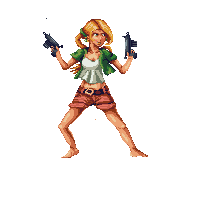
  Topic: Metal Slug Inspired Portirats Topic: Metal Slug Inspired PortiratsPosted: 01 February 2010 at 7:16pm |
 I'm not really going for metal slug style, I was just playing some metal slug when I thought of this idea. Soon I will making a guy portrait, but I wanted to receive some crit on this first. Thanks! |
|
 IP Logged IP Logged |
|
|
TMH
Commander
Joined: 28 December 2008 Online Status: Offline Posts: 291 |
Posted: 02 February 2010 at 4:45am |
|
shes has two left hands :P
|
|
|
IP Logged |
|
|
Hapiel_old
Seaman 
Joined: 29 January 2010 Online Status: Offline Posts: 11 |
Posted: 02 February 2010 at 9:58am |
|
Not that it matters much, but she in fact has two right hands ;)
|
|
|
IP Logged |
|
|
NaCl
Midshipman 
Joined: 20 December 2008 Online Status: Offline Posts: 69 |
Posted: 02 February 2010 at 2:45pm |
|
This has really got the spark of something awesome in it, the details just need refinement. The biggest issue is the anatomy. The torso is too long, her upper arms are too long, her head is too squished, and her facial features are squished upwards too much. Also, I see you struggling with the folds of the clothing, as you were in your last piece. That is hard to do, but remember not even fabric needs to be wrinkled to hell.
In my edit I just tried to fix some anatomy, arrange the face a bit better, redid the texture on the hair, and blocked out some new arms. Hope it helps 
|
|
|
IP Logged |
|
|
Adcrusher
Commander
Joined: 04 January 2016 Online Status: Offline Posts: 148 |
Posted: 03 February 2010 at 8:40pm |
|
Thanks for the crit guys! I've got an update:
 I still need to do the wrinkles in the shirt. I changed the arm placement to make her more relaxed. I want to try to keep the color count down to 16 but I'm not sure I can do that if I shade the gun. |
|
|
IP Logged |
|
|
NaCl
Midshipman
Joined: 20 December 2008 Online Status: Offline Posts: 69 |
Posted: 04 February 2010 at 12:21am |
|
Arms look better... face and head are still squished to hell
|
|
|
IP Logged |
|
|
Adcrusher
Commander
Joined: 04 January 2016 Online Status: Offline Posts: 148 |
Posted: 05 February 2010 at 2:30pm |
 Is her face less squished? I'm not very sure how to fix it. Also gave the shirt wrinkles a second attempt. Please C+C |
|
|
IP Logged |
|
|
xfro
Seaman
Joined: 01 February 2010 Online Status: Offline Posts: 3 |
Posted: 12 February 2010 at 9:32pm |
|
Inappropriate post removed. User has been warned.
--Hatch Edited by Hatch - 12 February 2010 at 10:35pm |
|
|
IP Logged |
|
|
A.B. Lazer
Commander
Joined: 21 July 2007 Online Status: Offline Posts: 310 |
Posted: 13 February 2010 at 6:40am |
|
A quick edit (made bg visible because that way it goes to MSPaint without problems):

|
|
|
IP Logged |
|
|
kenpokis
Commander
Joined: 09 January 2010 Online Status: Offline Posts: 202 |
Posted: 13 February 2010 at 10:35am |
|
I think if you brought the chin down further, it would fix the squished head problem. It's looking better, but the face still could use a tad work, IMO. Others may disagree.
|
|
|
IP Logged |
|
|
Ninja Crow
Commander
Joined: 02 June 2009 Online Status: Offline Posts: 323 |
Posted: 13 February 2010 at 12:33pm |
|
Hey, Adcrusher, I thought I'd give my 2p.
First off, your body is great, and the best part (though the jacket on the right is much shorter than on the left). If you're wondering about anatomy issues, it's all about comparative proportions. The arms look too much like stick arms (luckily, an easy fix) especially the upper arm on the left, and even though Metal Slug girls have skinny arms, they're pretty long to balance it. You'll need to make yours longer to match the great body you have so far (pretty easy, too, I think). And, the hands are too small for the arms. Also, the neck is too thick for the body (I assume you'll be using the body as the starting reference point since it's already 'done' imo). Sorry about the wall of text - here's a summary:
Thanks, JD |
|
|
IP Logged |
|
|
Adcrusher
Commander
Joined: 04 January 2016 Online Status: Offline Posts: 148 |
Posted: 13 February 2010 at 8:07pm |
|
Thanks for the crit, although I already started another one from
scratch. Well not completely I copied and pasted some parts. I've been
getting feedback at pixelation also. I've decided to do a whole body
shot, and I also when past 16 colors so I could shade the guns. Thanks!

|
|
|
IP Logged |
|
|
linx
Commander
Joined: 19 January 2009 Online Status: Offline Posts: 124 |
Posted: 13 February 2010 at 9:37pm |
 Just a little facial edit, as i say in a lot of my edits, it may just be a preference :). **Shortened the neck also** |
|
|
IP Logged |
|
|
dpixel
Commander
Joined: 03 February 2015 Online Status: Offline Posts: 564 |
Posted: 14 February 2010 at 12:33am |
|
Just awesome! I love this type of stuff. I couldn't resist a facial edit as well.
Mainly made the eyes a little bigger and took down some of the hair on the one side. And as linx said...it might just be a preference. 
|
|
|
|
|
|
IP Logged |
|
|
Manupix
Commander
Joined: 05 November 2024 Online Status: Offline Posts: 771 |
Posted: 14 February 2010 at 5:42am |
|
Wow, this has been through some improving!
Love your latest (and linx's face). The legs might be too symmetrical, for both function and art. One knee could be slightly bent, would look more 'poised'. Considering the navel, the pelvis is slightly rotated to the left but this doesn't show in the legs. Would give it much more depth if you can pull it! The thighs upper outline looks disconnected from the pants. Given the legs opening, the pants should look tighter on top of the thighs, slacker beneath. |
|
|
IP Logged |
|
|
Ninja Crow
Commander
Joined: 02 June 2009 Online Status: Offline Posts: 323 |
Posted: 14 February 2010 at 1:00pm |
|
A lot of fantastic work!
I think Manupix is hoping for a stance a little like this: <) In which the knees are bent, and the girl is on her toes, and the rightside knee is toward us and the leftside knee is turned out. If that's too dynamically different for what you wanted, though, I don't know if it would be worth changing the pose by just a fraction. For my personal preference, if you emphasise the cheek bone, it makes girls look too cadaverous (sorry dpixel - I guess the wider mouth made the cheekbone stand out). Ehm, the hands are too small.... |
|
|
IP Logged |
|
|
Adcrusher
Commander
Joined: 04 January 2016 Online Status: Offline Posts: 148 |
Posted: 14 February 2010 at 3:36pm |
|
Cool edits! thanks. Update!
 I took Ninja Crows suggestion with the legs, and I tried to make them look like they weren't unattached from the pants. I'm not sure how successful I was though. I also did some minor face changes. |
|
|
IP Logged |
|
|
Ninja Crow
Commander
Joined: 02 June 2009 Online Status: Offline Posts: 323 |
Posted: 15 February 2010 at 12:23pm |
|
Hey, I like the face - a very intent expression!
The stance came out very well! (however, her upper legs are a third or more longer than her lower legs, so is it possible to make them more even? To my eye, to achieve the proper balance, the upper legs need to be shortened a bit, and the lower legs lengthened a bit.) This is almost done! |
|
|
IP Logged |
|
|
Manupix
Commander
Joined: 05 November 2024 Online Status: Offline Posts: 771 |
Posted: 15 February 2010 at 6:09pm |
|
Agree with Ninja about legs lengths. Hadn't noticed before, but now I can't unsee it!
The change you did on the right-side (ours) thigh isn't the best choice, it gives a weird curve to the leg. I think a better way would be to move the whole leg. The bent knee looks ok, although I actually had a very small change in view, only a slight balance difference. But I'm no good at anatomy and people, what I might see is not clearly defined enough to be any use. I also think the pants are in conflict with the pelvis / legs orientation somehow. Is it the crotch position, or the cloth folds that are wrong? I'd suggest to temporarily remove the folds to try to understand it better. Or even remove the pants altogether and get the legs / pelvis ok. The more I look at it, the more I'm convinced the main problem is there. Edited by Manupix - 15 February 2010 at 6:10pm |
|
|
IP Logged |
|
| |
||
Forum Jump |
You cannot post new topics in this forum You cannot reply to topics in this forum You cannot delete your posts in this forum You cannot edit your posts in this forum You cannot create polls in this forum You cannot vote in polls in this forum |
|
