| Active TopicsSearchRegisterLogin |
| WIP (Work In Progress) | |
| |
  |
| Author | Message |
|
Indigo
Commander 
Joined: 20 April 2016 Online Status: Offline Posts: 174 |
  Topic: Knight sprite + Animation (WIP) Topic: Knight sprite + Animation (WIP)Posted: 04 November 2005 at 8:37pm |
|
the following was all written for a programmer bud I know over at the play basic forum. This short tutorial can be found in his game development thread for "draco's adventure" here: http://www.underwaredesign.com/forums/index.php?showtopic=78 5 . If you want to C+C the art - go for it.... if you want to C+C the tutorial in general, thats A-OK too. I didn't do the best i could have because this was for the purpose of teaching somebody instead of making a master-piece. here it is... As promised here is some critique for ya...
This will only focus on the main character today - tomorrow (hopefully) i'll get into color theory dealing with your background. so without further ado....
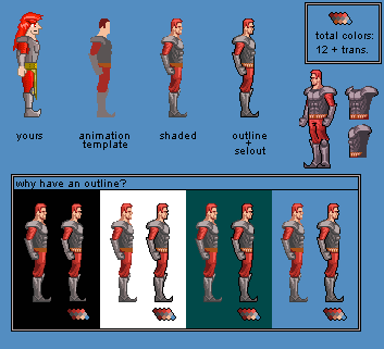
Alright - now lets talk artsy. The first thing i noticed about your sprite is the retona burning amount of saturation...almost %100 saturation i think. Generally speaking, things aren't ever that high in saturation except for controlled situations. The basic color theory about game design goes as follows; background = low contrast, low saturation.... sprites = high contrast, high saturation. I'll talk more about that later, but basically its just to make sure the user can always know the difference between his sprite and everything else cluttered around the screen without losing him constantly. Now although i say sprites are supposed to have high saturation doesn't mean that it can be retna burning and still be okay. Just lower the hue to be a bit more grey and you'll be fine. In my version i raised the contrast, lowered the saturation a tad, and added an outline. The second thing I noticed was your whomping 42 color count. Thats just crazy. I lowered the color count to 12 colors plus transparency. if you notice, even though i have about a fourth the amount of colors you have- mine looks more detailed and shaded. If you smart with colors, you can achieve this without too much hassle. Also it makes replacing colors if you need to not nearly as hard. the last thing that i did to make your character pop out from the background was add an outline. if you look closely at the outline, its not a continuous black line. In some areas where light would be hitting, i used a technique called "selout" or "selective outlining". Learn about it here and any other pixel term you dont understand: (Selective Outlining) As you can see - sometimes on different colored backgrounds (like you might find throughout various levels in a game) makes it hard to see the sprite distinctly unless it has an outline. The outline is optional, and not all games use it, but i think you can benifit from it in your case. Also notice how before i shaded the sprite, i 'blobbed' things in roughly. This is how i will be animating the whole sprite. Its generally not a good idea to animate a fully shaded sprite this complex - so instead, you do all of the frames in a simple manner and then shade each one individually. this will make your animation look more fluid and non-mechanical. This leads us to our next section - animation.
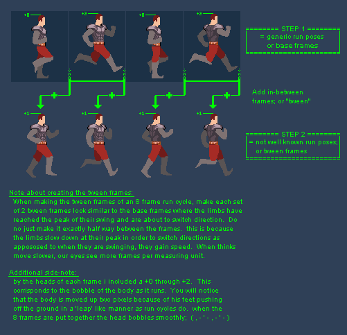
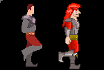
Usually people get overwhelmed on the mechanics of how a run animation works, but in reality you dont need to know much. Just by laying out the basic building blocks of base frames, all we have to do is look at the base frames before and after a tween in order to create a good seemless motion. Alot of useful info is typed up in the pic itself, so i'll just let it do the talking. Here is what my step 1 looked like when i was done with it, along with my step 2. Its amazing to note the big difference it makes when you add the tween frames in. Through the tweens opens the door to adding so much character and even emotion into the animation of your run to help 'define' who the character is. in closing, here is a final comparison to see how much difference these techniques have made in the overall product. Might be useful for ya. general info about animating moving things: Something that i should have also included in my animation was to have the character leaning into the run a little bit to keep him balanced. Also little things could have been added to even further progress the animation. things such as the shoulder pads could have bobbed up and down in due to his bodies rise and fall. I have already started on the second half of my little critique session and i hope to have it up by tomorrow. I hope this was helpful to you in some way shape or form. Let me know what you think |
|
 IP Logged IP Logged |
|
|
pixelblink
Commander
Joined: 19 February 2023 Online Status: Offline Posts: 2865 |
Posted: 04 November 2005 at 9:47pm |
|
wow... talk about being helpful. Great job on this tutorial dude. You should do some official ones to put up on the main site here!
|
|
|
IP Logged |
|
|
Citizen_Insane
Commander
Joined: 30 March 2005 Online Status: Offline Posts: 189 |
Posted: 05 November 2005 at 12:34am |
|
that walking animation is still better than some of the other ones I've seen.. heh good stuff there |
|
|
IP Logged |
|
|
Indigo
Commander
Joined: 20 April 2016 Online Status: Offline Posts: 174 |
Posted: 07 November 2005 at 2:35pm |
|
Originally posted by pixelblink
wow... talk about being helpful. Great job on this tutorial dude. You should do some official ones to put up on the main site here! Yeah - over at the playbasic forum they want me to do the same thing. So i think i'll just modify this tutorial to be more generic instead of with the intension of fixing an existing sprite. - then i'll had it over to you guys or whatever. thanks for the replies everybody |
|
|
IP Logged |
|
| |
||
Forum Jump |
You cannot post new topics in this forum You cannot reply to topics in this forum You cannot delete your posts in this forum You cannot edit your posts in this forum You cannot create polls in this forum You cannot vote in polls in this forum |
|