| Active TopicsSearchRegisterLogin |
| WIP (Work In Progress) | |
| |
  |
| Author | Message |
|
acidic055
Seaman 
Joined: 13 September 2011 Online Status: Offline Posts: 6 |
  Topic: Ice Ape Topic: Ice ApePosted: 15 September 2011 at 2:10am |
|
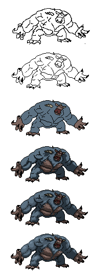
Did this during some spare time to try and improve my spriting. Trying out going from a picture to pixels. Looking for any comments and suggestions that might help me improve my skills, thanks :) I think I have problems with picking the right colours (contrast/saturation)....
Reference Picture
 |
|
 IP Logged IP Logged |
|
|
r1k
Commander 
Joined: 01 April 2014 Online Status: Offline Posts: 336 |
Posted: 15 September 2011 at 3:51am |
|
read what I said about outlines inside the sprite on your other thread, I think it applies here too. I would also say be more bold about your shading. Try thinking about things in terms of bold shapes. Shapes of color combine to make the image. Try thinking of it that way and maybe you wont need to rely so much on line. Lines can be fine, but I think here they are flattening the image and holding you back. Be bold in color choice; increase contrast to convey form more immediatly, and change the colors depending on the light. For example you could increase saturation towards the light and decrease it towards the shadows, or vice versa. You could also consider making colors warmer towards light and coolor towards shadows or vice versa. The drawing seems pretty accurate except the forarm on our left side looks a bit bulbous, check the shape of that part again.
|
|
|
IP Logged |
|
|
acidic055
Seaman
Joined: 13 September 2011 Online Status: Offline Posts: 6 |
Posted: 25 September 2011 at 7:05pm |
|
From the wise words of 'r1k,' I have gone back and edited it.
 Better? Worse?
|
|
|
IP Logged |
|
|
Cammymoop
Midshipman 
Joined: 27 July 2022 Online Status: Offline Posts: 40 |
Posted: 25 September 2011 at 8:12pm |
|
better in my opinion.
He still seems kinda dark, i suggest using lighter outlines also, (not really important if it's by itself but) if he is in a snowy/frozen environment, then a lot of light will be reflected from the ground, meaning shadows won't be very dark (google image polar bear to see what i mean) |
|
|
IP Logged |
|
|
BandarSharma
Seaman
Joined: 15 February 2009 Online Status: Offline Posts: 7 |
Posted: 26 September 2011 at 4:55am |
|
You captured the ape pretty well so far. I'm working on a gorilla in 3D and am still struggeling to get the proportions right. It's hard not to stick to the proportions of humans that we are used to :)
The colors look much better in the last version. I also think that the right arm has off proportions. Also since its nearer to the picture plane than the left one the shoulder and biceps are too small. They look even smaller than the left arm without taking perspective into account. Edited by BandarSharma - 26 September 2011 at 4:57am |
|
|
IP Logged |
|
| |
||
Forum Jump |
You cannot post new topics in this forum You cannot reply to topics in this forum You cannot delete your posts in this forum You cannot edit your posts in this forum You cannot create polls in this forum You cannot vote in polls in this forum |
|
