| Active TopicsSearchRegisterLogin |
| WIP (Work In Progress) | |
 Topic: {WIP} - Space scene! Topic: {WIP} - Space scene! |
  |
| Author | Message |
|
PureAwesomeness
Midshipman 
Joined: 20 July 2011 Online Status: Offline Posts: 46 |
  Topic: {WIP} - Space scene! Topic: {WIP} - Space scene!Posted: 29 September 2011 at 6:29pm |
|
I haven't made anything in the past month or so, so I figured I'd whip up something random... Anyway, this is what happens when I actually have the time to create something. It's better than Neon Nightfall by several orders of magnitude, I think. :) I at least hope I'll get more replies for this than I did with my other piece...
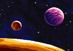 And currently: And currently: It's nowhere near done yet, I still have to shade the rest of the background and put some texture onto the big red planet (not sure if I'll make it cloudy like Venus or barren like Mars though, or do some weird two-tiered colour thing) I experimented with two styles of shading on the upper left corner and right sides of the background too. They both look good to me, but then again, I've been staring at it for several hours, so the effect's kinda lost on me. I also wasn't sure whether dithering or having more colours would be better for something so subtle, so I just stuck with dithering. Let me know which one you like better. Oh, and does the background have enough contrast to even show up on your monitor? I looked at it on another computer today, and it ended up as just pure black. And, actually, it needs a space station in there. I'm gonna go add that in right now. Be sure to let me know what you think! Edited by PureAwesomeness - 02 October 2011 at 7:38pm |
|
 IP Logged IP Logged |
|
|
Mr Special
Commander 
Joined: 20 December 2017 Online Status: Offline Posts: 106 |
Posted: 29 September 2011 at 8:08pm |
|
Wow. This is a huge improvement over your previous stuff! I definitely like the right-most side better. That's just an opinion though. If I wasn't so tired, I'd comment more. Good job though. The purple planet is my favorite so far!
|
|
|
IP Logged |
|
|
Friend
Commander
Joined: 01 April 2015 Online Status: Offline Posts: 710 |
Posted: 29 September 2011 at 8:10pm |
|
yay youre back!!! I have no crits
|
|
|
IP Logged |
|
|
reis
Commander
Joined: 13 March 2014 Online Status: Offline Posts: 118 |
Posted: 02 October 2011 at 7:12am |
|
Very good, but adds a dithering on this planet through yellow.
|
|
|
IP Logged |
|
|
PureAwesomeness
Midshipman
Joined: 20 July 2011 Online Status: Offline Posts: 46 |
Posted: 04 October 2011 at 7:51pm |
|
@Mr Special Yeah, the only other pixel art I've uploaded ended up
looking really bad because of the time limit... I'm glad you like this
one! Mind telling me what you wanted to comment on?
@Frost Butt Thanks! And luizfelipespr, what exactly do you mean? That you like the dithering, or I should add more? By the way, I did a bit more of the sky and part of the big planet. I'd appreciate any feedback, especially about its texture and whether I've made any glaring mistakes while shading it.
|
|
|
IP Logged |
|
|
jalonso
Admiral 
Joined: 29 November 2022 Online Status: Offline Posts: 13537 |
Posted: 04 October 2011 at 7:54pm |
|
Its looking really nice and you are doing a good job (bottom left corner, especially). Take your time :)
|
|
|
|
|
|
IP Logged |
|
|
cure
Commander
Joined: 23 March 2022 Online Status: Offline Posts: 2859 |
Posted: 04 October 2011 at 8:53pm |
|
the shape of the planets is a bit wonky, maybe overlay perfect circles to see where they're off.
|
|
|
IP Logged |
|
|
CELS
Commander
Joined: 23 September 2022 Online Status: Offline Posts: 758 |
Posted: 05 October 2011 at 1:56pm |
|
Ah, the nostalgia. Reminds me of the days of Dune 2 and Tie Fighter. Great work so far.
I'm not sure if I can be of any help here, but I'll try. The smallest moon looks flat at the bottom. The purple moon is wider than it is tall. The stars look very grey and though it may be a matter of style, I think they usually look better as shades of blue, yellow or purple. Also, your stars are very bright and there are no dim stars, which is a bit strange. Especially on account of the nebula, you would expect to see some dim stars. The dithering patterns are perhaps too visible at 2X, but it all looks great at 1x. |
|
|
IP Logged |
|
|
Friend
Commander
Joined: 01 April 2015 Online Status: Offline Posts: 710 |
Posted: 05 October 2011 at 2:42pm |
|
check the right end of the largest planet. I'm not sure if it is intended, but this is one of the areas cure was probably referring to
BTW, the bottom right corner is so Metroid Fusion. Be proud :) Edited by Frost Butt - 05 October 2011 at 2:44pm |
|
|
IP Logged |
|
|
PureAwesomeness
Midshipman
Joined: 20 July 2011 Online Status: Offline Posts: 46 |
Posted: 09 October 2011 at 10:10am |
|
@jalonso: Thanks!
@cure: Well, the red planets are supposed to be rocky and irregular, and small enough so that you can see that shape, but yeah, I probably messed up the AA a bit... @CELS: Thanks for the advice too! I used to have colourful stars, but then they looked kind of strange against the rest of the picture, so I stuck with blue and purple. Dimmer stars are a good idea, I'll go add a couple in. @Frost Butt: Haha thanks! Never actually played any of the Metroid games though. Kind of awesome that it reminds you of that. Oh, and I tried sticking a space station in there, but it looked really out of place so I might just leave it out... |
|
|
IP Logged |
|
|
cure
Commander
Joined: 23 March 2022 Online Status: Offline Posts: 2859 |
Posted: 09 October 2011 at 10:25am |
|
if it's a planet, then it's going to be pretty massive, and such tiny surface irregularities won't affect the silhouette. google pictures of Mars- small, rocky planet, but looks perfectly spherical unless you're standing on the surface. the AA could be a contributing factor but the planets generally are just a bit wonky (ie some sides are flat, there are some 'pointed' areas of the circumference)
Edited by cure - 09 October 2011 at 10:28am |
|
|
IP Logged |
|
|
PixelSnader
Commander
Not a troll! Joined: 08 January 2026 Online Status: Offline Posts: 3194 |
Posted: 10 October 2011 at 1:27am |
|
The moon is a pretty small piece of rock in astronomical terms, but even that is almost perfectly round from a distance:
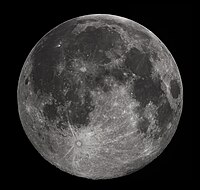
You don't get to see any jaggies until the objects are very 'small', below about 500Km diameter (smaller than Egypt or Texas): 
So definitely smooth out your planets. Your largest planet looks good so far but the colors are overly saturated (even for a bit stylized look). I'd also add about 3 or 4 colors to smooth out the darker parts (1 or 2 orange, 2 purple). You might also want to add an asteroid belt around the largest planet, this will give a good sense of depth. And everyone loves asteroids. Well, everyone that's not about to get killed by one... 
|
|
|
▄▄█ ▄▄█ ▄█▄ ▄█▄ |
|
|
IP Logged |
|
|
CELS
Commander
Joined: 23 September 2022 Online Status: Offline Posts: 758 |
Posted: 10 October 2011 at 5:30am |
|
Well... what about artistic license? A planet is by definition something round (by its own gravitational force), so call it a moon and keep it this way. It won't really have any impact on the scale of the image, because the scale and proportion is very unrealistic at the moment anyway. It's just a good 1980's space scene, throwing a few laws of physics out the window.
Edit: Horrendous typos... Edited by CELS - 10 October 2011 at 5:58am |
|
|
IP Logged |
|
| |
||
Forum Jump |
You cannot post new topics in this forum You cannot reply to topics in this forum You cannot delete your posts in this forum You cannot edit your posts in this forum You cannot create polls in this forum You cannot vote in polls in this forum |
|
