| Active TopicsSearchRegisterLogin |
| WIP (Work In Progress) | |
| |
  |
| Author | Message |
|
AlcopopStar
Midshipman 
Joined: 28 April 2022 Online Status: Offline Posts: 35 |
  Topic: C64 Knight Portrait Topic: C64 Knight PortraitPosted: 30 September 2013 at 2:39am |
|
Okay so i'm doing some c64 fantasy character portraits. The pixels are double width. And I should point out that the black is a slightly off blue for the sake of the engine it's going into.
current: 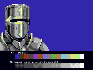
There should be 5 more after this one, and this one being the only helmeted figure. crossposted here Edited by AlcopopStar - 01 October 2013 at 9:02am |
|
 IP Logged IP Logged |
|
|
DawnBringer
Commander 
Joined: 11 August 2024 Online Status: Offline Posts: 568 |
Posted: 30 September 2013 at 4:07am |
|
First of all, check your program/process...you've got 39 colors with loads redundant variations of many colors.
The picture looks a bit washed out; the standard trick for C64 images to amp up realism and hide gradients and dithers, is to increase the contrast and employ the entire brightness spectrum from black to white. |
|
|
IP Logged |
|
|
AlcopopStar
Midshipman
Joined: 28 April 2022 Online Status: Offline Posts: 35 |
Posted: 30 September 2013 at 4:54am |
|
okay so I don't know what was going on there the colours there, something weird Photoshop decided to do I guess.
Anyway, that should be fixed now. I also made the shading a little less confused and added some more black to the image for contrast. Edit: I followed some feedback from the pixelation forum and made the metal more high contrast. Which, looking back, is probably what you meant dawn. Edited by AlcopopStar - 01 October 2013 at 9:02am |
|
|
IP Logged |
|
|
had0c
Midshipman
Joined: 03 September 2016 Online Status: Offline Posts: 20 |
Posted: 14 October 2013 at 8:24am |
|
i like it.
|
|
|
IP Logged |
|
|
PixelSnader
Commander
Not a troll! Joined: 05 June 2014 Online Status: Offline Posts: 3194 |
Posted: 16 October 2013 at 5:25pm |
|
The way you've done your banding makes the helmet look very un-round.
In particular the white highlight next to the dark grey one makes it look like there's a corner there. I think it would be a good idea to go back a few steps, and first make the rough cylindrical shading as a gradient: dark-mid-light-mid-dark. And then play around a bit with the edges. And keep in mind that things like the visor and the top rim are wider, which gives you a chance to break up your bands. Lastly, you could attempt drawing in some actual reflected details, for instance the turtleneck reflecting the insides of the pauldrons and the rivets. Or the background reflecting off the shiny armor, if you're adding a background. |
|
|
▄▄█ ▄▄█ ▄█▄ ▄█▄ |
|
|
IP Logged |
|
| |
||
Forum Jump |
You cannot post new topics in this forum You cannot reply to topics in this forum You cannot delete your posts in this forum You cannot edit your posts in this forum You cannot create polls in this forum You cannot vote in polls in this forum |
|
