| Active TopicsSearchRegisterLogin |
| WIP (Work In Progress) | |
| |
  |
| << Prev Page of 3 Next >> |
| Author | Message |
|
PixelSnader
Commander 
Not a troll! Joined: 08 January 2026 Online Status: Offline Posts: 3194 |
  Posted: 20 November 2014 at 11:29am Posted: 20 November 2014 at 11:29am |
|
Originally posted by eishiya
the Gameboy's "greys" were really green on the screen (and the shades varied depending on the light, since it was not backlit), and has empty space around each pixel. Technically, every screen has space around the pixels. But it was more noticeable on the GB because it wasn't backlit. Our current screens are simple, flat black when they're off. We light up pixels to create the image (instead of darkening them), and the light tends to bloom/glow a bit, which makes the pixels 'spill over' into the gutters. In fact, a modern backlit pixel often has more empty space around it (relatively, that is) compared to a monochrome unlit pixel. This image illustrates the effect a bit: The lone white pixel should stand out much more than the black one does. Aaaaaanyway. Yes those last tiles are a good bunch better. The tiles themselves have a much better sense of shape, material and lighting. The grass still feels too hard and blocky though. And to be frank, you're still going to run into the problem I described earlier; strong local depth will lead to weak overall feeling of depth. This image from the tutorial eishiya linked shows it well: 
Is there any particular you're switching to a monochrome palette? If it's because you think it's simpler than using colors, well you might be half correct. You won't have to worry as much about selecting a nice palette, but it'll be harder to accurately portray a material, and you need to think better about your color choices to get a good visual disctinction between objects. Now, I'm not saying you shouldn't go monochrome. In fact, it'd be great practice. You limit the amount of tools you use (from hue/sat/lum to just luminance) and you're forced to think about some focused issues instead of many different ones. This means you'd learn much more about shape/form and prioritization than you would with colors in your palette. I'm just saying you need to be aware of the impact of going monochrome. |
|
|
▄▄█ ▄▄█ ▄█▄ ▄█▄ |
|
 IP Logged IP Logged |
|
|
Turon
Commander
Joined: 03 March 2016 Online Status: Offline Posts: 128 |
Posted: 22 November 2014 at 4:31am |
|
So how can I improve on the Grass?
|
|
|
IP Logged |
|
|
eishiya
Commander
Joined: 04 August 2022 Online Status: Offline Posts: 1109 |
Posted: 22 November 2014 at 6:48am |
|
I don't think there's a rule against it or anything, but it seems a bit rude to me to remake the same post just to bump up your thread, just to make it look like you're not double-posting.
Between what has been told to you, the various tutorials linked in this thread, and your own observations of real grass, you should already have everything you need to make great-looking grass. Experiment! Try different things, different ways of applying what you've learned from this thread. It sounds like you're expecting people to tell you exactly how to proceed. That's not how art works. We're not here to do your work for you, we're here to help you learn. You'll never get good if you don't take the time to think critically and experiment on your own. |
|
|
IP Logged |
|
|
Turon
Commander
Joined: 03 March 2016 Online Status: Offline Posts: 128 |
Posted: 22 November 2014 at 9:53am |
|
Well sorry then I probably should have been more patient...Anyways I just redid the rock to look more like a cliff, not final product but I think I'm closer. I didn't do anything to the grass yet. 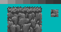
Sorry that lone rock was just for reference I was going to remove it but didn't get round. Edited by Turon - 22 November 2014 at 10:32pm |
|
|
IP Logged |
|
|
Turon
Commander
Joined: 03 March 2016 Online Status: Offline Posts: 128 |
Posted: 24 November 2014 at 3:45am |
|
Well then... what do you all make of this! I'm sure this is at least close to being some sort of cliff wouldn't you say?
 |
|
|
IP Logged |
|
|
eishiya
Commander
Joined: 04 August 2022 Online Status: Offline Posts: 1109 |
Posted: 24 November 2014 at 5:40am |
|
I think you're definitely getting there! I think you're overusing the darkest grey though, making everything look very separate. You should use it very sparingly. Perhaps use that 2nd darkest grey for most of the smaller/shallower shaded areas instead? That way, the darkest shadows can really feel dark and deep.
You're giving almost every single chunk of rock the full range of values, which flattens everything. Have some more rocks (not just right under the grass, but in various spots) where they only use a subset of the values, which will make those rocks feel flatter, and the entire surface will feel less uniform. You're also shading every rock as a sort of jagged jellybean, they all have exactly one bright protrusion at the top, no other highlighted bits elsewhere. That could be fine depending on what rocks you're drawing, but if that's not an effect you're consciously going for, try giving some rocks multiply protruding/highlighted bits and see how it looks. It might end up looking worse, but it's good to experiment. Your edge tiles create a silhouette for the cliff that appears to have nothing to do with the rocks you've drawn. I think working on those instead of just leaving the old silhouette in should help you get a feel for the 3D form of the rocks better, so you know how/where to shade since you'll see them from an extra angle (the side) at the edges. |
|
|
IP Logged |
|
|
PixelSnader
Commander
Not a troll! Joined: 08 January 2026 Online Status: Offline Posts: 3194 |
Posted: 24 November 2014 at 3:27pm |
|
You're still using the same value range for both materials, and you're still not putting the tileset in context.
|
|
|
▄▄█ ▄▄█ ▄█▄ ▄█▄ |
|
|
IP Logged |
|
|
Turon
Commander
Joined: 03 March 2016 Online Status: Offline Posts: 128 |
Posted: 24 November 2014 at 10:00pm |
|
What does putting the tiles in context mean?
|
|
|
IP Logged |
|
|
eishiya
Commander
Joined: 04 August 2022 Online Status: Offline Posts: 1109 |
Posted: 25 November 2014 at 5:09am |
|
It means using them in an environment/map, seeing how they work with other visuals (other tiles, characters, etc). The easiest way to put your tiles in context is to make a mock-up of your game using
them, and fill in any missing parts with suitable colours or rough
drawings of what you plan to make. Doing so helps see whether your tiles work well together early on. Working on anything in a vacuum (without context) usually leads to spending too much time on it, and then having to redo it anyway because it doesn't fit xP
|
|
|
IP Logged |
|
|
Turon
Commander
Joined: 03 March 2016 Online Status: Offline Posts: 128 |
Posted: 25 November 2014 at 11:25am |
|
the most immediate acid to develop would probably be the background, but backgrounds are so large its a nightmare trying to do it in pixel-art... is there some sort of way?
and I have been trying to minimize the really dark color. 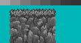 Edited by Turon - 25 November 2014 at 11:28am |
|
|
IP Logged |
|
|
eishiya
Commander
Joined: 04 August 2022 Online Status: Offline Posts: 1109 |
Posted: 25 November 2014 at 11:37am |
|
For the sake of context, the backgrounds, other tiles, etc don't have to be refined pixel art, they can just be rough sketches that give you an overall idea of how they'll look. Otherwise, it's be pretty pointless - you'd have to finish each section before putting it all together, which is the exact opposite of the goal here xP
As for backgrounds in pixel art in general, since eventually you'll probably need to do them - it's not as hard as you might think. Being backgrounds, they shouldn't be as detailed as the foreground, so you'll actually be using a lot of solid areas of colour. You'll also probably be working with fewer colours for the backgrounds, since backgrounds need to have less contrast to avoid clashing with the foreground. As for your updated tiles: I'm honestly not sure what to suggest anymore. There are a lot of different ways to go from here, depending on the look you want. The only real suggestion I have is to consider if the highlights need to be so rough or if they can be rounded. Depending on the kind of rock you're trying to depict, rough ones might be suitable, or they might not. Perhaps you should try adding some colours, and refine the details once you have everything coloured and tiled. I recommend starting from scratch on the colours instead of using the old ones you had. |
|
|
IP Logged |
|
|
Turon
Commander
Joined: 03 March 2016 Online Status: Offline Posts: 128 |
Posted: 26 November 2014 at 3:22am |
|
so you say maybe I should add color and see how it looks? I'll have a go and see.
but... have you ever made a tileset of rocks? whats been your experience? |
|
|
IP Logged |
|
|
eishiya
Commander
Joined: 04 August 2022 Online Status: Offline Posts: 1109 |
Posted: 26 November 2014 at 7:35am |
|
I have, and in all cases I had a pretty good idea of what I wanted to end up with, so it was largely a matter of just getting the pixels down.
Remember: You're the only one who knows what you want these tiles to feel like when they're done. Any feedback you get here is based on our (most likely highly inaccurate) ideas of what you're aiming for, so make sure you don't follow it blindly. For example, having a sense of large form to the rocks combined with some smaller details is a good idea in general, but in some games, it might not be desirable, you might want it to be flat. I think your apparent lack of a clear visual goal and the fact that you're working from details outward (starting with rock tiles rather than a sketched out level/map) are what's causing you to have so much trouble. |
|
|
IP Logged |
|
|
Turon
Commander
Joined: 03 March 2016 Online Status: Offline Posts: 128 |
Posted: 27 November 2014 at 12:49pm |
|
Did you say something about sketching to get a better picture on what I should do? did you mean sketch on paper?
well sketching isn't one of my strengths but what do you make of this? again cause it isn't pixel art I have just provided a link. |
|
|
IP Logged |
|
|
eishiya
Commander
Joined: 04 August 2022 Online Status: Offline Posts: 1109 |
Posted: 27 November 2014 at 3:31pm |
|
Sketch in whatever medium you like. Or, block the entire stage out (e.g. make solid squares for solid tiles, other kinds of squares for other features of the stage, etc) and then draw the tiles on top of that.
The way I usually do it is I block out a level that would use those tiles, then sketch features over it (cliffs, houses, trees, etc, all to scale but very roughly drawn) then do my pixel work on a layer above that. Since sketching isn't one of your strengths, I recommend working on it. You don't need to have great pencil control, but the general art skills that go into making a good drawing or painting are helpful for pixel art. The art tutorial I linked earlier covers most of those skills, but it's up to you to practice them and put them to use. (Unfortunately I can't give you feedback on your sketch because Photobucket hates me. If you can use it to direct your pixelling, then it's fine.) |
|
|
IP Logged |
|
|
Turon
Commander
Joined: 03 March 2016 Online Status: Offline Posts: 128 |
Posted: 28 November 2014 at 2:00am |
|
Well thanks for all the help so far (not being sarcastic)! I'll see what I can do now...
|
|
|
IP Logged |
|
|
Turon
Commander
Joined: 03 March 2016 Online Status: Offline Posts: 128 |
Posted: 30 November 2014 at 6:23am |
|
Well I made another sketch I think may be better. It isn't pixel art so if you guy don't want it here I can remove if necessary but here it is.
 |
|
|
IP Logged |
|
|
DrTripwire
Commander
Joined: 29 October 2014 Online Status: Offline Posts: 174 |
Posted: 30 November 2014 at 1:39pm |
|
Shows a lot of promise! I think it would look epic in pixels.
|
|
|
IP Logged |
|
|
Limes
Commander
Joined: 15 September 2021 Online Status: Offline Posts: 683 |
Posted: 30 November 2014 at 9:01pm |
|
Your sketch doesn't seem to show a lot of texture, or contrast in just about anything everything is just grey there is no black or white.
Hopefully this helps you One of the important skills he displays is proper crosshatchingd] Edited by Limes - 30 November 2014 at 9:07pm |
|
|
IP Logged |
|
|
Limes
Commander
Joined: 15 September 2021 Online Status: Offline Posts: 683 |
Posted: 01 December 2014 at 9:47am |
|
I do like how the foreground is easily visible from background.
|
|
|
IP Logged |
|
|
PixelSnader
Commander
Not a troll! Joined: 08 January 2026 Online Status: Offline Posts: 3194 |
Posted: 01 December 2014 at 11:59am |
|
Have you tried sketching on a PC? Like, in photoshop or MSPaint but crudely, and not like pixel art. I ask because on a PC it's much easier to edit composition and balance. Think of the time it takes to shade the entire sky with a pencil, for example. On a PC you could just use paintbucket/floodfill.
|
|
|
▄▄█ ▄▄█ ▄█▄ ▄█▄ |
|
|
IP Logged |
|
|
Limes
Commander
Joined: 15 September 2021 Online Status: Offline Posts: 683 |
Posted: 01 December 2014 at 12:23pm |
|
I prefer sketching to photoshop sketching, unless I have a pad that shows the screen directly on it.
|
|
|
IP Logged |
|
|
Turon
Commander
Joined: 03 March 2016 Online Status: Offline Posts: 128 |
Posted: 03 December 2014 at 5:28am |
|
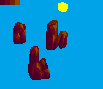
Well I've recolored and altered a bit, which one do you like more?
  The grass may not look great but I'm keeping it for context, I plan on altering later. |
|
|
IP Logged |
|
|
Turon
Commander
Joined: 03 March 2016 Online Status: Offline Posts: 128 |
Posted: 07 December 2014 at 4:53am |
|
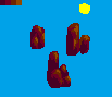
I have played around with the fist coloration And I think it looks much more like a cliff now.
 |
|
|
IP Logged |
|
|
RebeaLeion
Commander
Joined: 04 October 2017 Online Status: Offline Posts: 321 |
Posted: 07 December 2014 at 5:12am |
|
it's more readable, that's for sure. the second of two is the better.
|
|
|
IP Logged |
|
|
Turon
Commander
Joined: 03 March 2016 Online Status: Offline Posts: 128 |
Posted: 07 December 2014 at 7:50am |
|
The second coloration?
|
|
|
IP Logged |
|
|
Limes
Commander
Joined: 15 September 2021 Online Status: Offline Posts: 683 |
Posted: 08 December 2014 at 7:36am |

Practice drawing rocks just like this then try to incorporate them into the design. At the moment the dirt looks really messy and all over the place try to simpilize it just PRACTISE ROCKS |
|
|
IP Logged |
|
|
Turon
Commander
Joined: 03 March 2016 Online Status: Offline Posts: 128 |
Posted: 09 December 2014 at 9:35am |
|
um so another redo? okay... rocks, rocks are easy...
|
|
|
IP Logged |
|
|
Limes
Commander
Joined: 15 September 2021 Online Status: Offline Posts: 683 |
Posted: 09 December 2014 at 12:54pm |
|
yeah just draw rocks individually so they make sense when putting them into the big picture.
|
|
|
IP Logged |
|
|
Turon
Commander
Joined: 03 March 2016 Online Status: Offline Posts: 128 |
Posted: 10 December 2014 at 1:06am |
|
I have to be careful so as not to make It look like a pile of rocks...
|
|
|
IP Logged |
|
|
skittle
Commander
Joined: 20 July 2021 Online Status: Offline Posts: 350 |
Posted: 10 December 2014 at 2:38am |
|
Seconding what Limes said. Imo, you're more likely to get better results if you try drawing each individual rock into a tile instead of doing them all in one go. Then it gives you a better idea of how all the rocks effect each other in terms of lighting. You don't need to do it that way, but you may get better results.
If you want your tiles to really pop, try to emphasize on your darker colours instead of making your dominant colour the lightest in your palette. Think about it in terms of edges. You have a rock that has a certain amount of sides, which side will be darkest and which side will be the lighest? As oppose to making small cracks to separate each rock from each other. Edited by ADrawingMan - 10 December 2014 at 4:15am |
|
|
IP Logged |
|
|
Turon
Commander
Joined: 03 March 2016 Online Status: Offline Posts: 128 |
Posted: 16 December 2014 at 6:26am |
|
What do you think of these rocks they only use 4 colors and I think these are the best yet.

|
|
|
IP Logged |
|
|
eishiya
Commander
Joined: 04 August 2022 Online Status: Offline Posts: 1109 |
Posted: 16 December 2014 at 7:47am |
|
They look more like tufts of fur to me. They could work if you're going for a flowstone look, but then those colours are not appropriate. I was under the impression you were going for more of a boulder look, anyway? I have no idea though, you still haven't actually said what you're trying to depict.
Edited by eishiya - 16 December 2014 at 7:48am |
|
|
IP Logged |
|
|
Limes
Commander
Joined: 15 September 2021 Online Status: Offline Posts: 683 |
Posted: 16 December 2014 at 9:50am |
|
Your rocks come off as goop. THEY ARE ALSO PILLOW SHADED!!!!!
Okay step 1 decide on a light source and draw a random bulge of the darkest shade. Try to use lots of angles to make it look rocky. Do not make it go all flowy like the goop, and stick to solid square like clusters. Step two: highlight with second darkest color ONLY on the lighted side of the rock remember to use square like clusters. Then 3rd darkest color to bring more pop and finally your highlight to finalize the image. Don't overuse the highlight. 
The dominant shade should be the darkest. Edited by Limes - 16 December 2014 at 9:51am |
|
|
IP Logged |
|
|
Turon
Commander
Joined: 03 March 2016 Online Status: Offline Posts: 128 |
Posted: 16 December 2014 at 10:47am |
|
I would like to stress that my ultimate objective is to make a good cliff and grass tileset. so basically I should make the shape of the rock as the darkest color and add lighter shades to it and take note of the lightsource and I'm good to go?
|
|
|
IP Logged |
|
|
Limes
Commander
Joined: 15 September 2021 Online Status: Offline Posts: 683 |
Posted: 16 December 2014 at 11:58am |
|
Ultimately that is what you want to do. your rocks don't really follow any light source. Making the rocks pop should be the main focus. the way you had them they looked flat.
Edited by Limes - 16 December 2014 at 11:58am |
|
|
IP Logged |
|
|
Turon
Commander
Joined: 03 March 2016 Online Status: Offline Posts: 128 |
Posted: 17 December 2014 at 4:51am |
|
How do these rocks look?
 Edited by Turon - 17 December 2014 at 4:54am |
|
|
IP Logged |
|
|
Limes
Commander
Joined: 15 September 2021 Online Status: Offline Posts: 683 |
Posted: 17 December 2014 at 7:15am |
|
Much better :D
But you still seem to be dragging some lines down, not sure why you are doing that. Edited by Limes - 17 December 2014 at 9:36am |
|
|
IP Logged |
|
|
Turon
Commander
Joined: 03 March 2016 Online Status: Offline Posts: 128 |
Posted: 17 December 2014 at 10:14am |
|
is it bad to drag lines down?
|
|
|
IP Logged |
|
|
Limes
Commander
Joined: 15 September 2021 Online Status: Offline Posts: 683 |
Posted: 17 December 2014 at 10:16am |
|
In some cases no. It usually isn't with rocks. if you look at some of fools works you will rarely see him do it. If not at all.
|
|
|
IP Logged |
|
|
Turon
Commander
Joined: 03 March 2016 Online Status: Offline Posts: 128 |
Posted: 18 December 2014 at 5:04am |
|
what are "some of fools works"? your not being very clear, unless I'm mistaken...
|
|
|
IP Logged |
|
|
Limes
Commander
Joined: 15 September 2021 Online Status: Offline Posts: 683 |
Posted: 18 December 2014 at 7:33am |
|
|
|
|
IP Logged |
|
|
Turon
Commander
Joined: 03 March 2016 Online Status: Offline Posts: 128 |
Posted: 19 December 2014 at 9:57am |
|
um... forgive me if I appear ignorant but what er... point were you um... trying to make with those awesome pieces of pixel art?
 
|
|
|
IP Logged |
|
|
eishiya
Commander
Joined: 04 August 2022 Online Status: Offline Posts: 1109 |
Posted: 19 December 2014 at 10:02am |
|
Those are examples of Fool's pixel art, since you asked what "some of Fool's works" was referring to.
|
|
|
IP Logged |
|
|
Limes
Commander
Joined: 15 September 2021 Online Status: Offline Posts: 683 |
Posted: 19 December 2014 at 10:17am |
|
Ohh I kindove just assumed you knew who fool was. These are examples of fools rocks.
Fool is the most... "decorated" pixel artist. Edited by Limes - 19 December 2014 at 10:18am |
|
|
|
|
|
IP Logged |
|
|
Turon
Commander
Joined: 03 March 2016 Online Status: Offline Posts: 128 |
Posted: 19 December 2014 at 11:16am |
|
why that looked awesome! why would that be something a fool made? does my latest rocks look fool?
|
|
|
IP Logged |
|
|
eishiya
Commander
Joined: 04 August 2022 Online Status: Offline Posts: 1109 |
Posted: 19 December 2014 at 12:18pm |
|
Originally posted by Turon why that looked awesome! why would that be something a fool made? does my latest rocks look fool? "Fool" is the artist's username. |
|
|
IP Logged |
|
|
Turon
Commander
Joined: 03 March 2016 Online Status: Offline Posts: 128 |
Posted: 19 December 2014 at 12:31pm |
|
oh... okay I get it now, "Fool" is a genius! anyways must I remove those "lines coming down" or not?
|
|
|
IP Logged |
|
|
eishiya
Commander
Joined: 04 August 2022 Online Status: Offline Posts: 1109 |
Posted: 19 December 2014 at 12:39pm |
|
That's your decision to make, not anyone else's. Consider why those lines are there. If there's a good, useful reason, then keep them. If there's not, then get rid of them. They make your rocks look indistinct and drippy. If that's your intention, that's great. If it's not, then you should consider making changes.
|
|
|
IP Logged |
|
|
Turon
Commander
Joined: 03 March 2016 Online Status: Offline Posts: 128 |
Posted: 21 December 2014 at 5:22am |
|
I am trying to minimize on the drippyness but I'd also like to know which one of these colorations you prefer?
  |
|
|
IP Logged |
|
| << Prev Page of 3 Next >> |
| |
||
Forum Jump |
You cannot post new topics in this forum You cannot reply to topics in this forum You cannot delete your posts in this forum You cannot edit your posts in this forum You cannot create polls in this forum You cannot vote in polls in this forum |
|
