| Active TopicsSearchRegisterLogin |
| WIP (Work In Progress) | |
| |
  |
| Author | Message |
|
iSTVAN
Commander 
Joined: 03 March 2005 Online Status: Offline Posts: 626 |
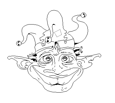
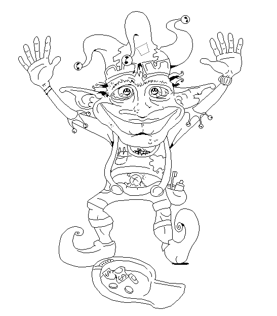
  Topic: Hairy Elf Dances (big!) Topic: Hairy Elf Dances (big!)Posted: 18 May 2005 at 6:23am |
|
Currently I'm about 2/3 through drawing this rather large piece of lineart. Im redrawing a handdrawn image using naught but the mouse. I plan on finishing the entire scene (including his body and a big background) and colouring her detailed like. Quite a major piece, so I thought I'd share it with ya'll.
Note: Even this part of the lineart could still use a bit of cleaning, so dont be too harsh. |
|
 IP Logged IP Logged |
|
|
Smite_O_Rama
Midshipman 
Joined: 10 April 2005 Location: United States Online Status: Offline Posts: 55 |
Posted: 18 May 2005 at 6:43am |
|
Wow, that'll be huge. I look forward to seeing the finished piece.
|
|
|
IP Logged |
|
|
sedgemonkey
Admiral 
Joined: 07 April 2021 Online Status: Offline Posts: 1669 |
Posted: 18 May 2005 at 7:29am |
|
Sweet. It'll be amazing to see such a gigantic pixel piece come together. Keep us posted. |
|
|
IP Logged |
|
|
Blueberry_pie
Rear Admiral 
Joined: 24 July 2015 Online Status: Offline Posts: 2176 |
Posted: 18 May 2005 at 8:28am |
|
Wow, that's gonna take a while... Good luck
 What you have here now already looks fantastic, can't wait to see everything finished  |
|
|
IP Logged |
|
|
Psychotic_Carp
Commander
Joined: 02 April 2005 Online Status: Offline Posts: 1008 |
Posted: 18 May 2005 at 1:44pm |
|
nice work, hes so nutty looking :P
|
|
 got game? got game?
|
|
|
IP Logged |
|
|
Garage Inc.
Commander
Joined: 20 October 2021 Location: United States Online Status: Offline Posts: 318 |
Posted: 18 May 2005 at 7:27pm |
|
Thats crazy so far. I love it. It is incredible and it's going to be even more incredible. I can't wait to see it finished.
|
|
|
For every second spent wondering if you can do something, you could spend 2 seconds doing it.
|
|
|
IP Logged |
|
|
iSTVAN
Commander
Joined: 03 March 2005 Online Status: Offline Posts: 626 |
Posted: 19 May 2005 at 5:58am |
|
Hehe, thanks alot peeps! It will indeed be huge. I drew that head REALLY late last night. I was feeling uninspired so I just used an old sketch I had. Because of the enormity of the piece, I may begin colouring this now, and I'll decide if I feel a background is necessary afterwards.
Still a little smoothing to be done here and there, but I'm pretty happy with it for a couple of hours effort! I really do appreciate all the encouraging words. Makes me want to make it live up to your expectations! Cheers! |
|
|
IP Logged |
|
|
Psychotic_Carp
Commander
Joined: 02 April 2005 Online Status: Offline Posts: 1008 |
Posted: 19 May 2005 at 3:01pm |
|
it makes me smile :)
|
|
|
got game?
|
|
|
IP Logged |
|
|
Zoomrix
Commander
Joined: 27 April 2005 Location: United States Online Status: Offline Posts: 342 |
Posted: 21 May 2005 at 7:21pm |
|
Me too. I love the arms the most in this piece for some reason. Probably because I almost always have problems with them. Very nice chibby-like style and just the general feel of your work.
|
|
|
IP Logged |
|
|
iSTVAN
Commander
Joined: 03 March 2005 Online Status: Offline Posts: 626 |
Posted: 21 May 2005 at 9:31pm |
|
Thanks peeps! The colouring process is well underway. Ive pretty much completed the face and hat, and Im currently working on the hands. The shading is particularly detailed, so I expect it will take some time. I'll reframe from posting the colouring process, as I'd prefer to keep it a surprise. However I'll post her if I come accross any difficulties. Feel free to keep commenting if you wish! |
|
|
IP Logged |
|
|
Blick
Commander
Joined: 21 June 2014 Online Status: Offline Posts: 389 |
Posted: 21 May 2005 at 9:38pm |
|
I don't like how fat the left (our right) leg looks at the calf. Being at this perspective, it should be a bit thinner.
The style really reminds me of Ptoing's larger pixel stuff. |
|

|
|
|
IP Logged |
|
|
iSTVAN
Commander
Joined: 03 March 2005 Online Status: Offline Posts: 626 |
Posted: 23 May 2005 at 5:10am |
|
Interesting Blick! The style is actually adapted from a rather large drawing I did a while back, which is ACTUALLY based on a style of drawing one of my mates tends to use. Almost dedicated to him. The colouring so far, however, is very different to Ptonig's style, methinks. Probably closer to the style SplatPixel uses on largish pics. But its hard to pigeon hole it. |
|
|
IP Logged |
|
|
iSTVAN
Commander
Joined: 03 March 2005 Online Status: Offline Posts: 626 |
Posted: 25 May 2005 at 4:55am |
|
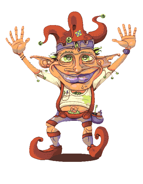
The colouring has progressed significantly!
However, I'm not sure if its totally complete. Something seems missing (besides the hat, which I removed because I wasnt happy with it.) I'll be posting it around the boards to see if you guys (non gender specific) can give me a hand (no sexual allusions what-so-ever) before I post it in my gallery. A background is by no means out of the question, however this took plenty long enough! Thanks! |
|
|
IP Logged |
|
|
sedgemonkey
Admiral
Joined: 07 April 2021 Online Status: Offline Posts: 1669 |
Posted: 25 May 2005 at 8:10am |
|
I don't want to see his happy trail you sicko. One crit and I feel bad for not mentioning this when you were on the lineart stage... his left leg looks a little bit shortened... I know that his heel is towards us, but the thigh area just looks ackward.
|
|
|
IP Logged |
|
|
pixelblink
Commander
Joined: 19 February 2023 Online Status: Offline Posts: 2865 |
Posted: 25 May 2005 at 1:46pm |
|
Looks phenomenal! The only crit I offer is that the lips could use a more natural colouring
|
|
|
IP Logged |
|
|
Sibix
Commander
Joined: 12 March 2005 Online Status: Offline Posts: 200 |
Posted: 26 May 2005 at 12:07am |
|
i think the green eyes dont fit in with the piece, maybe make tem a blueish grey
|
|
|
IP Logged |
|
|
Blick
Commander
Joined: 21 June 2014 Online Status: Offline Posts: 389 |
Posted: 26 May 2005 at 5:23pm |
|
I disagree. The green eyes really makes the face flow, since they're in
the middle of other green spots (bells, hair) and are nearly evenly
placed and it really brings the eyes to life. Making them a different
color would disrupt the pattern and overall make the face a lot duller.
|
|
|
|
|
|
IP Logged |
|
|
iSTVAN
Commander
Joined: 03 March 2005 Online Status: Offline Posts: 626 |
Posted: 27 May 2005 at 2:51am |
|
Thank you very much everyone for making your comments! I intend to not only reply to them but to instigate the given advice where I see fit (which will be no easy feat, as I've effectively whore'd this piece around every pixel alley, nook and cranny!) After finishing this piece and uploading it I took a couple of days off the computer to get my head straight before I attempted to respond to peoples help. The break may have enabled me to settle down a little and make a bit more sense with my replies. Sedgeman: Thankyou, however you must expect to see plenty more, and plenty HAPPIER trails than this cute litte elve's from me. Hehe. The colours, I am also proud of, however, I thought I may have been a little too tight with them. You may notice that I've only really used 5 different base colours (skinbrown, shirtcream, purple, green and red). Within these the colours many of the darker and lighter tones have been re-used, which I think has worked in favour of making the piece see more unified, however it does limit things somewhat. It means that every space must even out colourwise- which would mean making a background somewhat difficult for me. If there is one thing I respect about you is your anal need to respond to every single artwork that crosses your nose, so dont feel guilty that you didnt mention the out of whack leg earlier, you cant be expected to see everything! The leg has been brought up in a number of responses I've read. So it is certainly one that needs to be thoroughly seen to! I think the problem originated from the skecth stage. I think perhaps I should bring the left leg more towards the middle so that it looks less awkward, and counter this by moving the left arm down slightly to balance things out. This will also help me get the left arm right, as it currently looks a tad shifty (esp. the way it joins the shoulder, which is covered by his massive head). pixelblink: Cheers matey! But define 'natural' for me. This is a SUPERnatural hairy elf thing. I've explained my reason for colour selection in my Sedge response. However, and extra tone on the lips would not be out of the question, to smooooooth things out, but Sedge seems to like them the way it is ;] Sibix: See blick's post. Thanks for making a contribution though. Blick: You've pretty much justified the use of my palette. Cheers. EXPECT UPDATES, MATES! |
|
|
IP Logged |
|
|
sedgemonkey
Admiral
Joined: 07 April 2021 Online Status: Offline Posts: 1669 |
Posted: 27 May 2005 at 8:16am |
|
I have to say that iSTVAN's color palettes really are a treat for me personally. It's more about how the colors work together than any particular color used for a part of a piece. He gets away with using these super bright colors from all over the place and makes it work (most of the time
 ). ).
|
|
|
IP Logged |
|
|
samson
Seaman 
Joined: 21 May 2005 Online Status: Offline Posts: 20 |
Posted: 27 May 2005 at 12:34pm |
|
You've already gotten a lot of good comments so i'll just add one
thing: the shadow looks harsh, relative to the shading on piece itself.
Nice job.
|
|
|
IP Logged |
|
|
pixelblink
Commander
Joined: 19 February 2023 Online Status: Offline Posts: 2865 |
Posted: 27 May 2005 at 7:22pm |
|
Originally posted by iSTVAN
pixelblink: Cheers matey! But define 'natural' for me. This is a SUPERnatural hairy elf thing. I've explained my reason for colour selection in my Sedge response. However, and extra tone on the lips would not be out of the question, to smooooooth things out, but Sedge seems to like them the way it is ; I always find it hard to explain myself in words on an image.. so I must explain myself in the natural language of pixels!
Tried a lil something for that leg everyone's talking about too. |
|
|
IP Logged |
|
|
Monkey_man
Commander
Joined: 02 March 2014 Online Status: Offline Posts: 125 |
Posted: 29 May 2005 at 1:41pm |
|
lol it looks like my friend lolol i think the shadings superbizzle
|
|
|
www.engedientertainment.com/phpbb is my forum POST YOUR PIXELS
|
|
|
IP Logged |
|
|
purple_monkey
Seaman
Joined: 03 March 2005 Online Status: Offline Posts: 27 |
Posted: 01 June 2005 at 11:35am |
|
Whoa, that is one supersized sprite :-o I don´t know how to help on the shading, erm, well te shadow is the only thing I don´t like lol, fix it now boy sTan hehe.
|
|
|
IP Logged |
|
|
sedgemonkey
Admiral
Joined: 07 April 2021 Online Status: Offline Posts: 1669 |
Posted: 01 June 2005 at 12:07pm |
|
Awwww... iSTVAN bailed on the purple lips. It actually does look really nice with the red now. |
|
|
IP Logged |
|
|
pixelblink
Commander
Joined: 19 February 2023 Online Status: Offline Posts: 2865 |
Posted: 01 June 2005 at 4:57pm |
|
Originally posted by sedgemonkey
Awwww... iSTVAN bailed on the purple lips. It actually does look really nice with the red now. umm... that was my post with the red lips that I did up. |
|
|
IP Logged |
|
|
TakeOut
Commander
Joined: 27 March 2005 Location: United States Online Status: Offline Posts: 147 |
Posted: 02 June 2005 at 9:35pm |
|
Originally posted by sedgemonkey Awwww... iSTVAN bailed on the purple lips. It actually does look really nice with the red now. Yeah I agree, the red does look better. |
|
|
IP Logged |
|
|
iSTVAN
Commander
Joined: 03 March 2005 Online Status: Offline Posts: 626 |
Posted: 04 June 2005 at 2:20am |
|
Haha. I personally like the purple best. It just seems to balance out well. Thanks pixelblink though! I revised version is currently in the making. I am quite busy at the moment, but I WILL post it when its done!
|
|
|
IP Logged |
|
|
iSTVAN
Commander
Joined: 03 March 2005 Online Status: Offline Posts: 626 |
Posted: 08 June 2005 at 3:40am |
|
Sorry for the delayed....er...delay. I didnt want to reply with a half assed effort only to re-edit in a matter of minute. Pixelblink! The lips: The red sort makes it looke like he's wearing lipstick and it sort of makes the face unbalanced, colourwise. I've used a limited palette so it all sort of needs to feel even, and I feel your edit loses that with an abundance of red and a lack of purpley-ness on the face. I like what youve done with the leg though. Ive edited to include a few of the things mentioned here. The lips and skin now have a couple more colours to smoothen things out. His left leg has been shifted to look a little more regular. Plus I've made the shadow a little like. I've also worked a little more on the belly button, as well as edited a whole bunch of miscellaneous stuff.
|
|
|
IP Logged |
|
| |
||
Forum Jump |
You cannot post new topics in this forum You cannot reply to topics in this forum You cannot delete your posts in this forum You cannot edit your posts in this forum You cannot create polls in this forum You cannot vote in polls in this forum |
|
 You've really gone to town with this one. Amazing color work as always dude. The work you've done on the lips is really impressive.