| Active TopicsSearchRegisterLogin |
| WIP (Work In Progress) | |
| |
  |
| Author | Message |
|
BruceJuice
Midshipman 
Joined: 22 June 2005 Online Status: Offline Posts: 84 |
  Topic: A small pixelart i just made... Topic: A small pixelart i just made...Posted: 02 July 2005 at 7:02pm |
|
I just finished making this on the crapy computer in my bedroom. I
brought it over to the good pc and uploaded it. Tell me what u think.
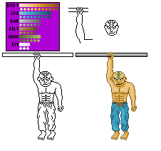  I based it off this sketch i drew. (this one was drawn, and then traced with a sharpie) http://img.photobucket.com/albums/v347/evileyes64/hanger.jpg If there's anything that needs changed, please tell me. If you guys like it, I may make more of him. |
|
 IP Logged IP Logged |
|
|
..::Naso::..
Commander 
Joined: 13 June 2005 Online Status: Offline Posts: 200 |
Posted: 02 July 2005 at 7:31pm |
|
More contrast
|
|
|
IP Logged |
|
|
Garage Inc.
Commander
Joined: 20 October 2021 Location: United States Online Status: Offline Posts: 318 |
Posted: 02 July 2005 at 7:37pm |
|
Instead of more contrast, you could cut out about hald of those colors. For the colors your using, I'm gonna tell you how many of each one you could have. Body: 4-6 Leg: 2-4 Bar: 2-3 Belt: 1-2 Head: 2-3 Eye: 1-2
Now for the crits. As said before, way to many colors. Also, the pants really get on my nerves. Look at your pants or someone elses pants and look how there shaded. It doesn't look anything like that. On the eye, there is no pupil. The left hand needs some work. It doesn't really look like a hand. The anatomy needs some work aswell. Keep working on it and this could be pretty cool. |
|
|
For every second spent wondering if you can do something, you could spend 2 seconds doing it.
|
|
|
IP Logged |
|
|
Lawrence
Commander
Joined: 30 June 2005 Online Status: Offline Posts: 481 |
Posted: 03 July 2005 at 4:21am |
|
The fingers which he holds onto the bar with, they look too thin and
"individual". Also his toes all appear bent, and the big toe on his
left foot is on the wrong side. If you look at some of the early Tintin
comics, Hergé merged characters' fingers together, which is something I
guess you could do too. Good effort nevertheless.
|
|
|
IP Logged |
|
|
Dixet
Seaman 
Joined: 26 June 2005 Online Status: Offline Posts: 8 |
Posted: 03 July 2005 at 6:18am |
|
I still don't knowing how with all that many colours I can hardly notice any shade.
|
|
|
IP Logged |
|
|
BruceJuice
Midshipman
Joined: 22 June 2005 Online Status: Offline Posts: 84 |
Posted: 03 July 2005 at 6:46am |
|
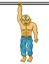
I'll just go ahead and reshade it again, with less colors. I'll also fix the outline too.
|
|
|
IP Logged |
|
|
Dixet
Seaman
Joined: 26 June 2005 Online Status: Offline Posts: 8 |
Posted: 03 July 2005 at 8:50am |
|
Good choice, also try to have more contrast between the shades ;)
|
|
|
IP Logged |
|
|
BruceJuice
Midshipman
Joined: 22 June 2005 Online Status: Offline Posts: 84 |
Posted: 03 July 2005 at 6:03pm |
|
To the comment about the pupil, his eyes are going to be white. sorta blind/possessed like.
Also, I think i'm going to just try a different pose. The whole hanging thing is just starting to bug me. Maybe just a simple(...yeah, sure, simple...) fighting stance will work. About the colors, I took it down. |
|
|
IP Logged |
|
| |
||
Forum Jump |
You cannot post new topics in this forum You cannot reply to topics in this forum You cannot delete your posts in this forum You cannot edit your posts in this forum You cannot create polls in this forum You cannot vote in polls in this forum |
|
