| Active TopicsSearchRegisterLogin |
| WIP (Work In Progress) | |
 Topic: 16x16 tile set dood! Topic: 16x16 tile set dood! |
  |
| Author | Message |
|
MurrMan
Commander 
Joined: 19 January 2006 Online Status: Offline Posts: 177 |
  Topic: 16x16 tile set dood! Topic: 16x16 tile set dood!Posted: 20 November 2006 at 2:57pm |
|
helloo all,
here is some thing i did over the summer. i chose not to post it because i was going to make some sprites to go with the tile set. well i know i probly wont get to the sprites for a while, so i am posting this alone. this is the product of playing metriod games for the gameboy advance. I liked the style of the tiles so i decided to make my own. it is all original. I would like some feedback. Like, do you guys like the colors, do you have any advice to make them look more rock like?  hmmmmm... maybe i should have left it with a background, it hurts the eyes with transperency edit: here it is with a background and demonstration of the tiles 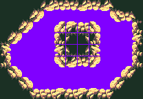 Edited by MurrMan - 20 November 2006 at 3:23pm |
|
|
I have plenty of emotions; It is Sleep that i lack
|
|
 IP Logged IP Logged |
|
|
Pixel_Outlaw
Commander
Joined: 01 September 2005 Online Status: Offline Posts: 3829 |
Posted: 20 November 2006 at 5:28pm |
|
I would tone down the amount of contrast between the yellow and the black. It burns the eyes.
|
|

|
|
|
IP Logged |
|
|
Larwick
Commander
Joined: 18 July 2024 Online Status: Offline Posts: 4015 |
Posted: 20 November 2006 at 5:33pm |
|
I'm really tired and about to go to bed, but i must say these look tasty. Perhaps tone the second lightest colour down a tad, as i think it blends a bit too much with the lightest. Good work.
|
|
 
|
|
|
IP Logged |
|
|
jalonso
Admiral 
Joined: 29 November 2022 Online Status: Offline Posts: 13537 |
Posted: 20 November 2006 at 8:03pm |
|
I likes eet. I agreed with Larwick even before reading his comment so there might be a problem with that shade :/
|
|
|
|
|
|
IP Logged |
|
|
EyeCraft
Commander
Joined: 07 July 2005 Location: Australia Online Status: Offline Posts: 425 |
Posted: 21 November 2006 at 12:21am |
|
Yeah I'll third the notion on darkening that tone. I think you should actually shade the tiles, as in pick a "global lightsource" such as the top-right, and shade the tiles accordingly. ie the ceiling rocks will be in shadow, etc.
That should help to tone the mirror-factor down a bit. But even then I'd suggest differentiating the tiles a bit to make the tileset more variated and interesting. Otherwise they are really quite nice.  |
|
|
IP Logged |
|
|
MurrMan
Commander
Joined: 19 January 2006 Online Status: Offline Posts: 177 |
Posted: 21 November 2006 at 12:06pm |
|
yeah i was thinking of shading the others but i just got lazy and
mirrored them. i might just do that. ill fix the second highlight too.
|
|
|
I have plenty of emotions; It is Sleep that i lack
|
|
|
IP Logged |
|
| |
||
Forum Jump |
You cannot post new topics in this forum You cannot reply to topics in this forum You cannot delete your posts in this forum You cannot edit your posts in this forum You cannot create polls in this forum You cannot vote in polls in this forum |
|
