| Active TopicsSearchRegisterLogin |
| WIP (Work In Progress) | |
| |
  |
| Author | Message |
|
BlackDragon
Commander 
Joined: 13 May 2014 Location: United States Online Status: Offline Posts: 729 |
  Topic: Logo Topic: LogoPosted: 14 January 2008 at 5:18pm |
|
Time for another WIP!
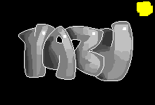 I wanted to make a logo. It reads: "Yazu" if you can't tell.
I dunno, maybe it will be my website's logo when I get one.
Before I move on,
Do I have the shading right?
I'm shooting for the ultra-smooth look of this.
Its going to have warm colors and maybe some blue ambience.
Any crits or suggestions are appreciated. Edited by BlackDragon - 14 January 2008 at 5:33pm |
|
 IP Logged IP Logged |
|
|
BlackDragon
Commander
Joined: 13 May 2014 Location: United States Online Status: Offline Posts: 729 |
Posted: 15 January 2008 at 4:58am |
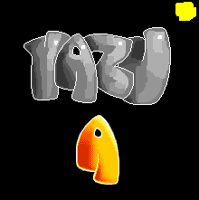 Sorry for the double post, but I need c+c.
I'm not sure about this A. It looks smooth but not the way I wanted it to be. It doesn't pop or anything like te Introx logo does.
What did I do wrong? I think its the lightsource, maybe I should try from the top instead of top-right?
|
|
|
IP Logged |
|
|
Pixel_Outlaw
Commander
Joined: 01 September 2005 Online Status: Offline Posts: 3829 |
Posted: 15 January 2008 at 8:56am |
|
I really like it! It reminds me of the font in some of the early 90's cracktros. If you want blocky carved looking contours you might consider making the silhouettes of the shapes a bit more carved of chunky looking. The way that the light reflects would suggest that the surface of the letters has small little facets you could continue this with the outline of the shapes.
|
|

|
|
|
IP Logged |
|
|
Hatch
Admiral 
Joined: 05 August 2015 Online Status: Offline Posts: 1387 |
Posted: 15 January 2008 at 10:28am |
|
I don't know how closely you're trying to match the style of your reference, but the shading on several of your letters suggests a lot of depth, whereas frost's piece is all definitely on one plane (your A, for example, almost looks like it's taking a step forward)
Also, frost's piece has two separate ramps, yellow and green, whereas you're using a single, heavily hue-shifted ramp. Notice that he doesn't use green colors to shade yellow areas or vice versa (well, he actually does use yellow for speculars on green, but I think my point remains valid.) Lastly, your letters shapes are slightly uninteresting. Again, frost's piece has lots of little details, and all of the letters interact with their neighbors, and the whole thing has a very active, dynamic feel. Your letter forms to me just feel sort of clumsy and bloated. I think the sort of inflated, baloony letter look I think your going for can totally work, I just don't think you've pulled it off well. Sorry, I know this sounds really harsh, but I would be remiss if I wasn't honest in telling you how the piece makes me feel, ya know? I would take a look at some good graffiti art for inspiration/ideas. |
|
|
IP Logged |
|
|
BlackDragon
Commander
Joined: 13 May 2014 Location: United States Online Status: Offline Posts: 729 |
Posted: 15 January 2008 at 2:36pm |
|
Thats okay Hatch, this is the WIP section so its good if you're blunt. Critique is what makes artists grow :) Back to the peice. I hate it now haha. I was thinking this over and I wanted to redo it entirely with a brand new approach. With skinnier letters; more crazy style and details; and bright colors; letters on the same plane; more like my ref. I am shooting for a 70-80 percent similarity, to give room for my own imagination.Mainly the reason I went with the bubble letters is that I couldn't really get inspiration for graffitti style letters. It looked too complicated.
Edited by BlackDragon - 15 January 2008 at 3:06pm |
|
|
IP Logged |
|
|
Pixel_Outlaw
Commander
Joined: 01 September 2005 Online Status: Offline Posts: 3829 |
Posted: 15 January 2008 at 3:15pm |
|
I think the effect you are going for is the found found within many of the "cracktros" made by hackers and programmers.
try googling pictures of "cracktro" and "demo scene" fonts, text and letters. That should get you where you're going.
|
|
|
|
|
|
IP Logged |
|
| |
||
Forum Jump |
You cannot post new topics in this forum You cannot reply to topics in this forum You cannot delete your posts in this forum You cannot edit your posts in this forum You cannot create polls in this forum You cannot vote in polls in this forum |
|
