| Active TopicsSearchRegisterLogin |
| WIP (Work In Progress) | |
| |
  |
| Page of 2 Next >> |
| Author | Message |
|
dyluck
Commander 
Joined: 24 July 2015 Online Status: Offline Posts: 231 |
  Topic: RPG Panic! Topic: RPG Panic!Posted: 23 September 2014 at 7:51am |
|
I'm currently not submitting stuff to the gallery and weekly challenges, nor beeing actively participating on the forum, because working alone on an RPG is my personal bittersweet daily hell (yep, I didn't manage to fool others to join me, so I'm on my own) and it drains currently all my time and stamina.
I have been working all along the summer on sprites, and some of my creatures... hell, I don't like. I'm sure here I can get all the C+C I'm able to manage and even lots more. From now on, I'll upload anything I'm not satisfied with, for anyone who cares and has the good will to help my poor soul. The Graphics: Please notice that the graphics are a low resolution ones. Any pixel you see would be shown at 4X in actual gameplay. Just click three times on the images to see how would they look. Also canvases I work with are ridiculously small, and so it is the detail level I can put into it. This is very peculiar, I know...  Well, first allow me to introduce you: the provisionally titled RPG Panic.  As I told, I'll add here just the stuff I'm not fully satisfied with, and all the finished stuff would be eventually submitted to Pixeljoint gallery. Hopefully, some of them would be included in the gallery. Thanks in advance for your time. 1-Street map:  --> --> --> --> Such terrible and simple sidewalk... and maybe many other things I can't see. 2-Ufo crash:  How about the design? And about colors? Edited by dyluck - 01 October 2014 at 7:37am |
|
 IP Logged IP Logged |
|
|
Mogh
Seaman 
Joined: 20 September 2014 Online Status: Offline Posts: 7 |
Posted: 23 September 2014 at 12:00pm |
|
That looks wonderful to me! I am no expert. The game looks amazing and I would love to try it. I can not find anything displeasing from a Gamer angle.
|
|
|
IP Logged |
|
|
Killapeanutz
Seaman
Joined: 04 September 2014 Online Status: Offline Posts: 31 |
Posted: 23 September 2014 at 10:42pm |
|
i feel like some shading may bring some depth to the pictures. also in the ufo crash i think a little crass would help. maybe even just some more visible pieces sticking up next to the aliens. the colors to me are amazing and as is it gives a very nice feel but in my opinion i think there are areas where more detail is needed. Now I'm quite nooby so il allow a pro to step in and guide you more. XD
|
|
|
IP Logged |
|
|
Latch
Midshipman 
Joined: 06 April 2014 Online Status: Offline Posts: 52 |
Posted: 24 September 2014 at 4:19am |
|
The cars perspective is not akin to the path's perspective, that will make a few people twitchy, but I don't really mind it.
Although, the path (sidewalk) is very big compared to what we see of the road. Edited by Latch - 25 September 2014 at 5:43am |
|
|
IP Logged |
|
|
dyluck
Commander
Joined: 24 July 2015 Online Status: Offline Posts: 231 |
Posted: 24 September 2014 at 5:59am |
|
Mogh -Thanks a lot! I'm glad to know your opinion, one of my main challenges and goals is to pixel appealing graphics despite the low resolution.
Killapeanutz -Thank you so much! True, they really need some deph. I also want to keep a simple style, not very texturized and unclean... so I need to find an adequate balance, and I'll work on it. Latch - Thank yoy very much! I feel a little embarassed. I didn't realized. For the car I should make a false perspetive more consistent. Consider me working already on it. Is great having your feedback, people. So great that I almost feel like I should pay you! (;) well, almost). I'll track all the useful feedback later, and as it is fair, won't forget it. ;) Edited by dyluck - 24 September 2014 at 5:59am |
|
|
IP Logged |
|
|
dyluck
Commander
Joined: 24 July 2015 Online Status: Offline Posts: 231 |
Posted: 25 September 2014 at 2:57am |
|
I tried to fix the car perspective, shorten the sidewalk and starting to add shading to the sidewalk even I'm not really sure how should I do that.
|
|
|
IP Logged |
|
|
MisaChanMikata
Seaman
Joined: 15 February 2014 Online Status: Offline Posts: 13 |
Posted: 25 September 2014 at 4:52am |
 just some edits got lazy. just some edits got lazy.
|
|
|
IP Logged |
|
|
dyluck
Commander
Joined: 24 July 2015 Online Status: Offline Posts: 231 |
Posted: 25 September 2014 at 5:25am |
|
MisaChanMikata - Mmm, really interesting! I'll use the asphalt color you suggest for the lane (I love yours! Mine was totally neutral and too light.) and work some light reflection on the car, sewers and other things. Since I wanted to keep a simple style, I'll avoid giving it too much detail, maybe a little less than you did.
Thank you very much for the time and effort put into the edit. You show really nice and useful interesting ideas that really help me to unclog myself from improving this stage. Did I mention how much I love edits? :P When you're doing very single thing all alone (to be honest, all but the music and sound effects) they give you fresh air. Edited by dyluck - 25 September 2014 at 5:39am |
|
|
IP Logged |
|
|
JustinGameDesign
Commander
Joined: 26 July 2016 Online Status: Offline Posts: 74 |
Posted: 25 September 2014 at 11:59am |
|
Previous version:
My edit:  Comparison:  I couldn't fix everything but this should give you a general idea. Here are some things to consider: Lighting When you illustrate a scene, always be aware of your light source. If it's the sun, it's probably above the scene. Things facing upward need to be lighter. Your car was previously lit from its left side. I also added subtle highlights to your tree where branches face the sky. As a nice trick, make angles facing the view lighter than their surrounding surfaces. This suggests the light is coming from above the viewer's head as well. I did this with the edges of the sidewalk, the border of the building, which I added, and the upper edge of the car. Hue and Saturation You're using almost exclusively straight ramps in your original. Vary your hues and saturation more. Check out this article: http://finalbossblues.com/using-and-choosing-colors/ I think it explains what I mean. I changed one tree and left the other alone. The tree I changed now shades towards purple and highlights towards orange. I left it subtle, but you can go more extreme if you like. Contrast Besides varying your hues and saturation you need to watch for contrast. In your version the tree on the right is difficult to pick out from the grass behind it and the building next to it. You can set the palette to express a sunny or gloomy day yourself but make sure that the mortar and the bricks behind the tree don't pop more than the tree itself. Angle Unfortunately, you rendered your buildings from a side perspective. Windows, doors, etc. need to be squashed at least as much as the car is. I can't redo this part for you. Text My advice: cut it. It pops more than anything in the entire scene. If you must have it, let it be an appropriately low contrast and angled to match its surroundings. I cut the ATM text to show you that it's still recognizable without it. The text on the left building, meanwhile, is angled directly out at the player instead of towards the street. How many RPGs can you think of with readable text on their buildings anyway? You're fine without it. Palette I'm not totally sure if this is supposed to be a gloomy day in your city, so I didn't do much to unify your palette, you but definitely should look into it. Here: 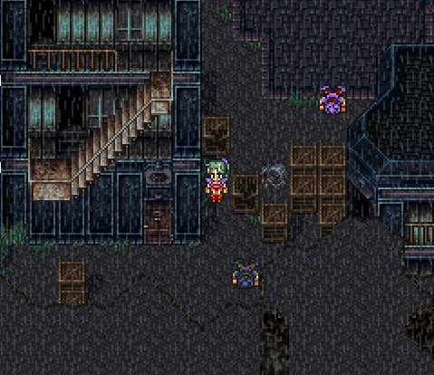 Everything in Zozo is dark, desaturated, and primarily blue or brown in hue. If you're not comfortable creating a palette from scratch, borrow one. You can also try working in monochrome and get the values straight before adding hues. Again, I didn't try to build your palette for you. I just reworked some individual aspects of it. Hopefully, some of the above is useful to you. Keep posting. Edited by JustinGameDesign - 25 September 2014 at 12:06pm |
|
|
IP Logged |
|
|
dyluck
Commander
Joined: 24 July 2015 Online Status: Offline Posts: 231 |
Posted: 25 September 2014 at 2:35pm |
|
JustinGameDesign- Thank you so much, everything you say is useful, even though a pair of things I've read before on other threads, many others are quite fresh to me. I'm getting nuts coding, designing and pixelling... and some aspects and things just escape my eye and my mind. That's why your edits are so prizeles to me.
You've been so helpful. About the atmosphere, the city (in my mind) was supposed to be far from that one from my favourite FF. It's a plain city during daylight, but I'll render it both in day and night version. So, I'll need two different palettes... or maybe I should just transform the daylight version with a tool like GIMP2? pd: May sound odd, but not only the shop, but also the ATM! are suposed to be interactive elements. I would like to keep text, but I'll work the contrast as you advice. You're right, the constrast on the letters keeps all the eye attention, and that's not interesting. Edited by dyluck - 25 September 2014 at 3:25pm |
|
|
IP Logged |
|
|
jtfjtfjtf
Commander
Joined: 17 July 2018 Online Status: Offline Posts: 162 |
Posted: 25 September 2014 at 4:12pm |
|
Have you looked at Earthbound? It has a fairly colorful but not overwhelming city.
|
|
|
IP Logged |
|
|
dyluck
Commander
Joined: 24 July 2015 Online Status: Offline Posts: 231 |
Posted: 25 September 2014 at 5:04pm |
|
Yep, one of my all-time favourite RPG. I'll check out the palettes!
Thanks! |
|
|
IP Logged |
|
|
dyluck
Commander
Joined: 24 July 2015 Online Status: Offline Posts: 231 |
Posted: 26 September 2014 at 3:05pm |
|
I'm still working on how to improve the street map as I've been adviced, but I would like C+C on some npc I would like to include in the game.
This time they are pair of police officers and a transvestite. The police officers I think are fine, but I'm not happy with the third one... does he really reads like a transvestite? ps: why a transvestite? Well, a friend of mine challenged me to pixel lots of things and characters, and I think it would be original to put a variety of npc. Please notice I don't want to make fun on anybody, just depict a fictional character.  Edited by dyluck - 26 September 2014 at 3:07pm |
|
|
IP Logged |
|
|
jalonso
Admiral 
Joined: 29 November 2022 Online Status: Offline Posts: 13537 |
Posted: 26 September 2014 at 3:28pm |
|
At first glance and before reading I saw woman with beard so yes. It works :)
Why is the car outlined in black? Fix those yellow triangles on the road they are fugly. |
|
|
|
|
|
IP Logged |
|
|
dyluck
Commander
Joined: 24 July 2015 Online Status: Offline Posts: 231 |
Posted: 26 September 2014 at 3:40pm |
|
jalonso- I'm on it. Thanks!
|
|
|
IP Logged |
|
|
Limes
Commander
Joined: 15 September 2021 Online Status: Offline Posts: 683 |
Posted: 26 September 2014 at 7:12pm |
|
Originally posted by jalonso
At first glance and before reading I saw woman with beard so yes. It works :) Why is the car outlined in black? Fix those yellow triangles on the road they are fugly. Oh, fugly, isn't it just a beautiful word? |
|
|
IP Logged |
|
|
dyluck
Commander
Joined: 24 July 2015 Online Status: Offline Posts: 231 |
Posted: 29 September 2014 at 1:18pm |
|
Hi again, I'm planning on including a cabin in a forest stage, but all I try is dull and ugly, like this one I show below. After some hours spent on this, I can't come up with nicer designs or with any details to improve or include on it.
 By the way, it's meant to be a forester's cabin in the woods. I also dislike the design of the city buildings and willing to improve them with some references and your previous tips and edits. Edited by dyluck - 29 September 2014 at 1:22pm |
|
|
IP Logged |
|
|
Xevil
Midshipman
Joined: 17 March 2016 Online Status: Offline Posts: 57 |
Posted: 29 September 2014 at 5:19pm |
|
Originally posted by dyluck Hi again, I'm planning on including a cabin in a forest stage, but all I try is dull and ugly, like this one I show below. After some hours spent on this, I can't come up with nicer designs or with any details to improve or include on it. By the way, it's meant to be a forester's cabin in the woods. I also dislike the design of the city buildings and willing to improve them with some references and your previous tips and edits. The logs are too smooth, they look like aluminum tubes, try adding darker areas to simulate the bumpyness of an actual log 2 light sources on the logs, one going left-right on the vertical, and one going top-down on the horizontal, try shading the whole house as a flat object to start No shading on the roof, it looks like it's flat and attached to the front of the cabin I'll try to do an example of what I mean soon |
|
|
IP Logged |
|
|
Xevil
Midshipman
Joined: 17 March 2016 Online Status: Offline Posts: 57 |
Posted: 29 September 2014 at 9:36pm |
 I'm terrible at shading, but it doesn't look as flat Edited by Xevil - 29 September 2014 at 9:36pm |
|
|
IP Logged |
|
|
dyluck
Commander
Joined: 24 July 2015 Online Status: Offline Posts: 231 |
Posted: 30 September 2014 at 4:49am |
|
Wow! Thank you very much for your edit, Xevil!
Seeing the logs beautifully textured and roof lighted really helps. Makes the design I made look much better eventhough it's quite plain and simple. (But in the end, it's not apalace, it's a forester's cabin!) I was planning on first improving the design or including more details, and then adding a little texture and deph and lighting. But I see now that it won't look as ugly as a desingn once polished! :D |
|
|
IP Logged |
|
|
dyluck
Commander
Joined: 24 July 2015 Online Status: Offline Posts: 231 |
Posted: 01 October 2014 at 7:40am |
|
This is the cabin with some issues fixed, plus some animals. C+C is so welcomed:
 |
|
|
IP Logged |
|
|
dyluck
Commander
Joined: 24 July 2015 Online Status: Offline Posts: 231 |
Posted: 01 October 2014 at 10:41am |
|
How about this cliff?
Looks a little unnatural, and I'm not happy with its texturing and shading.  |
|
|
IP Logged |
|
|
dyluck
Commander
Joined: 24 July 2015 Online Status: Offline Posts: 231 |
Posted: 22 October 2014 at 9:49am |
|
Good news for the project, a friend is working on nice tunes for the game, so its music would be unique instead of buyed from a ressource database!
I'm currently programming the NPC IA, but still pixelling a little. |
|
|
IP Logged |
|
|
dyluck
Commander
Joined: 24 July 2015 Online Status: Offline Posts: 231 |
Posted: 19 February 2015 at 4:51am |
|
Hi again, it's been a while since last update.
I'm working on the icons for objects and menu/submenus. The objects are difficult to do because of the size, but the icons for symbolicing menu concepts are a true pain in the ass. The worst part is the election of a symbol, rather than pixelling it, (which also it's quite a pain in the ass). Suggestions are also reaally welcomed.  Fist there's the menu, starting up and going clockwise: "pause", "status", "backpack/items", "settings", "skills", and finally "exit". Then a wip for the submenu "backpack/items", classified as: "weapons", "clothes", "health", "components" (there's crafting on the game), "tools" and "miscellaneous".  There's also sub-submenu to classify items, i.e., weapons are classified in ranged and melée, and "health" in "energy" and "medics". In the second .png the icons inside a rectangle are some alternate versions. Edited by dyluck - 19 February 2015 at 5:02am |
|
|
IP Logged |
|
|
skeddles
Commander
Joined: 08 April 2021 Online Status: Offline Posts: 636 |
Posted: 21 February 2015 at 2:35pm |
|
Originally posted by dyluck How about this cliff? Looks a little unnatural, and I'm not happy with its texturing and shading. You need more contrast in just about everything. You also need to think about 3d volume and how that affects the light. To me it looks likes you draw something, then fill it with color, then add texture. You need another step before texturing, which is to add volume. Start with a big brush, get messy, and then clean up and add detail. Right now it looks like a flat shape with texture painted on top. You could use some details such as grass on the top of the cliff. And some rocks in that dirt. |
|
|
|
|
|
IP Logged |
|
|
dyluck
Commander
Joined: 24 July 2015 Online Status: Offline Posts: 231 |
Posted: 22 February 2015 at 4:08am |
|
Thanks. I'll rework it. ;)
|
|
|
IP Logged |
|
|
Iscalio
Commander
Joined: 29 March 2023 Online Status: Offline Posts: 225 |
Posted: 23 February 2015 at 7:37am |
|
Your Trash Converters sign is using darker darks than the rest of your wall and the tree branch touches the edge of the sign without occluding it. This makes your sign look like it's a foreground or UI element instead of a background store sign.
Looks like you've edit this somewhat, and it is less confusing now. Edited by Iscalio - 23 February 2015 at 7:38am |
|
|
IP Logged |
|
|
dyluck
Commander
Joined: 24 July 2015 Online Status: Offline Posts: 231 |
Posted: 10 March 2015 at 8:58am |
|
I'm having a hard time working on the cliff, and not sure if I'm doing right.
  It looks wooden textured... I think the cliff really sucks, but I need it to give more game depth, and maze puzzle solving, so... I'll try to improve it sooner or later. I'm afraid for now I'm stuck. Edited by dyluck - 11 March 2015 at 3:07am |
|
|
IP Logged |
|
|
dyluck
Commander
Joined: 24 July 2015 Online Status: Offline Posts: 231 |
Posted: 11 March 2015 at 3:45am |
|
Time for some final bosses.
I've been working on bosses, and I've come with the idea of doing a little tribute to some adventure and RPG classics. This one is inspired by Thraxx (Secret of Evermore). A sort of coleoptera. There's also my version of the nasty maggots in the bugmuck swamp.  This is my version of Tropicallo (Secret of Mana). A lemmon headed pineapple.  This is, again SOE inspired, Salabog (Secret of Evermore).  This is (unfinished) inspired by the Trallü (Little Big Adventure 2)  What do you think about them? Edited by dyluck - 11 March 2015 at 9:49am |
|
|
IP Logged |
|
|
Palocles
Midshipman
Joined: 02 December 2013 Online Status: Offline Posts: 65 |
Posted: 14 March 2015 at 11:17pm |
|
Dyluck, I think you have misunderstood what skedldles meant regarding the cliff face. Turn you brush size up to 10-15 pixels or more and block in some big chunks of texture. Stuff like rough triangles over the entire height of the cliff. Also Google cliffs online.
Those bosses look pretty good. The contrast on the last three doesn't look very high though and the detail might disappear in your game. |
|
|
IP Logged |
|
|
dyluck
Commander
Joined: 24 July 2015 Online Status: Offline Posts: 231 |
Posted: 15 March 2015 at 9:15am |
|
Thanks for the feedback!
Sorry, I think now I understand better what he told. About the contrast issue: is not very high (in fact it's horrible in the last). But for the second and third, at 4X looks more decent. I'll tweak a little bit the contrast for the final version. Back to work, then. ;) |
|
|
IP Logged |
|
|
dyluck
Commander
Joined: 24 July 2015 Online Status: Offline Posts: 231 |
Posted: 18 March 2015 at 2:19pm |
|
I think I know now how to start again with the cliffs:
This is yet unfinished, just to ask if I'm going in the right direction. C&C?  ps: It's just me or there's too much detail on it? Edited by dyluck - 18 March 2015 at 2:21pm |
|
|
IP Logged |
|
|
RBL
Midshipman
Joined: 07 February 2018 Online Status: Offline Posts: 55 |
Posted: 18 March 2015 at 2:48pm |
|
Better use palettes with more pastel-like colors and make the gradients by skipping some hues to enrich the whole image.
|
|
|
IP Logged |
|
|
PixelSnader
Commander
Not a troll! Joined: 08 January 2026 Online Status: Offline Posts: 3194 |
Posted: 18 March 2015 at 5:00pm |
|
Your previous one looked a lot like wood/bark, and this one looks more like earth, so it's a step in the right direction. However, it looks like cracked earth from above, or like a pile of clumps. It's not a solid structure and I wouldn't want to walk over something that looks like it could collapse at any moment. The big issue is that you're currently trying to use the full range of colors everywhere.
If you look at this set: 
You can clearly see some vertical bars that stand out (and are brightly lit) and some that are recessed (and shaded) But in one pixel column from top to bottom, there's relatively little color difference; most of the color variation is because the tileset is a bit noisy overall. So by having some flat, interconnected planes, you make it look as if the ground particles and the sand clumps are also interconnected and thus, sturdy. |
|
|
▄▄█ ▄▄█ ▄█▄ ▄█▄ |
|
|
IP Logged |
|
|
dyluck
Commander
Joined: 24 July 2015 Online Status: Offline Posts: 231 |
Posted: 05 August 2015 at 1:24am |
|
More than 6 months since last update... I guess I was on a lapsus from pixelling. Just reading the forum, and doing some edit to other people's wips.
I also did paid pixel works for a little game, half coded yet, but promising, that I'll post here when the game is out, (with the owner's permission). Most of the time, I work on stories and concepts for my main game, this RPG Panic, and I have to say it's exhausting... items, menu system, skills, story, characters, enemys, puzzles and other stuff like ways to advertise and market it. It's not a one person's job. I undestood the C+C from your last advices, I was quite happy with my latest cliffs, but the crumbly rocks really look like dirth and not like rocks, maybe more for the colors used rather than the form, but I'll update themn in both ways. I completely forgot to thank you people for your C+C! . You have my gratitude. |
|
|
IP Logged |
|
|
dyluck
Commander
Joined: 24 July 2015 Online Status: Offline Posts: 231 |
Posted: 12 September 2016 at 2:00am |
|
Ages... no; -eons- since last update.
I'll work on the earthy cliffs, but had to move onto more assets. I got pretty busy, and kept working coding in my scarce free time. This septembrer I've been working on the street map, pixelling buildings, since I'll need a wide variety of them. This weekend I've been working on a church for it, an unfinished one for wich I would like some C&C to finish.  |
|
|
IP Logged |
|
|
dyluck
Commander
Joined: 24 July 2015 Online Status: Offline Posts: 231 |
Posted: 13 September 2016 at 4:00am |
|
Does anybody know any reference for little sized towns?( specially buildings) kind of the size and style of silent hill, but without the fog.
|
|
|
IP Logged |
|
|
pyrometal
Rear Admiral 
Joined: 20 October 2021 Online Status: Offline Posts: 305 |
Posted: 13 September 2016 at 5:50pm |
|
Sorry, I have no references for you :(
Ref crits on your current progress, you have conflicting perspectives being used here. For example I think we should be able to see more of the roofs of the entrance and tower. Also, roof tile shading direction is not consistent with brick shading. Where is your light source? Maybe you want to explore increasing the saturation a bit and use a few hues? You currently only have grays on the church. Otherwise, the layout of your church is nice and makes sense  |
|
|
IP Logged |
|
|
dyluck
Commander
Joined: 24 July 2015 Online Status: Offline Posts: 231 |
Posted: 14 September 2016 at 9:02am |
|
@pyrometal... thanks.
The light source is meant to be noon's sunlight, so exactly from above. the shadowing of the roof tiles is meant to be a first aproximation to texture rather than lighting itself, I should do something with that tiles, but don't know exactly what to do to them. the roof entrance is meant to be not so wide, but since the entrance stairs are not finished it doesn't look right, and it's confusing. The roof of the tower is a copy paste of a piece of the other, it should show tiles at the front side instead of stone bricks, like the rest of the roof. Any ideas on how to add volume to the stones not giving them too much detail? What could I do to the roof tiles to make them? Do I just remove the borders? I see what you say about gray too. |
|
|
IP Logged |
|
|
pyrometal
Rear Admiral
Joined: 20 October 2021 Online Status: Offline Posts: 305 |
Posted: 14 September 2016 at 6:37pm |
|
If you want more volume on your stone texture, try increasing the contrast and maybe adding an extra shade if you need extra transition colors.
For the roof, they currently read as if they are hollow squares, which is not how roofs are built. Look at some picture of roofs, pick one you like, and try to come up with a texture that communicates it well in pixel art. That would be my advice. Btw, I don't mean to come across as harsh, I actually like what you are doing here |
|
|
IP Logged |
|
|
dyluck
Commander
Joined: 24 July 2015 Online Status: Offline Posts: 231 |
Posted: 15 September 2016 at 1:08am |
|
thanks, I didn't read the crits as harsh. On the contrary, you were too kind expressing it.
It may look like if I didn't pay much attention to te C&C, because sometimes I did not fix things or I didn't show the results of that feedback, but I really pay much attention to it, and plan to fix as much of it as I can. I shoulnd't put too much detail to certain pieces that may benefit from it, to keep a consistent style, the stone bricks without the second color shadowing may look too plain, but texture gives them too much detail. The roof tiles are a little bit troublesome to me, maybe i just add another color and change the pattern or dither or something... I'll fix the main issues. |
|
|
IP Logged |
|
|
dyluck
Commander
Joined: 24 July 2015 Online Status: Offline Posts: 231 |
Posted: 15 September 2016 at 1:20am |
|
I have a major problem with the street map scenario, because I want to acces doors and building at both sides of the sidewalk, and I'm experiencing with transparency for the building and solid entrances, black hollows and transparency in mirrored entrance, and so.
And thinking a solution for perpendicular streets... Navigation on the maps would be odd and confusing otherwise... I'm not showing the buildings because I think they're ok (not finished with them, I need a lot more of styles for buildings), but now I'm struggling with a space for kids in the park, specially "slides", and I would need more C&C. I'm particulary concerned about the slide, does it reads like that? Any advice on how to handle it? (let's ignore the composition, extra elements, grass and other details for the park, but ideas for other elements and or wips would come in very handy.)  |
|
|
IP Logged |
|
|
pyrometal
Rear Admiral
Joined: 20 October 2021 Online Status: Offline Posts: 305 |
Posted: 15 September 2016 at 8:39pm |
|
The way you have your slide drawn (straight on)makes it hard to read as a slide. Try to make it curve and give it some perspective so we can see the ladder.
You should add a roundabout in your park: http://https://en.wikipedia.org/wiki/Roundabout_(play) Simple enough to draw and takes a decent amount of space (bang for your buck) which would make your park more appealing. |
|
|
IP Logged |
|
|
dyluck
Commander
Joined: 24 July 2015 Online Status: Offline Posts: 231 |
Posted: 25 September 2016 at 10:19am |
|
Thanks, I will try to pixel it from the side.
I used the playground from Silent Hill: DownPour, which also has a roundabout, so I think I will pixel that too. Thanks again. |
|
|
IP Logged |
|
|
dyluck
Commander
Joined: 24 July 2015 Online Status: Offline Posts: 231 |
Posted: 03 May 2018 at 12:14pm |
|
eons since last update...
Sadly, my lack of time ended up with me almost giving up. I managed to implement the action rpg combat system last summer and the next one I'll end the menus and will be finally free to pixel! It's crazy and stupid how long term it's taking me to make my first real game. But... Yay for me! |
|
|
IP Logged |
|
|
Palocles
Midshipman
Joined: 02 December 2013 Online Status: Offline Posts: 65 |
Posted: 03 May 2018 at 12:40pm |
|
At least your still getting work done on it. Good effort.
I havent worked on my pixels or game in ages. Really wish I add some more time to do something. |
|
|
IP Logged |
|
|
dyluck
Commander
Joined: 24 July 2015 Online Status: Offline Posts: 231 |
Posted: 04 May 2018 at 10:00am |
|
hey, buddy! it's been ages!
My "problem" was (finally) getting a job, wich was good news, I hope your lack of time has a good side too! I'll post some wips during weekend, and as soon as I can a video with actual gameplay of it. Maybe I can grab some more c&c from you. Thanks in advance! |
|
|
IP Logged |
|
|
Palocles
Midshipman
Joined: 02 December 2013 Online Status: Offline Posts: 65 |
Posted: 04 May 2018 at 1:28pm |
|
Yep, work here too.
And when not working I want to paint miniatures, build terrain, play ready made video games and workout. As well as pixels and game dev. Only the work and occasional video games tend to happen. |
|
|
IP Logged |
|
|
dyluck
Commander
Joined: 24 July 2015 Online Status: Offline Posts: 231 |
Posted: 06 May 2018 at 3:26am |
|
Hi, the first two enemies desiged for testing the action rpg combat
system were an exhibitionist and a stray dog. Any c&c welcomed!
 I'm not 100% satisfied with the dog facing up, facing down and attaking up. The animations kind of work, I know it's difficult to imagine just like that, I'll try to upload a video with some gameplay showing those guys animated. |
|
|
IP Logged |
|
|
dyluck
Commander
Joined: 24 July 2015 Online Status: Offline Posts: 231 |
Posted: 06 May 2018 at 3:32am |
|
In this wip I present the unfinished basic look of a street.
 I kind of like the building design, but it's still very simple. Also, I have like 4 different styles for buildings and I kind of need more variety. Any refferences or suggestion matching the style will be great!  |
|
|
IP Logged |
|
| Page of 2 Next >> |
| |
||
Forum Jump |
You cannot post new topics in this forum You cannot reply to topics in this forum You cannot delete your posts in this forum You cannot edit your posts in this forum You cannot create polls in this forum You cannot vote in polls in this forum |
|
