| Active TopicsSearchRegisterLogin |
| WIP (Work In Progress) | |
| |
  |
| << Prev Page of 3 Next >> |
| Author | Message |
|
skittle
Commander 
Joined: 20 July 2021 Online Status: Offline Posts: 350 |
  Posted: 20 May 2013 at 10:09am Posted: 20 May 2013 at 10:09am |
|
Alrighty, I removed the shrooms and the gears... those can come later. Right now I'm focusing more on the cone. Here's a rough thingy right now.

Small preview thingy  Edited by ADrawingMan - 20 May 2013 at 10:17am |
|
 IP Logged IP Logged |
|
|
onek
Commander
Joined: 19 May 2009 Online Status: Offline Posts: 416 |
Posted: 20 May 2013 at 12:32pm |
|
firstly, this has improved a whole lot since ur first post, this has potential to become quite a nice little piece..
i think it was definitly a wise choice to go smaller in size which will teach u a lot about the essentials of pixel art however before u go any further in refining on pixel level and getting lost in detail stuff i think it is important that u impove on ur composition.. right now everything looks slightly slanted, doesnt convey much feeling of depth and overall looks a bit empty and abandoned... i think u really need to throw those mushrooms back in there since their red makes for a strong contrast in the overall blueish scene and therefore gives the eye some more to work with.. also its always good to have leading lines which can guide the viewer through an image either telling some sort of story or just simply by creating depth and sucking the viewer into the image... heres a quick edit, trying to create more depths and atmosphere through different depth layers and lighting 
|
|
|
IP Logged |
|
|
skittle
Commander
Joined: 20 July 2021 Online Status: Offline Posts: 350 |
Posted: 20 May 2013 at 12:41pm |
|
Wow, this edit does give it quite a lot more atmosphere. I think I'm gonna do something in the background to give it more depth but in terms of colours... I think I'm gonna stick to my guns. I will be adding the mushrooms back but after I do other things such as revising the cone and the clouds.
I may (Most likely) add a bridge connecting another island in the background. After seeing the lighting on your tree I think I will also try to edit mine. Edited by ADrawingMan - 20 May 2013 at 12:43pm |
|
|
IP Logged |
|
|
onek
Commander
Joined: 19 May 2009 Online Status: Offline Posts: 416 |
Posted: 20 May 2013 at 1:10pm |
|
yeah not too fond about the colors in my edit aswell but i thought theyd fit the golden-hour-ish lighting i got going with those shadows and stuff
.. anyway main thing imo is that u really need to turn that island a bit |
|
|
IP Logged |
|
|
Marina
Seaman 
Joined: 11 August 2014 Online Status: Offline Posts: 21 |
Posted: 21 May 2013 at 6:00am |
|
I think i should follow the tips of all of you as well, because i am also kind of hard head and I dont organize much my stuff :P
I will go to the point. I think your scenario is good, but the tips they gave you are right too. Maybe will be easier for you to learn the technic if you start doing smaller things. At the moment, i can say that i like the concept. But the point, is how will you bring it till it's completely done. You can take a look of several references that use a similar style as yours (or maybe, that's the concept that i got in my mind). For example, you can take a look on The legend of Zelda Minish cap. The palette is colorful, and the shading is simple and effective. Not too hard. Maybe it will help you a bit. |
|
|
IP Logged |
|
|
skittle
Commander
Joined: 20 July 2021 Online Status: Offline Posts: 350 |
Posted: 21 May 2013 at 1:13pm |
|
Yeah, I was kind of hesitant when Jalonso talked to me about resizing it but now I really not regret doing it. I guess the last things to do is the shading and the clouds... apart from that I don't really think there's much else for me to do (or at least that I can think of).
Minish Cap is actually a very good example, their colors are cute. |
|
|
IP Logged |
|
|
jalonso
Admiral 
Joined: 29 November 2022 Online Status: Offline Posts: 13537 |
Posted: 21 May 2013 at 2:51pm |
|
You are not there yet...you have lots and lots and lots to do.
|
|
|
|
|
|
IP Logged |
|
|
skittle
Commander
Joined: 20 July 2021 Online Status: Offline Posts: 350 |
Posted: 21 May 2013 at 2:53pm |
|
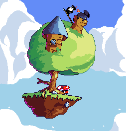
Added a flag. I think it's ready but I think I should get a "okay" from someone or a last critic.

@Crozier I removed the gears and stuff but as for the grass I kind of like the jaggy look and to be honest I would prefer it without texture. |
|
|
IP Logged |
|
|
skittle
Commander
Joined: 20 July 2021 Online Status: Offline Posts: 350 |
Posted: 21 May 2013 at 2:54pm |
|
Ah... what would you suggest that I should add or try to fix?
|
|
|
IP Logged |
|
|
ultimaodin
Commander
Joined: 04 May 2010 Location: Australia Online Status: Offline Posts: 162 |
Posted: 22 May 2013 at 12:14am |
|
Hey man, you have way too many colours. Here is an edit with 24 colours and a few slight adjustments:
 |
|
|
The world is but a shadow of emotion, cast in shades of grey.
|
|
|
IP Logged |
|
|
AtskaHeart
Commander
Joined: 06 June 2020 Online Status: Offline Posts: 114 |
Posted: 22 May 2013 at 1:36am |
|
^*likes*
But I feel the pink is being desaturated by the green on the left area. |
|
|
IP Logged |
|
|
skittle
Commander
Joined: 20 July 2021 Online Status: Offline Posts: 350 |
Posted: 22 May 2013 at 12:33pm |
|
I really like what you did with the cannon. Yeah... I think that most of my colours may have been mostly from trying to do AA :P. I'm not exactly a huge fan on the purple, but I must say I really love the brighter colours. What did you do exactly to reduce the colour count?
Is adding pink like that just a style or does it affect other colours somehow? Here's an edit of your edit (I kept the purple on the mushroom because I thought that it looked really cool with it) 
yay, 7777 topics have been made! Edited by ADrawingMan - 22 May 2013 at 1:39pm |
|
|
IP Logged |
|
|
skittle
Commander
Joined: 20 July 2021 Online Status: Offline Posts: 350 |
Posted: 23 May 2013 at 3:22pm |
|
I just changed a bit of the colors on the trunk... I'm not sure if it could be considered done at this point. I haven't been doing much with it now though.

|
|
|
IP Logged |
|
|
crozier
Commander
Joined: 08 May 2023 Online Status: Offline Posts: 190 |
Posted: 23 May 2013 at 5:24pm |
|
The right part of the tree is rather boring and not as tree-ly curved as the left part. Also the outline is kind of killing it.
I also really dislike the bottom part of the tower. The crazy bricks with the highly contrasting leaning bricks is not too appealing, in my opinion. Perhaps dull the bricks, and make it a more consistent pattern. (oh and the leaves on the bottom side of the tower is strange). The bottom few clouds are a bit out of place due to their strange curves. The large lumps aren't as nice as the clouds above it (with the smaller bumps). Also the specks near the clouds aren't really needed. They are merely distracting. Anyway, its certainly a lot nicer than when you started. Good luck with this, and don't forget "Rome wasn't built in a day." Edited by crozier - 23 May 2013 at 5:25pm |
|
|
IP Logged |
|
|
AtskaHeart
Commander
Joined: 06 June 2020 Online Status: Offline Posts: 114 |
Posted: 23 May 2013 at 5:52pm |
|
Well you definitely improved a lot! It still requires some more detail and refinement, yet I understand it's time consuming :/.
|
|
|
IP Logged |
|
|
jalonso
Admiral
Joined: 29 November 2022 Online Status: Offline Posts: 13537 |
Posted: 23 May 2013 at 6:14pm |
|
Be patient...its worth it.
Break the image into many small squares and 'pixel' those as stand alone art pieces. Focus and be deliberate in your pixel placements. If it looks funny it is. Focus on each 'cluster' or color area on its on and clean it up. You have lots of stray colors here and there so clean those up too. Now is the time to tweak your palette. For example in this square you can change the sky a bit darker to use for AAing the roof, or add a new blue or find an existing color somewhere that works. Don't make me go over there and whack you.  Edited by jalonso - 23 May 2013 at 6:16pm |
|
|
|
|
|
IP Logged |
|
|
skittle
Commander
Joined: 20 July 2021 Online Status: Offline Posts: 350 |
Posted: 24 May 2013 at 10:26am |
|
Please don't whack me!
I think I'll try this idea out, it may help me focus a lot more and I'm gonna go over all the colors I used and take out all the unnecessary ones. @crozier I see what you're saying about the left side of the tree and I totally agree with you. I think I'm gonna try making the brick lines more subtle and make them so they don't pop out as much. @AtskaHeart It is quite it is quite time consuming but I think that the one of the main reasons why it is taking very long is probably due to the fact that I tend to run out of ideas when I'm pixeling. |
|
|
IP Logged |
|
|
skittle
Commander
Joined: 20 July 2021 Online Status: Offline Posts: 350 |
Posted: 24 May 2013 at 4:39pm |
|
I picked through it using the tiled method, I may have to go through it one or two times more again to take out some colours but here it is so far...
I don't think the bricks are 100% yet but it is an improvement I think (I like them better than the previous ones that is). 
Anyone have any ideas on how to fix that funny little piece of leaf that is covering the bottom right corner of the tower with the blue cone? Edited by ADrawingMan - 25 May 2013 at 4:09pm |
|
|
IP Logged |
|
|
jalonso
Admiral
Joined: 29 November 2022 Online Status: Offline Posts: 13537 |
Posted: 26 May 2013 at 4:27am |
|
Your problems are all still the same: You are not 'working on the pixel level'. When I mentioned breaking the canvas into smaller parts that was the point of that.
I'm starting to think the canvas should be even smaller now, like half. Edited by jalonso - 26 May 2013 at 4:27am |
|
|
|
|
|
IP Logged |
|
|
AtskaHeart
Commander
Joined: 06 June 2020 Online Status: Offline Posts: 114 |
Posted: 26 May 2013 at 5:04am |
|
I must agree with jal :/.
Adding an example of pixel level detail 
|
|
|
IP Logged |
|
|
skittle
Commander
Joined: 20 July 2021 Online Status: Offline Posts: 350 |
Posted: 26 May 2013 at 9:07am |
|
Ah, to be honest adding rocks like that never really crossed my mind. But now that I see it with rocks I think I give it a try.
I think I really didn't think about adding details like that because I was attempting to mimic my drawing on paper to much. I think I'm gonna try a few more things before considering resizing again. Edited by ADrawingMan - 26 May 2013 at 9:09am |
|
|
IP Logged |
|
|
jalonso
Admiral
Joined: 29 November 2022 Online Status: Offline Posts: 13537 |
Posted: 26 May 2013 at 9:53am |
|
Still on the attention to 'on the pixel level'
You have many ugly spots that you should notice and clean up. These are some.  You have lost control of your colors and its going to cause you a lot of work. You are up to 110 colors. Here are lots of areas of waste and strays.  Use colors in more than a single spot and remove any and all needless shades as you go. Here I quickly brought down the color count to 44.  You don't seem to cross the 'on the pixel' level threshold so you might need to consider a fixed, small palette and canvas  Edited by jalonso - 26 May 2013 at 9:54am |
|
|
|
|
|
IP Logged |
|
|
skittle
Commander
Joined: 20 July 2021 Online Status: Offline Posts: 350 |
Posted: 26 May 2013 at 10:03am |
|
Uh oh, I didn't realize I had that many colors :/.
I'll try picking through it with the tiled method you showed me but... here's what I got using the tiled method right now. 
Actually I think I may know one of the reasons why I have a ton of colors. I'm using GIMP and I noticed that sometimes my opacity is 99% which may be what's causing so many colors? I switch to 100% opacity when I notice this but this is just a thought on what could be causing so many colours, or I may have been going overboard with trying to do AA. I just removed all my AA and I'm gonna forget about that for now. I'm gonna try to focus on details and try not to get tangled in all the other stuff. Edited by ADrawingMan - 26 May 2013 at 10:08am |
|
|
IP Logged |
|
|
jalonso
Admiral
Joined: 29 November 2022 Online Status: Offline Posts: 13537 |
Posted: 26 May 2013 at 10:07am |
|
Oh, that's better. Focus like that on all areas and this size canvas will be ok.
Yes, watch that 99% thing. |
|
|
|
|
|
IP Logged |
|
|
skittle
Commander
Joined: 20 July 2021 Online Status: Offline Posts: 350 |
Posted: 26 May 2013 at 12:53pm |
|
Here it is so far!

|
|
|
IP Logged |
|
|
jalonso
Admiral
Joined: 29 November 2022 Online Status: Offline Posts: 13537 |
Posted: 26 May 2013 at 1:03pm |
|
Doing good :)
Notice how the purple and the darkest brown in the rocks are almost the same color. Edit that dark brown to be just a bit darker so it doesn't blend with the purple. If dark enough then consider making all the black be that real dark brown. |
|
|
|
|
|
IP Logged |
|
|
AtskaHeart
Commander
Joined: 06 June 2020 Online Status: Offline Posts: 114 |
Posted: 26 May 2013 at 1:39pm |
|
Good job! The purple could be more purple/blueish or like jal says, the dark brown darker.
|
|
|
IP Logged |
|
|
skittle
Commander
Joined: 20 July 2021 Online Status: Offline Posts: 350 |
Posted: 26 May 2013 at 2:06pm |
|
Ah I see what you mean. I tried making the purple darker than the brown so it would look more like cracks.
@AtskaHeart Thanks! I like your edit much better though :P. Edited by ADrawingMan - 26 May 2013 at 2:06pm |
|
|
IP Logged |
|
|
jalonso
Admiral
Joined: 29 November 2022 Online Status: Offline Posts: 13537 |
Posted: 26 May 2013 at 2:17pm |
|
For now work on the tree trunk, rocks, mushrooms, towers, etc.
Leave ALL grass and the green part of the tree for after because that will need more attention. On the tree trunk FOCUS on being clean and pretty. Get rid of any I pixel sized gaps, they are ugly. Use colors other than the ones you need sometimes. For example, the white dots in the blue mushroom are in shadow so they are not white use a blue that 'reads' white but is not. Think light and shadow with every pixel... ...focus on the pixel level. E: If you are going with an outline on the outer side of everything then be consistent and don't leave any gaps. If you are only selectively outlining (selout) then be consistent with that. Edited by jalonso - 26 May 2013 at 2:19pm |
|
|
|
|
|
IP Logged |
|
|
Hapiel
Rear Admiral 
Joined: 30 June 2023 Online Status: Offline Posts: 3266 |
Posted: 26 May 2013 at 3:15pm |
|
Good luck with your island ADrawingMan! I have some tips for the rocks at the bottom of your island: perhaps be a bit more subtle. Not every rock needs to be surrounded with a dark outline, for example if one overlaps the other you could technically not see a line! Zoom in on Atska's example and see that they are not all completely seperated.
@Jal You do such a great job at creating artists! I have said it before but not often enough: Without you I would not be here. And now 5 years later you are still doing it, helping beginners step by step to a masterpiece! Forever patiently with clear instructions and edits. Please give yourself a gold star in my name for best C+C ever! |
|
|
IP Logged |
|
|
skittle
Commander
Joined: 20 July 2021 Online Status: Offline Posts: 350 |
Posted: 26 May 2013 at 4:02pm |
|
You're right! I think I did what's similar to Atska's rocks but more on the lighter side of the island. On the darker side I seem to have more outlines.
But on a different note, here's how things are going so far with my tower. 
The tower is far from being called done, right now I'm trying to get a feel for what the bricks should be like. |
|
|
IP Logged |
|
|
jalonso
Admiral
Joined: 29 November 2022 Online Status: Offline Posts: 13537 |
Posted: 26 May 2013 at 4:48pm |
|
Put 'on the pixel level' on hold and go back to 'planning'
Find your blocks by coloring them in (think perspective, size, design, layout, look and feel, etc.) then refine from that and when satisfied c/p onto the main art. Think of it as a stand alone asset that you'll paste in. You are basically making the wireframe. Left you a blank to work on :)  @Hapiel,  Edited by jalonso - 26 May 2013 at 5:00pm |
|
|
|
|
|
IP Logged |
|
|
skittle
Commander
Joined: 20 July 2021 Online Status: Offline Posts: 350 |
Posted: 27 May 2013 at 5:32pm |
|
Oi, this is what I've done so far.

To be honest I don't think I really wemt back into planning mode but rather planned on a "pixel level". I'm not totally sure if I want my tower to be completely covered in a brick like texture. I was thinking that on the dark side of the tower there would be slight hints of brick (I'm gonna try to make them more pronounced later) and going towards the lighter side of the tower the brick would be very subtle. This is still just an idea I'm toying with at the moment though. After looking at this from a distance I think I'm gonna make the subtle brick textures on the light side more noticeable. Edited by ADrawingMan - 27 May 2013 at 5:32pm |
|
|
IP Logged |
|
|
AtskaHeart
Commander
Joined: 06 June 2020 Online Status: Offline Posts: 114 |
Posted: 28 May 2013 at 5:36am |
|
A brick texture shouldn't be full of bricks, but hints that there are bricks (which is actually more eye-pleasing).
|
|
|
IP Logged |
|
|
jalonso
Admiral
Joined: 29 November 2022 Online Status: Offline Posts: 13537 |
Posted: 28 May 2013 at 6:04am |
|
I agree that they shouldn't be all defined bricks. The wireframe is just so that wherever you do place lines you know where they go.
|
|
|
|
|
|
IP Logged |
|
|
skittle
Commander
Joined: 20 July 2021 Online Status: Offline Posts: 350 |
Posted: 28 May 2013 at 2:40pm |
|
I haven't had the chance to do a ton (school and all that) except change a few of the colors.

|
|
|
IP Logged |
|
|
skittle
Commander
Joined: 20 July 2021 Online Status: Offline Posts: 350 |
Posted: 28 May 2013 at 6:02pm |
|
I changed a bit of stuff around, whatcha think?

I feel more comfortable with the position the window is in now. |
|
|
IP Logged |
|
|
onek
Commander
Joined: 19 May 2009 Online Status: Offline Posts: 416 |
Posted: 29 May 2013 at 5:09am |
|
man, ill be honest with you..
i think there hasnt been much improvement in the last 10 updates or so.. u hardly take any advice :/ the island thing is still crooked, the compostion is bad and theres no real sense of depth (which there should be, you know, its in the sky... which is like vast and stuff...) it looks abandoned and boring .. bring life into it... birds, smoke... anything.. the thing on the top is quite unreadable.. i suppose its a connon or something.. make it smoke, have the fuse burn (or is it?... idk, cant read it), put down a pile of cannonballs on the ground... the texture on the bottom doesnt work.. dont seperate the blocks with outlines.. it just looks like a bunch of loose stones, about to fall down... the colors are dull, the clouds shaded badly.. color count is way to high for what it is.. and makes dithering (as on the roof) completely unnecassary... sorry if this sounds a bit harsh, but to be honest i get a bit p***ed of when people dont take any advice.. there were a lot of very good tips given in this thread.. but u didnt really stick to any of those, except for making it smaller... and honestly, i like the big version from the start better than what u r at now... so why even bother with pixel art..? maybe just make a digital painting, or vector or something along those lines... anyway...heres another edit... have a good look at it  Edited by onek - 29 May 2013 at 5:11am |
|
|
IP Logged |
|
|
skittle
Commander
Joined: 20 July 2021 Online Status: Offline Posts: 350 |
Posted: 29 May 2013 at 1:58pm |
|
I see what you're saying in all but in regards to the island being crooked, I kind of like it, I feel as if it gives off a sense of floatyness.
I totally agree with you saying it's dead but shouldn't birds and all that come later when I'm done the towers? But addressing the fact that it should've been bigger, I must disagree. I doubt I would've made it this far if it had been bigger. I do not want to seems rude by ignoring advice if that's what I'm potraying, but if that is what I'm doing I guess I must apologize (and I do mean that sincerely if that's what I'm doing). For example, I love how you did the mushrooms on your edit (the colors and all) but I wouldn't want to use those colors or the mushrooms, not because I don't like them but solely for the fact that I feel as if I'm copying and not putting any real effort into it at all. Something like this may be interpreted as ignoring? But now that you say it I think I'm gonna try to fix the cone on my tower and possibly the color. I'm planning on adding things to make it seems more lively (birds and such) but I was thinking of adding those things later. I also rather fancy the stones on the bottom of the island because it does look like what you're saying, a bunch of stones ready to fall (I rather like the look). Now that I see your clouds it makes me want to touch up on mine too which I will definetely be doing. Again, if I seem like I'm ignoring advice I sincerely apologize. If there is advice I try to heed it and think it over. I may not necessarily use it but I do try to take it into consideration. Edited by ADrawingMan - 29 May 2013 at 2:05pm |
|
|
IP Logged |
|
|
onek
Commander
Joined: 19 May 2009 Online Status: Offline Posts: 416 |
Posted: 29 May 2013 at 3:03pm |
|
u really shouldnt be thinking like details (birds etc) are best left to the final stages of refining..
everything u want to include in ur picture should be there right from the beginning albeit being just some blocky shapes or so... just something to get the idea your initial sketch should be clear and thoroughly planned out so you can just refine it further and further as u go .. thats what pixel art is about imo.. refining coarse shapes and perfect them towards best readabilty possible what u are trying to depict here is some sort of landscape (skyscape?) and in that case composition is the most important factor .. a good landscape/scenic painting entire lifes from composition and should carefully be planned out.. starting out with a good sketch is essential to get a good composition.. and good compostion is essential to get a picture that works i see this problem with many beginners on this forum .. they simply start out with a bad base.. wrong anatomy, bad composition etc.. and then later on get lost in rather unimportant stuff like techniquewithout fixing the real issues i think ur biggest problem is that u are working too contained... just moving in the borders of ur initial lineart.. i dont like this linart approach at all because in most cases the results just end up looking stiff and boring be a bit more daring and block out general forms with a big brush (like the clouds and the tree top ) and then refine further... u are far from a skill level to get the perfect line art right away... what i would do is just take ur picture as it is now and go crazy and wildly paint over it trying to feel the volumes, the light and the shades... FEEL ur painting! :) |
|
|
IP Logged |
|
|
skittle
Commander
Joined: 20 July 2021 Online Status: Offline Posts: 350 |
Posted: 29 May 2013 at 3:24pm |
|
I see what you mean, sorta let loose. I actually talked about this on page one if you search a bit.
I don't think I'm gonna exactly let loose on the rocks under the island but I think I going to do that for the tower. And yes, my next update will definetely Include better clouds, cone, and rough birds. So in all, my plans for the next update in order will be: Working on the tower, rough birds, clouds etc. |
|
|
IP Logged |
|
|
skittle
Commander
Joined: 20 July 2021 Online Status: Offline Posts: 350 |
Posted: 05 June 2013 at 3:03pm |
|
My internet has been down so I haven't really been able to show you anything, any who, here it is.

The one on the right uses a pallet similar to that of onek. I didn't do a TON of stuff mainly due to another project that I got caught up in. Edited by ADrawingMan - 05 June 2013 at 3:26pm |
|
|
IP Logged |
|
|
skittle
Commander
Joined: 20 July 2021 Online Status: Offline Posts: 350 |
Posted: 06 June 2013 at 4:14pm |
|
Erm, I've kind of run into a snag in terms of leaves. To be honest I'm not sure if this tree will even look good with leaves (it probably will if I'm able to do it right). I tried using a style similar to this http://www.pixeljoint.com/pixelart/77185.htm
but to be honest it look hideous! I'm not really sure at this point what style I should approach this with. |
|
|
IP Logged |
|
|
jalonso
Admiral
Joined: 29 November 2022 Online Status: Offline Posts: 13537 |
Posted: 06 June 2013 at 5:30pm |
|
Suggest leaves instead of actually going overboard. remember its obvious its a tree.
You still have a lot of cleaning up to do and fine tooth comb all over the place...no slacking. |
|
|
|
|
|
IP Logged |
|
|
skittle
Commander
Joined: 20 July 2021 Online Status: Offline Posts: 350 |
Posted: 07 June 2013 at 4:25am |
|
I know, I try not to slack as much as can. I noticed that there are some rocks that need some tweaking so I may try to fix those.
I guess I'll try to do the tree leaves later when I can actually call everything else done. |
|
|
IP Logged |
|
|
jalonso
Admiral
Joined: 29 November 2022 Online Status: Offline Posts: 13537 |
Posted: 07 June 2013 at 5:29am |
|
Originally posted by ADrawingMan
...so I may try to fix those... Not try..DO! |
|
|
|
|
|
IP Logged |
|
|
skittle
Commander
Joined: 20 July 2021 Online Status: Offline Posts: 350 |
Posted: 09 June 2013 at 8:27am |
|
Some bricks that I like a lot more than the previous. I fixed a few rocks that have been bothering me on the bottom of the island.

|
|
|
IP Logged |
|
|
jalonso
Admiral
Joined: 29 November 2022 Online Status: Offline Posts: 13537 |
Posted: 09 June 2013 at 10:19am |
|
The bricks on the little square look nice but don't follow the lines of the tower and are more of a pattern than a texture. I do like them being simple like that.
...kill the birds. |
|
|
|
|
|
IP Logged |
|
|
skittle
Commander
Joined: 20 July 2021 Online Status: Offline Posts: 350 |
Posted: 11 June 2013 at 8:00am |
|
I destroyed the birds but I'm slightly curious to why you would suggest to do that. I was fooling around with making the tree look spiky.

What would you think the final product should contain? |
|
|
IP Logged |
|
|
RileyFiery
Midshipman 
Joined: 11 October 2020 Online Status: Offline Posts: 78 |
Posted: 11 June 2013 at 2:08pm |
|
He's joking about the birds. He has a deep seated hatred against black birds because of a traumatic experience as a small beetle.
I like the jaggy/spiky outline a lot more than the previous. The window is a tad odd. It looks like it leans towards the left while the tower leans right. |
|
|
IP Logged |
|
| << Prev Page of 3 Next >> |
| |
||
Forum Jump |
You cannot post new topics in this forum You cannot reply to topics in this forum You cannot delete your posts in this forum You cannot edit your posts in this forum You cannot create polls in this forum You cannot vote in polls in this forum |
|
