| Active TopicsSearchRegisterLogin |
| WIP (Work In Progress) | |
| |
  |
| Author | Message |
|
AirStyle
Commander 
Joined: 13 November 2017 Online Status: Offline Posts: 376 |
  Topic: Metal/Glass Tests Topic: Metal/Glass TestsPosted: 13 August 2012 at 10:22am |
|
Hi guys and gals.
I'm working on trying to make my glass and metal look better. So, as practice, I decided to make two iso-cubes exemplifying metal and glass. I have metal "done" as much as I can think to do with it, but I'm having trouble with the glass. Here's what I have so far: 
What should I do from here? |
|
 IP Logged IP Logged |
|
|
Yuran
Commander
Joined: 10 November 2024 Online Status: Offline Posts: 329 |
Posted: 13 August 2012 at 11:07am |
|
Try to play with the curvature of the the back edges, without the addition of caustic and glare while.
if it's not a perfect cube with flat surfaces, and it have a slightly curved surfaces |
|
|
IP Logged |
|
|
AirStyle
Commander
Joined: 13 November 2017 Online Status: Offline Posts: 376 |
Posted: 13 August 2012 at 11:16am |
|
Ok, I can do that. I wasn't going to keep it that way, however. I was planning on adding some character to the separate faces of the glass (I assume that's the one you're referring to). This is just a skeleton, but I'm not sure how to go about doing the glare and shading just yet. I'll try to have another one up today to show what I mean.
In any case, how does the metal look? I like the front face, but the other two still bother me a little. |
|
|
IP Logged |
|
|
Buddy90
Commander
Joined: 27 October 2009 Online Status: Offline Posts: 141 |
Posted: 13 August 2012 at 11:52am |
|
Actually, I think the glass cube is fine, it's simple enough and it reads as a glass cube.
But the metal cube doesn't read as metal, it looks more like rock. Try to simplify the design alot, and increase the contrast. Also, be careful with banding. |
|

|
|
|
IP Logged |
|
|
Yuran
Commander
Joined: 10 November 2024 Online Status: Offline Posts: 329 |
Posted: 13 August 2012 at 12:05pm |
|
So I realized that this is just a simple sketch of the glass,
and for better understanding of the glare of the light passes through the curved surfaces. Take a piece of ice rovy from the refrigerator, or look on the internet, if Can find a suitable piece of ice. I'm also going to look for you in Yandex/Google... P.S. A metal cube is more similar as a skin to Freddy Krueger :) ...Here is - 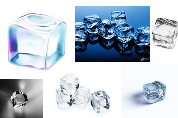 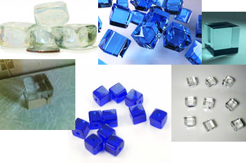 I think it is help for you ;) I think it is help for you ;)Edited by Yuran - 13 August 2012 at 1:06pm |
|
|
IP Logged |
|
|
AirStyle
Commander
Joined: 13 November 2017 Online Status: Offline Posts: 376 |
Posted: 13 August 2012 at 12:22pm |
|
@Buddy90: Thanks for the comment. I'll try to keep that in mind. I have a hard time being daring with my colors.
@Yuran: Ok, so from basic math, I know what when light hits a concave surface (i.e. the back of a sphere), it bounces light from all sides of the hemisphere and hits dead center of reflection (I mean, the spot where the light bounces and hits your eye). Now, with a cube, that obviously wouldn't happen as strong as what I have now. I'll have to fix that. Also, from the sides of the glass (i.e. the outer edge of the back of the cube), there should be a dimmer shine appearing. As it moves closer to the front of the glass object, the shines disappear, save for those moments wherein the glass creates a convex surface at which point the shine only appears at the center of reflection (I mean, the one lone specular spot on the top of the convex shape). Would I be wrong in saying all this? |
|
|
IP Logged |
|
|
AirStyle
Commander
Joined: 13 November 2017 Online Status: Offline Posts: 376 |
Posted: 13 August 2012 at 12:46pm |
|
Update (Check above as well):
I think I ruined the metal box, though :( Edited by AirStyle - 13 August 2012 at 12:46pm |
|
|
IP Logged |
|
|
A-Red
Seaman 
Joined: 13 August 2012 Online Status: Offline Posts: 13 |
Posted: 13 August 2012 at 1:13pm |
|
Yes, the glass is coming along well but the metal is a bit worse than before. I had no trouble reading the original as metal--although it's more of a pewter than a steel in terms of the contrast and shine. I'm struggling with these more reflective textures as well, so I'm not sure what to tell you. It looks like you maybe removed the brightest color, though--what would happen if you added it back in?
I do really like how you've handled the designs on the cube faces. Edited by A-Red - 13 August 2012 at 1:14pm |
|
|
IP Logged |
|
|
Yuran
Commander
Joined: 10 November 2024 Online Status: Offline Posts: 329 |
Posted: 13 August 2012 at 1:13pm |
|
I can not understand why the metallic cube you in such a planes of it,
if you want to do it, scrapes, scratches and grooves, they should not differ greatly from the tone of the plane of the cube on which are placed. Edited by Yuran - 13 August 2012 at 1:16pm |
|
|
IP Logged |
|
|
AirStyle
Commander
Joined: 13 November 2017 Online Status: Offline Posts: 376 |
Posted: 13 August 2012 at 1:21pm |
|
@Yuran: They're not grooves, more like bulges. Think like a melted ice cube made of metal.
@A-Red: I did remove the brightest color, but I'm still stuck on transposing the shading. I fear I may have to do it almost all over again *sigh... |
|
|
IP Logged |
|
|
Yuran
Commander
Joined: 10 November 2024 Online Status: Offline Posts: 329 |
Posted: 13 August 2012 at 1:36pm |
|
Can I change a couple of pixels on your work or you want to do myself?
How do I present the metal is a contrast material, if it is polished. You can use a second rear light source to emphasize the contrasts ... But add it probably is not necessary - and so many highlights on the invoice. Try to give the tone of each side (like a simple cube) and work on each side of within the level pitch. |
|
|
IP Logged |
|
|
AirStyle
Commander
Joined: 13 November 2017 Online Status: Offline Posts: 376 |
Posted: 13 August 2012 at 1:46pm |
|
go ahead, but just make sure you define where the light sources are. I like to know that, so I can understand why the lights are how they are.
|
|
|
IP Logged |
|
|
Yuran
Commander
Joined: 10 November 2024 Online Status: Offline Posts: 329 |
Posted: 13 August 2012 at 2:25pm |
|
Ок...
It is my Trying , 45% in progress: 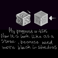 To begin with I did not complicate the process of fused edges To begin with I did not complicate the process of fused edges
 Okay, it's all for today.. Z-z-z... Okay, it's all for today.. Z-z-z...Edited by Yuran - 13 August 2012 at 3:16pm |
|
|
IP Logged |
|
|
AirStyle
Commander
Joined: 13 November 2017 Online Status: Offline Posts: 376 |
Posted: 14 August 2012 at 8:36pm |
|
whoah, you used that many colors?! That's amazing. It's starting to to look better too.
|
|
|
IP Logged |
|
|
Yuran
Commander
Joined: 10 November 2024 Online Status: Offline Posts: 329 |
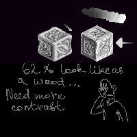
Posted: 14 August 2012 at 9:17pm |
|
Then do the optimization in the number of colors ...
I'm too lazy now and have no time, I ran to my employments ... |
|
|
IP Logged |
|
| |
||
Forum Jump |
You cannot post new topics in this forum You cannot reply to topics in this forum You cannot delete your posts in this forum You cannot edit your posts in this forum You cannot create polls in this forum You cannot vote in polls in this forum |
|
