| Active TopicsSearchRegisterLogin |
| Collaborations/Challenges | |
| |
  |
| Author | Message |
|
administrator
Admiral 
Joined: 03 March 2005 Online Status: Offline Posts: 0 |
  Topic: CHALLENGE 8/4/2014: Arabian Nights Topic: CHALLENGE 8/4/2014: Arabian NightsPosted: 04 August 2014 at 12:01am |
CHALLENGE: Arabian NightsCreate a video game mock-up that involves an Arabian Nights world. Canvas Size - Exactly 320 (width) x 200 (height). CHALLENGE RULES
CHALLENGE JUDGING
CHALLENGE PRIZES/GOODIES
CHALLENGE VOTINGVote now for your favorite pixelart in this week's challenge!CHALLENGE AWARDSThe Arabian Nights pixel art challenge is complete and we have three new champions. This week's challenge awards go to the following pieces:Thanks so much to all who took the time to vote and participate in the challenge! |
|
 IP Logged IP Logged |
|
|
DatMuffinMan
Commander 
Joined: 03 April 2023 Online Status: Offline Posts: 150 |
Posted: 04 August 2014 at 11:59am |
|
Husband has to leave the house, doesn't trust wife, leaves a parrot to spy on her. Parrot tells him that there was a lover, then everyone gets upset, etc.
Not sure how to make the colors look nicer to fit the dramatic "in-the-dark" scene without sacrificing enough contrast to make the main parts 'pop.' 
update -  Edited by DatMuffinMan - 04 August 2014 at 4:29pm |
|
|
IP Logged |
|
|
Damian
Commander
Joined: 24 February 2023 Location: United Kingdom Online Status: Offline Posts: 455 |
Posted: 04 August 2014 at 2:20pm |
|
That looks great MuffinMan!
Here's a wip of Es Sindibad. Absolutely hating the colour limit, had to change the characters design to allow for more colours for the background and objects. I'm sure you will notice my inspiration.  Edited by Damian - 04 August 2014 at 2:21pm |
|
|
IP Logged |
|
|
Skab
Seaman 
Joined: 28 May 2024 Online Status: Offline Posts: 6 |
Posted: 05 August 2014 at 10:05am |
|
I'm going for Alibaba...suggestions?

|
|
|
IP Logged |
|
|
almostpeaceful74
Seaman
Joined: 06 August 2014 Online Status: Offline Posts: 5 |
Posted: 05 August 2014 at 2:24pm |
|
Going for a (very loose) sci-fi interpretation of the Ensorcelled Prince, a prince who was half-turned to stone by his wife's magical powers. Decided to make him giant, too. The palette needs another look, and to be cut by a few colors:

|
|
|
IP Logged |
|
|
d9nis
Commander
Joined: 03 January 2025 Online Status: Offline Posts: 107 |
Posted: 09 August 2014 at 6:36pm |
|
Well here's my entry step-by-step for the contest. It's the very first time I do something like that. Loosing and messing with frame was a pain in the a**. I'll finaly make it. Hope you'll enjoy :)
Each frame was designed with grafx2, the animation was done with gimp. First a proof of concept. I wasn't sure if I'll do something animated or not. 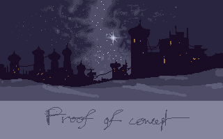 I then focused my self on the sky part.  then the city 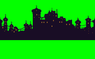 I quickly done an incomplete animation to had an idea how it's looked  the first dune layer  Well, the second dune layer. I put some detail but due to translation we can't really enjoy it...  he he here's the fun part. For the logo I first wrote the name of the game in grafx2. I used "Times" font. 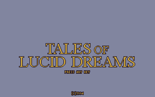 I also quickly made a blended gold/chrome effect  Then I used color selection to made full alpha on the logo, made the animation. And then remove the grey background. I finaly made a third dune layer 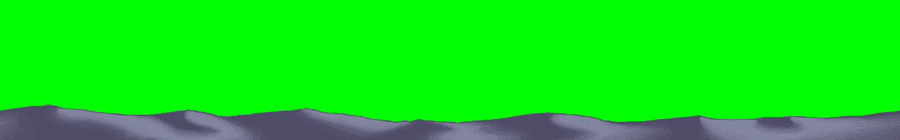 Assembling all the stuff... 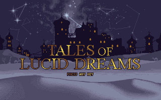 total frames: 64 total colors: 18 4 frames cycles for stars 5px/s for the city 10px/s for the first dune layer 20px/s for the second dune layer 40px/s for third dune layer 64 frames cycles for the typo ;D Edited by d9nis - 09 August 2014 at 6:43pm |
|
|
IP Logged |
|
|
jalonso
Admiral
Joined: 29 November 2022 Online Status: Offline Posts: 13537 |
Posted: 09 August 2014 at 7:10pm |
|
d9nis, you lost me at '...I used Times...'
|
|
|
|
|
|
IP Logged |
|
|
jalonso
Admiral
Joined: 29 November 2022 Online Status: Offline Posts: 13537 |
Posted: 09 August 2014 at 7:26pm |
|
d9nis,
I forgot your English is not the best. 'you lost me' is an American way of say you got confused or lost focus and attention. Times is a very basic font and this is an Arabian themed challenge and because your pixel depends on the type then something that looks more Arabic would look nicer. Just my opinion. The Times font is not that bad :) |
|
|
|
|
|
IP Logged |
|
|
d9nis
Commander
Joined: 03 January 2025 Online Status: Offline Posts: 107 |
Posted: 09 August 2014 at 7:38pm |
|
Indeed I thought about that, but I don't really like arabic typo. And "Times" fits more to what I had in mind (piran?se/schuiten/orientalism approach).
Also, I tried to manage the piece to something very personnal, still influenced by the arabian night. But yeah, well, I understand your point. :) |
|
|
IP Logged |
|
|
jalonso
Admiral
Joined: 29 November 2022 Online Status: Offline Posts: 13537 |
Posted: 09 August 2014 at 7:45pm |
|
Well, that's a design choice so Times is fine then :p
I will however say that the problem I saw was that I did not get a 'feeling' for Arabian because of the type but maybe too because the building go by so fast. Generally speaking an Arabian 'mood' is not fast because the traditional transportation is classically a camel. Maybe the type is right but the speed is not? |
|
|
|
|
|
IP Logged |
|
|
jalonso
Admiral
Joined: 29 November 2022 Online Status: Offline Posts: 13537 |
Posted: 10 August 2014 at 5:46am |
|
d9nis
 |
|
|
|
|
|
IP Logged |
|
|
Kerberos
Seaman
Joined: 12 September 2019 Online Status: Offline Posts: 5 |
Posted: 10 August 2014 at 8:10am |
|
I am still an amateur in backgroundpixelate...

17 colors. Sorry for my bad english, Kerberos.  Edited by Kerberos - 10 August 2014 at 8:27am |
|
|
IP Logged |
|
| |
||
Forum Jump |
You cannot post new topics in this forum You cannot reply to topics in this forum You cannot delete your posts in this forum You cannot edit your posts in this forum You cannot create polls in this forum You cannot vote in polls in this forum |
|
