| Active TopicsSearchRegisterLogin |
| Resources and Support | |
 Topic: DB8 - DawnBringer's 8 Color Palette V1.0 Topic: DB8 - DawnBringer's 8 Color Palette V1.0 |
  |
| Author | Message |
|
DawnBringer
Commander 
Joined: 11 August 2024 Online Status: Offline Posts: 568 |
  Topic: DB8 - DawnBringer's 8 Color Palette V1.0 Topic: DB8 - DawnBringer's 8 Color Palette V1.0Posted: 22 November 2017 at 12:24pm |

DB8 has been ready for several years by now, but I never got around to publish it. Since it's included in the (upcoming) V1.4 update of the GrafX2 Toolbox...why not do it now? With well balanced 16 & 32 color palettes done, it felt natural to expand the set with the 8 color one. Now, an 8 color palette might be of limited usefulness and more of a curiosity, but there's still things that makes it quite interesting:
I gotta admit there wasn't too much magic required to pick out the general colors, it kinda builds itself (that's probably why there's several nice 8 color palettes out there, not very different from this one). You need black and something close white, gotta have yellow and that would naturally be the 2nd brightest color. I wanted a red, green and blue to cover the spectrum. A gray would be nice and it would be suitable as halfshade for the green. Now we need a dark color for the last spot...violet is the natural choice as it shades both blue and red. Adjust the brightness levels, balance the ramps and a little bit of tweaking and we're done! (well, something like that ;)) Quickchart: 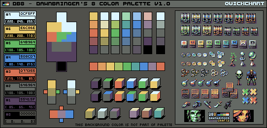
Mockup test (violently borrowing from Dan Malone :D, all drawn from scratch though!) 
Properties: 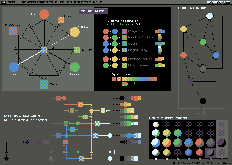
Colorschemes: 
Analyzis: 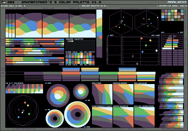
Files: PAL file (.pal) |
|
 IP Logged IP Logged |
|
|
NancyGold
Commander
Joined: 27 October 2021 Online Status: Offline Posts: 526 |
Posted: 22 November 2017 at 1:41pm |
|
Great work! Although I guess some would miss pink color for human portraits.
|
|
|
IP Logged |
|
|
Hapiel
Rear Admiral 
Joined: 30 June 2023 Online Status: Offline Posts: 3266 |
Posted: 22 November 2017 at 2:09pm |
|
Wonderful! I'm equally impressed by the palette, as by the applications and examples you've given! Also it is interesting, perhaps unsurprising, to see that it has a very similar aesthetic or style as db16 and 32.
@snv: DB litterally gave an image with examples of human portraits in 30 different color combinations with this palette! By the way, speaking of the dithering, I hardly noticed the dithering until I zoomed in. Dithering became a bit irrelevant when lcd screens first came out.. but now that resolutions are increasing, will it find back its purpose? |
|
|
IP Logged |
|
|
eishiya
Commander
Joined: 04 August 2022 Online Status: Offline Posts: 1109 |
Posted: 22 November 2017 at 2:35pm |
|
What do the exclamation marks on the portraits mean?
I quite like the range of skin tones. I'm also impressed by the dithering. Usually I don't like it since I'm a pleb using ancient LCD screens, but the value contrast in the colour pairs here is sufficiently low that it works very well. |
|
|
IP Logged |
|
|
DawnBringer
Commander
Joined: 11 August 2024 Online Status: Offline Posts: 568 |
Posted: 22 November 2017 at 2:44pm |
|
What do the exclamation marks on the portraits mean?
Oh, they just indicate the primary/best schemes with the most balanced ramps. |
|
|
IP Logged |
|
|
NancyGold
Commander
Joined: 27 October 2021 Online Status: Offline Posts: 526 |
Posted: 23 November 2017 at 4:39am |
|
Originally posted by Hapiel @snv: DB litterally gave an image with examples of human portraits in 30 different color combinations with this palette! Try recoloring your avatar using it, you will see that using it is not as easy as using db16.  So I won't recommend db8 for newbies. So I won't recommend db8 for newbies. |
|
|
IP Logged |
|
|
mordfikosz
Midshipman 
Joined: 17 August 2015 Online Status: Offline Posts: 10 |
Posted: 23 November 2017 at 7:52am |
 Also those mock ups... |
|
|
IP Logged |
|
|
yrizoud
Commander
Joined: 03 May 2021 Location: France Online Status: Offline Posts: 343 |
Posted: 24 November 2017 at 7:32am |
|
> (dithering) now that resolutions are increasing, will it find back its purpose?
Dithering large surfaces is still not recommended because if the image can scrolls freely, the screen pixels take a noticeable time to trasnsform from one color to the other, producing a "swarming" / "glittering" effect, unless you're using a gamer's fast screen, or you make sure to scroll only in coordinates which are multiples of the dither pattern's period (ie: generally 2x2). For example, try opening the following image, and slowly move your browser's window. http://www.dca.fee.unicamp.br/~lotufo/Courses/ia-636-1995/alberto/proj5/html/dither_pattern.gif (I've seen a website using such image as background, it was painful to scroll through) 
|
|
|
IP Logged |
|
|
Hapiel
Rear Admiral
Joined: 30 June 2023 Online Status: Offline Posts: 3266 |
Posted: 24 November 2017 at 8:54am |
|
Thanks for clearing that up, I never knew why dithered pattern scrolling had that effect!
|
|
|
IP Logged |
|
|
Frous
Seaman 
Joined: 30 April 2019 Online Status: Offline Posts: 1 |
Posted: 07 January 2018 at 12:47am |
|
Made this quick piece with 6 shades of the DB8. I don't know if there's a way to make more colors out of the existent ones, but it's a pretty nice pallete.
https://media.discordapp.net/attachments/243484311041474561/398967569819762700/Garbo_1x1.png sorry I can't pixel joint |
|
|
IP Logged |
|
| |
||
Forum Jump |
You cannot post new topics in this forum You cannot reply to topics in this forum You cannot delete your posts in this forum You cannot edit your posts in this forum You cannot create polls in this forum You cannot vote in polls in this forum |
|
