| Active TopicsSearchRegisterLogin |
| WIP (Work In Progress) | |
| |
  |
| Author | Message |
|
Kren
Midshipman 
Joined: 18 October 2005 Online Status: Offline Posts: 89 |
  Topic: a background (: Topic: a background (:Posted: 01 July 2007 at 8:25pm |
|
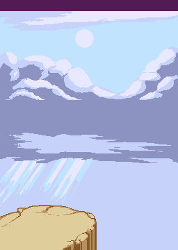
Well, this is the background for the tiltle screen, during game play you will just seea part of it, C+C are welcome: :)
|
|
 IP Logged IP Logged |
|
|
jalonso
Admiral 
Joined: 29 November 2022 Online Status: Offline Posts: 13537 |
Posted: 01 July 2007 at 8:26pm |
|
Its looking so good. I say in game play you should show ALL of it.
|
|
|
|
|
|
IP Logged |
|
|
Kren
Midshipman
Joined: 18 October 2005 Online Status: Offline Posts: 89 |
Posted: 01 July 2007 at 8:31pm |
|
well, the view is 256x160 and during the intro you will only see 64(or more really dunno I need to test it first)x256, the view will move from down to top.
I really dunno the only wrong part I see in it is the clouds but I don't know how to improve them D: |
|
|
IP Logged |
|
|
Monkey 'o Doom
Commander 
Joined: 24 September 2005 Online Status: Offline Posts: 2994 |
Posted: 01 July 2007 at 8:56pm |
|
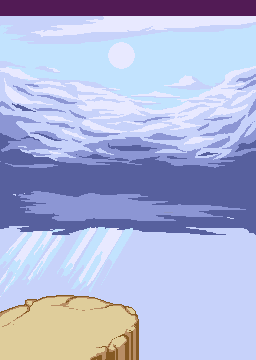
Add ing one more color to the clouds that's a bit lighter than the darkest color could add some depth and help it. You could also fix a couple jaggies on the clouds' shading.
|
|

RPG is numberwang. |
|
|
IP Logged |
|
|
jalonso
Admiral
Joined: 29 November 2022 Online Status: Offline Posts: 13537 |
Posted: 01 July 2007 at 9:26pm |
|
Not to be a egomaniac but I'll suggest you check out this sky I made. Notice I dithered nor AAd a thing. I used hue shifting exclusively to define volumes. I think it could work for you too. Ironically I used 7 colors as you have here. I think its you color choices more than anything else.
|
|
|
|
|
|
IP Logged |
|
|
Kren
Midshipman
Joined: 18 October 2005 Online Status: Offline Posts: 89 |
Posted: 01 July 2007 at 10:51pm |
|
jalonso I already tried that and it didn't ended good, hmm, I will try it again later today It is really late right now. Monkey I will add more colours to the clouds that could be the solution and then try to do what jalonso said. Well, the only problem Is that if I do what Jal says I will need to change the cloud on top and the one near the lightrays :/ I hope it ends better :)
|
|
|
IP Logged |
|
|
Kren
Midshipman
Joined: 18 October 2005 Online Status: Offline Posts: 89 |
Posted: 03 July 2007 at 1:15pm |
 hmm :/ didn't ended as I was expecting |
|
|
IP Logged |
|
|
ceddo
Commander
Joined: 01 June 2020 Online Status: Offline Posts: 466 |
Posted: 03 July 2007 at 1:25pm |
|
It has more movement than before, but you should have kept your previous versions' general shapes! Now, the shapes aren't so interesing.. great job on the wind effect though.
|
|
|
IP Logged |
|
|
Monkey 'o Doom
Commander
Joined: 24 September 2005 Online Status: Offline Posts: 2994 |
Posted: 03 July 2007 at 1:25pm |
|
I think it's better at conveying the texture of the clouds but they're not doing what they could be for the mood here. The original is really dramatic and stormy, now the piece just looks kind of boring and stuff. Were you going for a dramatic sort of thing, or what's your intention here? It seems that would be useful because the minutiae of pixel art technique isn't important so much here when you compare it to the purpose and intended emotional significance of the background.
|
|
|
RPG is numberwang. |
|
|
IP Logged |
|
|
Kren
Midshipman
Joined: 18 October 2005 Online Status: Offline Posts: 89 |
Posted: 03 July 2007 at 1:33pm |
|
Well, I find it more dramatic.. since you realize something unexpected during this scene..
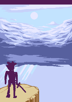 Still I dislike the first cloud.. It give it a childish look at the background. thats why I tried to change it. |
|
|
IP Logged |
|
|
Aleiav
Commander
Joined: 08 April 2016 Online Status: Offline Posts: 2380 |
Posted: 03 July 2007 at 1:56pm |
|
I kind of like it better without the guy there.
|
|
|
IP Logged |
|
|
EyeCraft
Commander
Joined: 07 July 2005 Location: Australia Online Status: Offline Posts: 425 |
Posted: 03 July 2007 at 6:05pm |
|
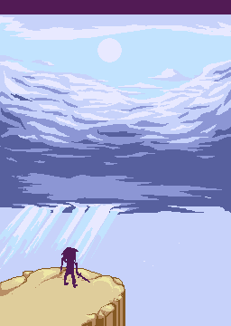
Hey there. Its a good basic setup youve got so far. The character IMO is too big. I think make him almost the size of a sprite (like 40x48, something like that) and place him/her closer to the cliff edge. I think this would convey a much better sense of scale and drama.
The rays of light underneath the clouds need to interact with the clouds in some way, as in pierce through it, otherwise they seem a little nonsensical. Towards the bottom I think the sky should gradiate a little to a slightly darker tone. The cloud above the sun looks strangely lit, almost inverse to what I would expect (ie brighter around the edges near the sun and darker towards its center). The bottom of the cloud should be dimly underlit by light reflecting off the planet. There needs to be more of a transition of value in that central band of cloud as well. It kind of just goes from highlight immediately to shadow. Stagger the transition just a little bit more. The shadow tones around the top edge of the cliff contradict the lightsource. I find the colours of the cliff too yellow and saturated. Looking forward to the next update :) |
|
|
IP Logged |
|
|
Kren
Midshipman
Joined: 18 October 2005 Online Status: Offline Posts: 89 |
Posted: 05 July 2007 at 12:35pm |
|
Eyecraft, alot of thanks you are right in all.. well, here is what I have so far:
 |
|
|
IP Logged |
|
| |
||
Forum Jump |
You cannot post new topics in this forum You cannot reply to topics in this forum You cannot delete your posts in this forum You cannot edit your posts in this forum You cannot create polls in this forum You cannot vote in polls in this forum |
|
