Goblin christmas card
Printed From: Pixel Joint
Category: Pixel Art
Forum Name: WIP (Work In Progress)
Forum Discription: Get crits and comments on your pixel WIPs and other art too!
URL: https://pixeljoint.com/forum/forum_posts.asp?TID=1022
Printed Date: 10 September 2025 at 2:55pm
Topic: Goblin christmas card
Posted By: ex0
Subject: Goblin christmas card
Date Posted: 02 November 2005 at 7:08am
|
Hello I finally scraped enough courage together to actually post this. It's an idea for a christmas card I had in mind. Comments are very welcomed, but please be gentle as this is the first thing I seriously tried.  |
Replies:
Posted By: Shark
Date Posted: 02 November 2005 at 10:10am
| ooo that dithering is horrid, but the bg is cool. |
Posted By: ex0
Date Posted: 05 November 2005 at 8:13am
|
Thank you for your input. Funny thing is, the background took me only a couple of minutes while I spend several days on the dithering and stuff. Can anyone provide me with any helpful points of improvement? |
Posted By: Helix
Date Posted: 06 November 2005 at 9:22am
|
On the bomb, you haven't dithered the 2 lightest greys. It stands out the most on the bomb. Like Shark said, the background is awesome!  ------------- H-Box |
Posted By: ex0
Date Posted: 07 November 2005 at 5:54pm
Thanks. The two lightest greys werent dithered out of style
considerations, I thought it would look more 'shiny' that way. But I
fixed it and I gotta agree it looks better dithered all the way.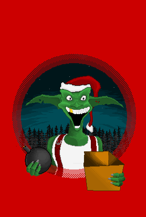 Are there any other comments or is this just too dull to comment on? |
Posted By: Helix
Date Posted: 08 November 2005 at 9:46am
|
Yeah, it fits the piece alot more, nice job.
------------- H-Box |
Posted By: hollietree
Date Posted: 09 November 2005 at 8:57am
|
i personally like the dithered lines around the edge. very stylistic. i think the bomb needs some sort of shine down the side, cuz it looks like it's made of rubber. the goblin's chest looks very flat and is not anatomically correct. if you look at pictures of men, you can see a collar-bone in the place where you have placed [boobs]. i like the face, but i would like to see a bit more contrast under the eyes of the character to emphasize that he has these massive eyebrows. |
Posted By: ex0
Date Posted: 09 November 2005 at 9:13am
| Thanks! I can work with that. ANd thank you too, Helix |