(Edit 3) (Edit 3) Sprite Templet WIP: Critique
Printed From: Pixel Joint
Category: Pixel Art
Forum Name: WIP (Work In Progress)
Forum Discription: Get crits and comments on your pixel WIPs and other art too!
URL: https://pixeljoint.com/forum/forum_posts.asp?TID=10452
Printed Date: 22 April 2026 at 5:10am
Topic: (Edit 3) (Edit 3) Sprite Templet WIP: Critique
Posted By: CrapFactory
Subject: (Edit 3) (Edit 3) Sprite Templet WIP: Critique
Date Posted: 04 June 2010 at 3:11pm
|
EDIT 3: I'm about ready to call it. I tried to increase the curve a bit in the middle so it wasn't so straight. I put her butt crack down and altared it a bit. At this point the only thing I might go back and do is more feet stabalization. Unless there's anything else that screams "ew!" I'm going to move on soon to an idle or walking animation.  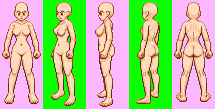 EDIT 2: I stabalized the the foot movement a bit. I worked on the lighting and the goal was the make the the light come from the top and front (compared to the sprite that looks direction at the screen). It's got a bit of shading on the inner thighs and arms and stuff and that's my attempt to give it a bit of depth as in the light source is huge like a sun and you're viewing the character from the middle so the shading on the outter layers is not as visible.  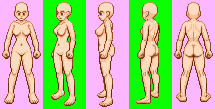 EDIT 1: I updated the sprite's shoulders, arms, chest and a bit of shading. I believe I can stabalize the feet more and do a few more things to it.  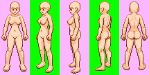 --------END OF EDIT 1---------------- I'm making some graphics for a game. This template is looking like it'll be huge (too many directions and animations!). Anyways I started with the female. Due to the sprite size and the fact that there are so many that need to be made I'm going to be just mirroring everything (no amazing idle poses :P). This is one frame of a 4 frame animation for idle in a 360 degree view.  Anyways make suggestions and stuff. Help a guy out. It needs a bit more smoothing then I'll go on to making each direction's idle animation. Is anything horribly off with this? P.S. I own this sprite. Don't steal it or post it anywhere else. It's currently planned to be used exclusively by a game coming in the future. |
Replies:
Posted By: Pragz
Date Posted: 04 June 2010 at 4:13pm
Always post the frames with it. Things that are moving (especially this fast) are harder to critique. And on that note, I see two problems that jump out at me:
------------- Hello - I'm new here. :) |
Posted By: CrapFactory
Date Posted: 04 June 2010 at 7:14pm
|
I updated the sprite's shoulders, arms, chest and a bit of shading. I think I can stabalize the feet a bit more. |
Posted By: Pragz
Date Posted: 04 June 2010 at 7:30pm
|
Your light source is all over the place. I see you're basically mirroring corresponding frames and each side of the body for the full-front/full-back. This is making it look really wonky in terms of depth. Try giving it all one light source. It'll be more work, but it will look better in the end. Here's an edit to the full-front's shading, plus some minor changes to her neck/shoulders.  ------------- Hello - I'm new here. :) |
Posted By: CrapFactory
Date Posted: 05 June 2010 at 11:25pm
|
I need to give it a more generalized light source methinks. Like from up and forward. This is to avoid seriously contrasting light sources as much as possible in the game. It needs more work and I'll get to it. |
Posted By: CrapFactory
Date Posted: 06 June 2010 at 1:22am
|
I stabalized the the foot movement a bit. I worked on
the lighting and the goal was the make the the light come from the top
and front (compared to the sprite that looks direction at the screen).
It's got a bit of shading on the inner thighs and arms and stuff and
that's my attempt to give it a bit of depth as in the light source is
huge like a sun and you're viewing the character from the middle so the
shading on the outter layers is not as visible.
|
Posted By: dpixel
Date Posted: 06 June 2010 at 9:41am
|
This is really cool. Maybe it's just a personal preference, but I thought the hips should be bigger near the top. Here's an edit to show what I mean:   ------------- |
Posted By: CrapFactory
Date Posted: 06 June 2010 at 11:20am
|
I'm slightly opposite. I think it's a bit too big. :P Though I do think the center can use smoothing. I've adjusted it a bit towards your direction but shank a bit more. |
Posted By: CrapFactory
Date Posted: 06 June 2010 at 11:36am
|
Hope this place doesn't mind double posts if it's not spam :P. I'm about ready to call it. I tried to increase the curve a bit in the middle so it wasn't so straight. I put her butt crack down and altared it a bit. At this point the only thing I might go back and do is more feet stabalization. Unless there's anything else that screams "ew!" I'm going to move on soon to an idle or walking animation. |