Action hero type guy.
Printed From: Pixel Joint
Category: Pixel Art
Forum Name: WIP (Work In Progress)
Forum Discription: Get crits and comments on your pixel WIPs and other art too!
URL: https://pixeljoint.com/forum/forum_posts.asp?TID=11332
Printed Date: 14 September 2025 at 4:23am
Topic: Action hero type guy.
Posted By: BurntToast
Subject: Action hero type guy.
Date Posted: 02 December 2010 at 8:15pm
|
First of all, awesome site, hope to get a lot from this place. So here it is, the piece of crap I've been playing around with these last few days. I started it as an experiment to see if I could pick nice colors from memory rather than grabbing my palette from a picture like I normally do. It's nearly finished. Anyhow, friendly critique and advice are always welcome. Have at it. 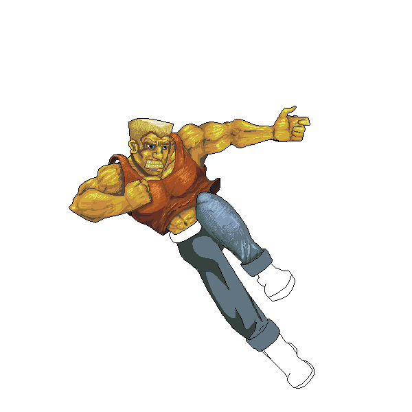 Oh, as a side note, there will e a gun in his hand in the finished product. |
Replies:
Posted By: jalonso
Date Posted: 02 December 2010 at 8:33pm
|
That much scribbly pixelling on his skin makes him look as if he's carved out of wood o.O ------------- |
Posted By: BurntToast
Date Posted: 02 December 2010 at 8:38pm
|
Yup yup, I see what you're saying. I'll try to find a better buffer between colors to reduce the scribbles. Alright, alright, tried smoothing out the skin tones a bit and getting rid of the stray pixels.  Any better? |
Posted By: carokann
Date Posted: 02 December 2010 at 9:09pm
|
Very nice! I am not sure about the shirt lifting from his left shoulder. He seems to already be on his way to ruin somebody's nose, so the movement energy or force or effect that would make the shirt rise at the beginning would, by then, have disappeared. His mouth just seems a bit out of place. The teeth are really nice though. His jumping backwards! I never thought of that. I guess everything is oki doki then :) |
Posted By: BurntToast
Date Posted: 02 December 2010 at 9:14pm
|
Oh, perhaps his legs don't convey it well enough, but the inference is that he's jumping backward whilst shooting. I'm not sure I fully understand what you mean about the mouth? Please explain in more detail if you can. It wasn't intended to be a street-fighter like character, but rather to be inserted into a zombie apocalypse scene. |
Posted By: Delko
Date Posted: 02 December 2010 at 9:57pm
 Youve got a a lot of good colors going on, but youre not using them to your full advantage. I did a quick paint over to show you what I meant. Youve got the basics blocked in, you just need to refine the shapes and shading. Youve got a a lot of good colors going on, but youre not using them to your full advantage. I did a quick paint over to show you what I meant. Youve got the basics blocked in, you just need to refine the shapes and shading.
|
Posted By: BurntToast
Date Posted: 02 December 2010 at 10:14pm
|
Very nice edit. Love it. I won't use it because I prefer to keep it all my own work, no offense. I will use it as a guide line however. Here's what I manages using your paint over as a spring board.  I love that you give constructive criticism here instead of yelling about how awful it is. I can see I'm going to learn a lot. |
Posted By: Delko
Date Posted: 02 December 2010 at 10:24pm
| Of course, thats the purpose of a paint over, its hard to express something visual with words. |
Posted By: BurntToast
Date Posted: 03 December 2010 at 7:36am
|
Alrighty! Using the awesome advice I received, I touched up the vest sideburns and the ears. So I started to recolor and shade the pants and they're still rough. 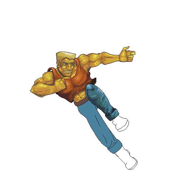 |
Posted By: Delko
Date Posted: 03 December 2010 at 2:38pm
Much better, but you've still got some wonky anatomy going on. Its not so much that its wrong, just misplaced. All I did here was just grab stuff you already drew and shifted it around a little, then filled in the gaps. You had his head off center on his upper body, and his belly button was falling off to the left. I tweaked his arm back to the left some so his shoulders were more even. |
Posted By: ChrisButton
Date Posted: 07 December 2010 at 5:11am
| Unecessary highlights on the majority of the body. You don't have to give everything one shadow, one base and one highlight. Depending on the texture of the surface you're colouring, it can vary. For example - the highlights on the skin make him appear to be oily or sweaty, which he may very well be. Maybe tone it down for a more realistic look! :-) |
Posted By: BurntToast
Date Posted: 07 December 2010 at 11:03am
|
I see what you're saying, and you're definitely right. It will take a while to find a good light source and figure out the depth of each muscle though. I'll be back with a better version soon. in the mean time, here's one with slightly updated anatomy. You know what, I just noticed his belt would look better at a different angle. >.> 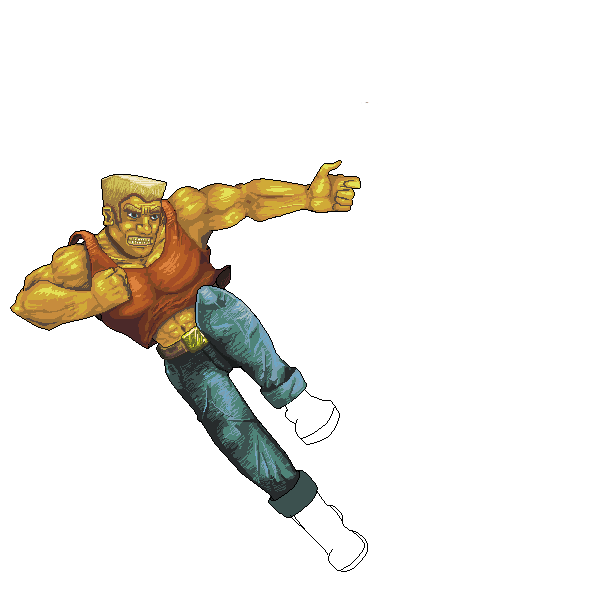 |