[wip]portrait
Printed From: Pixel Joint
Category: Pixel Art
Forum Name: WIP (Work In Progress)
Forum Discription: Get crits and comments on your pixel WIPs and other art too!
URL: https://pixeljoint.com/forum/forum_posts.asp?TID=12063
Printed Date: 21 April 2026 at 10:16pm
Topic: [wip]portrait
Posted By: pipe
Subject: [wip]portrait
Date Posted: 28 April 2011 at 1:21pm
I promised my classmate I will draw her a birthday portrait but now I am not so sure it will turn out good enough.It barely looks like her at the moment and I dont have many ideas how to improve it.If someone could ponint out my biggest mistakes or do a quick edit I would be grateful

reference photo: 
EDIT:here are some minor changes i did BEFORE I read these helpful advices... and yes, I also think it would be better if I just traced the photo.. I am a bit too ambitious, I should first learn the basics and then start drawing stuff like this 
|
Replies:
Posted By: CELS
Date Posted: 28 April 2011 at 2:34pm
|
Get ready for some tough love. :) The jaw is too wide. The space between her nose and mouth is slightly too long. Her cheek bones are not visible enough. Her hair is too flat. The forehead looks too tall. The eyes do not look natural, the eyelids need to pop more (plenty of good YouTube tutorials on drawing eyes). You might want to arch her eyebrows more. Maybe she has a powerful neck (hard to tell), but girls typically have more slender necks than that. (And she might want her portrait to have a slender neck). Good luck. I hope she lets you make sex to her. |
Posted By: tanuki
Date Posted: 28 April 2011 at 3:23pm
|
Drawing portraits is hard. Even for experienced people it can be hard to draw a portrait that really looks like a specific person if the reference you're using is in a different pose/angle/expression from what you're drawing. I think you can make this much easier on yourself if you either have a photo of her in the same position as what you're drawing, or start drawing her to be in the position of this photo.
When defining things like the crease line between the cheeks and mouth be careful not to make it too dark or too noticeable. Doing that makes people look older. From what I've heard, girls don't like that. |
Posted By: pipe
Date Posted: 30 April 2011 at 6:10am
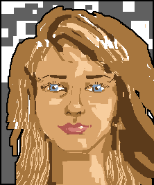
here is the latest version

I tried to listen to all the advice and this is what the final version will look like after I do some more work on hair and neck, but it is still not good enough...any ideas how to make it better? |
Posted By: Reo
Date Posted: 30 April 2011 at 7:18am
I did a very quick edit: 
Overall your piece has very poor contrast and I think using the same pallete for the hair as the skin is only working against you. the shape of her face is totally out of whack with what I saw in the reference( my edit is probably a bit too roundish though) Also you gotta be very careful with the features of the face if they're not subtle enough she's going to look way older than you intend for. The version you have at the moment looks more like a 40 year old woman than a teenager. Also not dealt with in my edit is her gigantic neck. |
Posted By: cure
Date Posted: 30 April 2011 at 11:05am
| you really need a reference from the same angle if it's ever going to look anything like her. |
Posted By: dpixel
Date Posted: 30 April 2011 at 10:54pm
|
Agreeing with everything thats been said, especially cure. I could do an edit but I really have no idea what she would look like from the angle you're trying to draw her. I've tried to do this before. You really have to get the proportions right first(spaces between features) and then really focus on the eyes mouth and nose shapes. The chin shape is really important too. At least that's my experience. Edit: Here's a hour of scribbling. Keep in mind I don't know what she looks like aside from that one photo. I tried to loosely follow proportions and basic shapes. I can spend hours on these things. I had to stop...lol Take it for what you want, but you can see my process. Far from accurate. Note the heavy contrast. I would avoid the pure black, but I was too lazy to change it.  ------------- |
Posted By: pipe
Date Posted: 01 May 2011 at 3:16am
|
man, that is a really impressive edit, miles better than my version.Thank you very much, I will try to fix the whole thing, this should be more than enough to see where am I going wrong.Thank you once again.
Update: 
This is close what it will look in the end after some polishing.I know I could do much more to improve it but I am running out of time and patience, this will have to do. |
Posted By: r1k
Date Posted: 01 May 2011 at 10:50am
I did an edit too, drawn on top of d-pixel's edit. I dont have much to add other than whats been said already, I just like editing portraits so I did, and here it is as said, all of us doing edits are just guessing what it should look like from this angle based on what we have to go by. Hope this helps, dont give up yet if you still have time. |
Posted By: onek
Date Posted: 01 May 2011 at 6:35pm
my try on an edit
|
Posted By: pipe
Date Posted: 02 May 2011 at 6:01am
| seeing how you guys took time to do an edit I would feel wrong if I didnt do my best... I still have few hours so I will definitely change skin colors and do some other changes...thank you all, you have been a great help, I learned a lot about shapes and colors while working on this piece |
Posted By: skamocore
Date Posted: 02 May 2011 at 10:13am
Heh, I ended up having a go at an edit too D: I'm in the same boat as dpixel, I had to tear myself away from working on this :( I haven't done a portrait in ages, so it was nice trying to get back into it :o Anyway, the main thing is, note the size. Seriously you're working far too big. |
Posted By: dpixel
Date Posted: 02 May 2011 at 2:17pm
|
Wow. Some other nice edits. pipe, I think you just created the official portrait thread. Your last edit was much better. Just needs more contrast. Sometimes I'll actually take the colors from the reference as a starting point. You really can see how dark the darks are and how light the lights are. It's hard to tell the hair by the picture. I'm guessing it's a lighter dirty blonde. I'm thinking everyone's edits including mine have the eyes too far apart. lol Could just be me. Edit of my edit (with eyes closer together):  Just to smooth things out a bit. ------------- |
Posted By: tanuki
Date Posted: 02 May 2011 at 6:11pm
| The next contest should be "Everyone pixel pipe's girlfriend." |
Posted By: pipe
Date Posted: 03 May 2011 at 11:54am
I am suprised to see so many edits in such a short period of time but now its all over.Dont worry though, we will be doing all this soon enough  .Here is the final version: .Here is the final version:

|