CHALLENGE 5/9/2011: It's Horrifying!
Printed From: Pixel Joint
Category: Pixel Art
Forum Name: Collaborations/Challenges
Forum Discription: Submit pixel art project ideas/templates or contribute to an existing pixel art collaboration.
URL: https://pixeljoint.com/forum/forum_posts.asp?TID=12112
Printed Date: 16 January 2026 at 9:55pm
Topic: CHALLENGE 5/9/2011: It's Horrifying!
Posted By: administrator
Subject: CHALLENGE 5/9/2011: It's Horrifying!
Date Posted: 09 May 2011 at 12:04am
Replies:
Posted By: Mrmo Tarius
Date Posted: 09 May 2011 at 3:16am
|
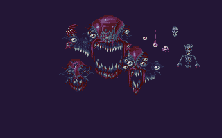
Awright, the inclusion of the central character means first-person horror games are out of the question? I was thinking of circumventing that by adding a player portrait (and maybe some dialogue). Acceptable? :)
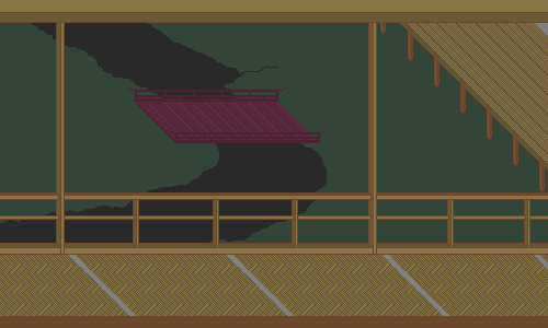
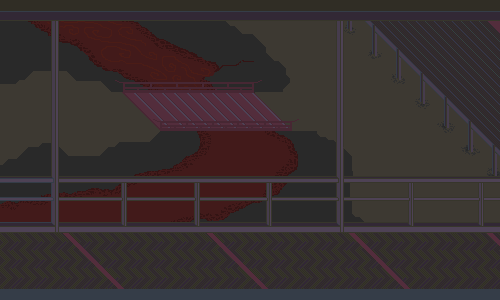
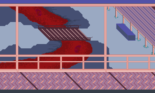
Also, WIP abomination: 
|
Posted By: Delicious
Date Posted: 09 May 2011 at 7:46am
|
Definitely acceptable, in my opinion - aslong as the character is being displayed in some way. WIP is looking great. :) |
Posted By: Mrmo Tarius
Date Posted: 09 May 2011 at 8:01am
This is getting kinda gory.
|
Posted By: Chibiwing
Date Posted: 09 May 2011 at 10:33am
| Looks very interesting though I'm not sure that I love the color choices. : ) |
Posted By: jalonso
Date Posted: 09 May 2011 at 4:57pm
|
Minor rule change/clarification added to first post: RULE EDIT: for those making multiple screens and want space between screens using trans color is ok for a total of 26. Single screen entries remain with 25 color limit. ------------- |
Posted By: FelipeFS
Date Posted: 09 May 2011 at 9:24pm
This is my entry. The mock-up for a dark RPG game.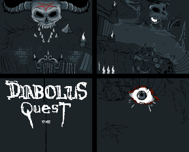 EDIT: I guess there is not enough time to make so many pieces. So I will make just one, and the others I will make just for the gallery. |
Posted By: wuhu
Date Posted: 09 May 2011 at 10:49pm
Here's my WIP. Just a simple adventure game.  |
Posted By: Mrmo Tarius
Date Posted: 10 May 2011 at 3:47am
|
Update!
Now with a basic form of GUI and main characters- a whole party of'em! Includes: -Bald Knight -Boxhead Wizard -Giant -Elder Liche -Mad Witch *edit* some buttons added ;P 
|
Posted By: jalonso
Date Posted: 10 May 2011 at 2:23pm
|
Is it horrifying? You play as a newb and must battle the pies, the eyes of big brother, tincjections, kiwi bombs, swedish meatballs, hatching snakes and finally skameanie. Avoid the flames, get +s avoid them -s  ------------- |
Posted By: Alex Pang
Date Posted: 10 May 2011 at 2:27pm
| Wtf, you have climax as a playble character 0_o |
Posted By: Velrio
Date Posted: 10 May 2011 at 4:44pm
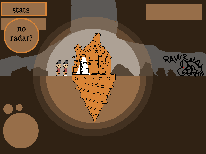
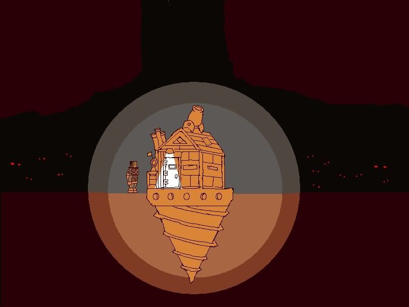
Right now it's called 3000 Miles Under London. Take steampunk + survival horror multiplayer and that's what I'm working on. I plan to greatly improve this mock up in the coming days so maybe I can meet the deadline even!
|
Posted By: dpixel
Date Posted: 10 May 2011 at 6:33pm
|
Nothing more horrifying than goblin hunting. Still needs a HUD and one less color. 
------------- |
Posted By: vecign
Date Posted: 10 May 2011 at 6:36pm
Hey, my art skills are horrifying, so this is the perfect challenge for me..uhuuu! ok, i know i still suck in pixel art, but i will try, here is my basic layout:  only can get better  |
Posted By: Delicious
Date Posted: 10 May 2011 at 7:41pm
|
Awesome WIP's here! Hope to see some more. :)
Velrio: Unfortunitly that piece is already 227 colors (The maximum is 25 for this challenge) and it is obvious that those circles surrounding the building and the text were automatically done rather done by hand. Same Pixel joint rules apply in this competition as they would in any - It must be pure pixel art. I like where you are heading with the drill and characters, perhaps crop it down to that and make sure you're not cheating and place em' pixel by pixel! Good luck. ;) Quote from one of the few rules of this site:
"Any art you post should be PIXEL ART! Pixel art implies that each pixel is placed by hand (no filters, paintbrushes, gradient fills, etc)."
|
Posted By: Velrio
Date Posted: 10 May 2011 at 10:36pm
Thanks delicious! Here's an updated version with less than 25 colors.
|
Posted By: Chibiwing
Date Posted: 11 May 2011 at 1:38am
I started when the challenge was posted yesterday and worked on it some tonight. I felt like trying for a Tale of Genji esque piece. Still fiddling with color, item placement, etc., but I think it's headed in a good direction. : )
 |
Posted By: Damian
Date Posted: 11 May 2011 at 8:19am

I'll try to finish this by sunday. Edit: @FelipeFS, That looks awesome. It looks like the type of game I'd play. The title screen reminds me of Diablo, which is always good. @Mrmo Tarius, Thats shaping up into something great. You've improved loads recently. @Velrio, looks interesting. Can't wait to see the end result. Dpixel, I like it, but I think the goblins could use a bit more contrast. I doupt I'll finish this before the deadline. |
Posted By: Delicious
Date Posted: 11 May 2011 at 2:14pm
|
Still working on my first panel... Might not have time for more. :(
You play as a truck driver trying to escape the city, driving down zombies and helping civilians! What a hero. :')
 HUD is a WIP
|
Posted By: FelipeFS
Date Posted: 11 May 2011 at 2:19pm
|
member_profile.asp?PF=18420&FID=1 - Jim16 : Thanks! What monster is this? Is this from any mythology? member_profile.asp?PF=17226&FID=1 - @Delicious : Nice truck! =) |
Posted By: twingloxx
Date Posted: 11 May 2011 at 3:56pm
|
Submitted my entry. I was happy to discover the theme of this week's
challenge, almost finished this the other day before I found out. So
thanks to Delicious for choosing a fun (and well-timed) theme. Some excellent stuff in this thread, looking forward to seeing the final entries! |
Posted By: W M
Date Posted: 11 May 2011 at 4:40pm
|
^Correct me if I'm wrong, but you're supposed to start from scratch for weekly challenges, right?
http://www.pixeljoint.com/forum/forum_posts.asp?TID=9378&FID=1&PR=3 - http://www.pixeljoint.com/forum/forum_posts.asp?TID=9378&FID=1&PR=3 There we go. Scroll down to the last post to see the rule. |
Posted By: Delicious
Date Posted: 11 May 2011 at 4:44pm
|
Originally posted by twingloxx
What an excellent piece.
Submitted my entry. I was happy to discover the theme of this week's challenge, almost finished this the other day before I found out. So thanks to Delicious for choosing a fun (and well-timed) theme. Some excellent stuff in this thread, looking forward to seeing the final entries! Unfortunitly, you're unable to submit this into the challenge because the rules state that you must start from scratch when the challenge starts, and considering you were working on this before, it can't be accepted. :(
It's a shame, because this definitely looked like it could've been a winner.
|
Posted By: jalonso
Date Posted: 11 May 2011 at 4:49pm
|
What a shame. Its fantastic. I've removed from challenge but left in member_profile.asp?PF=30149&FID=1 - twingloxx 's gallery. ------------- |
Posted By: W M
Date Posted: 11 May 2011 at 4:56pm
| I really liked it too, and saw it as a good contender for a ribbon. ): |
Posted By: twingloxx
Date Posted: 11 May 2011 at 10:16pm
| Oh well, should have read the rules more carefully. Anyway, glad you liked it! |
Posted By: vecign
Date Posted: 11 May 2011 at 10:32pm
|
-UPDATE- hello again! i start new, because the other image was too sh*t... now i only need some good monsters and a hero  and this is not easy for a noob like me^^ i work some hours on this, but really get in love with grafx2 now  |
Posted By: FelipeFS
Date Posted: 11 May 2011 at 10:54pm
Posted By: Chibiwing
Date Posted: 11 May 2011 at 10:58pm
I'm driving myself nuts just trying to establish a good palette.
 Color breakthrough! Now this is more my style. :D
 |
Posted By: wuhu
Date Posted: 12 May 2011 at 10:35am
Some great looking WIPS!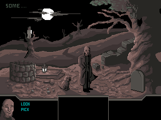 Hope i can finish in time |
Posted By: jalonso
Date Posted: 12 May 2011 at 11:30am
|
Originally posted by vecign ...my art skills are horrifying, so this is the perfect challenge for me... So many funny comments lately. ------------- |
Posted By: ||||
Date Posted: 12 May 2011 at 5:01pm
That  s funny. s funny.Damn I like the abomination you've created mrmo tarius!.. (had to check the spelling there) |
Posted By: FelipeFS
Date Posted: 12 May 2011 at 7:49pm
Posted By: jalonso
Date Posted: 12 May 2011 at 7:59pm
|
@FelipeFS, That was well written, clear and very funny to me. It seemed to me that vecign said that with humor at his own expense. It actually made me like his entry a little more for it. I would never laugh at anyone for their vocabulary (or anything else) and hope no one ever feels insulted or put down by me or anyone else here. If so, do report it even if by Mods. I do sometimes joke with members who've been around and know me a little. Just the same I apologize. ------------- |
Posted By: FelipeFS
Date Posted: 12 May 2011 at 8:44pm
| @ member_profile.asp?PF=3132&FID=1 - jalonso : No need to apologize, I understood what you meant. =) |
Posted By: FelipeFS
Date Posted: 12 May 2011 at 9:16pm
It's almost done! I will not be able to finish the other screens. The deadline is near. |
Posted By: vecign
Date Posted: 12 May 2011 at 10:32pm
@FelipeFS: oi, eu moro no Brasil mais sou alemão http://moskau.pauker.at/pauker/DE/PT/wb/?x=alem%E3o"> @jalonso: yeah, i meant it with humor and one tear in my eye when i see the great work of others here and how i suck, something must be wrong with my pixels, they just don't want how i do  anyway, i have one question, i must have 25 colors or can be less too? |
Posted By: Chibiwing
Date Posted: 12 May 2011 at 11:44pm
| You can definitely have less than 25! |
Posted By: NorthboundFox
Date Posted: 13 May 2011 at 2:19pm
| @FelipeFS That totally reminds me of the Icon Of Sin. Looks great so far! |
Posted By: vecign
Date Posted: 13 May 2011 at 4:22pm
|
-Update- still no Hero...and damn! where are those zombies?!  but my background and the hud is near to finish...oh oh but not much time more   |
Posted By: vecign
Date Posted: 13 May 2011 at 4:52pm
| how you guys upload your images? I use imageshack, but i have the impression the image loses some quality or that the colors look different when i compare my picture original in grafx2 & here in the forum.. |
Posted By: jalonso
Date Posted: 13 May 2011 at 6:25pm
|
@vecign, I use imgur.com and like it.
------------- |
Posted By: wenruto
Date Posted: 14 May 2011 at 3:08pm
|
@FelipeFS Jst post wht u have done for the challenge and finish the rest even if the challenge's over i wanna see the restt.. It's lookin Incredible so far keep it up! =] ------------- Earn free stuff by searching like Google http://swagbucks.com/refer/wendy"> 
|
Posted By: vecign
Date Posted: 14 May 2011 at 7:40pm
- update - hey..imgur.com looks nice, very fast &simple to use :) thx for this jalonso |
Posted By: FelipeFS
Date Posted: 14 May 2011 at 9:08pm
Posted By: jalonso
Date Posted: 15 May 2011 at 6:19am
|
Originally posted by vecign - update - hey..imgur.com looks nice, very fast &simple to use :) thx for this jalonso I joined imgur and use it all the time. I think if you don't join you get ads. So, it seems your skills are not so horrifying as you think. Still some observations: The banding/outling on the mountains is terrible/ugly and horrifying. The player sprite is maybe too big for the truck. The zombeh in the door is too small or uses perspective which a game like this wouldn't use. I think it would read better if player and this sprite matched in size so it reads as player /enemy. The road in blue is wrong from a design standpoint. Make it a dark grey but not black. This will help lower HUD stand out too. Unless you've run out of colors consider changing the sky to be a bit darker using blues. The very top of the doors have an ugly curve/jaggies. Maybe ...1-1-2-3-5-7-5-3-2-1-1px The GUI red numbers could use a white outline so they read better. ------------- |
Posted By: vecign
Date Posted: 15 May 2011 at 3:17pm
@jalonso: Hey man, thank you very much for the advices, today i am to drunk after one birthday party to change the things in time, but i learn a lot here & for sure you can count on me for the next competition! I know i suck very much in character creation, are there any good tutorials for this topic anywhere? The thing in the doors was not meant to be one zombie, it was only one funny decoration, the zombies are still missing, but like i say, today i have no time more to finish  But anyway, it was fun and i am looking forward for the next one :) |