CHALLENGE 8/1/2011: Sub-Terror-anean
Printed From: Pixel Joint
Category: Pixel Art
Forum Name: Collaborations/Challenges
Forum Discription: Submit pixel art project ideas/templates or contribute to an existing pixel art collaboration.
URL: https://pixeljoint.com/forum/forum_posts.asp?TID=12621
Printed Date: 22 February 2026 at 6:51pm
Topic: CHALLENGE 8/1/2011: Sub-Terror-anean
Posted By: administrator
Subject: CHALLENGE 8/1/2011: Sub-Terror-anean
Date Posted: 01 August 2011 at 12:01am
Replies:
Posted By: Night
Date Posted: 01 August 2011 at 7:03am
Well, I started to make something, not sure if I will finish the whole idea of it but. Here it is.

edit* Kind of finished it, but still I am planning to do something else with this. 
|
Posted By: artistictiger
Date Posted: 01 August 2011 at 9:09am
| hey! looking good^^, would be nice to see the final picture..you should finish it! i like it. |
Posted By: Alex Pang
Date Posted: 01 August 2011 at 10:13am

Ok, this sucked :P, ill start over ! |
Posted By: Juniorps
Date Posted: 01 August 2011 at 2:41pm
| A mole fit? Or punch an automobile? |
Posted By: Adcrusher
Date Posted: 01 August 2011 at 5:44pm
 There's mine been working on it for maybe two hours now. It's still rough I didn't clean it up yet and I'm not too sure about the colors. I want to do a longer animation for him, but I'm not sure If I will have time to do it. |
Posted By: Chibiwing
Date Posted: 01 August 2011 at 6:37pm
Wip:
 Not sure what to do with this.
|
Posted By: TrojanMonkey
Date Posted: 02 August 2011 at 12:04am
|
Seems this challange is tripping a few people over, stay strong. Too bad this is an underground theme, could use a mob from Larry Niven's books. P.S: If this challange did not require an "original" output, I bet ya'll draw Cthulu. d: |
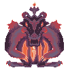
Posted By: Night
Date Posted: 02 August 2011 at 12:21am
This what I got so far:

Dont get confused both images are separated. Should I change the palette or something. I am asking because I working on it on my laptop and the colour lighting is different. Good work everybody! @artistictiger Thanks :) @TrojanMonkey I dont really mind about the theme of the monster, since after all its from your imagination, you can do w/e design you want your monster to have. :P |
Posted By: Spherical Ice
Date Posted: 02 August 2011 at 8:50am
 Eh, it's terrible I know. I'm planning on AAing the hair, but I can't seem to get the shading on this right. Oh, and it's a floating subterranean bear head. It's hidin' in yo garden. |
Posted By: cure
Date Posted: 02 August 2011 at 9:20am
|
@LB: Do I detect some Octoad&Friends stylistic influences? That second one looks great btw. First is a little strange, maybe cause he's leaning back a bit and I dunno what his hands are doing. But I love the posture and cloak on the second. @Spherical Ice: It seems like you're uncertain of the volumes of the grass. Is the top flat? You need to pick a solid light source and decide how the lights will hit the planes of the creature. inventive design though. |
Posted By: Night
Date Posted: 02 August 2011 at 10:04am
|
Yes cure, I was greatly inspired by this picture of yours(I should of mention). :P
I will try to fix it, I am not really sure what you meant, but I will see what can I do about it. Thanks for telling me also. |
Posted By: Dwimori
Date Posted: 02 August 2011 at 1:26pm
|
Here's what I got for shape, ripe for those knowledgeable in anatomy to tear apart. And please do, I beg you. Cuz I know my anatomy sucks.
Damn it nevermind its too big. I swear it said 200 x 200. |
Posted By: Chibiwing
Date Posted: 03 August 2011 at 1:05am
Wip:
 A little more work with the body and adding a tiny bit of ground.
|
Posted By: Mrmo Tarius
Date Posted: 03 August 2011 at 2:04am

what will they find? O_O |
Posted By: Chibiwing
Date Posted: 03 August 2011 at 9:33am
| Can you feel how much I hate you Tarius? TAT I love the colors of your wip. |
Posted By: PixelManiac
Date Posted: 03 August 2011 at 9:43am

Here's my WIP. |
Posted By: Dwimori
Date Posted: 03 August 2011 at 12:56pm
Here's mine's basic shape, now sized correctly. I can't figure out his other hand.

|
Posted By: Chibiwing
Date Posted: 03 August 2011 at 3:02pm
| Makes me think of a beefy Mewtwo. |
Posted By: Delicious
Date Posted: 03 August 2011 at 10:03pm
|
it's messy, but a start!  haven't checked the colorcount, but I would assume it's bellow 16 by quite a bit.
|
Posted By: tys
Date Posted: 03 August 2011 at 10:12pm
|
Hi guys, long time lurker, first time challenger.
Havent pixelled much since the Amiga days but here's my WIP. Sort of a long lost descendant of the Raptor with deep-sea fish adaptation. Still a bit messy for now. 
|
Posted By: Chibiwing
Date Posted: 03 August 2011 at 11:28pm
wip update:
 Can anyone help me figure out how to make a decent ground?
Del - It's cute! Did a messy count and it looks like you may have ten colors.
tsy - The colors aren't working for each other.
|
Posted By: Frogger5
Date Posted: 04 August 2011 at 1:04am
My WIP so far:

I plan to add a lamp of some sort. |
Posted By: AirStyle
Date Posted: 04 August 2011 at 4:28am
|
Quick question:
Can I add a cool background to go with my monstronsity? |
Posted By: Mrmo Tarius
Date Posted: 04 August 2011 at 4:44am
I think I'll abandon the 'digging down' project in favor of this one:

I was (very much) inspired by http://www.pixeljoint.com/pixelart/57615.htm - this piece , I totally love that style so I tried to make use of it :) The colors are prone to change, as I'd say the contrast between the mining hat and his head is not optimal. @Chibiwing, you can always try to use irregular pixel 'chunks' and apply some basic shading to them to get decent-looking ground. You can also do what I often do and make tiles and expand upon the tiled ground :) @AirStyle, nothing in the rules says otherwise :D |
Posted By: Night
Date Posted: 04 August 2011 at 5:36am
Here is all I got so far..
  
Also should I change the palette?   
I am not only talking about the following one's palette. I am talking about all of the monsters palette. |
Posted By: cure
Date Posted: 04 August 2011 at 8:51am
|
I like the palette, much more so than the more monochromatic versions at the bottom. new monster looks cool. the splayed hands of the first still make me assume his portrait was taken mid-manicure. @Delicious- Ahhhhhhhhhhhhhhhhhhhhhhh yeah! |
Posted By: Chibiwing
Date Posted: 04 August 2011 at 9:32am
|
Thank you so much for the feedback, Tarius! That was kind of what I figured... The only problem is that I have trouble drawing irregular and randon things, like a pebble strewn ground or the surface of the ocean. Hopefully your tile method helps with that. I've never worked that way, so is there and advice or tips you can give on tile usage?
I would have never guessed that that was a hard hat, so yeah, I think you might want to adjust the palette just a little. I think you should at least complete the digging down project-wait, never mind; I don't need anymore of your awesome work to compete with. XO
|
Posted By: Mrmo Tarius
Date Posted: 04 August 2011 at 9:56am
|
Well, as I work in Grafx2, here's a quick recap of what I'd do there:
1. 'shift-G' to get to the Grid properties. Set desired grid (tile!) size, uncheck snap and check show. 2. draw some tiles! :D 3. press 'g' (grid snap turn ON!) and then 'b' (brush grab mode!) 4. grab a tile! 5. after you grab a tile with 'b' you can proceed to apply it somewhere! (also pay attention to your 'transparent' color- you set it with right-clicking on the color within the palette) 6. repeat grabbing and tiling :D 7. press 'delete' to reset the brush to default, press 'g' to turn grid snap off, and edit the tiled stuff manually! Useful all-purpose tiling stuff/advice/whatever: -make tiles for 'bare' land and a few 'special' tiles containing pebbles and/or stuff- your terrain will consist of the 'bare' tiles with 'specials' adding diversity -tiles can be very small, 4x4 or even 2x2 pixels, depending on the size of the overall piece, and the desired level of detail! -you can form 'supertiles' consisting of several basic tiles, for easier terrain construction. |
Posted By: Adcrusher
Date Posted: 04 August 2011 at 1:42pm
About done with mine  I can't seem to get a good pallet... I'll have to keep messing around with it. |
Posted By: Melee
Date Posted: 04 August 2011 at 4:47pm
|
I'm new to the PixelJoint... and challenges (of course :P).
I'm... well, late. xD But this sounds so fun. 
I've made a quick sketch. I'm thinking big and beefy, with claws for digging. (Legs just for stability, short and hard to move, but useful for leverage.) Tiny head. Ummm, yeah. I'm going to finalize some line-art and see if I can get this colorfilled within the next few hours (after the promissed bick-ride to my sister). I want to try to get this in before the contest ends. Needless to say, I'm not even going to attempt animating. I'm not sure if I want to keep this leg shape... I may mess around with it, but keep the same basic idea behind it. (Ahh, I talked a lot! I'm nervous!) |
Posted By: Delicious
Date Posted: 04 August 2011 at 5:44pm
|
Thanks guys! Some nice starts here. Keep going with that Melee, looking nice. I look forward to the coloring and shading if it! :)
|
Posted By: Melee
Date Posted: 04 August 2011 at 8:23pm

I don't think I know how to anti-alias. @_@ Haha. |
Posted By: tys
Date Posted: 04 August 2011 at 8:39pm
|
@chibiwing thanks for the feedback.
Updated with new palette and better pixelling.
|
Posted By: Chibiwing
Date Posted: 04 August 2011 at 10:30pm
|
Thank you for replying. <3
I use GraphicsGale, but I downloaded Grafx2 to see what you were talking about; @p@ So different. It'll take me awhile to learn that program if I choose to try, but I'll definitely consider it. The feedback you gave me was useful *writes it all down*, and I'll be keeping it in mind. : )
Now, which of these three should I submit?
   I originally just did the negative for fun, but then it looked really awesome; is it all in my head? o_o
No problem. ^_^
|
Posted By: Melee
Date Posted: 04 August 2011 at 10:43pm
| @Chibiwing I like the middle one best. :O |
Posted By: Alanbato
Date Posted: 04 August 2011 at 10:46pm
| I think you should add the middle one, the red in the color palette fits better imo :P |
Posted By: r1k
Date Posted: 04 August 2011 at 11:15pm
|
@ melee: using dithering to create the effect of large flat areas of a new color isnt really neccesary unless youre under heavy color count restrictions (and even though youre limited to 16 I dont think the dithering is nessecary). You might also want to use dithering to imply texture, but in that case youll need to increase the contrast (which you might want to do anyways) as I could not even tell it was dithered until I zoomed in. Heres an edit:  yours is on the left, the right is my edit which takes out the dithering. At 1x on my moniter they both look almost exactly the same, which basically means the dithering isnt serving a purpose. The foot look out of perspective too. The toes should be pointing towards us, not going straight down, which makes him appear to be floating. I also noticed you tried to AA the claws into the background. Generally solid color backgrounds arent accepted into the gallery unless they serve a purpose (especially white backgrounds), and your AA right now doesnt seem to have enough purpose to warrent the background right now. For that reason AA around the outside of sprites is ussually left out for work in the gallery here unless it is blending the sprite into a background. If you go with a transparent background youll want to get rid of any AA around the outside. |
Posted By: Chibiwing
Date Posted: 05 August 2011 at 1:13am
| Middle it is. Vote for and rate me, guys! <3 |
Posted By: Mrmo Tarius
Date Posted: 05 August 2011 at 1:15am
|
That cave background is kinda cool! :D
I've finished my mining lizard-dragon-whatever, off to submit :D by the way, this is what the people digging down would have found: 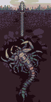
A huge, horrifying, unfinished... something! :D |
Posted By: PixelManiac
Date Posted: 05 August 2011 at 7:50am
Here's my update:

I need help, please? |
Posted By: cure
Date Posted: 05 August 2011 at 10:22am
| fades to black too quickly. if the face is that close to the surface and the lighting is as good as it is I don't see can't see more of it. the dithering is unnecessary. |
Posted By: Melee
Date Posted: 05 August 2011 at 11:43am
|
@r1k
I have a problem with dithering. xD I do it way too often. I redid the shading and dinked with the toes. I also shortened/changed the claws a bit so that it's less jagged looking. I feel like he's still blah. ;n; (I made his mouth glow too, haha.) 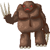
@Mrmo Tarius That's cool. :O |
Posted By: cure
Date Posted: 05 August 2011 at 12:08pm
|
why is one leg higher than the other? also, the legs don't look connected to the body. In my edit, I bumped up the saturation (palette is rather dull) and improved the contrast in the palette so the values weren't so close together. tip: never dither if you have a color in your palette that works just fine in that spot.  - - - @mrmo: lovin' it. |
Posted By: Frogger5
Date Posted: 05 August 2011 at 3:47pm
Finished version. Exactly 16 colours.

|
Posted By: Vbs-Rocha
Date Posted: 05 August 2011 at 6:57pm
Well, I'm doing this, this pixel art it is a snake with humando face.

if you have any tips on sombrementos or poses help me. |
Posted By: AirStyle
Date Posted: 05 August 2011 at 8:36pm
| You sure you're going to have time? You only got two days, man.... |
Posted By: Melee
Date Posted: 05 August 2011 at 9:11pm
|
@cure You're awesome. Ummm, I re-did the legs and /think/ I bumped up the contrast. It might need some more contrast though, which I can dink with again. Added texture because I had too much fun clicking and erasing and adding and click-click-clicking.
EDIT// Messed with claws and made belly outline less jagged. Ummmm. 
|
Posted By: AirStyle
Date Posted: 05 August 2011 at 11:12pm
So Here's what I got so far...

I still need help with the dithering on the tubes and the main body, if there's any. I'm so afraid of pillow shading and checkerboard-dithering...HELP!!! |
Posted By: Frogger5
Date Posted: 05 August 2011 at 11:56pm
| Looks a bit flat IMO, and I'm not sure how necessary all the dithering is, but good job. |
Posted By: AirStyle
Date Posted: 06 August 2011 at 7:01am
| Any way I can fix mine? I need a little more help than that.... |
Posted By: jalonso
Date Posted: 06 August 2011 at 7:29am
|
Originally posted by AirStyle
Imo, you are over pixelling. Too much dithering and not enough definition/contrast of the shapes within the creature. The yellows are nice but the rocks in such a pure black are not very interesting. Perhaps using dark desaturated blue/purples? ------------- |
Posted By: AirStyle
Date Posted: 06 August 2011 at 7:46am
| I was trying to make it look like obsidian rock. You think purple or blue won't change the type of rock? |
Posted By: jalonso
Date Posted: 06 August 2011 at 7:55am
|
Obsidian rock is defined by high gloss more than colors. If you had an black obsidan rock under a glowing yellow monster then some yellows, reds, browns would most likely reflect on the stone. However, as this is art and choosing those 'real' shades would make everything somewhat monochromatic I just thought maybe a bit of blue/purple would help the piece overali. Note that I mean almost black colors but leaning to a color for visual interest only...artistic license ;) ------------- |
Posted By: AirStyle
Date Posted: 06 August 2011 at 8:32am
| Ok, I see that. So what do you think my next step should be for the actual monster? How should I fix the dithering and overall form? One person told me that it looked a little flat. I don't know what to do about that.... I realize that I may have used a little too much dithering, but I was trying to keep with the overall texture of the monster. There was a point when I made the mouth of the tube rather smooth, and all of the colors flowed into each other. I was afraid that the monster may have seemed too multi-textured, with that smooth shading and all, so I decided to force-dither it. So how should I fix this? |
Posted By: jalonso
Date Posted: 06 August 2011 at 8:44am
|
Adding texture does not mean you have to pixel all over the place. Sometimes just a bit here and there will suggest more texture than you now have. For example, if the skin of your creature is bumpy then no matter what you do in the interior will not be as effective as bumps on the edges. Now you have a smooth outline so the skin will read as smooth regardless of what you do in the interior. If the bottom part is tentacles or many legs then your definition of that area is not reading that way. Its more of a series of folds and wrinkles. I apologize that I don't have the time right now to make even a quick edit for you to see a visual... maybe someone else can. For now just keep at it (see other people's work in the gallery - search monster, tentacle, skin, etc) and post updates :) E: Just added - Notice how much texture and definition can be achieved with little dithering more contrast of areas and forms. Notice how edges suggest the texture. ../files/icons/broccoli_guardian__r1925285271.png"> ------------- |
Posted By: bladeking77
Date Posted: 06 August 2011 at 9:46am
Is it normal for users to wait several days before their submission gets APPROVED? Well, while I'm waiting, I decided to post my entry here... Not the best piece of art, but I'll get better eventually.  |
Posted By: Melee
Date Posted: 06 August 2011 at 12:49pm
|
Question. So to submit to the contest, do I submit it to my gallery first, then do something?
Ahahaha, I'm such a n00b. |
Posted By: bladeking77
Date Posted: 06 August 2011 at 1:03pm
|
When submitting, right above the "submit" button, there's a "Submit to weekly challenge" option. Check it to submit your art as an entry to the challenge. It's my first time too, so I can't say for sure, but I think that should be it. |
Posted By: Melee
Date Posted: 06 August 2011 at 1:21pm
| Oh! Thank you. :P |
Posted By: Delicious
Date Posted: 06 August 2011 at 3:51pm

Almost done... I can see some errors from here, but I might as well just show what I got so far.
|
Posted By: jalonso
Date Posted: 06 August 2011 at 4:26pm
|
Guys, check the 'submit to challenge' when adding to the gallery and if all is cool and rules were followed, etc. we do the rest.
------------- |
Posted By: AirStyle
Date Posted: 06 August 2011 at 4:57pm
|
Hey, quick question: Do you guys count the color used for transparency as one color? I'm using Graphics Gale, and it counts the transparency as one color. If so, I'm at 16 right now, but if not, I can use one more. Please let me know. |
Posted By: Delicious
Date Posted: 06 August 2011 at 5:07pm
|
Originally posted by AirStyle
Yea, transparency counts as a color as far as I know.
Hey, quick question: Do you guys count the color used for transparency as one color? I'm using Graphics Gale, and it counts the transparency as one color. If so, I'm at 16 right now, but if not, I can use one more. Please let me know. |
Posted By: AirStyle
Date Posted: 06 August 2011 at 5:09pm
| K, Thanks. |
Posted By: jalonso
Date Posted: 06 August 2011 at 7:35pm
|
In pixelart transparency counts as a color because IT IS a color that is masked but technically still exists. This is an old school thing/tradition that remains as a technicality. @ member_profile.asp?PF=33841&FID=1 - bladeking77, I thought you were still on WIP mode. Its added now. For future work focus on definition a bit. On your entry the color choices makes it hard to read the details. This takes work and practice so don't stress too much but keep it in mind. ------------- |
Posted By: AirStyle
Date Posted: 06 August 2011 at 9:09pm
|
Hey, sorry... Got one more question... Do we have to submit by our own time zone, or by the server's time? Right now, for me, it's 8/7/11 at 12:08 AM. but the server is 8/6/11 at 9:05 PM. You can imagine my confusion. So by which one do I submit my sub-terror-anean? |
Posted By: cure
Date Posted: 06 August 2011 at 10:15pm
| server time. the front page of the site has a countdown clock. |
Posted By: AirStyle
Date Posted: 06 August 2011 at 10:27pm
Cool thanks. Can't imagine why I didn't see that... 
|
Posted By: Gugaknie
Date Posted: 07 August 2011 at 3:08pm
I was doing, but, o don't know how to shad it.

I need some help |