CHALLENGE 8/29/2011: Platform
Printed From: Pixel Joint
Category: Pixel Art
Forum Name: Collaborations/Challenges
Forum Discription: Submit pixel art project ideas/templates or contribute to an existing pixel art collaboration.
URL: https://pixeljoint.com/forum/forum_posts.asp?TID=12842
Printed Date: 28 April 2026 at 8:53pm
Topic: CHALLENGE 8/29/2011: Platform
Posted By: administrator
Subject: CHALLENGE 8/29/2011: Platform
Date Posted: 29 August 2011 at 12:01am
Replies:
Posted By: Mrmo Tarius
Date Posted: 29 August 2011 at 2:51am
Totally stole Dawnbringer's 16col palette, and made something of a basic tileset:

I still can't draw rocks, but as you can see, I'd really like to :D *edit* progress! |
Posted By: a3um
Date Posted: 29 August 2011 at 6:44am
|
@Mrmo Tarius - a pixelling machine in action again as I see <_< What kind of fuel do you use? chocolate? O:
Hopefully I'll have some time to make an entry |
Posted By: Mrmo Tarius
Date Posted: 29 August 2011 at 8:17am
|
Originally posted by a3um
What kind of fuel do you use? chocolate? O: yes :D |
Posted By: Chibiwing
Date Posted: 29 August 2011 at 10:00am
|
Originally posted by Mrmo Tarius
Liar. It's orphan blood, isn't it? Originally posted by a3um What kind of fuel do you use? chocolate? O: yes :D 
|
Posted By: Mrmo Tarius
Date Posted: 29 August 2011 at 10:27am
|
Originally posted by Chibiwing
Liar. It's orphan blood, isn't it? Yes. Erm, I mean, of course not! :D Anyways, this time it was a couple hundred liters of coffee. Here's an update! 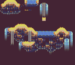
I realised I also have a light blue at my disposal :D |
Posted By: stealthnachos
Date Posted: 29 August 2011 at 11:56am
| alright, ima enter this one but for some reason my entry didnt even go through on the last one. i entered it at like 10 oclock on saturday so maybe it didnt get approved in time. oh well, expect something SOONISH |
Posted By: Harrisonk
Date Posted: 29 August 2011 at 1:38pm
|
wow i like it a lot!!!
i think i might use dawnbringers pallete too! or maybe not... |
Posted By: Level 1
Date Posted: 29 August 2011 at 2:53pm
|
Best Challenge yet >:3
I will start working on it right now |
Posted By: CELS
Date Posted: 29 August 2011 at 6:51pm
This is going to be my contribution. I can't say what the game will be. It's a big secret. (I'm using the NES palette, just for added oldschoolness) |
Posted By: skamocore
Date Posted: 29 August 2011 at 8:53pm
|
As long as it's a new and original game and not some demake of a certain game involving portals and references to cake...
------------- |
Posted By: Killermachine
Date Posted: 29 August 2011 at 11:12pm
| Sorry for being ultra noob but can anyone tell me about SNES restrictions? Iv been searching on net for a while and im not getting an answer that is exact and helpful. Only thing i found is that it can use upto 256 colours and size(which is already mentioned here). Thanks. |
Posted By: jeremy
Date Posted: 29 August 2011 at 11:15pm
|
shampoop posted this in the news thread: http://en.wikipedia.org/wiki/List_of_video_game_console_palettes#SNES - en.wikipedia.org/wiki/List_of_video_game_console_palettes#SNES explains the restrictions. This is the pallete: http://en.wikipedia.org/wiki/List_of_monochrome_and_RGB_palettes#15-bit_RGB - http://en.wikipedia.org/wiki/List_of_monochrome_and_RGB_palettes#15-bit_RGB . Looks like you can have up to 256 on screen with 32,768 to choose from. Mode 0: 4 layers, all using 4-color palettes. Each BG uses its own section of the SNES palette. Mode 1: 3 layers, two using 16-color palettes and one using 4-color palettes.
Mode 2: 2 layers, both using 16-color palettes. Each tile can be individually scrolled.
Mode 3: 2 layers, one using the full 256-color palette and one
using 16-color palettes. The 256-color layer can also directly specify
colors from an 11-bit (RGB443) colorspace.
Mode 4: 2 layers, one using the full 256-color palette and one
using 4-color palettes. The 256-color layer can directly specify colors,
and each tile can be individually scrolled.
Mode 5: 2 layers, one using 16-color palettes and one using 4-color
palettes. Tile decoding is altered to facilitate use of the 512-width
and interlaced resolutions.
Mode 6: 1 layer, using 16-color palettes. Tile decoding is as in Mode 5, and each tile can be individually scrolled.
Mode 7: 1 layer of 128×128 tiles from a set of 256, which may be
interpreted as a 256-color one-plane layer or a 128-color two-plane
layer. |
Posted By: Killermachine
Date Posted: 29 August 2011 at 11:34pm
|
Thanks alot for the help Jeremy. I found this also
http://www.wayofthepixel.net/pixelation/index.php?action=printpage;topic=7368.0 As i understand these modes are different ways to do pixel art in snes 
And according to Mode 0, if I use 4 different layers I can use a set of four colours only in each layer? Also can you explain these points- - Each BG uses its own section of the SNES palette. - Each tile can be individually scrolled. |
Posted By: michalio5
Date Posted: 30 August 2011 at 2:07am
|
http://imageshack.us/photo/my-images/191/frgh.png/
Niwa my picture where you had to send it here I have given |
Posted By: CELS
Date Posted: 30 August 2011 at 3:51am
|
Originally posted by skamocore As long as it's a new and original game and not some demake of a certain game involving portals and references to cake... Ah, my bad! I misunderstood the challenge. |
Posted By: neofotistou
Date Posted: 30 August 2011 at 6:15am
|
What about the 16 color palettes and 4 color palettes? Can they contain any 16 and any 4 colors from the 15-bit RGB palette? |
Posted By: PureAwesomeness
Date Posted: 30 August 2011 at 9:32am
|
I've finally found a challenge I want to do, and found it long enough before the deadline to do it! Woo! I'm gonna do some kind of city level, I guess. Current WIP (Only the background's outline is done so far): 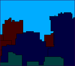 |
Posted By: alart
Date Posted: 30 August 2011 at 10:32am
WIP |
Posted By: Chesu
Date Posted: 30 August 2011 at 12:41pm
|
When I think of SNES platformers, what immediately springs to mind is cartoonie mascot games like Bubsy, designed to capitalize on the success of Mario and Sonic.  Unfortunately, I'm terrible at coloring, so this may not be finished in time. |
Posted By: Crazy_Leen
Date Posted: 30 August 2011 at 3:39pm
|
Hiya : D Uhm..I'm new here, can someone how or where the final pic has to be uploaded at D: ? In this thread, or where? @topic: I like the theme : D Hopefully I can think of something good ._." |
Posted By: DawnBringer
Date Posted: 30 August 2011 at 6:06pm
|
@Mrmo: Nice to see you try the palette :) A tip: if you use "black" as the darkest interior color you can shade the rocks with dark-brown instead of dark-blue...which will separate them better from the water.
@Crazy: There's a challenge-box that you can check when submitting art. |
Posted By: Chibiwing
Date Posted: 30 August 2011 at 7:16pm
Just started:
 |
Posted By: Jinn
Date Posted: 30 August 2011 at 8:04pm
Well... since I'm not a background guy, this is where I stuck =P It was suposed to be a hell'ish game with a Spartan as the main character. ---   |
Posted By: CELS
Date Posted: 30 August 2011 at 9:27pm
|
Originally posted by Jinn Well... since I'm not a background guy, this is where I stuck =P It was suposed to be a hell'ish game with a Spartan as the main character. The pixelling techniques and the colours are awesome, but that Spartan pose looks very weird to me. I can't tell which way he's headed or what he's doing. The other dude looks great though. ----- Here's my WIP. It's about a girl in a red dress chased by the US government in some kind of apocalyptic setting. I've no idea why.  |
Posted By: surt
Date Posted: 30 August 2011 at 11:46pm
Stole Harrisonk's idea to steal Mrmo Tarius's idea to steal DawnBringer's palette.
------------- 
|
Posted By: Chibiwing
Date Posted: 31 August 2011 at 12:18am
Color change and some more work:
 |
Posted By: TrojanMonkey
Date Posted: 31 August 2011 at 12:36am
| What? no boss fights? I was sure the major population* would jump on such a setting. |
Posted By: Mrmo Tarius
Date Posted: 31 August 2011 at 3:09am
|
It had crossed my mind, but then again I suck at drawing sprites.
Here's an update- I followed DB's advice, but brightened the 'black' just a bit :) 
I don't like the tree on the right. Will change it :P *edit* why did I make the background color black? It's not black anymore :) *edit2* doodads! :) |
Posted By: Chibiwing
Date Posted: 31 August 2011 at 3:15am
| Frickin' gorgeous. DX |
Posted By: Crazy_Leen
Date Posted: 31 August 2011 at 4:00am
|
Holy cheesecake ._____." You guys are too good O___Q |
Posted By: Jinn
Date Posted: 31 August 2011 at 6:58am
|
Originally posted by CELS Originally posted by Jinn The pixelling techniques and the colours are awesome, but that Spartan pose looks very weird to me. I can't tell which way he's headed or what he's doing. The other dude looks great though. He was suposed to be charging an attack in the air. But thanks! Edits are apreciated.  |
Posted By: surt
Date Posted: 31 August 2011 at 7:40am
Mrmo Tarius: Looks amazing as ever. One thing bugs me though. The pool of water in the centre is being magically held in place by an invisible wall?
-------------
|
Posted By: Mrmo Tarius
Date Posted: 31 August 2011 at 8:28am
|
Yes.
I mean no, that's pretty much just a tileset test, the water should be near the bottom of the screen when I get to constructing the actual scene :) Also your piece reminds me of Altered Beast for some reason. |
Posted By: CELS
Date Posted: 31 August 2011 at 8:52am
|
Originally posted by Jinn He was suposed to be charging an attack in the air. But thanks! Edits are apreciated. Oh, I don't think an edit by me is particularly helpful, as I'm no good with anatomy. Here's a very quick and simple edit, just to illustrate my point (I've basically just chopped up and rearranged your spartan, which is why the sword arm looks strange and the pose is still quite unnatural as he's out of balance)  [Not as aesthetically pleasing, perhaps. But it does make more sense to me, and it's easier to understand what's going on] My point was just that if he's jumping forward to attack his opponent, it would be very difficult (and very silly) to turn his hips away from his opponent. It's not a normal way to attack, so for me the original looked more like he was jumping away from the spear attack. PS: As I zoomed in to work on this, I suddenly noticed he was nude.  |
Posted By: Jinn
Date Posted: 31 August 2011 at 8:59am
|
But what's the point of heaving a shield then? The pose was to keep the shield in front of the body while he's jumping. Anyway, thanks pal! I'll see what I can do. edit Maybe changing the arm would make it easier to understand?  new > old |
Posted By: CELS
Date Posted: 31 August 2011 at 9:12am
|
"But what's the point of heaving a shield then?" Well, I don't have a good answer for that, except the Spartans probably didn't do this kind of jumping attacks. And they almost certainly didn't do it naked. So logic isn't really of any help here.  "Maybe changing the arm would make it easier to understand?" Well, you do whatever you want. But if you have some space in your living room, try doing a running jump whilst turning your hips backwards in mid-air. I think you'll find it difficult to do this, even without holding a shield and swinging a sword. But hey, art doesn't always have to be realistic, so do what you want. ----------- Tiny bit of progress. I have virtually no experience drawing sprites this size, so any feedback is welcome. Particularly, I'm wondering how the little girl looks.  |
Posted By: Mr Special
Date Posted: 31 August 2011 at 2:28pm
|
@CELS
The soldiers look better than the girl IMO. I think the shading on her dress looks a little weird and maybe her face with no detail. I understand when working with tiny sprites you sacrifice details like that. I would still like to see something else that maybe indicates a face though. Anyways, just my two cents. Also, maybe you could make it even more dystopian. It seems a like a very cool idea. |
Posted By: CELS
Date Posted: 31 August 2011 at 6:21pm
|
Thanks, Mr Special. Now that you mention it, I should definitely make it more dystopian. In regards to the girl, I'll try to improve the shading on her dress. I don't really know what to do with her face. The only 1990s platform games with somewhat realistic graphics (Prince of Persia, Flashback, Another World) tend to have a relatively blank face. In my first version, seen above, I tried to create some facial features, but she ended up looking like Super Mario's princess, which isn't quite what you want in this dystopian universe. :) |
Posted By: Jinn
Date Posted: 31 August 2011 at 6:28pm
Then Cels, if you are going for Pop/Flashback style, you should remove almost all the shade from the sprites and keep the details just to the background:  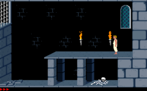 
|
Posted By: CELS
Date Posted: 31 August 2011 at 6:49pm
| Well, I think the lack of details and shade on those characters was just for the sake of animation. I'm not trying to imitate the style, I'm just trying to figure out the best way of drawing a 6 x 6 pixel head in a realistic manner. A blank face seems the best solution. |
Posted By: PureAwesomeness
Date Posted: 31 August 2011 at 8:04pm
|
@CELS Her pose seems kind of awkward to me. It's like she's trying to run and crouch at the same time. The red's also too bright compared to everything else. Otherwise it looks great! BY THE WAY... Another wip of my background:  I know I'm gonna have to mess around with the contrast and the colours a bit, especially when I put the foreground in. What colour should the building in the middle be? I'm thinking a dull reddish purple, but then it's TOO much red in the picture. Bluish-purple maybe? |
Posted By: Jinn
Date Posted: 31 August 2011 at 8:20pm
Another update:
|
Posted By: DawnBringer
Date Posted: 31 August 2011 at 8:29pm
| Mm, that bg is starting to look real nice...I'm getting a "Savage World"-vibe :) |
Posted By: Chibiwing
Date Posted: 31 August 2011 at 9:52pm
I honestly have no idea where I'm headed with this; any suggestions/help?
 |
Posted By: Mrmo Tarius
Date Posted: 01 September 2011 at 3:30am
I have made some updaets:

|
Posted By: AirStyle
Date Posted: 01 September 2011 at 4:43am
|
Originally posted by PureAwesomeness
I know I'm gonna have to mess around with the contrast and the colours a bit, especially when I put the foreground in. What colour should the building in the middle be? I'm thinking a dull reddish purple, but then it's TOO much red in the picture. Bluish-purple maybe?[/QUOTE It'll be hard to say until you mess with the background. I could suggest all kinds of crazy colors, but if your foreground is not in, and you background's colors are too busy, my suggestion could mess up everything. Fix up your background, settle on a few colors, and t It'll be hard to say until you mess with the background. I could suggest all kinds of crazy colors, but if your foreground is not in, and you background's colors are too busy, my suggestion could mess up everything. Fix up your background, settle on a few colors, and then it'll be easier to see what colors you have left. |
Posted By: kevink
Date Posted: 01 September 2011 at 7:18am
Some thing I just started. Don't know where this will go. |
Posted By: CELS
Date Posted: 01 September 2011 at 8:44am
|
Originally posted by PureAwesomeness @CELS Her pose seems kind of awkward to me. It's like she's trying to run and crouch at the same time. The red's also too bright compared to everything else. Otherwise it looks great! Thanks! It's probably a result of me drawing cartoony proportions, and then trying to modify them to be more realistic. I guess I'll draw it from scratch. The red is meant to stand out, it's artistic license. :) Originally posted by PureAwesomeness
I know I'm gonna have to mess around with the contrast and the colours a bit, especially when I put the foreground in. What colour should the building in the middle be? I'm thinking a dull reddish purple, but then it's TOO much red in the picture. Bluish-purple maybe? I don't think the hue matters, as long as you get some good contrast going. Well, unless the foreground is all black and/or white, of course. But really, I don't see the problem with having so many colors. It reminds me of Commander Keen 6 and Space Quest. If you can get the saturation and brightness right, you can still end up with a readable game. I think your piece looks great so far, and the colours play a large part in that. Originally posted by Chibiwing I honestly have no idea where I'm headed with this; any suggestions/help? Ah, this is vintage Chibiwing pixel art :) I'm not sure what to say about the technique, I mean it's a bit low contrast, but your stuff is usually like that. Your colours here are quite similar, but they usually are. What you have so far reminds me of http://en.wikipedia.org/wiki/Indian_art - Indian art . Everything looks so ornate and luxurious, with all the gold and decorations, and then you have the skulls as an opposite to that. In Indian [Hindu] art, you'd often see grotesque demons and malicious gods decorated with gold and ornate jewelry. Perhaps that's a useful direction to explore. It's just what came to mind, for me. |
Posted By: divtag
Date Posted: 01 September 2011 at 1:27pm
|
WIP... |
Posted By: Chibiwing
Date Posted: 01 September 2011 at 2:55pm
|
Originally posted by CELS
Thank you for replying! I'm surprised by where you see this going because I wasn't anywhere near that, but I can see it now, and I'm considering going with it. As far as the skulls not seeming Indian; didn't the Indian culture have nagas (half snake people)? Grotesque demons and malicious gods will play to my weaknesses in anatomy by making them strengths, maybe.
Ah, this is vintage Chibiwing pixel art :) I'm not sure what to say about the technique, I mean it's a bit low contrast, but your stuff is usually like that. Your colours here are quite similar, but they usually are. What you have so far reminds me of http://en.wikipedia.org/wiki/Indian_art - Indian art . Everything looks so ornate and luxurious, with all the gold and decorations, and then you have the skulls as an opposite to that. In Indian [Hindu] art, you'd often see grotesque demons and malicious gods decorated with gold and ornate jewelry. Perhaps that's a useful direction to explore. It's just what came to mind, for me. I'm still open to more ideas from you guys. I'll also probably start something else and work on that when I get stuck on the first piece.
|
Posted By: Chrispy
Date Posted: 01 September 2011 at 3:52pm
Very early WIP. I'm making mine based off the movie Fight Club using http://mattmicheletti.files.wordpress.com/2011/07/fight-club.jpg - this reference  EDIT: Ack, it seems I skimmed over the "platform" bit. I'm still gonna continue with this, just not submit it to the challenge. XP |
Posted By: showtime
Date Posted: 01 September 2011 at 7:36pm
|
Jinn, that is a very strange pose. I find it to be visually confusing, as it's very unusual for a character's head to face in (essentially) the opposite direction of their body. Unless you're going for a surreal effect, I guess. : ) Based on your image, I have no idea whether he is supposed to be moving to the left, to the right or hell, just jumping vertically. I'm trying really hard to picture him in motion but it's just not happening.  Anyway, I made a REALLY REALLY messy edit here to, hopefully, show you what I mean. I really think that making the body face in the same direction as the head will unify the sprite and produce a more easy-to-read gesture. Sorry for murdering your work, I was just trying to get an idea across, not produce a masterpiece. Cheers |
Posted By: Jinn
Date Posted: 01 September 2011 at 8:05pm
Honestly i don't see this as a huge problem, I tried to find some examples of this pose, and I found a pretty good one, from Hook on the snes: I think it's a purelly artistical way to make jumps, but I like it. Also, you did use an old version of him, I changed a bit his right arm.  Anyway, thanks for the support. I do think your edit is more suitable, but less artistical.. Spartans prized for the beauty of the body, afterall. |
Posted By: showtime
Date Posted: 01 September 2011 at 8:30pm
|
Weeeell, in your example Peter Pan's (it is Peter Pan, right? : P) shoulders are rotated -- and it's very obvious that he's doing this to be able to deliver a powerful swing with his sword. Also, his hips are facing the same way as his face, so I would argue that this sprite is not an example of the same pose. And sorry if I wasn't being clear, I was not trying to edit your style or anything like that!! I was only trying to edit the pose. heh, a little part of me wants to challenge you to animate the sprite. Anyway, just wanted to say that I really admire your art and I'm really looking forward to seeing this piece finished. : ) |
Posted By: Jinn
Date Posted: 01 September 2011 at 8:40pm
|
Thank you very much for the support. I think it's better to start over than try to fix... So, would you mind to tell what do you think of this pose then? (before I star to shade, hehe)  |
Posted By: AirStyle
Date Posted: 01 September 2011 at 8:49pm
|
I think it would be good for the naked spartan to do a jumping sword-stab attack onto the spear-holder, wherein the spartan would have his legs stretched out below his torso, with his sword clutched in both hands above his head. It would show that he's putting everything into this last attack.
Moreover, if you want to add to the dynamic of the pre-described pose, you make the spear holder hold the spear aimed at the spartan's torso, as opposed to aiming blindly at the ground. It's obvious the naked spartan isn't going to be at that spot anytime soon... |
Posted By: Cammymoop
Date Posted: 01 September 2011 at 8:53pm
My First post  I decided to make a 2 color mock-up, mostly done just wanted to see if anyone had some advice for me (because i'm a pixel noob) before i submitted it.  |
Posted By: CELS
Date Posted: 01 September 2011 at 8:54pm
|
I guess Jinn has fallen in love with the pose (and has also decided to have the Spartan use his curved sword as a stabbing weapon, which is a bit unusual), which is fair enough. I agree that the new background is absolutely fabulous and I'm sure this piece will be top 3. One thing I didn't notice before, Jinn, was that you seem to have the shield upside down. The V is actually supposed to be the greek letter Lambda, which is an upside down V. According to Wikipedia, the letter L is for http://en.wikipedia.org/wiki/Lakedaimon - Lakedaimon , the name of the region of Sparta. (You'll see this in most illustrations and the movie 300) EDIT: Jinn, the new pose is much better. Looks like Achilles in Troy, when he kills the enemy's champion with a single strike. Basically the same movement. @Chibiwing: I didn't really consider the Nagas, but that's an interesting observation, since your skulls have the bodies of snakes. As you say, it's at least an option, unless you think of something else. |
Posted By: showtime
Date Posted: 01 September 2011 at 9:14pm
Jinn, I think this new pose is a step in the right direction. I made some minor edits, but I'm not great with anatomy so I'm not really sure if they're even helpful: My edit is on the left. It's just a couple of minor things, although I might have misunderstood some stylistic choices of yours. ; )
Anyway, I'm really sleepy right now and can't tell if my edit even makes any sense, so maybe somebody else will have some input. Nighty night. : ) |
Posted By: Chrispy
Date Posted: 01 September 2011 at 9:20pm
| Jinn, nice job on the newer pose. It's much better. I'd adjust his furthest leg's angle a bit, maybe. I dunno, I'm not the greatest at anatomy XP |
Posted By: surt
Date Posted: 01 September 2011 at 10:41pm
|
Djinn: I'm not a professional soldier by any means, but for the nudist I feel you should reverse the sword-hand and flip the sword-blade. That should allow him to perform a downward thrust and have sword ready for a slash on landing. -------------
|
Posted By: Chibiwing
Date Posted: 02 September 2011 at 12:55am
My second attempt:
 Ignore the bad aa and stuff on the grass; I just stretched it a minute ago because it was too small compared to the picnic blanket.
|
Posted By: Lathien
Date Posted: 02 September 2011 at 6:32am
Hopefully I'll meet the deadline this week :S The game is called WallRun and it's a new take on the platformer genre; taking it vertical. You tap the run button to keep running and press jump to jump outwards to avoid obstacles. Once you hit an obstacle or slow down too much, you flip back to ground and check your distance. C&C Very much welcome. Except for the building and sky, they're just placeholders. EDIT: BTW, this is also Dawnbringer's palette. |
Posted By: neofotistou
Date Posted: 02 September 2011 at 7:31am
|
Everything is looking awesome!! I will comment when I get the time. Meanwhile can anyone answer this question? Does this SNES mode: "Pixel-to-pixel Mode 1 comprised of three scrolling layers: two 16 color (4-bit) per tile layers and one 4 color (2-bit) layer" Mean I can have one 16color layer as background, one 4 color layer (as a sky or whatever) and one layer with platforms on it? And on top of that any sprites I want? Am I missing a layer? Am I adding more than the SNES could handle? Thanks |
Posted By: waloumi
Date Posted: 02 September 2011 at 8:23am
| All the wip's posted so far looks amazing, im condesidering to join this and i would to restrict the colors to the snes palette, how do i do that? |
Posted By: shampoop
Date Posted: 02 September 2011 at 9:04am
|
I think you are right about mode 1. 4-bit means 2^4 = 16 and 2-bit means 2^2 = 4. 0100 maps to one color for layer one and 0100 maps to a different color in layer two. I imagine a map to fetch a color given the 4-bits. I do not see any specifications on how large a specific layer can be.
In mode 1, the three layers scroll at the same speed. In mode 2, you get two layers that can scroll at independent speeds. |
Posted By: PureAwesomeness
Date Posted: 02 September 2011 at 12:57pm
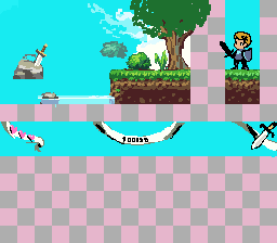
Few video game plots are more self-explanatory than "alien invasion," so there you go. I still have to add at least one alien chasing him, and possibly redo the ship, but that shouldn't take too long. I'm also not sure whether outlining or shading is better in terms of readability:  I looked through the thread, and there's lots of nice art here! Looking forward to seeing everyone's completed pieces. |
Posted By: Lathien
Date Posted: 02 September 2011 at 1:25pm
Update: I think I'm done but I'm not sure. Anything I should change before I submit? @PureAwesomeness. I'd say the one on the left. Reads a lot better with higher contrast. |
Posted By: PureAwesomeness
Date Posted: 02 September 2011 at 1:37pm
|
@Lathien: Thanks. What do you think of it overall? By the way, yours looks nice! A little nitpick would be that adjacent rows of bricks are offset by a bit instead of aligning in perfect rows. You might also want to shade them a little in order to give the side of the building a little dimension like the window and your character, so it looks more like a foreground instead of just a separate colour from the sky. |
Posted By: Lathien
Date Posted: 02 September 2011 at 1:54pm
How's this? Not sure what you meant by "adjacent rows of bricks are offset by a bit instead of aligning in perfect rows." though. Care to elaborate? As for your piece, I like it, although it's a little cluttered, personally. But I assume that's what you're going for so it works. The heel of the player's front foot is a little square and the green palette for the alien portrait in the bottom corner doesn't contrast enough so all the shades tend to just kind of blend into each other, lessening the "pop" so to speak. |
Posted By: Jinn
Date Posted: 02 September 2011 at 3:01pm
|
Due the close deadline, I'll stick with the current edit, I'll just adjust what member_profile.asp?PF=32721&FID=1 - showtime
said. But I really apreciate your ideas, guys! Thanks for all! ^^ Soon you will see the result in my gallery! See ya! |
Posted By: CELS
Date Posted: 02 September 2011 at 4:04pm
|
Originally posted by Lathien Not sure what you meant by "adjacent rows of bricks are offset by a bit instead of aligning in perfect rows." though. Care to elaborate? I assume he's referring to the fact that you have bricks positioned directly on top of each other. If you just google "bricks" and look at the images, you'll notice that they have a different pattern. By the way, while I do applaud your original approach, I can't help but wonder how your game would work. I assume your guy can't jump, because he'd fall off the wall. Does he meet enemies and just run through them? EDIT- Never mind, I saw you already explained. Kudos for originality. |
Posted By: PureAwesomeness
Date Posted: 02 September 2011 at 5:56pm
|
I solved my readability issue at the expense of my nice, bright palette. *sigh...* So anyway, I gave the alien a spear for some unknown reason. Any suggestions or comments?  |
Posted By: neofotistou
Date Posted: 02 September 2011 at 6:22pm
|
@alart way to go! don't give this up @CELS: you might want to try to separate the background, midground and foreground a little bit. Color-wise. Looking good @kevink so pretty! keep it up! @shampoop: thanks for the help! Ok here's my WIP as well. 19 colors (so far) What do you think?  |
Posted By: neofotistou
Date Posted: 02 September 2011 at 6:25pm
|
@Jinn: what showtime said. Also, here's a rough edit. It's where I would take it, it's not 'the right way' or anything. More specific anatomy, heroic proportions and a more dramatic poise. The hand holding the sword is more loose, because it's getting ready to strike. Minor nitpick: the greeks didn't have curved swords.  |
Posted By: Jinn
Date Posted: 02 September 2011 at 6:55pm
I was going for the last version, I even had it shaded: But how can I say no for sush a badass edit? Thank you very much, Neo! I'll for sure take this pose in consideration. I just hope it's my last edit! hehehe |
Posted By: Chibiwing
Date Posted: 02 September 2011 at 7:34pm
 I decided to make a boss; bad idea? He's obviously not done, but are there major errors?
|
Posted By: AirStyle
Date Posted: 02 September 2011 at 8:33pm
|
Taking into consideration the style of level, the only thing I would say is to highlight the "spine" with the vibrant red used on his head, and may be make it drape over the platform he's on.
Also, the level does not inspire fear, although the boss intends to to. He doesn't seem to fit... |
Posted By: Chibiwing
Date Posted: 02 September 2011 at 9:30pm
|
Originally posted by AirStyle
I was planning on the red highlights, just hadn't made it that far yet. ^_^ The draping is an excellent idea!
Taking into consideration the style of level, the only thing I would say is to highlight the "spine" with the vibrant red used on his head, and may be make it drape over the platform he's on. Also, the level does not inspire fear, although the boss intends to to. He doesn't seem to fit... I get what you mean, and I think the best way to fix that is to change my background.
|
Posted By: neofotistou
Date Posted: 03 September 2011 at 1:31am
|
@chibiwing: the background is fantastic. The foreground doesn't read well, however, with these colors. Check some bubble bobble 3 or bubble bobble evolution references maybe?Also, good job with the skulls. @jinn you're welcome/I'm sorry. lol |
Posted By: Chibiwing
Date Posted: 03 September 2011 at 1:45am
|
Originally posted by neofotistou
Thank you. o///o I'm terrible with color choices; are there any you think would work better against that background? I looked at them both but I'm not exactly sure what I should be looking for...? Thank you... >///< With zero anatomy instruction I'm amazed they came out as well as they did.
@chibiwing: the background is fantastic. The foreground doesn't read well, however, with these colors. Check some bubble bobble 3 or bubble bobble evolution references maybe?Also, good job with the skulls. @jinn you're welcome/I'm sorry. lol |
Posted By: neofotistou
Date Posted: 03 September 2011 at 2:00am
|
Sure, but don't take my word for it. I think your background suggests old house wallpaper and lace and chocolate cookies. So, if you want to keep the background, maybe you could go with wood for the platforms or something. Like grandma's coffee tables. It feels nostalgic, to me at least. What do you think? |
Posted By: surt
Date Posted: 03 September 2011 at 2:47am

-------------
|
Posted By: neofotistou
Date Posted: 03 September 2011 at 3:00am
| @surt: this is very good! It reminds me of "gods" by the bitmap brothers. Maybe make his legs less crooked. |
Posted By: kevink
Date Posted: 03 September 2011 at 6:42am
|
Originally posted by neofotistou
Ok here's my WIP as well.19 colors (so far)What do you think?
Nice WIP neofotistou, I would love to see this finished. |
Posted By: Mr Special
Date Posted: 03 September 2011 at 8:08am
Omg, these WIPS are awesome! I especially like neo's and surt's! Everyone is doing great. I wish I coulda participated in this challenge, but I didn't have any good ideas 
Neo, your's will make me mad if it isn't an actual game in the near future! 
|
Posted By: CELS
Date Posted: 03 September 2011 at 9:40am
|
Originally posted by neofotistou @CELS: you might want to try to separate the background, midground and foreground a little bit. Color-wise. Looking good Thanks! Actually, I was going for a Schindler's List thing. You know the scene with the girl in the red dress and everything else is black and white. Well, just pure grey tones would be boring, so I used blue and yellow with very low saturation instead. But the principle is the same: make the world look bleak and monotonous, and make the girl stand out. Do you think I should increase contrast instead of separating the colors? Slight changes, btw.  Originally posted by neofotistou Ok here's my WIP as well. 19 colors (so far) What do you think? I think it's great. I love the steampunk and the colors. Is that a bionic eye, or just a really big monocle? And he's wearing white socks. How embarrassing. |
Posted By: PureAwesomeness
Date Posted: 03 September 2011 at 10:27am
|
@CELS: It's still nice. Maybe add some more contrast in the front layer of buildings, so you can tell it's part of the foreground. @neofotistou: Ooh, nice. Not really much to say. P.S. what do you guys think about mine? I looked at it today, and it doesn't look as good as it did yesterday when I was working on it. I think I should probably just keep the colours, maybe brighten the buildings a little more. Any suggestions? |
Posted By: Cammymoop
Date Posted: 03 September 2011 at 3:00pm
|
Fixed some stuff, I think it's done not sure if I should add anything else  |
Posted By: jalonso
Date Posted: 03 September 2011 at 3:07pm
|
WOW! some really great stuff this week. @ member_profile.asp?PF=32133&FID=1 - Chibiwing and member_profile.asp?PF=34299&FID=1 - Felix2, Kinda sloppy and disorganized. Think quality lines the competition is tough this week. @ member_profile.asp?PF=32133&FID=1 - Chibiwing You are going back to that 'hen-pecking' pixelling style that never quite works, PJ members dislike and generally are not well received. That works ok for 1bit pieces but you tend to use enough colors that its not really needed. Your AA and general pixelling was improving with every piece but something has happened...*slaps* ------------- |
Posted By: Cammymoop
Date Posted: 03 September 2011 at 3:27pm
|
@ jalonso what specifically do you think I should change, I'm not very good at this I think I should redo the background |
Posted By: Chibiwing
Date Posted: 03 September 2011 at 3:41pm
|
Originally posted by neofotistou
You totally nailed the feeling I was going for but couldn't pin down; thank you, thank you! If I take that direction (and a part of me really, really wants to) should I abandon these monsters for something else?
Sure, but don't take my word for it.  I think your background suggests old house wallpaper and lace and chocolate cookies. So, if you want to keep the background, maybe you could go with wood for the platforms or something. Like grandma's coffee tables. It feels nostalgic, to me at least. What do you think? |
Posted By: AirStyle
Date Posted: 03 September 2011 at 3:51pm
|
Probably so. Think of what kind of stuff would attack in Grandma's kitchen. I don't think I've ever seen skull monsters in mine, but you never know.
~Spiders maybe? ~Cockroaches? ~Very aggressive dust bunnies? ~Moths? ~Half-eaten Gingerbread men, although this could lead to a Shrek reference... ~Mouse traps? ~Mice? ~Levitating floor tiles? (BIIGGG stretch on this one...) ~Rotten food? ~Wild light fixtures? ~Mean old oven: I'm talking smokestack oven!! ~Tea kettle? ~Forks and other various pieces of cutlery? You name it! |
Posted By: jalonso
Date Posted: 03 September 2011 at 7:48pm
|
Originally posted by Felix20 @ jalonso what specifically do you think I should change, I'm not very good at this I think I should redo the background Well the background is what needs help. The clouds look good but they don't quite match the style overall. Also the mountains have minimal pixelwork but the way you've shown them they also don't quite match. Maybe a pixel pattern that's anything but 50/50 for the caps? or lines... Whatever makes every item suit the style on its own. Also remember that its a game so the player sprite IS the most important thing. If lost you failed. Not saying it is now but it sure is close. Fyi, the less colors the harder it is. For your next work, If you're new and learning keep colors low but use enough to hide the flaws ;) ------------- |
Posted By: surt
Date Posted: 03 September 2011 at 10:48pm
neofotistou: Tweaked dudes legs, hopefully works better now. -------------
|
Posted By: neofotistou
Date Posted: 04 September 2011 at 3:34am
| @surt: yeap. Love the cyclops |
Posted By: Lathien
Date Posted: 04 September 2011 at 7:59am
| @surt: Love the piece, it all works well, especially the cyclops, but the skeleton guy underground has his bones the same color as the masonry and his hat and cloths the same color as the bricks, so he becomes very hard to see. I didn't even know he was there until I looked more carefully. |
Posted By: PureAwesomeness
Date Posted: 04 September 2011 at 9:43am
I think I'm finally done! |
Posted By: Cammymoop
Date Posted: 04 September 2011 at 12:15pm
|
I guess I'm finished, i think it turned out ok but I probably won't be wining any awards. Thanks for helping, jalonso   |