Adding depth
Printed From: Pixel Joint
Category: Pixel Art
Forum Name: WIP (Work In Progress)
Forum Discription: Get crits and comments on your pixel WIPs and other art too!
URL: https://pixeljoint.com/forum/forum_posts.asp?TID=12939
Printed Date: 14 September 2025 at 4:23am
Topic: Adding depth
Posted By: Ego
Subject: Adding depth
Date Posted: 11 September 2011 at 12:57am
 If you've ever seen my gallery, you've seen this guy before. Well, not this one specifically, but a number of very similar ones. Based on what Claredeth said on my last one, I'm trying to add a sense of depth to him. Some things I did was I built the palette with high contrast and gave him very strong highlights and shadows, which I think gives him some depth. However, I'm at a loss for how to do more, so how do you think I could do that? Also, if you see anything else, let me know please. Depth is the goal, but I still want him to look good. Don't mention the mirrored wings though, it was irritating enough to slog through ONE wing. |
Replies:
Posted By: Qemist
Date Posted: 11 September 2011 at 5:16am
|
I think if you talk depth you're talking shadows. Either in the room the object is in or on the object itself. Depth.. it says it all I guess. If you shadow the object in a room it would extend the object with the shade, thus creating depth? In this case I would create more shadows between the wing layers? just like the body has a certain depth due to the muscles? Im not educated at all but this seemed logical to me the way I put it down. Hope it helps. |
Posted By: cure
Date Posted: 11 September 2011 at 9:26am
right now his wings are flat, like a butterfly on display in a case. you could always have them in a position more like this: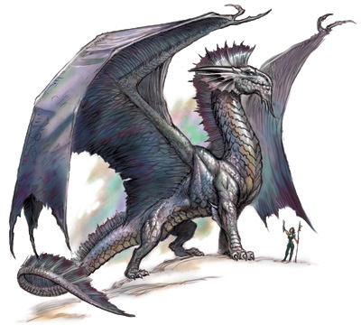 , in which they are angled toward the viewer (ignore the fact that this dragon is at a different angle alltogether). |
Posted By: jalonso
Date Posted: 11 September 2011 at 9:40am
|
This, very popular, ../p/2000.htm - Badassbill lineart just doesn't lend itself well for depth unless as stated you include BG space and even then the design seems to be more intentionally graphic. I think you did about as much as could be done with form :/ ------------- |
Posted By: Ego
Date Posted: 11 September 2011 at 12:51pm
|
Oops, I forgot to mention that it was BAB's lineart entirely! I posted this in the wee hours of the morning, so I guess I wasn't thinking straight. I was a little concerned that the lineart itself didn't lend itself to to depth, but I thought I'd try. With confirmation from you guys, I guess I've done as much as I can with the lines as they are, but thank all three of you very much, hopefully I can apply the same advice to future pieces! I may take a shot at re-angling the wings though, just to try. |