Game sprites
Printed From: Pixel Joint
Category: Pixel Art
Forum Name: WIP (Work In Progress)
Forum Discription: Get crits and comments on your pixel WIPs and other art too!
URL: https://pixeljoint.com/forum/forum_posts.asp?TID=12968
Printed Date: 12 September 2025 at 8:40am
Topic: Game sprites
Posted By: acidic055
Subject: Game sprites
Date Posted: 15 September 2011 at 1:54am
|
I did this for a game I am making. I am also looking to improve my spriting technique. It's meant to be kinda cartoony and pixelly...if that makes sense :P. I guess kinda like the pokemon games. So yea, any comments, improvements, CC let me know thanks :) |

Replies:
Posted By: r1k
Date Posted: 15 September 2011 at 3:40am
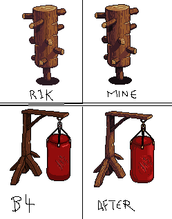
looks pretty good. Heres an edit I did to adress a few points basically I increased the contrast, such that the distinction between whats in the light and whats in the shadow becomes more imideatly obvious. I also changed the palette to include hue shifting. So here I started the lights towards yellow, and moved towards red-violet in the shadows. I also got rid of the pure black outlines and replaced them with the darkest purple I had. Also I noticed that you used a couple differnt colors in your outline, but this is not neccesary. At 1x, each color still looks black, so theres only use in having a single color. Even at 10x I cant really tell. Also, even if you are going to use solid outlines, I think you should work to get rid of the outlines on the inside of the sprite. In my edit I replaced the bottm half of the elipse on top of the log from a black outline to just AAing the light part into the dark. In the little projections from the log you could make the top part of the outline lighter than the bottom so that it conforms with the light source. Black outlines, when brought too much into the inside of the sprite tend to make things look a little more amaturish in my opinion. Lastly I think a bit of reflected light on the left side of the log helps give it a sense of roundness. I added it in pretty sloppily into my edit. |
Posted By: acidic055
Date Posted: 15 September 2011 at 5:32pm
Thanks r1k! Now I can really see what issues i really need to tackle. I've fixed up the wooden block and I'm pretty happy with it now. Increased the contrast a little bit and removed more of the outlines on the inside of the sprite. I tried to fix up another wooden object using the advice you gave me. It looks much better than it did before.
 |
Posted By: Lathien
Date Posted: 15 September 2011 at 11:23pm
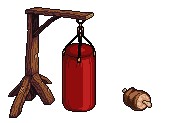
| With this punching bag, I like the new version so well done, but if that's a symbol or writing on it it's hard to read and if it's scratches or cuts, I don't think the highlights should circle around it like that. In fact, the only reason they would for a symbol is because it's commonly a seperate piece of fabric. |
Posted By: ChrisButton
Date Posted: 15 September 2011 at 11:52pm
|
In the 4 part picture, you copied yours from R1k's.
They're the exact same. :\
|
Posted By: Hapiel
Date Posted: 16 September 2011 at 12:34am
|
Have a better look Chris, they are not exaclty the same. About the punching bag: review the bottom part of the wooden stand (the diagonals). The lines on there which are supposed to be the wood texture are very unclean and make it look messy, while the rest of your pixel is nice and crispy even with the texture! The same goes for the punching bag. Whatever you tried to put on it, clean it up! Oh, and about perspective, I think the diagonal on the north side (behind) is much and much too high up in the air to reach the floor. Good luck! ------------- |
Posted By: Qemist
Date Posted: 16 September 2011 at 8:03am
| I think just like the wooden thing that the punchy bag just needs way more contrast. :) But I have to say I really like how that wooden sprite turned out it looks pro! |
Posted By: acidic055
Date Posted: 19 September 2011 at 12:04am
Alright, so i've gone back and tried to address some of the issues.
 With the sprite of the meat, I've been trying to learning how to "ramp colours" and be bold with contrast and saturation choices. How did I go?
|
Posted By: Qemist
Date Posted: 19 September 2011 at 1:19am
|
I think the right part of the bag contains shadows while it should actually contain more light. The meat is cool but shadows are flipped a bit compared to the whole punch bag perspective. It looks a bit pillow shady.. I think the top of the meat should be more bright instead of dark. |
Posted By: acidic055
Date Posted: 23 September 2011 at 6:29am
|
So, I'm still on the crusade to perfect my pixelling technique. I've started to create my main character for the game but something seems...missing/odd? 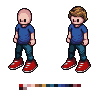
For the moment you can ignore the eyes. Something about him makes him look more like an NPC than a main character (maybe this question is for a different forum).
Also looking for same type of critique, colour, shading...anything.
|
Posted By: cure
Date Posted: 24 September 2011 at 9:54am
|
the foot on the right looks larger than the foot on (our) left. it also doesn't seem to connect to the ground as well. I understand of course that you're exaggerating the size of the feet, but when that's the only thing that's being exaggerated to such an extent, it just makes it look clunky. also the arms a re a bit short, since he can only reach to his waist. about the NPC bit: there's nothing really special about him. the main character has no 'character'. just a guy in normal clothes with normal hair, with no distinguishing characteristics. |