AdventureGame Mockup
Printed From: Pixel Joint
Category: Pixel Art
Forum Name: WIP (Work In Progress)
Forum Discription: Get crits and comments on your pixel WIPs and other art too!
URL: https://pixeljoint.com/forum/forum_posts.asp?TID=13224
Printed Date: 12 September 2025 at 9:46pm
Topic: AdventureGame Mockup
Posted By: AlexHW
Subject: AdventureGame Mockup
Date Posted: 22 October 2011 at 12:59am
I haven't touched this in over a year, but I plan to add/edit it here and there. Feedback/critique wanted. |
Replies:
Posted By: AlexHW
Date Posted: 22 October 2011 at 1:38am
updated a bit of the water/pinetree/and dirt.
|
Posted By: AlexHW
Date Posted: 22 October 2011 at 12:31pm
here's an update to the girls face, adjusted the alignment of the eyes mainly. |
Posted By: onek
Date Posted: 22 October 2011 at 12:52pm
|
i really like this
the colors are great and it has a very unique style i especially love that fox! i dont really like that girls face tho ... its too round / pancake-ish and the forehead is too short maybe a bit like this? 
|
Posted By: AlexHW
Date Posted: 22 October 2011 at 1:04pm
|
nice! I like your edit, it makes her look older and more apt. I'm torn between the two though. hmm.. thanks |
Posted By: King of Games
Date Posted: 22 October 2011 at 1:58pm
|
I think you are going to have some readability
issues. The hyper detailed style that you taking on, though ambitious,
is going to bleed into the sprite and they'll muddily merge together
like in here: http://www.pixeljoint.com/pixelart/65783.htm# While the style is great and totally unique, you have to approach this from a game design perspective, one readability and priority. I think right now, with how busy it is, it takes a time for our eyes to adjust and read each object/detail individually. With the sprites layered on it's almost too much visual information at once, when essentially we're only looking at some grass, a tree, and some characters, an allegedly simple scenario. It's relatively low contrast, so the depth looks hurt. (why are there dark strays in the bottom of the tree canopy?) The sprites definitely don't pop enough and their limbs merge into the grass. You can change the sprites or change the BG, but the relationship needs to be emphasized that the sprites take more importance and should be higher prioritized, as in we shouldn't have to visually 'search' for them and know where they are at all times. |
Posted By: AlexHW
Date Posted: 22 October 2011 at 2:23pm
|
Originally posted by King of Games
I think you are going to have some readability issues. The hyper detailed style that you taking on, though ambitious, is going to bleed into the sprite and they'll muddily merge together like in here: http://www.pixeljoint.com/pixelart/65783.htm# I want them to bleed. It's intentional. While the style is great and totally unique, you have to approach this from a game design perspective, one readability and priority. I think right now, with how busy it is, it takes a time for our eyes to adjust and read each object/detail individually. With the sprites layered on it's almost too much visual information at once, when essentially we're only looking at some grass, a tree, and some characters, an allegedly simple scenario. I am approaching it from a game design perspective and I want to explore a different expectation. I disagree with the notion that sprites must pop out and be in your face. The notion that sprites must be instantly readable is very boring to me and in my opinion locks you to a specific mindset that can hinder new ideas or techniques or different styles of play. It's relatively low contrast, so the depth looks hurt. (why are there dark strays in the bottom of the tree canopy?) The sprites definitely don't pop enough and their limbs merge into the grass. You can change the sprites or change the BG, but the relationship needs to be emphasized that the sprites take more importance and should be higher prioritized, as in we shouldn't have to visually 'search' for them and know where they are at all times. It's still a wip, but I disagree. I'm not going for a high contrast/defined, hit your eyes, look. I am going for a more natural, organic, and seamless look. |
Posted By: Zeratanus
Date Posted: 22 October 2011 at 2:59pm
|
Well from at least an artist view I really like them :D
Though I like your original facial structure better I like Onek's edit for the forhead/hair. I dont find the faces of either to be wrong, but I like the original wider face. The muddiness is an interesting game design element, but I'd have to see it in motion before I could say much about it. If, say, there was enough animation and movement to visually separate elements it could work as well as anything, but if it comes down to getting killed because you didnt see one grey lump of an enemy moving past that other grey lump of a background, or i thought i WAS that other lump, that'd suck (naturally). Right now i think each of the characters is distinct enough (even with color) to stop that from being a problem. |
Posted By: King of Games
Date Posted: 22 October 2011 at 3:30pm
|
The sprites don't have to be in your face, they should just be distinct enough from the background that you can easily interpret the situation that you're in as a player. And I like that you're playing with style. It looks like you're creating a very luscious world, very seamless, as you say. Its your decision as to how to proceed. I would be wary of detail overload, in that, if this canvas was completed in the current way you've gone about it, our eyes would have no place to rest, and in the circumstances of actual gameplay, could be distracting and physically strain our eyes. I mean I understand where you're coming from, I love details. Its what graces 3d games, the minute attention to every conceivable surface and texture. But in pixel art, it's a bit different, smaller resolution, no z axis, etc. Like I understand you're intentionally going against convention, and I respect that, but there's a difference between visual tropes and visual necessity to distinguish the player from his environment. |
Posted By: AlexHW
Date Posted: 22 October 2011 at 3:36pm
|
thanks, yea.. In my mind, I want a lot of hiding in the environment and emerging from the environment type of concepts. foliage/elements galore. I still havent decided the direction i want to take with the girl's face. but I worked on the bush and also started the knight's picture (he's actually the fox's human form and guardian of the girl).  |
Posted By: AlexHW
Date Posted: 22 October 2011 at 10:00pm
small update: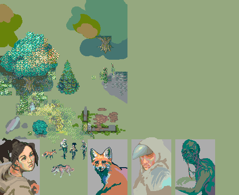 |
Posted By: AlexHW
Date Posted: 22 October 2011 at 11:29pm
 |
Posted By: CELS
Date Posted: 23 October 2011 at 12:07am
|
I'm not sure if this is actually helping you, but I have to say that I'm also a fan of the style where sprites don't really 'pop' by having dark outlines or bright colours. I think this style is fantastic. Very often, I think game designers put gameplay over aesthetics too readily. I for one am not bothered by games that have slight gameplay issues, if they look good enough. With that said, I do things would be better with overall increased contrast. It looks fine here, but judging from the piece you posted to the gallery, I think everything looks a bit washed out. Of course, this may be a stylistic choice. The wolf, I assume, will be shaded more consistently with the rest of the scenario? Right now, it's hard to see the light source above when looking at the wolf, I think. Even if wolves often have white bellies and feet. I think you should go for onek's edit. It doesn't really make the girl look older, as I see it, it just improves the shape of her skull relative to her pose. Of course, you could also change her pose. |
Posted By: AlexHW
Date Posted: 23 October 2011 at 2:25am
|
yea, onek's edit is growing on me.. things might get more contrast as i flesh things out depending on how things go. I don't plan to change anything with the wolf currently unless something blatantly wrong appears. Light can diffuse a lot with fur/fuzzy surfaces. here's update to knight face..  |
Posted By: AlexHW
Date Posted: 23 October 2011 at 10:39am
update to face 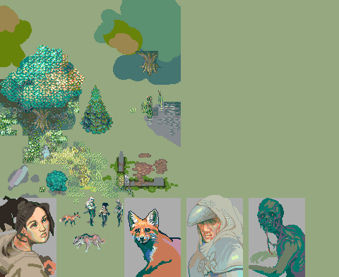
|
Posted By: Friend
Date Posted: 23 October 2011 at 10:59am
couldn't you just change the hue/brightness of the characters/important things to make them stand out just enough from the background?

|
Posted By: AlexHW
Date Posted: 23 October 2011 at 11:19am
| eww.. no, not like that. I prefer more natural looks. |
Posted By: Hapiel
Date Posted: 23 October 2011 at 11:36am
|
Hi Alex, Cool stuff! I agree with Onek that the girl is not that nice. Werther you want to have her look young or old, it needs some changes! Another thing that bothers me is that the edges of the tiles on the tree are often quite visible. It took me long time to assure myself that there were actually tiles, because you don't repeat them much which is great, yet still I was able to see a grid from on the beginning! Perhaps you should think of a system so that the edges always blend nicely into the edges of the next tile, or create some tiles that are specially designed to be placed next to specific other tiles! Good luck with your ideas of artistically ideal pixel art games! ------------- |
Posted By: AlexHW
Date Posted: 23 October 2011 at 12:58pm
|
thanks I'll probably edit those tiles at some point as it bothers me a bit too.. I went ahead and edited the girls face, taking into account some of onek's changes. how's this? 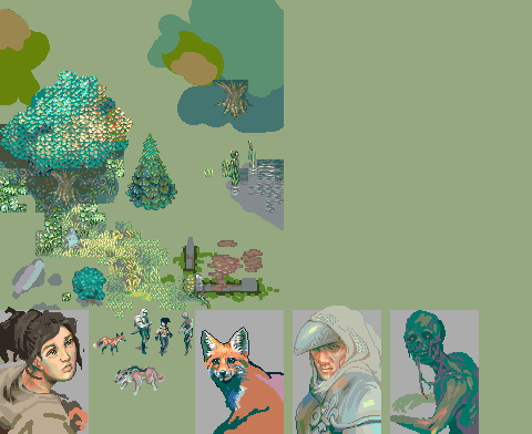 |
Posted By: Christoballs
Date Posted: 23 October 2011 at 1:09pm
i like the way this is progressing, but here are some things i edited: i tried to make the face seem less diagonal: i think that impression is given by the eye farthest away from us. i've also done some colour swaps on both sprites, so they match more or less their portraits. looking forward to more! edit: alternative face  |
Posted By: Zeratanus
Date Posted: 23 October 2011 at 6:58pm
|
Did an edit to check out readability, and i think the girl reads fine everywhere so far. Her jacket makes her read in dark areas, and her hair and pants work in lighter ones Also did a face edit, because its the cool new thing to do, and because I still like the original face, just thought it could use some tweaking. (mine on the left, original on the right) 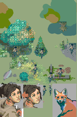 |
Posted By: Friend
Date Posted: 23 October 2011 at 7:36pm
|
of course she'll be *noticeable* when you just stick her beside a lone tree or in a pond, or on top of a grass tile, but when the whole thing comes together in unification, when the level of detail will be so gigantic, I think she won't be noticeable or readable at all. In my opinion, she isn't really very readable even with your disjunctive readability test. |
Posted By: AlexHW
Date Posted: 23 October 2011 at 8:09pm
| This game is for people with at least 3rd grade reading skills. :P |
Posted By: Damian
Date Posted: 23 October 2011 at 10:50pm
|
http://www.youtube.com/watch?v=bcYppAs6ZdI - http://www.youtube.com/watch?v=bcYppAs6ZdI
Character looks fine and contrasts well enough. Frost Butt, your last post smells of bullsh*t. |
Posted By: AlexHW
Date Posted: 24 October 2011 at 1:11pm
| how come this thread doesn't show up in forum? thought it was deleted? |
Posted By: AlexHW
Date Posted: 24 October 2011 at 1:12pm
|
oh weird.. now it shows up.. anyways.. here's an update..  |
Posted By: Friend
Date Posted: 24 October 2011 at 1:30pm
|
Originally posted by Jim16 http://www.youtube.com/watch?v=bcYppAs6ZdI - http://www.youtube.com/watch?v=bcYppAs6ZdI Character looks fine and contrasts well enough. Frost Butt, your last post smells of bullsh*t. It is just my opinion. No need to be rude. Regardless, I really love the piece so far whether I think the characters are readable enough or not |
Posted By: AlexHW
Date Posted: 25 October 2011 at 2:44pm
|
trying to work on how the tiles are near water/ponds.. may have to separate cattail heads to another layer and make them mroe pronounced.  |
Posted By: AlexHW
Date Posted: 25 October 2011 at 3:57pm
slight update |
Posted By: AlexHW
Date Posted: 28 October 2011 at 5:02pm
small update to knight and zombie
|
Posted By: AlexHW
Date Posted: 01 November 2011 at 1:20am
for those interested.. been trying to program some random generated maps..  |
Posted By: Christoballs
Date Posted: 01 November 2011 at 3:34am
| I love the look of those. I hope to see some updates with a wider range of tiles! |
Posted By: AlexHW
Date Posted: 02 November 2011 at 11:32am
|
thanks.. I copy pasted the tree from my mockup onto a screenshot to show how it might look in game to see if I'm on the right track.. Hopefully I'll be able to make the canopy of each tree a bit random.. I might change the style of the canopy too.. idk yet.  |
Posted By: Christoballs
Date Posted: 02 November 2011 at 11:56am
| That's probably not your intention but I'm really digging the blockiness of the current mockup. |