CHALLENGE 4/23/2012: Not-Particularly-Big
Printed From: Pixel Joint
Category: Pixel Art
Forum Name: Collaborations/Challenges
Forum Discription: Submit pixel art project ideas/templates or contribute to an existing pixel art collaboration.
URL: https://pixeljoint.com/forum/forum_posts.asp?TID=14244
Printed Date: 03 November 2025 at 9:42am
Topic: CHALLENGE 4/23/2012: Not-Particularly-Big
Posted By: administrator
Subject: CHALLENGE 4/23/2012: Not-Particularly-Big
Date Posted: 23 April 2012 at 12:00am

Replies:
Posted By: Adam
Date Posted: 23 April 2012 at 2:41am
 |
Posted By: surt
Date Posted: 23 April 2012 at 3:02am
|
Small coccyx.
------------- 
|
Posted By: MidnightCity
Date Posted: 23 April 2012 at 3:33am
Idk what to do to make this alot better :C

update: 
|
Posted By: philippejugnet
Date Posted: 23 April 2012 at 8:13am
I think its both funny and annoying the fact small dogs think they are stronger enought to hurt me.

|
Posted By: Maven
Date Posted: 23 April 2012 at 9:06am
Hiho guys, here's my wip (actually my first ever challenge entry *Yeeay!) of an... racoon!, firstly it was going to be grey, but i experimented a bit with colors, and here it is: I've tried to do something... uhm... with an uni..orgi.. original style. 7 colors, all from MS Office ^^. Any crits, suggestions, etc... greatly apperticated. :) -Maven |
Posted By: Nevercreature
Date Posted: 23 April 2012 at 1:47pm
Boron atom.  Very small. Isn't it? |
Posted By: Hapiel
Date Posted: 23 April 2012 at 1:52pm
|
I guess I was not the only one who got the atom idea. Anyway, here is my atom, critique is welcome!  ------------- |
Posted By: Erstus
Date Posted: 23 April 2012 at 3:59pm
Here's my WIP. What you think?

|
Posted By: philippejugnet
Date Posted: 23 April 2012 at 4:05pm
|
Originally posted by Erstus
Here's my WIP. What you think? Well, you should depic something small compared to human size DEPIC SOMETHING SMALL. Didnt you guys fought I was gonna do a chiuaua right? rofl. Here is my pic: 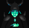
|
Posted By: Skull
Date Posted: 23 April 2012 at 4:18pm
|
Originally posted by philippejugnet
Originally posted by Erstus
Here's my WIP. What you think? Well, you should depic something small compared to human size DEPIC SOMETHING SMALL. It's a fairy or something.. Pretty cool work so far. ------------- |
Posted By: JDaddario
Date Posted: 23 April 2012 at 5:22pm
|
Here's my first weekly challenge. I still have a long way to go, but how can I improve from here. Edit: Grrrr, how do I get a non-blurry picture? I am saving it as a .png. |
Posted By: philippejugnet
Date Posted: 23 April 2012 at 5:56pm
| PNG or Bitmap |
Posted By: JDaddario
Date Posted: 23 April 2012 at 6:07pm
| I am using a PNG. |
Posted By: jellybeanfish
Date Posted: 23 April 2012 at 6:21pm
|
Originally posted by Maven
Hiho guys, here's my wip (actually my first ever challenge entry *Yeeay!) of an... racoon!, firstly it was going to be grey, but i experimented a bit with colors, and here it is: I've tried to do something... uhm... with an uni..orgi.. original style.7 colors, all from MS Office ^^.Any crits, suggestions, etc... greatly apperticated. :)-Maven
I like this style and colors a lot - you picked a good set of expressive colors within the given palette. But I feel like the shape of the feet are a little uneven? I'm not sure how to describe that. The hind leg's foot is a little squarish and MAYBE a little too long (I don't know, though, I'm not great at animal anatomy), and while the front two are alright the front leg on the viewer's left is quite round on the paw, maybe you could try defining the toes somewhat? :) Raccoons have very sharp claws and defined toes, after all. The outline on the very top left (its back) is also a little uneven, it's not too noticeable unless you're looking for it but it isn't a very smooth curve. I think the atom ideas are very clever, haha. I was thinking small but not THAT small! Originally posted by Erstus
Here's my WIP. What you think? I LOVE this background. It shows that three colors can go a long way and it's well rendered, even though water and ripples are a difficult subject to work on. The minimalistic colors remind me of Gameboy games. The fairy, however, immediately sticks out - the colors are very stark, which isn't necessarily a bad thing, but the colors in the background are very minimalist and desaturated so it's weird to have a bunch of bright, saturated skintones and purples in the middle of the piece. I think you should consider rendering her in colors that complement the background more, maybe even the colors that you've already chosen or similar shades. She looks out of place, is the problem. As for her pose, she's supposed to be diving, right? Her pose isn't conveying that effectively - the hair is flowing like she's diving but the feet look like they're touching the lilypad still. Her legs are also a bit awkwardly curved, making it difficult to discern what's going on with her lower leg area. Where are her knees? Stylization is obviously an okay thing, but you've gone with a fairly realistic anatomy for the rest of the piece, so it sticks out. Try putting her higher in the air and make her body look less bent. Look for diving poses on deviantART's stock model section or Google something like 'olympic diver'. I'm no expert on diving poses, but it seems the body often stays relatively straight for most of the dive, so such a dramatic bending motion makes it look like she's reaching down awkwardly to touch the water, especially when she's so close to the ground. Hope this helps! Originally posted by philippejugnet
Originally posted by Erstus
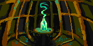
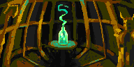
Here's my WIP. What you think? Well, you should depic something small compared to human size DEPIC SOMETHING SMALL. Didnt you guys fought I was gonna do a chiuaua right? rofl. Here is my pic: I really, really love the use of blue and greens with the lighting here - it works very well with the greyscale colors in the piece, providing a lighting that is both cold and atmospheric. It feels like the focus is less on the 'something small' and more on the person holding it, though - it took me a minute to figure out what the 'something small' was. If you wanted to change that, you could try toning down the lighting on the face somewhat to draw the eye's focus to the crystal, making it more of a focal point. The hand is a little weird, too, I'm not sure if that's intentional stylization or not. Mostly it is comparatively small - if you place your hand on your face you will notice that it easily covers most of your face. If you rest the bottom of your palm on the bottom of your chin, the tips of your fingers still easily reach your brow. If you compare his hand to his face, it's too small. Here's my attempt (and my first entry into a challenge I think, actually). I drew a Bold Jumping Spider: 
I'm not super happy with it, but oh well. This palette sure is hard to work with. |
Posted By: JDaddario
Date Posted: 23 April 2012 at 6:27pm
http://postimage.org/"> Here you guys go. It's super fuzzy for some reason even though I saved it as a png... I'm currently debating about what to do with the background. I also need to figure out how to liven up the image... |
Posted By: jellybeanfish
Date Posted: 23 April 2012 at 6:41pm
|
Originally posted by JDaddario
http://postimage.org/"> Here you guys go. It's super fuzzy for some reason even though I saved it as a png... I'm currently debating about what to do with the background. I also need to figure out how to liven up the image...
You could light the match on fire?  Or make it look burnt out, have it being held between two fingers, sticking out of a matchbox... Or make it look burnt out, have it being held between two fingers, sticking out of a matchbox...
It doesn't look blurry to me. Maybe it's your browser? Are you zoomed in at all? What browser are you using? I'm using Google Chrome. |
Posted By: JDaddario
Date Posted: 23 April 2012 at 7:17pm
|
I use Firefox. Edit: Oh my goodness, you were right! I just zoomed out and in a bit and it was fixed! Thank you so much. |
Posted By: jellybeanfish
Date Posted: 23 April 2012 at 7:40pm
|
Originally posted by JDaddario
I use Firefox. Edit: Oh my goodness, you were right! I just zoomed out and in a bit and it was fixed! Thank you so much. No problem! I used to have that problem a lot when I still used Firefox, haha. I wrote up more crit because I am apparently full of words tonight: Originally posted by MidnightCity
Idk what to do to make this alot better :C
update: The biggest problem with this, I think, is that you're using too many colors. This is a common mistake - the color you're using isn't giving the desired effect, so you add on more, which in turn tends to make a piece's colors look 'muddy' and overexposed. The rule with pixel art is generally 'less is more'. 
You're also not really considering Kirby's shape with the shading - he's more or less a sphere with arms and legs. The shading is very curvy in places with shadows around the eyes and makes him look more like you're trying to shade a face. Which works for faces, not living spheres that happen to have cartoony faces on them. You gotta treat Kirby like a sphere and shade him as such. I drew a sphere to try and show what I mean: 
This is 2 colors not counting the outline. Quick and dirty and not perfect by any means, but you can see that it's a sphere - and that the light hitting the sphere is also spheric because light and shadow conform to the shape of the surface they're on. Though there's very few colors used, the contrast between the two is enough to make sure the shadows are visible and apparent. Every color plays an important role. Still, if you wanted to soften it a little: 
This is 3 colors not counting the outline, still not very many. It's soft, but the shadow is still obvious. So, I would recommend trying to shade Kirby more like a sphere - if you want to see how the games did it, there's plenty of http://www.spriters-resource.com/search/?q=kirby&g=1 - awesome resources over at The Spriter's Resource to help you out. Try minimizing your colors to see if that helps you out some - make sure every color is important and serves a clear purpose. If you're struggling to see a shadow, you should make that color darker. Conversely, if the shadow is too dark, try choosing a lighter color instead, etc. Every color counts! Of course, I'm an amateur so I might not know anything - take everything with a grain of salt. I hope this helps a little, though.
|
Posted By: jeiki
Date Posted: 23 April 2012 at 7:42pm
|
This is my Wip.. a baby dragon EDIT: oops messed up colors while saving  |
Posted By: Aastikya
Date Posted: 24 April 2012 at 1:12am
Will this work? Here's a WIP... a pencil!

Comment please. 
|
Posted By: jeiki
Date Posted: 24 April 2012 at 1:25am
 update, cant seem to get scales right.. |
Posted By: Nevercreature
Date Posted: 24 April 2012 at 3:26am
New piece.
 |
Posted By: offwhite
Date Posted: 24 April 2012 at 9:10am
Lots of nice wips already!  Well, here's mine. Tata... Well, here's mine. Tata... Not very creative, I know. I just need to finish something  |
Posted By: Nevercreature
Date Posted: 24 April 2012 at 9:22am
|
Originally posted by offwhite Lots of nice wips already! Well, here's mine. Tata...Not very creative, I know. I just need to finish something Aaaaah! I've done little bugs for my glass!!... Buy they're green. |
Posted By: Erstus
Date Posted: 24 April 2012 at 11:57am
|
Originally posted by jellybeanfish
Originally posted by Erstus
Here's my WIP. What you think? I LOVE this background. It shows that three colors can go a long way and it's well rendered, even though water and ripples are a difficult subject to work on. The minimalistic colors remind me of Gameboy games. The fairy, however, immediately sticks out - the colors are very stark, which isn't necessarily a bad thing, but the colors in the background are very minimalist and desaturated so it's weird to have a bunch of bright, saturated skintones and purples in the middle of the piece. I think you should consider rendering her in colors that complement the background more, maybe even the colors that you've already chosen or similar shades. She looks out of place, is the problem. As for her pose, she's supposed to be diving, right? Her pose isn't conveying that effectively - the hair is flowing like she's diving but the feet look like they're touching the lilypad still. Her legs are also a bit awkwardly curved, making it difficult to discern what's going on with her lower leg area. Where are her knees? Stylization is obviously an okay thing, but you've gone with a fairly realistic anatomy for the rest of the piece, so it sticks out. Try putting her higher in the air and make her body look less bent. Look for diving poses on deviantART's stock model section or Google something like 'olympic diver'. I'm no expert on diving poses, but it seems the body often stays relatively straight for most of the dive, so such a dramatic bending motion makes it look like she's reaching down awkwardly to touch the water, especially when she's so close to the ground. Hope this helps! Thank You Jelly for CC, it did help. Here's the new version. I had to change the background to fix perspective. 
Originally posted by jellybeanfish
Here's my attempt (and my first entry into a challenge I think, actually). I drew a Bold Jumping Spider:
I'm not super happy with it, but oh well. This palette sure is hard to work with. I like your spider, but it's body seems off or uncomfortably bent. I suggest you to shift it's body more behind the head. The palette is ofcoure simple but it's working well and it's wise that you've used light blue and green instead of pure white for the spots. The spots on the back however look too much like reflections, maybe you find a different shape for them. Making those spots "hairy" like the outline would do the trick i suppose. |
Posted By: Colonel_Bracket
Date Posted: 24 April 2012 at 12:13pm
|
Blargh. Used a million colours and it's not even that great and there's already one that's way better and my life sucks. :c
Time to find a new subject I guess. |
Posted By: philippejugnet
Date Posted: 24 April 2012 at 12:29pm
Updated =)
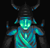
hey offwhite! back again? ;) |
Posted By: Nevercreature
Date Posted: 24 April 2012 at 12:30pm
Bugs are good topic to this challenge... |
Posted By: Maven
Date Posted: 24 April 2012 at 12:31pm
|
Thanks alot for your CC jellybean, I tried to fix most of errors you've precised. And here's the fixed version.  Thanks again for help, and more CC is greatly apperticated ^^. |
Posted By: philippejugnet
Date Posted: 24 April 2012 at 12:33pm
| I guess we posted at the same time guys, 1:30 ROFL |
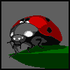
Posted By: AdamPlays
Date Posted: 24 April 2012 at 1:57pm
I did a ladybug too! Still very rough... will keep working on it tomorrow.
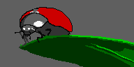
http://www.celticbug.com/Real/HugeBug.jpg - Reference ------------- And now for something completely different... |
Posted By: philippejugnet
Date Posted: 24 April 2012 at 2:17pm
| wait, rules changed, draw ladybugs with microsoft palette... stop imitating someone else's idea! |
Posted By: AdamPlays
Date Posted: 24 April 2012 at 2:19pm
|
I didn't see these WIPs until after I already started. Great minds think alike I guess! ------------- And now for something completely different... |
Posted By: Nevercreature
Date Posted: 24 April 2012 at 2:25pm
|
Mine are not ladybug.
|
Posted By: offwhite
Date Posted: 24 April 2012 at 2:44pm
Ladybug party! To be fair though, I think it's only to be expected that several people go for the ladybug. It is a classical "not particularly big" thing to portray. I say, the more the merrier!  @Colonel_Bracket: Don't give up! It looks like a great start. I don't understand what the red rim on that leaf is, though. @Nevercreature: Nice bugs in the hardware! Love the idea! @philippejugnet: Feels good to be back Nice atmosphere on you pic, but the focus doesn't seem to be on the "not particularly big" thing. |
Posted By: surt
Date Posted: 24 April 2012 at 3:21pm
|
Originally posted by philippejugnet
wait, rules changed, draw ladybugs with microsoft palette... stop imitating someone else's idea!  -------------
|
Posted By: Erstus
Date Posted: 24 April 2012 at 4:42pm

Making water is fun 
|
Posted By: AdamPlays
Date Posted: 24 April 2012 at 4:50pm
Update!
 ------------- And now for something completely different... |
Posted By: philippejugnet
Date Posted: 24 April 2012 at 5:01pm
|
@surt ;)
here is an edit. 
thanks offwhite ;) keep it up buddy! |
Posted By: Colonel_Bracket
Date Posted: 24 April 2012 at 5:56pm

|
Posted By: AdamPlays
Date Posted: 24 April 2012 at 6:23pm
|
yay, more ladybugs! ------------- And now for something completely different... |
Posted By: a3um
Date Posted: 24 April 2012 at 8:54pm
|
@Erstus - I like non-dithered version more :]
wip 
|
Posted By: ultimaodin
Date Posted: 25 April 2012 at 12:24am
|
@Erstus - her pose bothers me diving like that. Try to straighten her line of action a bit so it looks like the pixie girl is actually diving rather than stretching in mid air. @a3um - looking great but what exactly is the small thing we are focusing on? @offwhite - that is nicely pixelled mate. Lots of Ladybug entries it seems @ member_profile.asp?PF=37074&FID=1 - JDaddario - try uploading to a different provider as where you uploaded has caused me issues. @Maven -Looks great! Anyway, so I decided to play blind colour picking to get 8 colours. The pallet actually resulted in a rather simple and effective ramp (although the high saturated pink is proving difficult) and while I was origionally planing on doing a Gecko with this random pallet I decided the Frilled Neck Lizard suited this pallet more so. member_profile.asp?PF=37074&FID=1">  So yeah that's the head thus far, got to do the body/tail section to the (our) left and then clean up any issues I find. ^_^ Before that though, back to writing my oh so riveting essay on multimodal texts. =D Why does only one notification thing come up with the green? O_o ------------- The world is but a shadow of emotion, cast in shades of grey. |
Posted By: a3um
Date Posted: 25 April 2012 at 1:58am
|
@ultimaodin - swarm of spiders coming from the hole:) Hopefully multiple small things are acceptable
Update. Ok, decided to go with a single spider 
Update 2 
|
Posted By: ultimaodin
Date Posted: 25 April 2012 at 3:41am
|
@a3um - much more readable, also a lot more creepy as heck. I hate spiders!!!!!
------------- The world is but a shadow of emotion, cast in shades of grey. |
Posted By: bladeking77
Date Posted: 25 April 2012 at 5:33am
|
Maybe one day I'll be good enough to give useful feedback to others, but until then... Here's a little WIP chicken:  |
Posted By: ultimaodin
Date Posted: 25 April 2012 at 8:28am
@ member_profile.asp?PF=33841&FID=1 - bladeking77
- The wing could be made a little more apparent. Also doesn't really help you but when I looked at your grass I noticed just how some changes in your pallet would result in fire: ^_^ Again serves no purpose aside from being what I consider amusing. @a3um - the lime green is more venom-y ------------- The world is but a shadow of emotion, cast in shades of grey. |
Posted By: Colonel_Bracket
Date Posted: 25 April 2012 at 9:20am
|
Looks great Bladeking! Love how the dither translates into duvet so well.
I'm really sorry about my first post, it was rather self centered. I didn't even tell everyone else how great their WIPs were looking! Thanks for the encouragement, offwhite. Is the aphid readable here? Any suggestions for cutting colours? |
Posted By: reis
Date Posted: 25 April 2012 at 10:56am

Can you help me? ;) |
Posted By: philippejugnet
Date Posted: 25 April 2012 at 12:56pm
|
Well, I had to do something better cause the WIPS here are so great!
here's what I've got so far :) 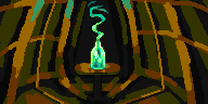
tried to imitate some french architecture but I failed - -' |
Posted By: Erstus
Date Posted: 25 April 2012 at 1:43pm
|
ok, took 12 random colours from the list,
and started a new piece. 
update: 
hmm, black lines did gave some dimension.. i hope i dont need them back. 
Yes! i did manage to restore the form without black lines. Thou i'm still not sure about the purple around the neck.
I try put it under legs as well and see. 
|
Posted By: philippejugnet
Date Posted: 25 April 2012 at 4:18pm
| It looks too much bright to me. You got some low contrast colors. |
Posted By: philippejugnet
Date Posted: 25 April 2012 at 4:32pm
Thanks to the LBPixels for the help and edit :) thats how it is so far.
|
Posted By: Erstus
Date Posted: 25 April 2012 at 5:25pm
|
Originally posted by philippejugnet
It looks too much bright to me. You got some low contrast colors. Thanks, i used brown instead of that purple. And i made black to a transparent color. It might be Ready now. But maybe a shadow? Or was that black as a background better? 
|
Posted By: philippejugnet
Date Posted: 25 April 2012 at 5:30pm
this is what I mean =)

|
Posted By: Erstus
Date Posted: 25 April 2012 at 5:42pm
|
Originally posted by philippejugnet
this is what I mean =) Thank you, i actually would'nt have come to this. That would change my randomly picked colours, but i think a tweak would do good. Since i was focused on working something out of those random colours, i thought you were talking about that line. 
|
Posted By: AdamPlays
Date Posted: 25 April 2012 at 6:10pm
Could use help figuring out what to do with the background (if it needs one), how to color the leaf, and if there is anything wrong with the ladybug itself. I still have 2 colors to spare! ------------- And now for something completely different... |
Posted By: Erstus
Date Posted: 25 April 2012 at 6:56pm

My frog shall sit on a Lily-pad! Well that's not a lily-pad, but i'll make it be one.
(If i have enough time.) |
Posted By: philippejugnet
Date Posted: 26 April 2012 at 10:29am
Little update ;)

|
Posted By: Hapiel
Date Posted: 26 April 2012 at 2:18pm
|
Any great suggestions for improvement or should I just call this finished? Drawing apples while the theme is Microsoft did not seem so funny after all, I should have joined the ladybug fad!  ------------- |
Posted By: Levaunt
Date Posted: 26 April 2012 at 2:37pm
Here's my WIP. Trying to get the scale right so it looks like the goron is normal sized. I feel like the colors might need work as well. |
Posted By: cure
Date Posted: 26 April 2012 at 3:48pm
>>  you should definitely get the sketchpad out and do perspective studies, this is a tricky angle. you should remember that normal proportions no longer matter, you gotta treat him like a sky scraper. as far as the challenge goes though, I gotta say the emphasis is on the largeness of the goron. maybe if the blades of grass were larger it'd let the viewer know that link is really small. |
Posted By: AdamPlays
Date Posted: 26 April 2012 at 5:31pm
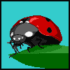
Added a blue for backdrop and a pink for lighting on the bug. Gonna finish dithering tomorrow. ------------- And now for something completely different... |
Posted By: philippejugnet
Date Posted: 26 April 2012 at 6:35pm
Do you think those soldiers are nice?
nice pics you all :) |
Posted By: Nevercreature
Date Posted: 27 April 2012 at 4:52am
|
This challenge is going to be interesting...
Another piece...
 |
Posted By: AirStyle
Date Posted: 27 April 2012 at 8:24am
| Excellent dithering! |
Posted By: ultimaodin
Date Posted: 27 April 2012 at 8:52am
|
@ member_profile.asp?PF=36042&FID=1 - Nevercreature - That's a leap and a half from your last piece. That is looking outstanding!
------------- The world is but a shadow of emotion, cast in shades of grey. |
Posted By: Nevercreature
Date Posted: 27 April 2012 at 10:42am
Thank you! I like to try new techniques. Step by step ... |
Posted By: Colonel_Bracket
Date Posted: 27 April 2012 at 10:49am
|
That, my friend, is some serious amazing.
Edit: 
Got down to 12 colours. ^.^ |
Posted By: ZombieFish
Date Posted: 27 April 2012 at 10:49pm
Just really started this today for the challenge:

I like the idea, but I think it's lacking somewhere. Criticism would be awesome. n_n |
Posted By: ultimaodin
Date Posted: 28 April 2012 at 7:16pm
No matter what I do I can't get this looking correct: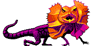 T_T ------------- The world is but a shadow of emotion, cast in shades of grey. |
Posted By: a3um
Date Posted: 28 April 2012 at 9:02pm
@ultimaodin - you drew head and body separately and that is the main problem, IMO. It doesn't have a flow. The legs (especially front) look odd. Here is a quick edit:

|
Posted By: JQWAN
Date Posted: 28 April 2012 at 9:07pm
|
well this is what I have so far, I'm still trying to work with the colors and whatnot but this is tough |
Posted By: thepezman
Date Posted: 28 April 2012 at 11:19pm

I quick whipped up this wip tonight. I know I won't have time to polish it up for a submission, though... Ah, well, it was nice to give the first stages of it a shot :) |
Posted By: JQWAN
Date Posted: 29 April 2012 at 1:49am
mini-update:
|