CHALLENGE 5/21/2012: Steamy Icons
Printed From: Pixel Joint
Category: Pixel Art
Forum Name: Collaborations/Challenges
Forum Discription: Submit pixel art project ideas/templates or contribute to an existing pixel art collaboration.
URL: https://pixeljoint.com/forum/forum_posts.asp?TID=14400
Printed Date: 08 September 2025 at 12:10am
Topic: CHALLENGE 5/21/2012: Steamy Icons
Posted By: administrator
Subject: CHALLENGE 5/21/2012: Steamy Icons
Date Posted: 21 May 2012 at 12:00am

Replies:
Posted By: SturmgewehrKreuz
Date Posted: 21 May 2012 at 12:08am
| does that mean you'll have to come up with a genuine game title? looks fun, gotta try it.:) |
Posted By: skamocore
Date Posted: 21 May 2012 at 12:13am
|
Originally posted by SturmgewehrKreuz does that mean you'll have to come up with a genuine game title? looks fun, gotta try it.:) You definitely should come up with a name for the game (I have yet to come across a icon on Steam that doesn't show the game's name...) ------------- |
Posted By: AngelOTG
Date Posted: 21 May 2012 at 2:21am
| Digging this challenge. I love small canvases. We can enter multiple times, right? |
Posted By: skamocore
Date Posted: 21 May 2012 at 2:22am
|
Originally posted by AngelOTG Digging this challenge. I love small canvases. We can enter multiple times, right? As many times as you like. ------------- |
Posted By: Bam112
Date Posted: 21 May 2012 at 2:50am
Something I started. Feedback?

|
Posted By: AngelOTG
Date Posted: 21 May 2012 at 2:54am
| It would be better if the slimes had rounded bottoms, and maybe a little slime trail behind them. |
Posted By: Bam112
Date Posted: 21 May 2012 at 2:56am
|
Originally posted by AngelOTG
It would be better if the slimes had rounded bottoms, and maybe a little slime trail behind them. I wanted them to be sort of squished into the ground.I'll play around with adding a slime trail. Thanks! |
Posted By: AngelOTG
Date Posted: 21 May 2012 at 3:58am
A couple of ideas I'm batting around. I still haven't decided if I want to do a landscape or something more like a portrait/sprite with an abstract background. My mind is wandering towards a landscape...


|
Posted By: moondrome
Date Posted: 21 May 2012 at 8:18am
| I started a black and white sketch today and I feel the pixel force is strong in this one :) the problem will be adding colors :( |
Posted By: AngelOTG
Date Posted: 21 May 2012 at 8:48am
I don't like how the birds came out, and I'm not sure if I should texture the rocks normally or just add more elements like the vines to give it depth.

|
Posted By: Christoballs
Date Posted: 21 May 2012 at 9:51am
| The red AA is bleeding, I suggest you use a more desaturated colour to AA so that there's less noise. Looking good otherwise! |
Posted By: SturmgewehrKreuz
Date Posted: 21 May 2012 at 11:52am
| uh, this may sound dumb, but how can I post WIP pics? :-( |
Posted By: PixelIvan
Date Posted: 21 May 2012 at 12:26pm
| can i make a diablo 3 title in pixel ? |
Posted By: Reo
Date Posted: 21 May 2012 at 12:59pm
|
Originally posted by PixelIvan
can i make a diablo 3 title in pixel ? No, It must be a new and original title thought up by you. |
Posted By: orange08
Date Posted: 21 May 2012 at 1:17pm
 Here's hoping I can finish this. Any advice appreciated. |
Posted By: Bam112
Date Posted: 21 May 2012 at 2:58pm
Edited it some more:

|
Posted By: coolsarahkry
Date Posted: 21 May 2012 at 5:15pm
|
Originally posted by SturmgewehrKreuz
uh, this may sound dumb, but how can I post WIP pics? :-( You can upload it on imageshack or photoshop, then click the little 'insert image' icon while your posting and link to your art. |
Posted By: AngelOTG
Date Posted: 21 May 2012 at 7:07pm
Update. Reduced the bleeding you pointed out Chris, but I still need to fix the orange color too.

Also need a name for this game, lol. Maybe I should have thought of that before doing the image... :P Edit: Maybe "Genesis: World Builder" |
Posted By: SturmgewehrKreuz
Date Posted: 21 May 2012 at 11:51pm
|
does my work look good?(translation:please comment.) WIP  The title is Mekk Arms 1944( I know what you're thinking: it's lame..). The game is all about a spy sent to investigate (and fight) these fascists with metal arms.(DUH) it's my first time to join a challenge. does the anatomy look good? is my font good?any comments, violent reactions, criticisms, and threats are welcomed. thank ya all. |
Posted By: Mrmo Tarius
Date Posted: 22 May 2012 at 4:48am

Dunno if I'll manage to finish this. I'm kinda fond of the old guy for some reason. |
Posted By: oka
Date Posted: 22 May 2012 at 4:50am
|
Mrmo Tarius- awesome!!
such a cool challenge... |
Posted By: A2J2TIWARI
Date Posted: 22 May 2012 at 5:39am
 This is a WIP. I dunno why but I find my own idea bit weird... Anyways, I am going to name this Skate Trauma. C and C welcome. |
Posted By: Bam112
Date Posted: 22 May 2012 at 5:54am
|
Originally posted by Mrmo Tarius
Dunno if I'll manage to finish this. I'm kinda fond of the old guy for some reason. Nice work. 
|
Posted By: moondrome
Date Posted: 22 May 2012 at 7:22am
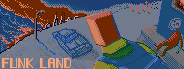
here's my sketch. it's a post-nuclear war, apocalyptic game. 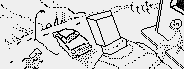

I don't have a title yet... |
Posted By: AirStyle
Date Posted: 22 May 2012 at 9:23am
| Mrmo, have you ever considered working for Nitrome? You kind of have their style. |
Posted By: reis
Date Posted: 22 May 2012 at 11:56am
Starting work, all ideas are welcome!

|
Posted By: SturmgewehrKreuz
Date Posted: 22 May 2012 at 1:03pm
|
Here's another of my creation. WIP  this game is all about panzers! need comments and suggestions please.thanks PJ community. |
Posted By: AngelOTG
Date Posted: 22 May 2012 at 8:26pm
| Since it's about Panzers, maybe add a panzer to the image somewhere? |
Posted By: SturmgewehrKreuz
Date Posted: 22 May 2012 at 8:34pm
|
Originally posted by AngelOTG Since it's about Panzers, maybe add a panzer to the image somewhere? all right. maybe some tank sillhouettes will do.:) |
Posted By: SturmgewehrKreuz
Date Posted: 23 May 2012 at 1:03am
|
Here's another version: WIP (nearly done!)  I cant think of other things to put in this canxas.:( any comments/suggestions?:) |
Posted By: shampoop
Date Posted: 23 May 2012 at 9:50am
| Bullet hole in the metal or a small explosion in the background are two ideas. I realize there isn't a lot of real estate around the label but this is where you could improve your piece. |
Posted By: SturmgewehrKreuz
Date Posted: 23 May 2012 at 11:11am
|
Originally posted by shampoop Bullet hole in the metal or a small explosion in the background are two ideas. I realize there isn't a lot of real estate around the label but this is where you could improve your piece. i'll try... there's still little space, im afraid. still, thanks for the idea! |
Posted By: Blackparade
Date Posted: 23 May 2012 at 4:59pm
|
This is my first pixel art submission, first draft.
WIP 
Comments or suggestions appreciated! Thanks! |
Posted By: reis
Date Posted: 23 May 2012 at 6:58pm

I tried another technique, which will blend more with the name, because soon I'll use this in my next mockup. Tomorrow I'll get the background, and some other details soon! Tips are welcome! :) |
Posted By: SturmgewehrKreuz
Date Posted: 23 May 2012 at 7:07pm
|
Originally posted by Blackparade This is my first pixel art submission, first draft. WIP 
Comments or suggestions appreciated! Thanks! Cool Gibson SG pixel! I think that the title is somewhat too general, too vague.. but this is cool! |
Posted By: AngelOTG
Date Posted: 23 May 2012 at 9:35pm
I have no clue how to make the title not look like crap.

|
Posted By: x-death
Date Posted: 23 May 2012 at 10:50pm
|
Originally posted by AngelOTG I have no clue how to make the title not look like crap. as the first letters of your title go over the lighter colors. it makes it harder to see. but if you notice the "NE" in your title are over the darkest area and they seem to look much better. so this proves in-order to get a better result there needs to be more contrast between the title and the background. |
Posted By: moondrome
Date Posted: 24 May 2012 at 10:17am
skull on the right wall and car on the front may need some work but what you can see right now is near to my final version... I feel I can't add much more to this one |
Posted By: moondrome
Date Posted: 24 May 2012 at 11:04am
|
Originally posted by x-death
Originally posted by AngelOTG as the first letters of your title go over the lighter colors. it makes it harder to see. but if you notice the "NE" in your title are over the darkest area and they seem to look much better. so this proves in-order to get a better result there needs to be more contrast between the title and the background.
I have no clue how to make the title not look like crap. looks really cool, but on my monitor is hard to see the figure standing on the rock. perhaps you could add some more light to him ( after all he is holding a torch) |
Posted By: Arkan85
Date Posted: 24 May 2012 at 12:04pm
|
That's my entry... for a Cthulhu related game... Comments are welcome... |
Posted By: Arkan85
Date Posted: 24 May 2012 at 12:07pm
|
Originally posted by AngelOTG I have no clue how to make the title not look like crap. If you want to make the title more readable you can try to add a small black border around the letters... Great work, however!  |
Posted By: Skoby
Date Posted: 24 May 2012 at 12:42pm
I've still got to come up with a name but heres my entry so far

Going for a Reservoir Dogs/Pulp Fiction feel crime game. Not sure on the street background, I like the brick walls but will probably change the houses and the road. |
Posted By: SJL
Date Posted: 24 May 2012 at 3:39pm
|
Hi im new here :D this is my first post and (obviously) my first challenge entered. Looking at stuff by Mrmo and Angel makes me feel inferior though :P
I call it the Leaning Tower of Pizza Still a WIP 
|
Posted By: SturmgewehrKreuz
Date Posted: 24 May 2012 at 5:40pm
|
Originally posted by SJL Hi im new here :D this is my first post and (obviously) my first challenge entered. Looking at stuff by Mrmo and Angel makes me feel inferior though :P I call it the Leaning Tower of Pizza Still a WIP cool!i also considered doing iso.maybe do the title in iso? |
Posted By: greenmango
Date Posted: 24 May 2012 at 5:52pm
I'm probably gonna do a regular old match three :) Here's my rough sketch of what the banner will look like:

(and yes, my symbols do look suspiciously like mathematical symbols :P) Still no name yet though... |
Posted By: SJL
Date Posted: 24 May 2012 at 7:02pm
|
Originally posted by SturmgewehrKreuz
Originally posted by SJL cool!i also considered doing iso.maybe do the title in iso?Hi im new here :D this is my first post and (obviously) my first challenge entered. Looking at stuff by Mrmo and Angel makes me feel inferior though :P I call it the Leaning Tower of Pizza Still a WIP That was the idea. I'm probably going to spend the rest of tomorrow doing that ha |
Posted By: oka
Date Posted: 25 May 2012 at 4:08am

Sadly, thats basicly all i have- dont know where to take it from this point. only detailed the ends of the sword... edit- 
|
Posted By: EME
Date Posted: 25 May 2012 at 5:11am

Help? |
Posted By: jeremy
Date Posted: 25 May 2012 at 6:06am
| it needs to be a new and original game. |
Posted By: SturmgewehrKreuz
Date Posted: 25 May 2012 at 6:06am
|
Originally posted by EME 
Help? dude, game name must be NEW and ORIGINAL. |
Posted By: EME
Date Posted: 25 May 2012 at 6:17am
|
Originally posted by Jeremy
it needs to be a new and original game. i need create new game? |
Posted By: EME
Date Posted: 25 May 2012 at 7:15am

|
Posted By: SturmgewehrKreuz
Date Posted: 25 May 2012 at 8:48am
|
Yes, you need to create only the title/logo of the game, not necessarily the game itself. In other words, invent! good luck! |
Posted By: EME
Date Posted: 25 May 2012 at 10:38am
|
Originally posted by SturmgewehrKreuz
Yes, you need to create only the title/logo of the game, not necessarily the game itself. In other words, invent!good luck! Thanks i created |
Posted By: SJL
Date Posted: 25 May 2012 at 3:45pm
| Should I keep trying for an isometric logo? Writing out The Leaning Tower of Pizza on such a small canvas is a bit difficult |
Posted By: damicon
Date Posted: 25 May 2012 at 10:00pm
|
Hi pixeljoint-members! This is the my first version of "SUB" the underwater game. What do you think? what could I do better? |
Posted By: VOW
Date Posted: 26 May 2012 at 10:33am
| I just found this site.. was looking at posts at FFH and saw a link to a tutorial from there. These challenges seem like a good way to improve skill in pixel art. Good job on these everyone! |
Posted By: saurion
Date Posted: 26 May 2012 at 11:50am
|
Massive sim game fan
Rough layout before the detail.Want a bubbly sort of text. Could bump the size a couple of pixels before I color it but don't want it to be too weighty. 
Lots of awesome pieces already teasing us, nice works 
|