CHALLENGE 1/21/2013: What Lies Beneath?
Printed From: Pixel Joint
Category: Pixel Art
Forum Name: Collaborations/Challenges
Forum Discription: Submit pixel art project ideas/templates or contribute to an existing pixel art collaboration.
URL: https://pixeljoint.com/forum/forum_posts.asp?TID=15753
Printed Date: 31 December 2025 at 5:45am
Topic: CHALLENGE 1/21/2013: What Lies Beneath?
Posted By: administrator
Subject: CHALLENGE 1/21/2013: What Lies Beneath?
Date Posted: 21 January 2013 at 12:03am
Replies:
Posted By: YellowLime
Date Posted: 21 January 2013 at 1:35am
OK people, let's just agree that most of us are going to pixel some underground bodies 
|
Posted By: Joseki
Date Posted: 21 January 2013 at 2:52am
|
Originally posted by YellowLime
OK people, let's just agree that most of us are going to pixel some underground bodies
This came to my mind when I read the challenge 
|
Posted By: CrimsonPixel
Date Posted: 21 January 2013 at 7:18am
|
Perfect example Joseki! That will serve as a primary point for inspiration. I'm continuing to learn pixel art through this challenges, and let's see what people can come up with. |
Posted By: YellowLime
Date Posted: 22 January 2013 at 1:46am
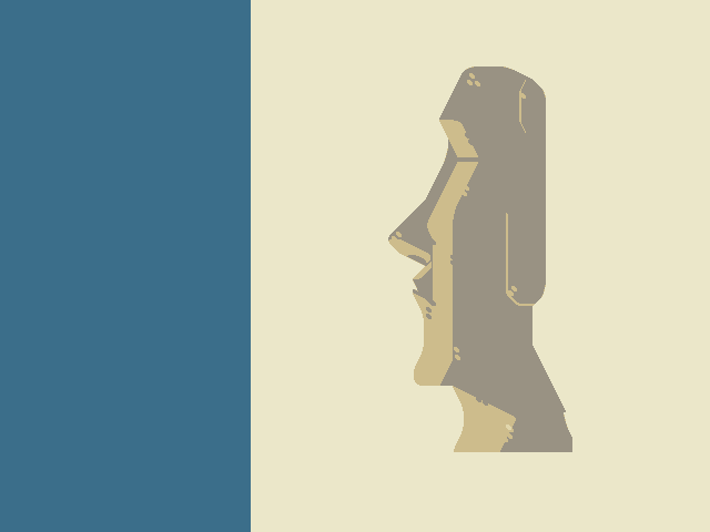
 MOAI DRAWING HOT TIPZ: MOAI DRAWING HOT TIPZ:-The nose is the most prominent feature! It has to be VERY big!! -They lack eyes-- they can't see you!! -The moai heads are very long! They're also like... pin-headed!! -The ears are also long, like Buddha's, but they're not smiling!! -Use photo reference! Especially profile ones!! |
Posted By: Joseki
Date Posted: 22 January 2013 at 1:55am
|
Originally posted by YellowLime
They lack eyes-- they can't see you!! If I manage to find the time to enter the challenge, I'm going to play with this feature. |
Posted By: YellowLime
Date Posted: 22 January 2013 at 3:06am
|
Originally posted by Joseki If I manage to find the time to enter the challenge, I'm going to play with this feature. I really am intrigued as to what you have in mind, so please do! |
Posted By: Mrmo Tarius
Date Posted: 22 January 2013 at 4:27am
I started drawing a Moai statue ;P
|
Posted By: maganegorap
Date Posted: 22 January 2013 at 12:17pm
|
Oh my God,Mrmo, awesome!
I really want to participate, I'll se if i have ideas hahaha 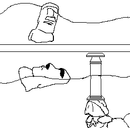
My idea is Atlantis, the legendary lost island hahaha I know it's absurd, but that's my idea. |
Posted By: KRD
Date Posted: 22 January 2013 at 8:37pm
Oh, I think we all know what's really down there... |
Posted By: YellowLime
Date Posted: 22 January 2013 at 11:41pm
|
****!! I swear, I had this idea too! Goes to show how original it really was... But I'm still going through with it!! YOU CANNOT STOP ME!! |
Posted By: Joseki
Date Posted: 23 January 2013 at 12:03am
|
Originally posted by YellowLime
Originally posted by Joseki I really am intrigued as to what you have in mind, so please do! If I manage to find the time to enter the challenge, I'm going to play with this feature.
Unfortunately I won't have time to do what I have in mind due to lot of work and snowboarding weekend  , so I'll just give away my idea for anyone to do it, and maybe do something simpler instead. , so I'll just give away my idea for anyone to do it, and maybe do something simpler instead.
I was thinking... these moai statues are kinda tall, and lot of them are looking toward the ocean... so maybe they could be some kind of lighthouses, with some sort of ancient arcane mechanism under them that project light from eyes. It's up to you guys now, make me proud 
|
Posted By: Mrmo Tarius
Date Posted: 23 January 2013 at 2:53am

|
Posted By: YellowLime
Date Posted: 23 January 2013 at 3:08am
|
Mrmo, you asshole! That is way awesome!
(the back of the neck is broken, though) |
Posted By: Joseki
Date Posted: 23 January 2013 at 3:29am
This is almost finished, just need some polish and cropping of the transparent side. I could need some help with the AA of the moai... any advice?

|
Posted By: Gecimen
Date Posted: 23 January 2013 at 7:18am
| Well for the AA, pick a color that's in the middle value of the 2 colors you're AAing. |
Posted By: ||||
Date Posted: 23 January 2013 at 5:32pm
|
KRD: That is brilliant! I don't think I can enter this one... all my ideas have been perverted. |
Posted By: Pixelart_kid
Date Posted: 24 January 2013 at 10:46am
|
I will participate in this weekly challenge! This is my WIP of my work for the challenge!. My WIP: http://dl.dropbox.com/u/30422420/Moai.png - http://dl.dropbox.com/u/30422420/Moai.png OMG!!! http://www.pixeljoint.com/forum/member_profile.asp?PF=7740&FID=8 - Mrmo Tarius Great work!! |
Posted By: coloringsquared
Date Posted: 25 January 2013 at 6:21am
Ok, here is mine. I also put a coloring sheet to go with it.


|
Posted By: YellowLime
Date Posted: 25 January 2013 at 8:06am
 my wrist is bothering me, so I'm taking it easy |
Posted By: AtskaHeart
Date Posted: 25 January 2013 at 9:42am

Still not sure about the outline of the ground/sky, but this is my wip so far. *Edit: 
|
Posted By: Pixelart_kid
Date Posted: 25 January 2013 at 12:15pm
|
I decided to improve my work, thanks to the advice of the members of the site. Here is a sample of my WIP:  |
Posted By: jalonso
Date Posted: 25 January 2013 at 12:50pm
|
Originally posted by Pixelart_kid
I decided to improve my work, thanks to the advice of the members of the site. Here is a sample of my WIP: You need to be cleaner and more delbarate in your pixels. There is no doubt this is pixelart but its somewhat uncontrolled and sloppy in areas, like the lineart. Be patient. You certainly have been trying and you seem to like to pixel so we want you to continue improving all the time. You will be well served to ask lots of questions, make WIP threads and inspect other's work. Please take special note that we want you here and we want you to improve and in no way am I, or is anyone else coming down on you in a negative way, k. OT: In the last 2 weeks you flooded us with your work and eventually all your pieces had the same issue. You are skipping a lot of simple pixel techniques. You have been banding, throwing pixels around in uncontrolled ways and the lineart almost always seems to have severe weaknesses. This is all simple to improve upon and having some patience will do you good. Quality always trumps quantity. Also note that I reviewed a lot of those flood pieces and just simply had no time to detail and c+c each one so you were a victim of your own flooding the gallery by getting a flood rejection. Perhaps a piece or two would have been added taking your current skill level into account but with so many pieces they all just ran into each other. ------------- |
Posted By: Pixelart_kid
Date Posted: 25 January 2013 at 1:18pm
|
Jalonso thank you very much! I will improve my works and that's thanks to their advice and experience that it is vital for I can improve and hone my skills. PD: Sorry for my poor skill in English too. XD |
Posted By: AtskaHeart
Date Posted: 25 January 2013 at 1:44pm
Hmm, I'm having some trouble with the perspective. I forced a topdown perspective so I could draw some part of the ground, but now the body looks weird.

Not sure what to do in there :S. Shall I create a cave for the body so it's not strange to see the whole body (the other leg), instead of drawing it as if it were buried and surrounded by earth (I'm not sure if I explained myself properly lol). |
Posted By: Pixelart_kid
Date Posted: 25 January 2013 at 2:32pm
And now you say? I'm getting better?. |
Posted By: AtskaHeart
Date Posted: 25 January 2013 at 3:52pm
|
I like the concept and perspective, but I don't understand the light source. Banding is not helping as well. Keep in mind that you are illuminating a rock texture, take some references from digital paintings and/or other pixel art pieces in which you can study several ways to illuminate rocks. Banding is terribad even in small pixel clusters (take your time to work on shading until you get rid of it).
Besides, I would recommend to work on smaller resolutions (shading won't be a pain :p). |
Posted By: Pixelart_kid
Date Posted: 25 January 2013 at 4:11pm
|
Originally posted by AtskaHeart I like the concept and perspective, but I don't understand the light source. Banding is not helping as well. Keep in mind that you are illuminating a rock texture, take some references from digital paintings and/or other pixel art pieces in which you can study several ways to illuminate rocks. Banding is terribad even in small pixel clusters (take your time to work on shading until you get rid of it). Besides, I would recommend to work on smaller resolutions (shading won't be a pain :p). AtskaHeart!! Thank you very much!! All manner of what I'm trying to do is this! (do you think of this?)  |
Posted By: jalonso
Date Posted: 25 January 2013 at 4:36pm
|
@Pixelart_kid, why are you showing a screenshot of your app instead of the actual file output. I'm not sure I can actually see your pixelwork or what actual resolution you are showing. ps: language should not be a problem here. Your English is fine and if you really need some PJers do speak Spanish. ------------- |
Posted By: AtskaHeart
Date Posted: 25 January 2013 at 4:51pm
|
Originally posted by jalonso
Your English is fine and if you really need some PJers do speak Spanish. *raises his hand* I do xD. @Pixelart_kid, I agree with jal, the actual file would be better than a screenshot (we can't actually see the pixels you draw). |
Posted By: Nikonani
Date Posted: 25 January 2013 at 4:51pm
|
Originally posted by Pixelart_kid
The biggest edit you will have to do is a fix on the perspective; the head is at an extreme angle tilt, yet the body is seen almost straight-on, and the ground is seen from yet another conflicting angle. |
Posted By: Pixelart_kid
Date Posted: 25 January 2013 at 4:52pm
|
Originally posted by jalonso @Pixelart_kid, why are you showing a screenshot of your app instead of the actual file output. I'm not sure I can actually see your pixelwork or what actual resolution you are showing. ps: language should not be a problem here. Your English is fine and if you really need some PJers do speak Spanish. Hi Jalonso!! Oh, I thought it would be easier this way, to make a screenshot of my work on the app. Here I leave a complete picture of my work!: (Thank you!!)  |
Posted By: Pixelart_kid
Date Posted: 25 January 2013 at 6:45pm
|
Originally posted by Ashbad Originally posted by Pixelart_kid
The biggest edit you will have to do is a fix on the perspective; the head is at an extreme angle tilt, yet the body is seen almost straight-on, and the ground is seen from yet another conflicting angle. You're absolutely right Ashbad!  |
Posted By: Friend
Date Posted: 25 January 2013 at 7:33pm
|
pixelart kid, you have some crazy bad banding going on. Banding is when you create bands of different colors that line up, either vertical, horizontal, or diagonal. It is a huge pixel art no no. |
Posted By: Nikonani
Date Posted: 25 January 2013 at 9:20pm
|
Originally posted by Pixelart_kid
<span id="result_" ="short_text" lang="en"><span ="hps">You're absolutely right</span><span =""> Ashbad!</span></span> While a non-curved slice of ground makes more sense, given the perspective of the head, no visible ground at all would make more sense. Here's a way to describe how the perspective is working on the head: 
The "vanishing point" is where the end of the head seems to "vanish" towards -- this is a basic concept of perspective; the perspective and angle you chose were interesting, and with proper execution, could look rather cool. However, this is the only part of the piece that conforms to this perspective. 
The body, for example, does not vanish towards this point, even though it would be at the same angle as the head; this makes the piece as a whole a bit confusing to viewers, and kills any feeling of depth. 
This is a quick little sketch (it's past midnight here and I'm too tired to do much more) that (roughly) shows how you could fit the rest of the body to match the perspective set by the head (everything is way larger than the head mostly because I rushed and didn't scale things down to keep some trace of those red lines there; also the arms in the edit don't quite conform as well as they could.) You'll notice I used some quick little guidelines from the vanishing point to help quickly flesh out some forms. If you want to conform the head to the body, however, things would be a lot simpler (and a bit less interesting), since you could settle for a more straight-on head tilt. Some helpful links: http://www.olejarz.com/arted/perspective/ http://www.technologystudent.com/designpro/twopers1.htm http://www.explore-drawing-and-painting.com/3-point-perspective.html (this third link relates to the perspective in your piece in particular) One other large problem is that the light source is inconsistent; you seem to be rim-shading certain areas but not others, and you have a yellowish light source when the sky is purple and there is no trace of a yellowed sun. Keep in mind that perspective is not a "pixel art concept", but one from general art. There are specific skills and techniques needed to produce good-looking pixel art, but other than that, pixel art is in the end, art, but with pixels. Treat it as such by practicing your general art skills, draw a lot, etc., and you'll notice that every single one of your general art advancements will directly aide you in your pixel art pieces. Hope this is of some help. |
Posted By: crozier
Date Posted: 25 January 2013 at 9:41pm
|
Well, here's my shabby attempt. Still a ways away from finishing though.
I don't even know whats gonna be under him :o 
EDIT:(and hes missing ears doh!) |
Posted By: CyberneticMonkey
Date Posted: 26 January 2013 at 6:04am
Hello! I've a small problem, I submitted too quickly this for the challenge : But I decided to edit to add textures, and for a better canevas. ->  And naturally i want to replace my first one with the second for the challenge. It's possible? (And before make the same stupidity, have you some critics?) And i want to thank Jalonso for his commentary. ;) (Sorry for my syntax or my grammar, but i don't be english :3) |
Posted By: AtskaHeart
Date Posted: 26 January 2013 at 6:33am
| Btw, transparency is not allowed :o. |
Posted By: crozier
Date Posted: 26 January 2013 at 7:16am
|
It's looking much better Monkey! But, yes, Ataska is correct. You are not allowed to have transparency for this challenge (that means those corners).
There are a few lines on the moai that are unrefined. The top-left of the statue has a few pixels that form a backwards L shape, which needs fixing, and also his chin looks unrefined. You're clouds could also use for more work, as they are kind of sad looking and small. |
Posted By: CyberneticMonkey
Date Posted: 26 January 2013 at 8:48am
|
Do you analyse each pixel art to see few pixels in excess? Thank you, normally i have corrected this fault.  Is it better? |
Posted By: Gecimen
Date Posted: 26 January 2013 at 8:58am
| looks awesome :) |
Posted By: YellowLime
Date Posted: 27 January 2013 at 3:14pm
The progression GIF of my submission: |
Posted By: Pixelart_kid
Date Posted: 27 January 2013 at 4:27pm
|
Thank you Ashbad and Friend, I will practice more perspectiva and light source. The study of perspective will help me in creating such isometric elements. 
|
Posted By: AtskaHeart
Date Posted: 27 January 2013 at 4:47pm
|
Oh, that wasn't isometric, but a one point perspective projection (Perspectiva cónica)
@CyberneticMonkey, the top left now looks better :P. |