the lute [game]
Printed From: Pixel Joint
Category: Pixel Art
Forum Name: WIP (Work In Progress)
Forum Discription: Get crits and comments on your pixel WIPs and other art too!
URL: https://pixeljoint.com/forum/forum_posts.asp?TID=15963
Printed Date: 12 June 2026 at 8:49am
Topic: the lute [game]
Posted By: sclly
Subject: the lute [game]
Date Posted: 05 March 2013 at 2:59am
|
Instead of opening a new post, I will update this one.
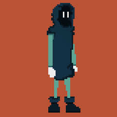
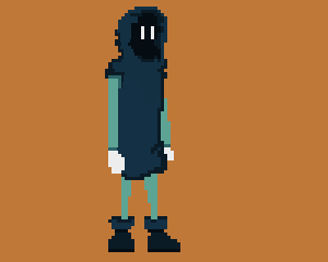
so, here is a shishi-odoshi! 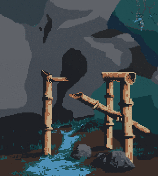
__________________________________________ __________________________________________ Heyho, I'm quite new here. I knew the site for quite some time, but I was never active in pixel art, so I never posted. Since I'm now working on a Video Game with a couple of buddies of mine, and I'm kinda doing the art (the pixel-art), I'll use the opportunity. I won't give away what the game is about, just that it will be a point&click adventure, that's why this perspective. I gave the colors much thoughts, but if you've got any critics, please I sincerly beg you, shout em out! 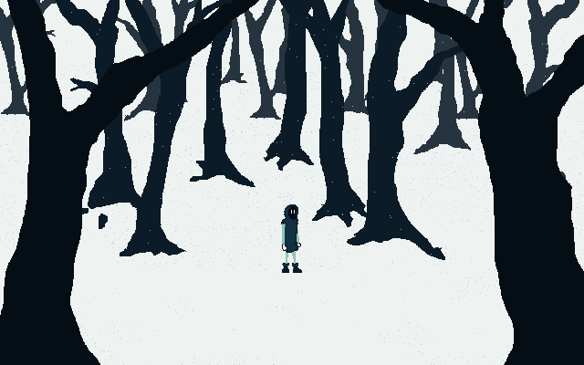
the game won't be on 640x360. It's just the working scale. It will be bigger, but scaled without smoothing, so the hard pixel edges will remain. Thanks a lot! |
Replies:
Posted By: jalonso
Date Posted: 05 March 2013 at 2:30pm
|
You have a nice idea and some good images that I assumed you are in the planning stages still. I see you have submitted 2 (as is) to the gallery. These images are all very Oekaki-ish or maybe sloppy/messy/WIPish pixelart. Some bits show you have skill so use them, k. ------------- |
Posted By: sclly
Date Posted: 06 March 2013 at 1:40am
|
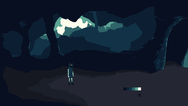
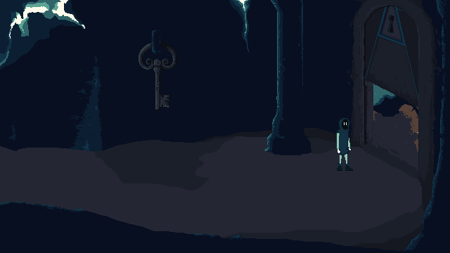
yes, although some of them (the 3 cave-screens) are ready for use, i have no doubt about it - in a month or two i will have to work on them again. I'm kinda trying to find my style.
thx |
Posted By: jalonso
Date Posted: 06 March 2013 at 5:51am
|
Note that I was only mentioning pixelart techniques and actual pixel work and not design, look, style or anything subjective like that. ------------- |
Posted By: sclly
Date Posted: 14 March 2013 at 3:07am
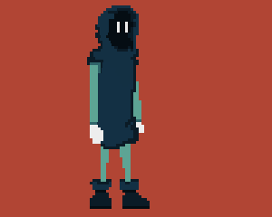
a stand-to-walk and walk animation. 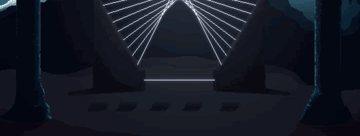
|
Posted By: jalonso
Date Posted: 14 March 2013 at 6:24am
|
You are still being very messy and scrappy :( ------------- |
Posted By: sclly
Date Posted: 14 March 2013 at 6:37am
|
Originally posted by jalonso
You are still being very messy and scrappy :( you probably mean both the animation and the art. yeah, i kinda get what you say. i know it's not easy but: do you have any advice on what parts i should work on? like, if you had to choose what parts would get more detail or more attention, what would they be (what parts would archive the most if they had more details on them, name one or two)? the animation to be smoother? shadowing of the character? textures of the cave? thanks a lot |
Posted By: jalonso
Date Posted: 14 March 2013 at 6:43am
|
None of that. Design, look, style and all that stuff should be unique and original which your project is. I only mean that if you have decided to go with pixelart, then the pixelart should be well pixelled using clean, precise and deliberate pixelling. Here you can cell-shade or use dithering as tools or whatever you end up needing. What you have so far is roughly colored pieces using the pencil tool in what ends up being a scrappy/Oekaki-ish thing:/ This is why your work has been sitting in the gallery queue with very low member voting. It all reads as WIPs. ------------- |
Posted By: gnodab2
Date Posted: 14 March 2013 at 6:47am
|
Originally posted by sclly Originally posted by jalonso
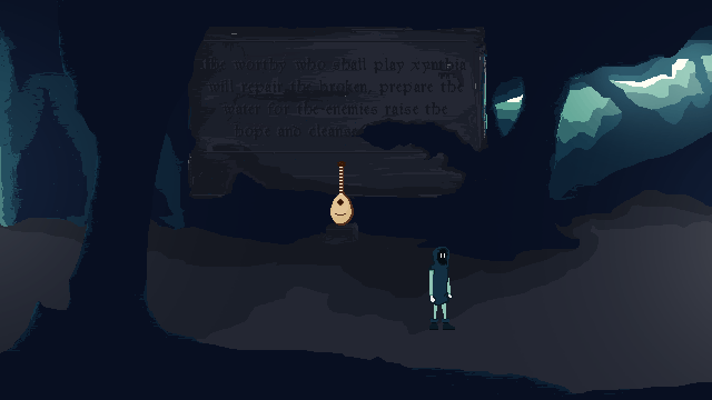
You are still being very messy and scrappy :( you probably mean both the animation and the art. yeah, i kinda get what you say. i know it's not easy but: do you have any advice on what parts i should work on? like, if you had to choose what parts would get more detail or more attention, what would they be? the animation to be smoother? shadowing of the character? texture's of the cave? thanks a lot Heyho... i totally like your cave style this can can be great. here are my critics: I think the walking aniamtion should be reworked. Try this one http://pxlartist.com/forinternet/cycle1.gif - http://pxlartist.com/forinternet/cycle1.gif If you want to do less aniamtionframes try this: http://pxlartist.com/forinternet/cycle2.jpg - http://pxlartist.com/forinternet/cycle2.jpg + I cant read the sign.. the letters are o dark use a blueish one o a medium grey. so keep up the good work! |
Posted By: sclly
Date Posted: 14 March 2013 at 6:48am
|
Originally posted by jalonso
None of that. Design, look, style and all that stuff should be unique and original which your project is.I only mean that if you have decided to go with pixelart, then the pixelart should be well pixelled using clean, precise and deliberate pixelling. Here you can cell-shade or use dithering as tools or whatever you end up needing. What you have so far is roughly colored pieces using the pencil tool in what ends up being a scrappy/Oekaki-ish thing:/This is why your work has been sitting in the gallery queue with very low member voting. It all reads as WIPs. ok, i get what you mean. i'll have to decide whether i'll persue a better pixelart - style or continue with oekaki. |
Posted By: sclly
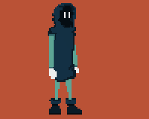
Date Posted: 14 March 2013 at 7:15am
is this one better? i worked in the missing piece. |
Posted By: gnodab2
Date Posted: 14 March 2013 at 7:20am
|
Much better.. I think there si one frame wrong with the leg in the back. The front leg is runnign on 2 Frames when hiting the ground, the backone seems to be 3 Frames. try to delete the Frame 1 before hiting the ground with the backleg =) |
Posted By: sclly
Date Posted: 14 March 2013 at 7:34am
|
Originally posted by gnodab2
Much better.. I think there si one frame wrong with the leg in the back.The front leg is runnign on 2 Frames when hiting the ground, the backone seems to be 3 Frames.try to delete the Frame 1 before hiting the ground with the backleg =) old:
new:
seems a bit better. i'll have to work on it later more =) thanks |
Posted By: gnodab2
Date Posted: 14 March 2013 at 8:26am
|
Originally posted by sclly Originally posted by gnodab2
Much better.. I think there si one frame wrong with the leg in the back.The front leg is runnign on 2 Frames when hiting the ground, the backone seems to be 3 Frames.try to delete the Frame 1 before hiting the ground with the backleg =) old:
new:
seems a bit better. i'll have to work on it later more =) thanks Nice... You're welcome |
Posted By: sclly
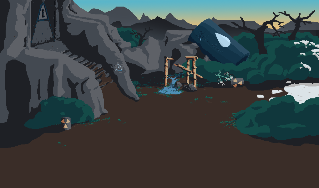
Date Posted: 01 April 2013 at 11:37am
|
A new scene, this one is bigger.
Only the upper half is finished tho.
and an animation
|
Posted By: armteethwow
Date Posted: 01 April 2013 at 7:55pm
|
I think there si one frame wrong with the leg in the back.The front leg
is runnign on 2 Frames when hiting the ground, the backone seems to be 3
Frames.try to delete the Frame 1 before hiting the ground with the
backleg. http://www.arm2teeth.com/ - Buy WOW Gold http://www.arm2teeth.com/ - Cheap WOW Gold |
Posted By: fbepyon
Date Posted: 16 April 2013 at 12:50am
|
This looks like your trying to make a remake or revisit to Loom, which was made back in the days of Lucas games.. I would be careful with your idea, try not to use to much of the same concept... http://en.wikipedia.org/wiki/Loom_%28video_game%29 But it looks okay from what I can see I would agree with the walking animation it seems to be a little choppy needs more frames added.. http://www.idleworm.com/how/anm/02w/walk1.shtml Keep it up though. |
Posted By: Occillo
Date Posted: 17 April 2013 at 4:27pm
| I really like the colour scheme, good job! |
Posted By: millian
Date Posted: 03 June 2013 at 8:53pm
|
Early versions of the super-horror genre, flexible mobile power, high-speed life force set speed, bleeding wound with both the upper level straight, kept vampire with big strokes to get DS block, five seconds out of DS solutions wave of symptoms and so on. Characteristics to be changed only after the weeping tree, but still very fun.
http://www.gw2goldsale.com/news/index-140 - http://www.gw2goldsale.com/news/index-140 |