Robot Factory
Printed From: Pixel Joint
Category: Pixel Art
Forum Name: WIP (Work In Progress)
Forum Discription: Get crits and comments on your pixel WIPs and other art too!
URL: https://pixeljoint.com/forum/forum_posts.asp?TID=16880
Printed Date: 12 September 2025 at 7:55am
Topic: Robot Factory
Posted By: Adcrusher
Subject: Robot Factory
Date Posted: 06 August 2013 at 11:04am
|
Hi everyone! Recently I've been working on a mockup using the http://www.pixeljoint.com/pixelart/79621.htm - sprite I posted earlier here on pixeljoint. http://s520.photobucket.com/user/adcrusher/media/mockup4_zps6034f085.png.html">  The premise of the game is that you are dropped off on a conveyor belt, which leads to a big smasher thing like in megaman x, flame mammoth stage. You have to survive as long as possible while rescuing your robot friends, who are going to be smashed! Any comments or criticism is greatly appreciated! I'll be posting an update soon, so stay tuned! Thanks! P.S ignore the red lightbulb type thing at the top, I was doodling :D |
Replies:
Posted By: buprettyinpink
Date Posted: 07 August 2013 at 12:26pm
| looks nice :) would like to point out though that the bottom looks 100 times more detailed than the top, I assume the rest just isn't finished yet though? |
Posted By: jalonso
Date Posted: 07 August 2013 at 1:32pm
|
Looks nice already. I don't know about the green ramp on the BG. Seems the ambient light shouldn't be green :/ ------------- |
Posted By: Adcrusher
Date Posted: 07 August 2013 at 4:54pm
|
Hey, thanks for the comments guys!I added some detail to the top, and changed the color scheme around a bit. What do you think of it? I think it's an improvement, but I'm not sure. http://s520.photobucket.com/user/adcrusher/media/mockup5_zps7845f8b2.png.html">  Thanks! |
Posted By: jalonso
Date Posted: 08 August 2013 at 6:09am
|
I like the new colors better but I somehow don't get a cyber 'feel' yet. Here are some nice cyper/bot colors that help with 'look and feel' (sorry, links not adding)
http://www.pixeljoint.com/pixelart/59950.htm http://www.pixeljoint.com/pixelart/43377.htm http://www.pixeljoint.com/pixelart/60847.htm As you work on it keep an eye on the scale of anything you place so that the sprites don't end up reading puny. For example, the wood crate seems just slightly too big as do the chains hanging in the BG. The pipes on the right can be big but consider adding some thinner ones to balance things out. The big wheel on the conveyor belt really should be round, no? ------------- |
Posted By: Adcrusher
Date Posted: 14 August 2013 at 4:19pm
|
Update! I did an edit on the smasher thing, but it's too busy right now, or something. I'm not quite sure what's wrong with it, I think i need to give it a different color scheme. Right now it kind of blends into the background, and some parts are impossible to see. http://s520.photobucket.com/user/adcrusher/media/mockup5_zps77f49d2e.png.html"> 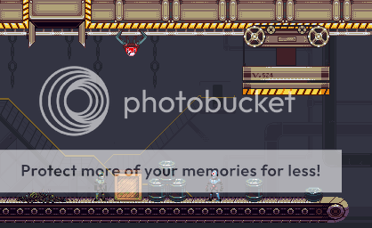 Here it is with a white background, and a small wheel turning animation http://s520.photobucket.com/user/adcrusher/media/smasher_zps18acbe77.gif.html">  I have the game in a semi-playable state. You can try it out https://dl.dropboxusercontent.com/u/1579152/New%20folder/index.html - HERE ! There's a lot of place holder graphics, sorry about that. Press X to jump and hold down and press X to slide (no sliding animation yet, sorry!) Thanks! |
Posted By: Xhukari
Date Posted: 14 August 2013 at 4:41pm
|
Yeah I see what you mean about the smasher, I didn't even see the cables until you posted the one on the white background! I like the look of the game a lot though, it is nicely animated.
I think your issue with the smasher IS what you thought it was; that it blends too much, a different colour scheme would help wonders I feel, plus I think part the issue is the angle of the smasher; you can see a bit of the top of the objects, but not the smasher. My other issue is the game itself; please fix the hit boxes! The projectile if they hit at say, the top right corner, doesn't actually actually *hit* the player, but rather what I assume to be the bounding box around the sprite. I'm not sure how you would fix that in GameMaker, however... |
Posted By: Adcrusher
Date Posted: 14 August 2013 at 6:12pm
|
Thanks for your reply! I'll give it a new color scheme on my next update. I agree, the hitboxes are probably a bit off. I used game maker, but I coded the whole thing as opposed to using drag and drop. I should be able to change the hit boxes very easily. Thanks! |