CHALLENGE 12/2/2013: When Gods Collide
Printed From: Pixel Joint
Category: Pixel Art
Forum Name: Collaborations/Challenges
Forum Discription: Submit pixel art project ideas/templates or contribute to an existing pixel art collaboration.
URL: https://pixeljoint.com/forum/forum_posts.asp?TID=17578
Printed Date: 07 September 2025 at 5:12am
Topic: CHALLENGE 12/2/2013: When Gods Collide
Posted By: administrator
Subject: CHALLENGE 12/2/2013: When Gods Collide
Date Posted: 02 December 2013 at 12:00am
Replies:
Posted By: Mrmo Tarius
Date Posted: 02 December 2013 at 4:52am
|
I love these unrestricted canvas challenges, makes the overuse of simple tiles possible :D
Here's Anubis! 
|
Posted By: Nokuru
Date Posted: 02 December 2013 at 1:08pm

Ra vs Odin. good enough? [edit] i only used 11 colors. do i need to use *exactly* 14? |
Posted By: jalonso
Date Posted: 02 December 2013 at 1:30pm
|
Originally posted by Mrmo Tarius
I love these unrestricted canvas challenges I hate these unrestricted canvas challenges *Just leveling the balance of the Universe* ------------- |
Posted By: jalonso
Date Posted: 02 December 2013 at 1:32pm
|
Originally posted by Nokuru
Ra vs Odin. good enough? [edit] i only used 11 coors. do i need to use *exactly* 14? In PJ challenges 'max' means the most colors you can use so this week you can use less. When a challenge must use a certain amount then no 'max' is used. ------------- |
Posted By: Nokuru
Date Posted: 02 December 2013 at 1:39pm
| oh. i suppose someone could give some advice? or at least say its good enough to be submitted. its my second work to be posted here, so, im a bit insecure. :s |
Posted By: philippejugnet
Date Posted: 02 December 2013 at 2:08pm
| stupid question nvm ;) |
Posted By: Nokuru
Date Posted: 02 December 2013 at 3:58pm
|
UPDATE:
since i had 3 more colors to use, i decided to update this and make small adjustments. criticism please. 
|
Posted By: Gecimen
Date Posted: 02 December 2013 at 5:00pm
|
@Nokuru; the background is overdithered. It makes the characters less visible. Your characters can use some darker colors. That OR the background could be darker. Anyways it's good enough to be submitted, but it can be better. |
Posted By: AirStyle
Date Posted: 02 December 2013 at 5:14pm
| @Nokuru: If I were you, I would probably make the canvas a little bigger. At this size, it's hard to tell what characters you're trying to portray. I know it's a little daunting to make a large, or well, larger, piece, but this one may be calling for that. |
Posted By: adamSrgnt
Date Posted: 02 December 2013 at 8:17pm
I have my basic idea, but I'm not sure what I want for a background yet. |
Posted By: Mrmo Tarius
Date Posted: 03 December 2013 at 1:10am
Another wip... this one has no tiles :D

*edit* further refined and antialiased :P |
Posted By: Muxaun
Date Posted: 03 December 2013 at 1:27am
|
Originally posted by Mrmo Tarius
Another wip... this one has no tiles :D Are you going to enter twice? The second version looks more interesting.
Anubis is definitely the coolest God! I bet most pieces will be about him.
|
Posted By: Nokuru
Date Posted: 03 December 2013 at 6:57am
| i have a question. can i submit more than once for the challenge? because if i can ill submit this one and make another... |
Posted By: Muxaun
Date Posted: 03 December 2013 at 7:31am
|
Originally posted by Nokuru
i have a question. can i submit more than once for the challenge? because if i can ill submit this one and make another... Yes, you can.
|
Posted By: Mrmo Tarius
Date Posted: 03 December 2013 at 7:32am
|
As far as I know, the weekly challenges have always allowed multiple entries!
Philippe even managed to get all top three awards once, now THAT was amazing :D *edit* also no, I will only be submitting the second one, assuming I have the time to actually finish it :) |
Posted By: Eggy
Date Posted: 03 December 2013 at 9:21am
| I'm planning to join on this one, if I manage to make my entry in time... And it's gonna involve Zeus and Anubis. And something other than a fight/battle :P |
Posted By: Nokuru
Date Posted: 03 December 2013 at 11:20am
here's a wip on my new piece. this is ra. criticism is welcome. 
|
Posted By: Drazelic
Date Posted: 03 December 2013 at 12:14pm
| No Japanese or Chinese gods? I am rather disappointed. |
Posted By: Gecimen
Date Posted: 03 December 2013 at 12:27pm
|
Originally posted by Drazelic No Japanese or Chinese gods? I am rather disappointed. We put this limit in order to prevent a religion-bashing campaign (and it has nothing to do with our religious views, believe it or not). So, as long as you address relatively inactive deities, it's ok. It's just that I have no clue if these Japanese or Chinese gods are still being commonly worshipped. Originally posted by Nokuru
here's a wip on my new piece. this is ra. criticism is welcome. Overall it's good. If I were you I'd use a strong dark color in shaded places, such as armpits. |
Posted By: Mrmo Tarius
Date Posted: 03 December 2013 at 1:33pm
| So... ancient Aztec/Inca/Maya deities are ok? Cause I had an awesome god of death opponent for Anubis :D |
Posted By: jalonso
Date Posted: 03 December 2013 at 2:13pm
|
Any diety is fine, imo. Just be careful/sensitive if still worshipped. ------------- |
Posted By: adamSrgnt
Date Posted: 03 December 2013 at 2:15pm
| I hope to see at least one Quetzalcoatl. I'm not sure if I can pull it off. It's general depicted pretty colorfully too. |
Posted By: Muxaun
Date Posted: 03 December 2013 at 2:51pm
Anubis doodle.  Want to make Poseidon to oppose him. Maybe I have to reduce the size. I have to do something to make it clear that his left arm was intentionally made too big and it is not a problem with perspective. Want to make Poseidon to oppose him. Maybe I have to reduce the size. I have to do something to make it clear that his left arm was intentionally made too big and it is not a problem with perspective.
UPDATE  It is too huge. and it looks bad ((( Even though it is just a sketch.
I'll mess with it a little more, but it looks like I'd better get another idea for this piece.
|
Posted By: jalonso
Date Posted: 03 December 2013 at 4:43pm
|
Originally posted by Muxaun
...I have to do something to make it clear that his left arm was intentionally made too big and it is not a problem with perspective. Use ground shadow to ground in place :) ------------- |
Posted By: a3um
Date Posted: 04 December 2013 at 3:53am
Tlalok and Poseidon:)

|
Posted By: Thu
Date Posted: 04 December 2013 at 7:51am

|
Posted By: jalonso
Date Posted: 04 December 2013 at 8:31am
|
Originally posted by Muxaun
Anubis doodle. Want to make Poseidon to oppose him. Maybe I have to reduce the size. I have to do something to make it clear that his left arm was intentionally made too big and it is not a problem with perspective.
UPDATE It is too huge. and it looks bad ((( Even though it is just a sketch.
I'll mess with it a little more, but it looks like I'd better get another idea for this piece. Update is too much and doesn't forward the story at all. The first rough is awesome and graphic as it is and instead of the light hitting head on as it is I think if you light from the top it will solve you 'big hand' problem as the shadows would be straight down thus reading as a large hand. Just my opinion of course that what you need here is editing and thinking as a graphic instead of a scene. ------------- |
Posted By: Nokuru
Date Posted: 04 December 2013 at 8:47am
i think this one is pretty much done.. anyone think otherwise?

================================================= animated just for the fun of it 
http://i.imgur.com/wwjTDkM.gif |
Posted By: Muxaun
Date Posted: 04 December 2013 at 9:51am
|
Originally posted by jalonso
Update is too much and doesn't forward the story at all. The first rough is awesome and graphic as it is and instead of the light hitting head on as it is I think if you light from the top it will solve you 'big hand' problem as the shadows would be straight down thus reading as a large hand. Just my opinion of course that what you need here is editing and thinking as a graphic instead of a scene. You're so totally right! Yeah, the graphic was the first priority for me, but I got distracted by the environment. Thanks! You're saving me again. @Nokuru consider increasing the contrast in your picture. 
|
Posted By: Nokuru
Date Posted: 04 December 2013 at 10:01am
|
Originally posted by Muxaun
Originally posted by jalonso
Update is too much and doesn't forward the story at all. The first rough is awesome and graphic as it is and instead of the light hitting head on as it is I think if you light from the top it will solve you 'big hand' problem as the shadows would be straight down thus reading as a large hand. Just my opinion of course that what you need here is editing and thinking as a graphic instead of a scene. You're so totally right! Yeah, the graphic was the first priority for me, but I got distracted by the environment. Thanks! You're saving me again. @Nokuru consider increasing the contrast in your picture. how can i do that without adding more colors or losing detail? a lot of this is already very high in contrast. i'm kind of a noob you know.. |
Posted By: Dastal
Date Posted: 04 December 2013 at 12:16pm
|
Originally posted by a3um
Tlalok and Poseidon:) Oh an Aztec god,nice. This duo sound interesting! ------------------ Got an other retarded idea for this challenge. but I dont have yet idea for the character. 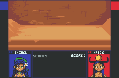
|
Posted By: Muxaun
Date Posted: 04 December 2013 at 12:26pm
|
Originally posted by Nokuru
how can i do that without adding more colors or losing detail? a lot of this is already very high in contrast. i'm kind of a noob you know.. You can make dark colors darker and light colors lighter. But follow your own feelings of what is good. |
Posted By: jalonso
Date Posted: 04 December 2013 at 12:29pm
|
Originally posted by Nokuru
...how can i do that without adding more colors or losing detail? a lot of this is already very high in contrast. i'm kind of a noob you know.. This is called palette unfication and/or development. You choose shades and tweak them individually until the palette is unified. You current palette is not that good on contrast, k. Understand that a palette is not solely judged on its own all the time you have to see it in action too. Color in pixelart takes some time so keep at it. ------------- |
Posted By: jalonso
Date Posted: 04 December 2013 at 12:31pm
|
@dastal, I like your fighter game idea. ------------- |
Posted By: Myleo
Date Posted: 04 December 2013 at 2:32pm
 Odin's wolf and crow Odin's wolf and crow |
Posted By: a3um
Date Posted: 04 December 2013 at 10:10pm
|
Originally posted by Myleo
Odin's wolf and crow I don't think they can be considered as "gods" also, update:  
update 3 
|
Posted By: Muxaun
Date Posted: 05 December 2013 at 6:25am
|
Originally posted by a3um
this is so incredibly awesome that I cannot look at my piece anymore :).
also, update: IMO Poseidon looks better on the left version due to more natural pose and colors.
|
Posted By: Gecimen
Date Posted: 05 December 2013 at 6:56am
|
Originally posted by Muxaun this is so incredibly awesome that I cannot look at my piece anymore :). IMO Poseidon looks better on the left version due to more natural pose and colors. Actually I like your piece a lot with the background. You just have a lot of polishing work to do for a few days. I think you could somehow simplify the piece by darkening most of the outer regions or something. |
Posted By: skittle
Date Posted: 05 December 2013 at 7:13am
| These pieces are just stunning! You guys are gonna make voting really hard. |
Posted By: Muxaun
Date Posted: 05 December 2013 at 11:52am
|
I redid colors entirely and changed the water.
Something needs to be done with the contrast. And the left hand will be redrawn for sure. 
Still didn't even try to polish anything. I guess it will take forever. |
Posted By: Dastal
Date Posted: 05 December 2013 at 2:14pm
|
A lot of good entrie here.
I wish Mrmotarius will finish his work, the style is very interesting. Btw here's an update of my piece. So yes its a battle mock up, but a dance battle huhu. 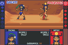
I don't know if I have to add an audience (like paper mario 2)or not. |
Posted By: Daimoth
Date Posted: 05 December 2013 at 2:26pm
| Hm, I'm having a hard time reading Hator's boob properly. I think it's supposed to be the bottom of her golden bra, but it looks like a crease. Still love the entry, though. |
Posted By: jalonso
Date Posted: 05 December 2013 at 2:46pm
|
Originally posted by Dastal
A lot of good entrie here. I wish Mrmotarius will finish his work, the style is very interesting. Btw here's an update of my piece. So yes its a battle mock up, but a dance battle huhu.
I don't know if I have to add an audience (like paper mario 2)or not. To better read as a music/dance battle add and highlight some kind of music icon somewhere. ------------- |
Posted By: Janiskeisari
Date Posted: 06 December 2013 at 12:40am
|
You guys are making so awesome work I almost gave up with mine. But then again, I'm just a beginner so I'll take this as a good training.
My entry will be about the battle of the gods of love - Freya vs Isis. |
Posted By: Muxaun
Date Posted: 06 December 2013 at 4:31pm
reworked my piece entirely.

It is still a subject for huge changes. I feel the palette needs to be more diverse, but I don't know where to add new colors. |
Posted By: skittle
Date Posted: 06 December 2013 at 6:41pm
|
Originally posted by Muxaun
reworked my piece entirely.
It is still a subject for huge changes. I feel the palette needs to be more diverse, but I don't know where to add new colors. This piece makes me feel uneasy :P. Its pretty great so far though! |
Posted By: Corpsegrinder
Date Posted: 07 December 2013 at 2:30am
This is the rough sketch for the piece that i was gonna make. However, since i am new to pixel art, i failed and i don't have much time anyway due to college. Thought I'd Share it anyway. this is just the idea (pencil sketch) |
Posted By: Fily
Date Posted: 07 December 2013 at 2:49am

Looking awesome as usual everyone! Corpsegrinder I did chess too! but at the retirement home with an ageing Odin vs Gaea, pretty heated. Need some last minute direction. Does the composition work? Can you read the characters? Is it too dark? Should I increase contrast? Have I used the colours correctly (I edited a Bigbrother palette but I don't know if I've used it right - cheers for the inspirational work) Any other niggles or bad pixel technique? How do I make the vines not look like tentacles? I think I'll need to go dig out some pixel references for that - any suggestions I'm thinking of adding detail on the furniture so it won't look so boring. -sorry for the outsource/ if the link doesn't work and thanks in advance for any feedback xx |
Posted By: Muxaun
Date Posted: 07 December 2013 at 3:04am
|
Originally posted by Fily
Looking awesome as usual everyone! Corpsegrinder I did chess too! but at the retirement home with an ageing Odin vs Gaea, pretty heated. Need some last minute direction. Does the composition work? Can you read the characters? Is it too dark? Should I increase contrast? Have I used the colours correctly (I edited a Bigbrother palette but I don't know if I've used it right - cheers for the inspirational work) Any other niggles or bad pixel technique? How do I make the vines not look like tentacles? I think I'll need to go dig out some pixel references for that - any suggestions I'm thinking of adding detail on the furniture so it won't look so boring. -sorry for the outsource/ if the link doesn't work and thanks in advance for any feedback xx problems I see: - the wall behind them does not read well. At first I thougt it is a window. The picture here is just a noise. You could actually place a window here. the space between them shall not be cluttered with objects - it makes the piece look too cramped. - these guys do drop shadow to the floor, but not to the chairs. - To make the vine not look like tentacle you can add leaves. Also the vine is more like a DNA spiral, not flat spiral. Also the vine's thickness changes very smoothly. |
Posted By: AlabasterJazz
Date Posted: 07 December 2013 at 8:35am
|
Originally posted by Muxaun
I redid colors entirely and changed the water. Something needs to be done with the contrast. And the left hand will be redrawn for sure.
Still didn't even try to polish anything. I guess it will take forever. PLEASE continue work on this piece, even if there's not enough time to get it done before the voting. In my opinion it has enough potential to get faved and voted to the hall of fame in it's own right, as long as it's polished to it's inevitable potential - Also I like this version much more than the newest render, Anubis' pose and "Godliness" just seem more impressive to me here - PS I love that left hand & don't see the need to redraw it at all ;p Great work to all so far, voting is going to be tough as hell for this one :) |
Posted By: Muxaun
Date Posted: 07 December 2013 at 9:23am
|
Originally posted by AlabasterJazz
PLEASE continue work on this piece, even if there's not enough time to get it done before the voting. In my opinion it has enough potential to get faved and voted to the hall of fame in it's own right, as long as it's polished to it's inevitable potential - Also I like this version much more than the newest render, Anubis' pose and "Godliness" just seem more impressive to me here - PS I love that left hand & don't see the need to redraw it at all ;p Great work to all so far, voting is going to be tough as hell for this one :) I have no time to finish the piece as it was. actually it doesn't work with all the waves. The initial version best looks with an empty ground or chasm in front of Anubis, but it will not suit the challenge theme well enough. Maybe I will finish it one day, but truth is I cannot work without time limit. Will something like this satisfy you? 
|
Posted By: Fily
Date Posted: 09 December 2013 at 12:00am
Much appreciated Muxaun!!! I tried to apply what you said but there are still some issues with it. Any further feedback would be great as I've clearly got lots to learn.

|