3D font - Trouble with G
Printed From: Pixel Joint
Category: Pixel Art
Forum Name: WIP (Work In Progress)
Forum Discription: Get crits and comments on your pixel WIPs and other art too!
URL: https://pixeljoint.com/forum/forum_posts.asp?TID=18004
Printed Date: 11 September 2025 at 10:54pm
Topic: 3D font - Trouble with G
Posted By: Rayovatron
Subject: 3D font - Trouble with G
Date Posted: 14 January 2014 at 11:16am
|
I'm working on a 3d font for a banner and I'm having a hard time with the letter G.
I used a 3 pixel vertical per 1 pixel horizontal angle for E,M and A I dont want to use curve lines, but right now the G looks weird. Can someone help me please 
http://s1179.photobucket.com/user/Rayovatron/media/WIP_zpsb92a2830.png.html"> 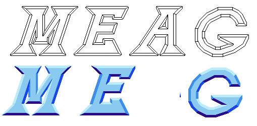
|
Replies:
Posted By: skittle
Date Posted: 14 January 2014 at 11:39am
| I don't know how beneficial this advice will be but I think that adding AA would really make things looks nicer. Especially on the G since it's so curvy. |
Posted By: Noburo
Date Posted: 14 January 2014 at 11:43am
| One thing that could be done is to scrap the current rounded style of the G, and go with a boxier form. Kind of like what was used in the http://cdnl.complex.com/m.php/CHANNEL_IMAGES/VIDEO_GAMES/2013/11/best-megaman-2d-games/lugbf_15megaman7_782939.jpg - Mega Man 7 box art logo. |
Posted By: r1k
Date Posted: 14 January 2014 at 3:13pm
|
ya make the G more rectangular, or octaginal, like in the megaman X logo http://static.tumblr.com/ziyrfda/8pWlhio3x/mega_man_x_logo_final.jpg - http://static.tumblr.com/ziyrfda/8pWlhio3x/mega_man_x_logo_final.jpg |
Posted By: Rayovatron
Date Posted: 14 January 2014 at 4:51pm
|
I went for the octo g. Not the final version but i'm satisfied.
Thanks guys http://s1179.photobucket.com/user/Rayovatron/media/WIP2_zpsf3fc75e4.png.html"> 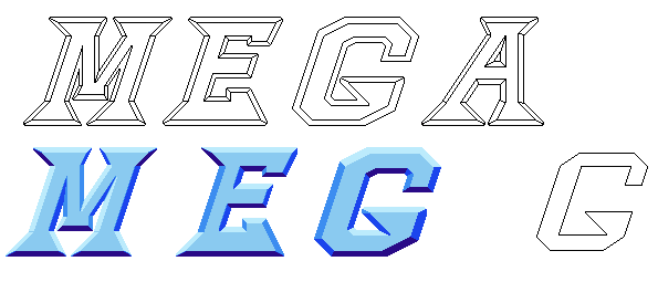
|