Knight old art remake
Printed From: Pixel Joint
Category: Pixel Art
Forum Name: WIP (Work In Progress)
Forum Discription: Get crits and comments on your pixel WIPs and other art too!
URL: https://pixeljoint.com/forum/forum_posts.asp?TID=19003
Printed Date: 12 September 2025 at 9:41pm
Topic: Knight old art remake
Posted By: Alex Pang
Subject: Knight old art remake
Date Posted: 01 June 2014 at 5:10am
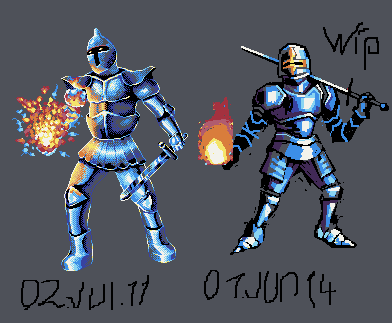
Just remaking this one to see what progress I've made. right now just messing with values and design later I will make sure the anatomy and proportions are correct right now they aren't. If you have any suggestions or critique. Post it here :) |
Replies:
Posted By: DawnBringer
Date Posted: 01 June 2014 at 6:43am
| Sadly your calligraphy doesn't seem to have improved as much as the rest ;) |
Posted By: Alex Pang
Date Posted: 01 June 2014 at 7:22am
|
Originally posted by DawnBringer
Sadly your calligraphy doesn't seem to have improved as much as the rest ;) Yes I should take a mousepad calligraphy course :P 
|
Posted By: FrostPumpkin
Date Posted: 01 June 2014 at 10:43am
|
Hey Alex ! Great improvement so far, the only critic I have to make is about anatomy : The legs are way too short.
I also liked the light coming from the fire power thing. I made an edit, I'm certainly not the best anatomy teacher but I think it's better 
|
Posted By: Alex Pang
Date Posted: 01 June 2014 at 2:23pm
|
Daaarn that looks great!
working on the issue! Not great yet, and the shading is half done. In fact I probably will need too google some reference. But your edit is a great guide, thank you! Will do a more complete version quite soon :) 
|
Posted By: Limes
Date Posted: 03 June 2014 at 9:34am
| Never really understood the blocking style... I have always used Line work first. |
Posted By: FrostPumpkin
Date Posted: 03 June 2014 at 10:24am
This is better ! Don't forget to think about the pose and the impression it gives. Here's a part of Arne's great tutorial about mostly everything, this section talks about pose

I think your pose needs to have strong lines, like in the image above. It will help showing how solid and strong and solid this knight is cause for now it looks quite unbalanced. Also, here's a link to the complete tutorial if you didn't get the chance to see it yet, very full of useful informations and examples http://androidarts.com/art_tut.htm - http://androidarts.com/art_tut.htm In this you will also find some examples of rendering metal and reflections. |
Posted By: H|F
Date Posted: 12 June 2014 at 2:20am
|
I think both knees turned outward makes it look very strange. I would suggest to make a few separate sketches to play around with the posing. Remember full armour doesn't allow for some poses also.
|