CHALLENGE 7/14/2014: All in One Canvas
Printed From: Pixel Joint
Category: Pixel Art
Forum Name: Collaborations/Challenges
Forum Discription: Submit pixel art project ideas/templates or contribute to an existing pixel art collaboration.
URL: https://pixeljoint.com/forum/forum_posts.asp?TID=19322
Printed Date: 31 December 2025 at 3:53am
Topic: CHALLENGE 7/14/2014: All in One Canvas
Posted By: administrator
Subject: CHALLENGE 7/14/2014: All in One Canvas
Date Posted: 14 July 2014 at 12:11am

Replies:
Posted By: Mrmo Tarius
Date Posted: 14 July 2014 at 1:13am
So, this happened. Yeah.

update update aaaaa |
Posted By: WickedCake
Date Posted: 14 July 2014 at 1:53am

Thought I'd get in on the fun. |
Posted By: WickedCake
Date Posted: 14 July 2014 at 1:54am
|
Originally posted by Mrmo Tarius
So, this happened. Yeah.  Plagiarism is scary 
|
Posted By: felchqueen
Date Posted: 14 July 2014 at 3:22am
I was going to do a German eagle, but why just do (my most hated) feathers when I can throw flames into the mix Can any of you pallete gurus advise on what other colours to introduce should I be looking for AA colours between yellow and black and red and black? is the white too white? Ignore the grey this was just my background colour.  @ Mandrill thanks for the advice was going to go for a reddish brown, but didn't think of purple. Falmes are hard and I'm not liking how it's coming out, perhaps I should have tried something more stylised? Anyhoo must crack on |
Posted By: Mandrill
Date Posted: 14 July 2014 at 4:54am
|
Originally posted by felchqueen
I was going to do a German eagle, but why just do (my most hated) feathers when I can throw flames into the mix Can any of you pallete gurus advise on what other colours to introduce should I be looking for AA colours between yellow and black and red and black? is the white too white? Ignore the grey this was just my background colour. @ Felch Looking good :P I would go with these colours if I wanted to do a bird in red and yellow against a black backround. They are good for both, AA and shading. Not that "flamy" though...  |
Posted By: Juniorps
Date Posted: 14 July 2014 at 6:08am
hahahaha

|
Posted By: Daimoth
Date Posted: 14 July 2014 at 6:16am
|
Originally posted by Mrmo Tarius
So, this happened. Yeah.
update update aaaaa Reads PLACIARISM |
Posted By: AshCrimson
Date Posted: 14 July 2014 at 7:25am
So uh, here's my bad attempt at doing a piece for a challenge (for the first time ever): |
Posted By: Mrmo Tarius
Date Posted: 14 July 2014 at 7:31am

oh god what have I done |
Posted By: felchqueen
Date Posted: 14 July 2014 at 7:38am
|
@AshCrimson, you can have 3 more colours so you could look to AA this piece, also the text could be embellished a little. the M and sharp S or whatever it's called (SS in Fussball) could be improved. Edit: Doh just zoomed in and can see that you have got the other colours in there. |
Posted By: AshCrimson
Date Posted: 14 July 2014 at 8:19am
|
Originally posted by felchqueen @AshCrimson, you can have 3 more colours so you could look to AA this piece, also the text could be embellished a little. the M and sharp S or whatever it's called (SS in Fussball) could be improved. Edit: Doh just zoomed in and can see that you have got the other colours in there. Thanks for the advice, tried to spruce up the letters and make them look less boring:  |
Posted By: jalonso
Date Posted: 14 July 2014 at 8:46am
|
Originally posted by AshCrimson
So uh, here's my bad attempt at doing a piece for a challenge (for the first time ever): Me thinks, this is below your skill and capabilities both in technique and design :/ ------------- |
Posted By: AshCrimson
Date Posted: 14 July 2014 at 9:18am
| It was just a quick attempt, i will probably end up changing it most likely. |
Posted By: jalonso
Date Posted: 14 July 2014 at 9:23am
|
Originally posted by AshCrimson
It was just a quick attempt, i will probably end up changing it most likely. Great, because if not I'll send it back for revision...most likely  ------------- |
Posted By: Eggy
Date Posted: 14 July 2014 at 12:11pm
I'm joining for sure. Here's my (possibly nightmare worthy) entry I plan to enter.

Decided to go for something creepy. It's not done yet, though; I want to animate it. |
Posted By: Meapers
Date Posted: 14 July 2014 at 12:46pm
Current wip, pretty messy right now.

Update1: 
Update2: 
Update3: 
Update4(final): 
|
Posted By: Skoby
Date Posted: 14 July 2014 at 2:29pm
|
Very basic at the moment, not sure whether to go for a biker cruising down the highway or a hotrod
edit: might help if I post the pic 
|
Posted By: jalonso
Date Posted: 14 July 2014 at 2:38pm
|
Originally posted by Meapers
Current wip, pretty messy right now.
Update1: Canvas Size - Exactly 200 (width) x 120 (height) You have 100 height. ------------- |
Posted By: Meapers
Date Posted: 14 July 2014 at 2:42pm
| Oops. Haha, thought it said 100 height, oh well not that big of a problem to change. |
Posted By: Whisper Heart
Date Posted: 14 July 2014 at 3:13pm
wiP
|
Posted By: felchqueen
Date Posted: 14 July 2014 at 3:14pm
| @Skoby, it's got that Queens of the Stone Age vibe, just a suggestion. :) |
Posted By: Limes
Date Posted: 14 July 2014 at 9:11pm

I am doing a german history mural. Going to be a sh*t ton of work to get this done in a week. |
Posted By: Skoby
Date Posted: 15 July 2014 at 12:30am
| @feltch, I originally was looking at the Rancid-Indestructable cover but it got me thinking about Queens of the stone age. It really fascinates me what ideas some people on here get to these challenges. No idea how your imagination got to that piece from this pallete @mrmo |
Posted By: Drazile
Date Posted: 15 July 2014 at 1:41am

Early WIP of anti-MacDonalds propaganda. |
Posted By: felchqueen
Date Posted: 15 July 2014 at 8:48am
Still going, think I'm going blind: |
Posted By: Rydido
Date Posted: 15 July 2014 at 10:34am

Sort of going for a metal look. He's got a panpipe-guitar. I think it needs something, but I can't figure out what.  These limited color palettes drive me nuts, because my impulse is always to add more colors for AA and such. These limited color palettes drive me nuts, because my impulse is always to add more colors for AA and such.
Final(?): 
EDIT?: Geez I can do a lot better :T What am I thinking... Are we allowed to enter more than one piece? |
Posted By: SuperTurnip
Date Posted: 15 July 2014 at 12:53pm
Super rough WIP:

I'm not so sure about the subject of the piece, I kind of want to do something fun and cartoony... But I've been saving up inspiration to draw a really neat octopus for a while. Any thoughts on it so far? |
Posted By: Skoby
Date Posted: 15 July 2014 at 1:04pm
I gave in and went full QotSA, got really far on the truck on my lunchbreak at work using my phone, got home and realised the perspective was miles off so had to redo it.

|
Posted By: Zamaj
Date Posted: 15 July 2014 at 1:17pm
WIP:

Thoughts? I want to make the phoenix less harsh/softer and less prominent. Update: 
Needs more work. Update 2: 
Update 3: 
|
Posted By: jalonso
Date Posted: 15 July 2014 at 2:29pm
|
Originally posted by Zamaj WIP:
Thought? I want to make the phoenix less harsh/softer an less prominent. Use secondary light on the BG rocks to soften and make less prominent? ------------- |
Posted By: Limes
Date Posted: 15 July 2014 at 8:26pm

WIP Just going with the flow, Planning is for the weak eh ehe he |
Posted By: Kaishido
Date Posted: 15 July 2014 at 9:18pm
WIP here:

|
Posted By: MFlanaga
Date Posted: 16 July 2014 at 12:28am
Hi guys it's been forever! Is this OK? what should I do to make it good or is that impossibru?

|
Posted By: Siikikala
Date Posted: 16 July 2014 at 2:31am
| well you still have some colors to use, maybe add aa with them? |
Posted By: Drazile
Date Posted: 16 July 2014 at 3:01am
Progress

I'm making this a lot darker than I was going to originally :D |
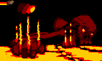
Posted By: felchqueen
Date Posted: 16 July 2014 at 7:00am
Mmmm almost there any suggestions for the background I was going to do a trail as if it was coming from the sun, but I couldn't get it to work. Any other crits warmly received. It looks horribly overdone, a more subtle effect probably would look much better but as I don't know what that effect is, this'll have to do. |
Posted By: SuperTurnip
Date Posted: 16 July 2014 at 9:42am
felchqueen, study flames a little more. They are not opaque, so it might be a good idea to try and create a transparent effect at the edges of the wings. Take a look at this:

Candle on Earth candle in space It's possible to look right through the flame, around the blue areas (the transparency and the blue are the hottest parts)! You've got some mega-banding on the sun and the edges of the wings, and your phoenix needs form work on the chest and head. Keep working on it, it can be improved if you take care! Image credits go NASA, via an anonymous internet poster on imgur. |
Posted By: felchqueen
Date Posted: 16 July 2014 at 11:07am
|
@Superturnip, thanks for your response, I absolutely agree, my problem is I'm unsure how to communicate this via the medium of pixels. I think this is in part due to my uselesness with colour, as you can see I've only introduced an orange, to avoid dithering. Also how do you give form using light and dark to an object that itself is all illuminated  I will heed your advice though and try a rework. Thank you. |
Posted By: tomic
Date Posted: 16 July 2014 at 2:01pm
|
quickie.. tried to get not too patriotic :))  no idea yet on the background, outer space probably ------------- pixel suit up! |
Posted By: Pheno
Date Posted: 16 July 2014 at 8:13pm

Not a very strong entry, more just an experiment with wide pixels (and in ONLY using the three colors provided). Ref: http://hqscreen.com/wallpapers/l/1920x1080/52/sterling_archer_tv_lana_kane_1920x1080_51769.jpg Any suggestions on improving the quality? Not super proud of it, but I am stubborn and want to keep the wide pixels and the three-color limitation. Edit: should NOT have embedded that image, pfft |
Posted By: Drazile
Date Posted: 17 July 2014 at 12:58am

I think I'm done (mostly because I've ran out of ideas). |
Posted By: felchqueen
Date Posted: 17 July 2014 at 5:06am
Here's a new version, better? Still trying out different things for the flames are any bits 'working' for people? |
Posted By: SuperTurnip
Date Posted: 17 July 2014 at 11:29am
|
felchqueen, this is awesome! I think it's much better with the flames surrounding it like this, and a simpler body is already doing wonders. I also like the idea of having the head glow brightly, it looks good. You've got some banding around the head, but the rest is good (if rough).
EDIT: didn't need to make another post, I'll just update this one instead. Well, I'm not sure if I wanna follow through with the octopus, because this happened: 
The actual content is not that great (composition, why?!), but I think it's got potential. Any crits? EDIT 2: 
|
Posted By: tomic
Date Posted: 18 July 2014 at 3:52pm
pixeling feathers until i fall asleep.. @SuperTurnip: looks great! i'd suggest adding some sort of topdown-perspective background.. walls or something, to frame it. ------------- pixel suit up! |
Posted By: Drazile
Date Posted: 19 July 2014 at 12:47am
|
Originally posted by tomic It reminds me of the KAOS logo from Get Smart.
pixeling feathers until i fall asleep..
|
Posted By: Aureliano
Date Posted: 19 July 2014 at 4:18am
This is what iv'e been working on for my second entry, changed it around a lot, still not sure about it. Any ideas for improving it?

|
Posted By: DatMuffinMan
Date Posted: 20 July 2014 at 7:31am
I need one more color! just one more!

took some ideas from tomic too, which is kinda obvious. oh well. |
Posted By: Pixelist
Date Posted: 20 July 2014 at 12:18pm
 First thing I've made on PJ. o= |
Posted By: jalonso
Date Posted: 20 July 2014 at 1:23pm
|
Originally posted by Pixelist First thing I've made on PJ. o= Its nice tho I wonder about splitting the mid purple behind the branch. If you go above the branch then you can use the dark purple to AA and soften the harshest jaggies on the top of the branch. E: oops, its a challenge color >.< PJ has a no birds in the sky rule, k  E2: Use the 'edit it' under the art and place this small preview file in the first panel and the actual pixel piece in the second panel then hit the resubmit.  ------------- |
Posted By: Pixelist
Date Posted: 20 July 2014 at 2:28pm
|
Originally posted by jalonso
Originally posted by Pixelist Its nice tho I wonder about splitting the mid purple behind the branch.If you go above the branch then you can use the dark purple to AA and soften the harshest jaggies on the top of the branch.First thing I've made on PJ. o=
E2: Use the 'edit it' under the art and place this small preview file in the
first panel and the actual pixel piece in the second panel then hit the resubmit. Yeah, I was thinking the same thing about the mid purple splitting being the branch. Before this response I made a new edit of it and actually lowered it quite a bit since it was a sunset idea. (Brightest color would be off in the distance) And really no birds in the sky?  Damn, I thought it made it a bit more 'realistic.' Haha. Alright thanks for the feedback! I'll fix it sometime tomorrow Damn, I thought it made it a bit more 'realistic.' Haha. Alright thanks for the feedback! I'll fix it sometime tomorrow  This really helped man haha, I'm new at PJ. So again, thanks! This really helped man haha, I'm new at PJ. So again, thanks!
|
Posted By: jalonso
Date Posted: 20 July 2014 at 4:31pm
|
If you fail to update before the server clock ends the challenge it cannot be added later. It will be added to your gallery tho.
------------- |
Posted By: Limes
Date Posted: 20 July 2014 at 6:40pm
| why can't you have flying birds? |
Posted By: Pixelist
Date Posted: 20 July 2014 at 7:04pm
|
Originally posted by Limes
why can't you have flying birds? Confuses me as well. 
|
Posted By: SuperTurnip
Date Posted: 20 July 2014 at 11:13pm
| That seems like a fairly odd rule. Shame I didn't know it earlier so I could make my challenge entry a flock of birds. |
Posted By: Pixelist
Date Posted: 21 July 2014 at 2:06am
 Anyway, I'm too late to submit but I did add the AA and lower the sky.  Dammit. Dammit. |
Posted By: jalonso
Date Posted: 21 July 2014 at 5:44am
|
No birds in the sky is just my pet peeve There is no rule on that and its why I used > ------------- |