Furturistic Space Turtle
Printed From: Pixel Joint
Category: Pixel Art
Forum Name: WIP (Work In Progress)
Forum Discription: Get crits and comments on your pixel WIPs and other art too!
URL: https://pixeljoint.com/forum/forum_posts.asp?TID=213
Printed Date: 10 September 2025 at 11:38pm
Topic: Furturistic Space Turtle
Posted By: flaber
Subject: Furturistic Space Turtle
Date Posted: 09 May 2005 at 7:15am
|
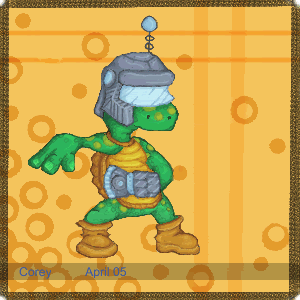
There it is. Tell me what ya think |
Replies:
Posted By: Brian the Great
Date Posted: 09 May 2005 at 7:27am
Wow! Must be one of the coolest turtles I've seen. I like the skin and background most. Good job on those!  Though I think the metal looks a bit too much like stone at the moment. Try increasing the contrast on that. Maybe make his shield of metal too? Uber-cool! Keep it up! ------------- http://www.twoschizos.com"> 
|
Posted By: sedgemonkey
Date Posted: 09 May 2005 at 1:32pm
|
It's definitely a sweet character design and I like the color interaction with the bg. Heh, looks like the turtle is doing "the robot" |
Posted By: Monkey_man
Date Posted: 09 May 2005 at 4:07pm
holy crud thats sweet couldnt even tell it was pixel art  ------------- www.engedientertainment.com/phpbb is my forum POST YOUR PIXELS |
Posted By: Blick
Date Posted: 09 May 2005 at 8:05pm
|
Monkey_man, I'm sure it's CG with pixel tactics taken into mind, sort
of like how DayDream works. If you don't know who DayDream is, he's the
artist for the fairly popular HeliAttack series, by SquareCircleCo. It looks pretty good, Flaber, but awfully flat and distorted in places. The knees especially look distorted. The leg farther from the viewer doesn't appear to have a knee and the one closer to the viewer looks distorted just from its position. Bringing the leg in a little should help. Lowering the boots so the knee area looks less like an ankle area might help too. The boot on the closer foot seems to push outwards on the sole, I'd bring that in a bit and puff up the top to match the other boot more accurately. Then the metallic thing on his hard doesn't have much depth to it. It looks like it should be metal, if so then give it a lot more contrast. You seem to hug those midtones and never let go, you'll have to get past that with shiny metal and dare to put dark shadows directly next to highlights. Also, the reflected light would change the metal in places as far as color is concerned. The yellow from his belly would show especially well on the metal. Speaking of the belly, I have two problems with it. It doesn't have a shadow cast on it from his arm or head. The next problem is how his normal arm emerges. It cuts into the belly, I think the shoulder should be covered more, since it looks like it's cut straight into the underside of the shell right now, in a copy+paste sort of way. ------------- http://punaji.com/"> 
|
Posted By: flaber
Date Posted: 10 May 2005 at 10:26pm
|
Ehh?? whats this??? wasnt there a section where you could post CG stuff. I coulda sworn... But uh yes, it is CG. sorry if its wrong to be here, but i coulda sworn i put it in a CG section. Sorry. Thanks for the comments. Havent quite decided if im done with him or not. But if not ill show the update. Other wise ill keep those points in mind for my next piece. Much appreciated. heh, Sorry again for the CG thing..... maby theres rocks in me head.... |
Posted By: sedgemonkey
Date Posted: 10 May 2005 at 10:52pm
|
flaber: "Other Art" section was removed and all topics moved to WIP just a couple of hours ago. You had the very last topic before it was removed. Sorry about the confusion. |
Posted By: Bisque
Date Posted: 11 May 2005 at 10:07am
|
The metal parts of this pic deffinitely need some work. Although it doesnt look BAD right now, it looks more like its made out of stone.
I couldnt find anything that looks very much like the helmet in the pic but i foudn some normal metal helmet for you to look at for exampels of contrast/highlights haha => http://www.brucegray.com/images/helmet2.jpg - http://www.brucegray.com/images/helmet2.jpg
Another thing i noticed is the glass (?) visor. It doesnt look tinted at all so shouldnt it be transparent? Even if it was fogged glass we would still see something of the eyes behind it. Fogged glass would be kind of stupid for a visor though haha =o he'd walk into things! |
Posted By: sedgemonkey
Date Posted: 11 May 2005 at 9:07pm
|
The first helmet you picked out there looks really sweet. Perfect for the turtle.
|
Posted By: Monkey_man
Date Posted: 12 May 2005 at 7:06pm
ooo sry i didnt know it wasnt pixel art and i didnt know they took away the otehr art section sorry  ------------- www.engedientertainment.com/phpbb is my forum POST YOUR PIXELS |
Posted By: flaber
Date Posted: 14 May 2005 at 10:18pm
|
thanks for the comments again Ill keep those in mind if i ever feel to fix it... I currently have a few other pieces on their way so ill keep these in mind for them. thanks again, corey |