Looking for feedback: Barbarian game sprite
Printed From: Pixel Joint
Category: Pixel Art
Forum Name: WIP (Work In Progress)
Forum Discription: Get crits and comments on your pixel WIPs and other art too!
URL: https://pixeljoint.com/forum/forum_posts.asp?TID=21711
Printed Date: 12 June 2026 at 3:07pm
Topic: Looking for feedback: Barbarian game sprite
Posted By: Palocles
Subject: Looking for feedback: Barbarian game sprite
Date Posted: 05 March 2015 at 6:40pm
|
Hi, i've posted this guy in the gallery so he's not really WIP. If i go on to do animation with him he'll probably change a bit though.
http://www.pixeljoint.com/pixelart/92833.htm Any feedback welcome. (Re: stuff talked about in the gallery entry: It will probably be easier for me to do a scrolling shooter first so i'll probably do some sort of flying thing for my next pixart.) |
Replies:
Posted By: Iscalio
Date Posted: 07 March 2015 at 1:43pm
|
Looks pretty neat to me. I can mention some possible edits tho.
You seem to be missing a few outlines in various places from the back of the forward leg to the top of the axe and the front of the face and the horns. If you are doing outlining and don't want full black everywhere maybe do a dark, but not fully black, outline in the direction of the main light source. Your hair color is rather close to your skin color and so the hair/beard get lost at such small scale. You have a few sporadic white spots on the skin that I think you could take out, or else put in only one general area, maybe where light hits the skin most. At the same time your helmet feels gritty and bumpy like it's made of stone rather than metal. I think this is because you're kinda speckling it with lighter and darker greys instead of making a decision as to what's light and what's dark, and it doesn't have much high highlights like most shiny metal does (even your axe has significantly more high tone shine). Your pose seems pretty good, but the back of the axe is overlapping his face. I'd find a way to get the back of the axe out of his face so you get a better read. |
Posted By: Palocles
Date Posted: 07 March 2015 at 11:40pm
|
Thanks Iscalio.
I'm actually trying to knock out the outlines as much as i can, but it's a little tricky when i start with them in there. I've done the helmet top and hopefully it will look more like metal now too. The hair was bugging me with it's low contrast with the skin. I want him to be a nordic ginger but might have to make him dark haired so it shows. I've reduced some of the white spots too, they were supposed to be highlights. I haven't changed the position of the axe (and didn't initially get what you meant, it doesn't actually OVERlap) but i've done a second pose and made a GIF. Hopefully the full walking animation will make it clear the parts are seperate. So here are new pixarts and the GIF:   
There are some inconsistencies that need fixing but i'm out of time tonight. Que piensas ahora? |
Posted By: Palocles
Date Posted: 10 March 2015 at 6:25pm
|
50+ more views and nobody has anything else to suggest?
Well anyway. I hope to have another frame done soon to make a better walk motion. |
Posted By: dyluck
Date Posted: 11 March 2015 at 1:52am
|
It's not very elegant to point out how much time or views are past since last feedback, you ask for help and recieve the feedback people want to give you. ;) For your request: I think in the first one, if the light source is up and back, the shield should not be outlined in black. You can try a reder hair and a leather colored clothes.You can redesign the clothing, wich doesn't look as nice as the rest to me, and maybe add a belt to it. |
Posted By: Palocles
Date Posted: 11 March 2015 at 2:33am
|
I'm not "telling people to help", i was just surprised that no one else could find a hole to pick at.
Thanks for you suggestions though, whether they were elegantly elicited or not. ;) Are you talking about the pic in the first post when you mention the shield? They curve is similar to a shield top but it's actually his arm. The ones in the second post have a little round buckler on the left hand but is outlined in grey. Love the belt idea. That will make a much better center line than that scruffy loincloth fold over. And i think i agree i should redo his outfit. Maybe i could give him green trousers? Not sure because i'm trying to limit myself to a 30 colour palette. I don't really want to go too far from that shade for the hair though. I'll see what i can do later on with contrast and movement though. It might still work. Turns out that other frame i wanted to do is taking longer than i hoped. I've now decided to try keep the axe shape more consistent (as it moves) too, so i've made a larger axe shape, rotated it and scaled it down. Haven't put in any frames yet but i'll try get a pic to show here. Anyway, here are pics of the axe template and palette: 
|
Posted By: dyluck
Date Posted: 11 March 2015 at 2:55am
|
It's common having views of your post and not having feedback, people is often busy, don't get discouraged, someone eventually will help. :P Sorry, it's not the outline of the shield, I meant the arm at the left! My mistake :P In fact the upper outline of the shield is correct. I mean the arm outline in the first frame, the one in wich the axe is in front of his face. pS: I have a similar feedback hunger, in my "RPG Panic!" thead. I know how bad is it when you are stuck and don't know how to improve something. :( |
Posted By: dpixel
Date Posted: 11 March 2015 at 9:06am
|
Got kind of carried away with an edit. Hope you don't mind. You had a lot of single pixels which made it look speckled and didn't help the readability. Something about the axe was bothering me so I redrew it. Tried to make the hair look braided. I think that's what you were going for. Sometimes you need to just suggest something at this size instead of trying to draw it and it will read better. 
------------- |
Posted By: Palocles
Date Posted: 11 March 2015 at 6:42pm
|
Dyluck, that's probably what got me too. I wanted to get feedback while i still had time to work on the sprite. Otherwise it'd be a week before i can make any changes.
I saw the RPG Panic thread but didn't realise it was yours or have time to look at it yet. I like to reciprocate so i'll check it out later today (NZ time). Thanks dpixel. Having someone more experienced do a number on Bogan is really helpful. I can see that i've been trying to put in too much detail with those bitty little single pixels. Though i thought i was suggesting teeth and muscles, among other things. Anyway, i think i'll basically start over and animate a nice sprite well instead of just throwing something together. I'll combine your guys tips with the technique from this site http://www.manningkrull.com/pixel-art/walking.php and maybe a bit of a wardrobe change. Hopefully can show more in a few hours. (5 or 6 hours) edit: Nope, out of time. Had trouble syncing the feet positions with the body bob. Should have something by this time tomoro. |
Posted By: Iscalio
Date Posted: 12 March 2015 at 2:25pm
| Palocles - I hear you about the views vs critiques. I often post solid work I'm trying to improve or have important questions and I have at least 2 threads with probably 100+ views and 0 responses. Meanwhile I'm trying to answer people with solid critiques based on what experience I have. *shrug* I imagine a lot of people just don't feel they can give a solid critique that is more than a personal view? I dunno. |
Posted By: dyluck
Date Posted: 12 March 2015 at 2:50pm
|
I think he just made the comment innocently. :P What you say about the solid feedback is sensible. Sometimes I read a thread but I don't have solid knowledge or just I don't come up with anything useful to share. |
Posted By: Palocles
Date Posted: 13 March 2015 at 9:33pm

So it's been tedious and full of interruptions but i've got this to show. The basic structure of the walk animation. Though i made the speed too slow. I'll add a flat coloured axe to each frame in the correct position and then start to fill in the details. edit: Now with axe: 
|
Posted By: mzn528
Date Posted: 14 March 2015 at 6:27pm
|
First of all, want to say I like it a lot and good job!
My personal opinion though: 1. given the size of the canvas, I feel like you stuffed too much detail into the character and now he looks a bit messy 2. shading can be improved a little bit, identify a clear light source (wish I can show you but I suck at this) 3. I am not a big fan of the black outline, but that is just me and I am being really picky here.. Good job and keep us updated! |
Posted By: Palocles
Date Posted: 14 March 2015 at 7:31pm
|
Thanks mzn528. I've already been working on some of those points thanks to dpixels edit and everyone elses feedback.
I think his face is still a bit busy though and might go with flatter easier to see colours for his hair/beard. I've been filling in detail on that last gif i posted but it's taking soooo long. And i've realised that his legs look weird because they are so short and the boot soles that i put in make them too squashed when his feet are off the ground. Another WIP frame (minus left arm): 
BTW; i'll probably be using him and the other sprites i make at 2 times size. And now here he is, still minus left arm and some properly worked hari, but walking: 
I'm finding that i'm not liking the result terribly much. Maybe i need to make him taller so his legs are less deformed but maybe he looks ok to other peoples eyes? I'll call it a day here and carry on later in the week. Edit: Just whipped up this trap enemy for Bogan to face. 
|
Posted By: Zizka
Date Posted: 15 March 2015 at 6:04pm
|
Massive improvement.
Regarding critique: it's not because people don't want to. I've been at pixels for two years and I'm still learning myself. I'd rather shut up then talk about something I'm not sure about and give someone bad advice. It looks like you changed the axe orientation via automatic tools though and that'll get you a spanking. I do have an advice: Keep your threads separate. This thead is about a barbarian. If you wish critique on something else, create a new thread. You'll get more replies that way, trust me (I made the same mistake when I joined). |
Posted By: Palocles
Date Posted: 15 March 2015 at 6:52pm
|
Well, i'm not really worried about getting replies now. As there are people making comments and they are helpful. I was at a point where i needed feedback before i could continue earlier though. Now i can plow on.
Yeah, i used Rotate on the axe blank, as i said i would a few posts up. I coloured and shaded by hand though and i will be redrawing the highlight on the axe edge too. I'll take the spanking if it make the sprite look more consistent in the game. I'm also going to redo his legs and boots. Despite that bogans* usually wear black jeans, i'll make his blue and his boots black. I'll also make the boots simpler as the roll top causes problems when the boot isn't flat on the round. *For those who are unaware a bogan is a metaler or metal head. Aussie bogans are not the same as kiwi bogans. |
Posted By: dyluck
Date Posted: 16 March 2015 at 5:37am
|
Just a little hunchbacked, and the back moves a little odd. |
Posted By: Palocles
Date Posted: 16 March 2015 at 7:12pm
|
I agree. I'm going to redo him AGAIN because i'm not really happy with the result yet. I'm considering increasing the sprite to 60 x 60 and using the extra height to put his head more on top of his shoulders and make his legs longer. The extra width will allow for more movement in the axe swing. His right arm looks far too stiff at the moment.
I'll use a different process to draw him so i can get the position of the body and legs in place before covering those bits up with the axe like i did with this version. |
Posted By: PixelSnader
Date Posted: 17 March 2015 at 10:33am
|
The movement you have on the axe is very sharp. When it reaches the front frame it instantly reverses at the same speed. In reality, you would slow the axe down, it'd halt, and then it would speed up towards the back again.
Compare these two gifs:  
Left looks to bounce between two walls or something, right looks like it actually swings. With a bit more explanation: 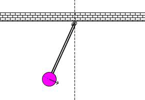
The arrow you see is the momentum/force in the pendulum. The pendulum gains momentum when it 'falls' and expends it again when it 'rises'. The more momentum, the larger the arrow, the faster the movement. You have 8 frames. I would make the pixel distances: current -------> suggestion front extreme quarter ----------> 1/8th halfway three quarters --> 7/8th rear extreme quarter ----------> 1/8th halfway three quarters --> 7/8th ------------- ▄▄█ ▄▄█ ▄█▄ ▄█▄ |
Posted By: Palocles
Date Posted: 17 March 2015 at 5:07pm
|
Thanks for pointing that out. I could only see one of those gifs at first but I knew exactly what you meant.
It's also kind of serendipitous as I was thinking of making a pendulum axe trap to put in the game too. Hehe. I had tried to put those 1/4 3/4 frames closer to 1/8 7/8 but it's obviously not noticeable enough. It's definitely something I will look more closely at when I redo him. (Might even get to start on that tonight.) |
Posted By: PixelSnader
Date Posted: 18 March 2015 at 5:52pm
|
Also, I forgot to mention that your elbow is super rigid, generally when you swing something heavyish you usually bend your arms a bit. This is to make the compound motion of the arm, wrist, item, and its shared center of gravity more fluid.
If that's too complex too understand, that's because, well, it IS a complex motion. (and it's nearing 2AM here) But smoothing out the motion like I explained in the previous post should improve a lot already, and maybe even make it so you spot what I mean and/or what feels off. ------------- ▄▄█ ▄▄█ ▄█▄ ▄█▄ |
Posted By: Palocles
Date Posted: 18 March 2015 at 6:33pm
|
Yup. That stiff elbow is part of the reason i'm redoing him.
It ended up that way because i out the axe in first and didn't have room in the canvas to do it any other way. I'll do it differently this time. |
Posted By: Palocles
Date Posted: 13 May 2015 at 12:42am
|
It has occurred to me recently that Bogan should not be swinging the axe so much at all.
Physics and stuff would mean that the extra weight in his hand would not need to move as far to help maintain balance. Like if you walk with a brick in your hand. Ok, a heavy bag then. That's more normal than carrying bricks around. Likewise if he has a shield in the other hand it will only move a little. There are other things I need to fix too, like the arm length but if I have those two items moving a pixel or two each frame that will look better. Sorry no animation yet but I'm on the right track, right? |