"You should call it an alien"
Printed From: Pixel Joint
Category: Pixel Art
Forum Name: WIP (Work In Progress)
Forum Discription: Get crits and comments on your pixel WIPs and other art too!
URL: https://pixeljoint.com/forum/forum_posts.asp?TID=2301
Printed Date: 21 April 2026 at 6:45pm
Topic: "You should call it an alien"
Posted By: KawizradSaddrax
Subject: "You should call it an alien"
Date Posted: 03 June 2006 at 8:19am
|
**Updates below** Well, here is my second pixel art ever. Obviously its a work in progress. I plan to remove the out line, and finish coloring it. Right now Im wondering how the basic shape and colors are looking. Some times I think the orange is a bit much, but other time I like it. Any one who has suggestions, I would appreciate it! Thanks in advance.  update... update... Here is the concept drawing I did for it: http://i79.photobucket.com/albums/j137/cweller60/May30.jpg - Concept ***edit* 6/07 I wil be updating this guy over the weekend. Thanks for the help so far!*** ***Edit*6/10 Updated WIP /weller |
Replies:
Posted By: Setzer
Date Posted: 03 June 2006 at 9:16am
|
his right ankle/heel is looking odd, so is his crotch. and he doesn't have hands, just blobs =o. you should at least suggest fingers in the lineart phase, so you're not stumped later.
------------- http://sj-gfx.com"> 
|
Posted By: Bryan24
Date Posted: 03 June 2006 at 12:18pm
|
You should call it an alien ------------- Revive the bannana thread, and keep the pomegrantate thread! P.S.The bannana thread is supposed to not make sense. P.S.S.or dollars |
Posted By: Pixel_Outlaw
Date Posted: 03 June 2006 at 12:20pm
|
I don't think gravity would allow for that pose, it's very good for a second pixel art piece. ------------- http://www.shmup-dev.com/forum/"> 
|
Posted By: KawizradSaddrax
Date Posted: 04 June 2006 at 9:25am
|
well I started shading it a bit...I know ive got some aa to do still. Thanks for the crits! I havent fixed the ankel yet, but i wil for the next post, also and I added fingers. I have included a picture of the reference i used because I got a lot of comments on his pose. I Think Im pretty close to the referance pic, but if you guys see where Im off, ill switch it up. Anymore c&c would be great! http://www.karate-shotokan.be/Photos/katabo.jpg - Pose Referance 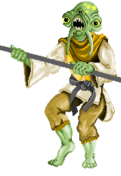 |
Posted By: Souly
Date Posted: 06 June 2006 at 8:48am
|
uHH... ------------- 
I am the jesus of PJ. |

Posted By: KawizradSaddrax
Date Posted: 10 June 2006 at 5:03pm
|
Hi! Thanks for the crits so far everyone, I am very grateful. Souly: Thanks for the tip. Lighting is my weakest link, so Im trying to improve on it. I made a lot of changes on this one; it might be too dark now... I made some changes to his pose, fixed his lower leg, and worked some more on the coloring. Let me know how Im doing. Thanks in advance! |
Posted By: Larwick
Date Posted: 10 June 2006 at 5:09pm
|
Omg dude, the concept drawing is the shizz! I think you should pixel the same pose of that in say, half the size. But ignoring that, i feel that now it seems as if there's an imaginary light-blocking wall between his legs. And at the moment, because the upper half of his leg (above the knee) is flatter and higher, it should catch the light differently than the shin, as now it seems that the leg is generally small. I'm also not so keen on the dithering, as it is very contrasted and so makes the image seem very rough in places. Anyways, keep at it. ~ -------------  http://larw-ck.deviantart.com"> http://larw-ck.deviantart.com">
|