[WIP] Dwarf character base and walk cycle
Printed From: Pixel Joint
Category: Pixel Art
Forum Name: WIP (Work In Progress)
Forum Discription: Get crits and comments on your pixel WIPs and other art too!
URL: https://pixeljoint.com/forum/forum_posts.asp?TID=25920
Printed Date: 23 April 2026 at 4:30pm
Topic: [WIP] Dwarf character base and walk cycle
Posted By: murmelot
Subject: [WIP] Dwarf character base and walk cycle
Date Posted: 27 August 2017 at 1:09pm
|
Hello, World!
First post and first-ish steps into pixel art. I'm a hobbyist game developer and have until now been focusing on the programming-part of game development. However - I've reached a stage when I feel I need to learn how to create somewhat decent assets for my projects. I've always been a fan of pixel art, but have never seriously tried "pixeling" before. After lurking around this site and forum for some time, it is obvious that there is a lot of talented people present here - from whom I hope to get some pointers. So here's the actual character: 
It's supposed to be an armored dwarf. The game perspective is orthogonal non-isometric front/top-view (I hope that makes sense). I've restricted myself to using Dawnbringer's 32 color palette. What I would like to know: - Have I made any glaring beginner-mistakes? - Could any features be represented better? - Any other pointers are most welcome I've also experimented with a basic walk cycle, based on http://manningkrull.com/pixel-art/walking.php - Manning Krull's tutorial . The character in his tutorial is however from a side-view perspective. Does this work for my character? 
Note that the animation is very rudimentary as of now. I'm just curious as to if this approach to a walk cycle works for this type of perspective. Give me a shout if I've left something out! Any and all criticism is greatly appreciated :). |
Replies:
Posted By: Yuran
Date Posted: 27 August 2017 at 4:20pm
I'm confused myself Something in the animation also do not match  
|
Posted By: murmelot
Date Posted: 28 August 2017 at 6:57am
|
Hey Yuran and thanks for the edit!
Your changes made the animation a great deal more fluid. I guess I should exaggerate more when animating so that the motion will be less static. I'll keep it in mind for the next iteration. Perhaps I should complete the non-animated sprite before further animating. Is the sprite "ok" or is there anything I should change? |
Posted By: Yuran
Date Posted: 28 August 2017 at 7:59am
|
Do not take the previous post seriously I'm just having fun :) All is well, only it is necessary to correct the timing, too smooth movement of the legs  |
Posted By: murmelot
Date Posted: 17 December 2017 at 3:25pm
Haven't had a chance to work on this due to life stuff. Finally managed to give this dude another chance: I stopped each leg for a frame to make the animation less smooth and add more impact. Hopefully it looks a bit less like the character is ice-skating now. Also added some head-bobbing to make it more dynamic.  Added a simple idle animation as well. Perhaps it's a bit too exaggerated though.. |
Posted By: Hapiel
Date Posted: 17 December 2017 at 3:57pm
|
He can't stop traveling like that, it looks like he freezes but his heavy body should keep his motion pushing forward and loose his balance if he were to stop his feet like that. To give him some impact, you can try some forward backward motion. I did this real quick and didn't get the timing right, I'm sure you can do better than me with a little experimentation :)  |
Posted By: murmelot
Date Posted: 19 December 2017 at 3:00pm
|
Thanks for the input, Hapiel! I tried to add some momentum as you described, but can't seem to get the timing to feel right. Also tried adding some movement to his right arm (the left one / rightmost one looks like crap no matter how I change it). I'll give it another shot later. Now it looks like this:  Digression: Also discovered during testing in my game that I've made the dwarf on a 64x64 base, and my tilesets are all at 32x32 (facepalm). I tried shrinking / slimming down but felt like I lost too much detail in the process. Has anyone had any experience with mixing sprite and tile sizes? My gut tells me that it wouldn't look good due to pixels being different sizes (different scaling in engine) ... Perhaps it's better if I just go for 64x64 tiles. That feels rather large though. |
Posted By: Hapiel
Date Posted: 20 December 2017 at 4:23am
|
I don't think the arm needs movement forwards and backwards, his shoulders are solid as a rock! Normally the forward push comes the moment the back leg is at it's most powerful moment, just before the release. Sprite and tile sizes are just indicative, you can make 16x16 tiles but still at a scale that they fit a 128x128 character. It's hard to judge how to help yours until you post them ;) http://openpixelproject.com - openpixelproject.com uses 64x sprites and 32x tiles, works fine there |
Posted By: murmelot
Date Posted: 23 December 2017 at 11:22am
|
I agree that his arm doesn't need the movement - I'll remove it again. The reason I'm worried that it won't look good in the engine is due to the fact that characters must (in my game) occupy the same amount of world units as for example a chair, a wall tile or a door. This could either be achieved by scaling in-engine (ergo one pixel will be half the size for characters as compared to a ground tile in this case). I'll try to add some test images later today to help explain :) Edit: Here's the unscaled image (tiles and characters are both 64x64): 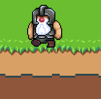 ... and here's the scaled image (characters 64x64 and tiles 32x32, scaled to match). To me this doesn't really look good: 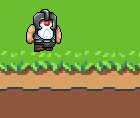 Note that neither the grass or mud-tiles are finished yet. Later on I'll also add some blob shadows to help with the perspective. |
Posted By: king_bobston
Date Posted: 24 December 2017 at 8:50am
the mixxed res does look weird  I dig the character, especially the red nose! I think it would look even a bit better if you add one more contrasting shade in the beard - maybe only around the mouth part? |
Posted By: murmelot
Date Posted: 24 December 2017 at 11:19am
|
I also thought about just ignoring it and hoping that nobody would notice. Problem is that -I- would notice and never stop being irritated about it :p. I'll probably just repaint all my tiles in 64x64. Nice to hear that you dig the character - thanks! I'll add another shade to the beard to see how it looks. (I'm trying to keep the palette to a minimum since I read somewhere that noobs often go overboard with amount of colors.. also figured it would be easier to animate.. not that the beard moves now) |
Posted By: eishiya
Date Posted: 24 December 2017 at 3:10pm
|
Why not keep the art all in the same pixel scale, but use 32x32 tiles and 64x64 characters? It would just mean making your characters be 2x2 tiles instead of 1x1 tile in size. This is very common in games. |
Posted By: murmelot
Date Posted: 25 December 2017 at 5:01am
|
32x32 tiles would be nice, since I think 64x64 is a bit overkill (and the fact that the few tilesets I already have are at 32x32). Is it really overkill though? It seems like <= 32x32 is most common, but has anyone had any experience with 64x64 (or larger) tilesets for pixel art? I have to consider other factors also - for instance pathfinding, as I would have to implement a clearance-based algorithm on top of the one I've already got. It's definitely doable but having everything the same size makes a lot of stuff much easier :). |
Posted By: eishiya
Date Posted: 25 December 2017 at 8:59am
|
For easier pathfinding, you could have 64x64 tiles for your collision map but use 32x32 graphical tiles. It would have some of the challenges of using 64x64 tiles (e.g. thin elements would have collision far beyond their visual boundaries) but also afford you more flexibility that you can't have with 64x64 tiles. You could also treat the character as having a 32x32 base and have their arms and head go outside of the tile, which would probably look more natural anyway. However, I think your dwarf is a tad too wide for that to look good, their feet would overlap walls a lot. Another, probably not good, possibility is to compromise and use 48x48 tiles, letting your dwarf be 1x1 tiles, and still being able to use smaller environment tiles than 64x64. However, that still means using pretty large tiles and drawing new tiles (if you decide to use 32x32 tiles, you should redraw your existing tiles too though, mismatching pixel sizes look bad). Though this sort of compromise is something I've done in one of my own games, I don't recommend it for your case, because of the large tile size. Or of course, you can calculate clearance, like you said. If the maximum size of characters is known (and if merely making everything 64x64 would solve this problem, that means your max character size is 2x2 tiles if you use 32x32 tiles), then the clearance should be very easy to do, since you only need to check that at least one chevron of neighbouring tiles is all free for each tile you check (e.g. above, left, and above-left, or above, right, and above-right). I'd say 16x16px is most common for pixel art tilesets, by the way, though 32x32 is also very common in more recent years (RPGMaker making it hard to use anything else is surely a contributor to that). The 16x16 size has a long history, and makes it easier to make more versatile tiles, i.e. tiles that can be used in many contexts instead of just e.g. "grass-dirt-transition-bottom" thanks to the inherent ambiguity in using only a few pixels and a few colours, which is one of the reasons some newer games use it. In general, the smaller the tile size, the easier it is to have versatile tiles and reduce repetition (because you can fit more variant tiles in the same texture space and rearrange them in more patterns than the equivalent larger tiles would allow), which is why I think you should go for 32x32 tiles instead of 64x64. |