How can I make my knight more readable
Printed From: Pixel Joint
Category: Pixel Art
Forum Name: WIP (Work In Progress)
Forum Discription: Get crits and comments on your pixel WIPs and other art too!
URL: https://pixeljoint.com/forum/forum_posts.asp?TID=26755
Printed Date: 10 September 2025 at 9:07pm
Topic: How can I make my knight more readable
Posted By: alexcalin95
Subject: How can I make my knight more readable
Date Posted: 20 October 2019 at 3:07am
I have this knight animation what can I add to different colors or improve to this piece to help it stand out more?

|
Replies:
Posted By: Greycloak
Date Posted: 20 October 2019 at 8:31am
|
Some of the colors in the palette look like they have similar values. So I would try changing the contrast and/or luminosity of each color to try to make them more distinct. Right now the darkest color, which is used for the border, isn't very dark and short of meshes with the rest of knight. Whereas the highlights are extremely bright in comparison to the second most bright color. Since the knight is wearing metallic armor there should still be quite a bit of contrast between highlights and midtones, but it seems a bit overdone in this case. Here's some similar knights (by Cyangmou) that might help as a reference: 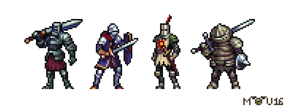 |
Posted By: alexcalin95
Date Posted: 21 October 2019 at 1:08am
Thank you for your great advices, as usual,those are great pieces I don't have that understanding of light and 3d space (I'll work on that too) but thanks to your advice I came up with this.

|