Shark WIP
Printed From: Pixel Joint
Category: Pixel Art
Forum Name: WIP (Work In Progress)
Forum Discription: Get crits and comments on your pixel WIPs and other art too!
URL: https://pixeljoint.com/forum/forum_posts.asp?TID=3218
Printed Date: 11 September 2025 at 8:26pm
Topic: Shark WIP
Posted By: cure
Subject: Shark WIP
Date Posted: 17 October 2006 at 12:33pm
|
Current project in graphic design. I basically surf pixel art sites and make pixel art in whatever program I choose, for an hour a day, FOR A CLASS. Anyway, here it is (don't expect a masterpiece or pillar of my gallery, its just a project thats due friday):
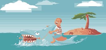 Many areas still very WIP-ish.
|
Replies:
Posted By: Blick
Date Posted: 17 October 2006 at 12:51pm
|
The squares behind the clouds aren't something I'm a fan of. I love the face of the shark thus far, and that you're already starting to put in subtle things to find in the picture which I always like. Such as the two skulls and crossbones. The guy's face would look better if it were less rounded and maybe less slack on the reigns would be more convincing. ------------- http://punaji.com/"> 
|
Posted By: cure
Date Posted: 17 October 2006 at 12:53pm
|
Yea, I began the piece by making rectangles using the tool at x2 zoom, I wasn't sure exactly where I was going with leaving them in the clouds, just messing around a bit. The reigns definitely need to be visited, and I'll get to work on the face. ------------- |
Posted By: jalonso
Date Posted: 17 October 2006 at 12:58pm
|
So what is the objective for this assignment? Is there a perticular thing the assigmetn is based? ps: You could use it as starting point for Pixelween. Bruce the shark from Jaws v ??? ------------- |
Posted By: cure
Date Posted: 17 October 2006 at 1:01pm
|
Jalonso and his Pixelween pitches...
Its just make something. Using an analogy. I forgot what type of analogy I chose, its really unimportant. Its someone conquering fear, or something, I just wanted to make a shark.
Is Jaws a horror movie? Not a bad idea if so. ------------- |
Posted By: jalonso
Date Posted: 17 October 2006 at 1:05pm
 just being motivational. just being motivational.The rules state its villain v villain from a movie. Bruce the shark is quite the villain, I think. I suppose its not Halloween-Horror-ish but then again under those limitations there is not much to choose from. anyhoo... the art is cute and the colors are pretty. I'm with Blick on the somewaht retarded looking clouds. ------------- |
Posted By: Monkey 'o Doom
Date Posted: 17 October 2006 at 1:06pm
|
The shark's name was Bruce? Wasn't that the shark's name in Finding Nemo too? lol
I like most of the piece, but you should either use the rectangle stuff throughout the piece or eliminate it; right now it's not evident on the kid and shark. The tree looks great so far; I'm really looking forward to seeing more refinement there. ------------- http://pixelmonkey.ensellitis.com"> 
RPG is numberwang. |
Posted By: jalonso
Date Posted: 17 October 2006 at 1:11pm
ps. Besides now that I'm through with the PR drive with my former project. I needed a new thing to push  E: yes MoD, PB had the same question. The shark in Nemo is named after the shark in Jaws. Bruce was never actually used in the movie. Tha's what the cast and crew called him. It stuck. ------------- |
Posted By: Godslayer
Date Posted: 17 October 2006 at 1:49pm
|
I like the squares behind the cloud, it would be a neat way to unify the piece by making those behind everything. ------------- Oi. |
Posted By: Blick
Date Posted: 17 October 2006 at 3:02pm
|
With the squares not being the focus of the piece, if they were implimented behind everything I think it'd be fighting for dominance against the foreground action. Uh... which is bad. ------------- http://punaji.com/">
|
Posted By: Lawrence
Date Posted: 17 October 2006 at 3:18pm
|
I love the squares in the clouds. Perhaps you could integrate that style in an inconspicuous way like giving the sky's dithering a squareish dither style or have the splashes in the water somewhat squareish whilst leaving the main subject, the shark and person, in crisp focus.
------------- |
Posted By: Godslayer
Date Posted: 18 October 2006 at 4:43am
|
Originally posted by Blick
With the squares not being the focus of the piece, if they were implimented behind everything I think it'd be fighting for dominance against the foreground action. Uh... which is bad. If the squares were neon green perhaps. ------------- Oi. |
Posted By: cure
Date Posted: 18 October 2006 at 1:42pm
|
It seems there are some differing opinions. I could always do both, without the rectangles should be relatively easy, but I'm not entirely sure how I would implement them in areas other than the clouds and water. The sky inparticular might yield some problems. So any suggestions there would help. ------------- |
Posted By: cure
Date Posted: 19 October 2006 at 7:59pm
update: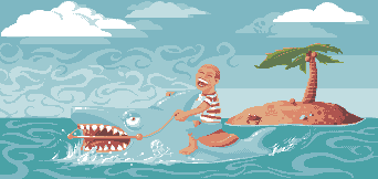 Using a proxy to log in to the forum again, I hope the image shows, if not you here is the link: http://i57.photobucket.com/albums/g209/phototekcub/shurk.gif and I'll just upload tomorrow from a different computer. Anyway, a turn for the better, or a turn for the worse? Criticism/suggestions welcome and appreciated. ------------- |
Posted By: Microradiation
Date Posted: 19 October 2006 at 8:33pm
|
Personally, all the swirly dithering you have going on in the bg is WAY too distracting. I don't mind if you work on the swirls in the water (be sure to decrease detail and size as you go farther). But yeah,
The clouds very much remind me of teh viking pic. Whether that's good or bad is up to you. The shark blends into the background. It might be considerable using a different colorspace for the shark or something to define it more. Don't get me wrong. All the CA stylings = really kewl, and I really love the little crab on the island, and all these other little details. That skull tattoo on the shark is da BOM. ------------- Formerly CrazyAznGamer. |
Posted By: Aleiav
Date Posted: 19 October 2006 at 10:00pm
|
I like the swirly sky thing. It's SO awesome. :D You're going to have to add some highlights though to the person to make him stand out from the background.
------------- |
Posted By: cure
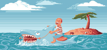
Date Posted: 27 October 2006 at 1:04pm
worked the water a bit, axed the busy background, messed with the colors in photoshop. Once again I end up taking my sweet time on a project. ------------- |
Posted By: jalonso
Date Posted: 27 October 2006 at 11:57pm
What the f**k, were you thinking with all those swirls? Jeez I go away for a few days and look at the sh*t that happens  PS: jk, I think this piece is about keeping things simple and cartoony. As opposed to overworking the pixelling details so that the details (crab, skull, the skull on the cloud) stand out some. You could turn a frond into a penis since you already have the coconuts. Maybe something inside a swirl. Something in a tooth. Like a puzzle thing or something. Just my thoughts, ignore as needed. Besides it's not like you're goiing to be creating another 'pixel masterpiece again so soon'. Those happen very rarely, have fun. ------------- |