Iso Building
Printed From: Pixel Joint
Category: Pixel Art
Forum Name: WIP (Work In Progress)
Forum Discription: Get crits and comments on your pixel WIPs and other art too!
URL: https://pixeljoint.com/forum/forum_posts.asp?TID=4116
Printed Date: 12 September 2025 at 6:18am
Topic: Iso Building
Posted By: Joenorton
Subject: Iso Building
Date Posted: 16 April 2007 at 8:44pm
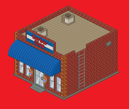
This is a building for my game The City Life. And I was wondering what you guy think about it.I havent added any small details here and there yet though.They will be added to it when it is put on to the board.
 Joenorton -------------  
|
Replies:
Posted By: jalonso
Date Posted: 17 April 2007 at 5:24am
|
Nice job so far. I would keep an eye on the scale of things. The ladder is wider than the window for example. Pixelling is good and its laid out well. The sign is hard to read, maybe use the yellows instead of the blue colors so that it reads better? Or the greys from the steps for the BG of the sign, red letters and white outline? Props, on making the top of the bricks properly ------------- |
Posted By: Joenorton
Date Posted: 17 April 2007 at 9:42pm
|
Originally posted by jalonso
Nice job so far. I would keep an eye on the scale of things. The ladder is wider than the window for example. Pixelling is good and its laid out well. The sign is hard to read, maybe use the yellows instead of the blue colors so that it reads better? Or the greys from the steps for the BG of the sign, red letters and white outline? Props, on making the top of the bricks properly Thanks man. I'll fix the sign and the ladder when i have the time.Any other suggestions? -------------
|
Posted By: jalonso
Date Posted: 18 April 2007 at 7:38pm
|
...maybe add a more interesting ledge to the building top, and add some depth to the barber pole signs. You did good, there's not much to fix.
------------- |
Posted By: Pixelator
Date Posted: 28 April 2007 at 10:31am
| The top of the building could do with a few more accesories but the bricks and canopy are very good. I also like the corners of the building where you changed brick colour. |