Hero RunWalk
Printed From: Pixel Joint
Category: Pixel Art
Forum Name: WIP (Work In Progress)
Forum Discription: Get crits and comments on your pixel WIPs and other art too!
URL: https://pixeljoint.com/forum/forum_posts.asp?TID=4362
Printed Date: 22 April 2026 at 12:31am
Topic: Hero RunWalk
Posted By: M.E.
Subject: Hero RunWalk
Date Posted: 03 June 2007 at 12:39pm
|
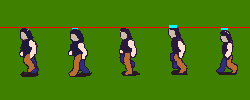
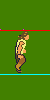
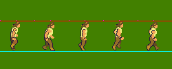
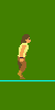
Hello Everybody, Here is what I did for the hero at the moment. Boy, is animating tough! The hero of my game should look a bit romanticed strong person, although he himself is just a boy. I tried to mix some styles but I'm not sure if it works. The reference for the boy was Kevin Sorbo who starred in the Hercules TV show. Unfortunately the pants and the shoes are almost identical colored. I think it would work better if the shoes would be a more lighter color?!?! The progression is from the right to the left. Sorry I just ended up copying the latest work first and then the oldest ones. Hope you can still 'read' what I attempted to do. Lessons Learned: 1. Use a background color and only one tool => Pencil Make transparent afterwards. 2. Use color blocks for different parts of the body 3. Do not work on details like hair 4. Remove shade/shadow 5. You can have large distance between frames but they have to be TIMED right! Otherwise they look jumpy. 6. Use reference lines to help you with the movement 7. Keep things smooth for both animation and lines. Too much different frames gives rough feeling. Played with highlights and shadows. Make legs and arms darker when moved behind body:  Enlarged the sprites a bit and new colors:      Lighter shadow,, arm exageration, lighter hand:   Details and shadows:  And the left version:  Smooth lines:  Arm movement change, hair and basic coloring:    Without Reference lines, color blocks:   No details, reference line, color blocks:  Speed of the frames  (150 ms) (150 ms) (100 ms) (100 ms) Limitations: - 5 frame cycle - 50x100 pixel width/height - speed will be determined by the player - View is a kind of weird isometric-frontal view - Hero should be a mid-height person (There will be a giant and smaller characters) Thanks in advance for all the comments that you may have for this. Best regards from M.E. ------------- http://www.kunststukken.nl - KunstStukken.nl M.E. Art |
Replies:
Posted By: Kfuchoin
Date Posted: 03 June 2007 at 3:47pm
|
dude.. his right leg (our left) of the first animation cycle.. when the 5 frames end come to the front without any sprites... basically is like it teleports..., make it go back normally.... ------------- may the pixels be with you.. ~Kfuchoin eMo looking for people for an RPG info: http://www.pixeljoint.com/forum/forum_posts.asp?TID=4903 |
Posted By: jalonso
Date Posted: 03 June 2007 at 7:14pm
|
They all look slightly 'rough' in lineart quality. There is a bit of a jump in time on all these versions. Animation in 5 frames is rough going so patience will be needed here. I will admit to you that I don't feel qualified to crit on anatomical pixels but will certainly leave my take on things so that you may ignore them, lol. ------------- |
Posted By: M.E.
Date Posted: 03 June 2007 at 10:56pm
|
Originally posted by jalonso They all look slightly 'rough' in lineart quality. Absolutely! It is still very much WIP  And luckily I didn't work on them too much : Originally posted by jalonso There is a bit of a jump in time on all these versions. Animation in 5 frames is rough going so patience will be needed here. I have patience. OK, back to the drawing board for the cycles. It was the best that I came up with after a lot of trying. Maybe I will be using Ensellitis technique he used on his walk/run cycle by using a wire-frame first.... Does anybody else use a different technique animating? Or is it just a bunch of trial-and-error? Best regards from M.E. ------------- http://www.kunststukken.nl - KunstStukken.nl M.E. Art |
Posted By: Metaru
Date Posted: 04 June 2007 at 12:29pm
|
Que tal M.E., or I shall say "Sir"? :D i often draw each part in black&gray, and then i start animating it. sometimes, i animate each part individually and then i merge them all in one single image. those are just ideas, most of the times is just trial and error(where a software with a real-time preview is often your best friend) Ens's Wireframe is good when working on more complex/larger animations, but you could use it here as well. now, for the 5 frame animation.. althougth they 're 6 frames long, Chronno Trigger Sprites can be an exelent reference for a walking animation.  I took me a while, and found very hard to make a credible walking/run animation in 5 frames, since most animations are often the first half + mirrowed second half. so, my conclusion is that you ------------- I ate leel's babies |
Posted By: Hapiel
Date Posted: 04 June 2007 at 12:55pm
|
Originally posted by Metaru so, my conclusion is that you should make 6 frames? should stop this project? should kill yourself? should stop reading now?? ------------- |
Posted By: M.E.
Date Posted: 04 June 2007 at 1:03pm
|
Originally posted by Lollige Originally posted by Metaru so, my conclusion is that you should make 6 frames? should stop this project? should kill yourself? should stop reading now??  I will choose: 'should investigate these awesome characters' I never have seen the chrono trigger stuff before. Excellent work! OK those are 6 frames. But it gets really close to what I 'm looking for. Thanks Metaru!! Kind regard from M.E. ------------- http://www.kunststukken.nl - KunstStukken.nl M.E. Art |
Posted By: dragonrc
Date Posted: 04 June 2007 at 1:11pm
I think that you should make it 6 frames, but I know your limitations so that won't be changed
I put the forward running cycle togather in the right place to give proper critique(all my critique will be pointed at this one):
 The frames in your running cycle look a bit out of place.
I think one of the biggest issues is that the image changes too much with each frame. Take a look at the hair for example. But maybe it is this way because it is a very WIP.
I also think you should make the left arm (to our right) move more like his right arm.
For the legs, the biggest problem I see is that the leg that is at the back goes behind the foreward leg. This is visible in frame 1 and 5. the left foot (to our right) in frame 4 looks a bit weird.
When you start to shade it, you should make the back leg and foot much darker then the foreward one.
Also, I think that you should finish the foreward running cycle first before you move on to the next one.
|
Posted By: jalonso
Date Posted: 04 June 2007 at 8:12pm
|
damm, dragonrc thats great. Your comments are well put too. You are improving so much, kudos. ------------- |
Posted By: M.E.
Date Posted: 05 June 2007 at 2:52am
|
Originally posted by dragonrc I think that you should make it 6 frames, but I know your limitations so that won't be changed
Unfortunately.... The width*height of each tile would change. Since the frames are calculated based on the width/height. Propably that is not a good thing to do, but I couldn't figure out how to do it differently in the programming language. Originally posted by dragonrc The frames in your running cycle look a bit out of place.
I think one of the biggest issues is that the image changes too much with each frame. Take a look at the hair for example. But maybe it is this way because it is a very WIP.
Indeed very WIP. But you got a good point I think. When investigating the chrono trigger sprites there was movement in the hair and clothes, but the legs & arms & head moved rather smoothly and not so jumpy as I had done it. The frame steps are too wide apart. They are missing in-between frames in my animation. I'm currently working on a 'slower' walk by keeping the legs and arms relatively close together. Originally posted by dragonrc
I also think you should make the left arm (to our right) move more like his right arm. For the legs, the biggest problem I see is that the leg that is at
the back goes behind the foreward leg. This is visible in frame 1 and
5. the left foot (to our right) in frame 4 looks a bit weird.
When you start to shade it, you should make the back leg and foot much darker then the foreward one.
Thanks. Will keep my eye out when I'm on the front view. Originally posted by dragonrc Also, I think that you should finish the foreward running cycle first before you move on to the next one. Actually, I start with the side-view as I have two in-game objects when I flip it (of course not when the lightsource has been added ) So, this is where I am: - Chrono Trigger Has three, four and six frames for enemies and the 6 one for the team players. When removing just one of the 6 frames the movement becomes lumpy/jumpy. So, I had to touch mostly every frame to make the movement 'better'. At least that is what I hope for. Not sure if this is regarding ripping, but if I change the height and width and the placements of the limps I think I'm not violating the copyright. (Is there copyright on walk?  ) )I discovered that animation is a lot about timing. When taking the same cycle with different speed it is not really working: (Very WIP) This is 150 ms, which looks better than: the one with 100 ms.My game will enable the user to select the speed of the animation. But I have a starting speed that suits the first (slow) one better. There are a lot of animations to be done so I decided to go for one speed to base my animations on rather than creating different animation cycles for different selection speeds. If the player wants to go faster he will have to be faced with the jumpier graphics. Am I on the right track? Or, is what I'm talking about nonsense? Thanks a bunch for everybody who is taking the time and effort to help me. Highly appreciated! Best regards from M.E. ------------- http://www.kunststukken.nl - KunstStukken.nl M.E. Art |
Posted By: Monkey 'o Doom
Date Posted: 05 June 2007 at 3:47am
|
The slower animation looks smoother except for one bit: when he stops moving his nearer arm to our left and it swings to the right, the animation jumps and it throws the whole thing off. Look at the differences between the frame where his arm is farthest to the left and the next one in the animatin and see if you can't soften the transition. About the Chrono Trigger sprite, go ahead, nobody really minds unless you try to submit a Chrono Trigger rip/edit to the gallery, pass it off as your own, or sell it.------------- http://pixelmonkey.ensellitis.com"> 
RPG is numberwang. |
Posted By: Ensellitis
Date Posted: 05 June 2007 at 4:48am
quick sketch ups of a 8 frame run cycle from both left and right... imageready screwed up my save for web prefs, so it is a bit screwed up... but maybe it will still help  timing slowed down for reference ------------- There's a pubic hair on my keyboard. What the f**k?? I "mow the lawn" so it's not mine. Gross. |
Posted By: jalonso
Date Posted: 05 June 2007 at 5:16am
|
You asked about the best way to get animations going. The wireframe way I find very difficult. This (color blocking) however is the best way, I find: ------------- |
Posted By: Ensellitis
Date Posted: 05 June 2007 at 5:24am
|
wire frame is good if you are doint a very very detailed animation. such as a larger run and you want to have skeleton base to work with, for me atleast thats the best way. animations this small, i clock the hell out of em
------------- There's a pubic hair on my keyboard. What the f**k?? I "mow the lawn" so it's not mine. Gross. |
Posted By: dragonrc
Date Posted: 05 June 2007 at 6:56am
|
This critique will be for the sidewards walking animation:
I know it is still a WIP, but you should try to make the frames look more like eachother, the frames are changing to much and it gives a messy feeling.
I suggest you don't start with details to soon, save that for later. So it's best to remove the shadow.
  To get the effect of a walk you should make the sprite bump, you do that yourself when you walk. What you did here is almost right, in frame 2 you got it right, you go down a little bit when walking and that is when you place a step like in frame 2. In frame 4 you made the sprite to high up, it should be in the same position as frame 1 and 3, just below the red line. In frame 5 you made the sprite to low, it should be in the same position as frame 2.
 This is an edit I made, I did a few things here. Placed red lines for where the head should be (with exeption for the head at frame 2+5) and for where the feet should be placed when put down on the ground. I also made a blue line to show where the head should be, it shouldn't move forward or backward (to our left and right)
I also copy pasted the head and put the same head on the body in every frame, it changes too much in your frames. The only thing that should move is the hair, but you should wait with doing that untill you shade and detail it.
For the left arm(the one closest to us), I think it should be placed more forward (to our left).
Here is an image that shows you how the arms movement usually is:
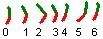 (green= upper arm, red= underarm)
0 - usually not in a 6 framed walking animation, it is this way when the character is standing still.
1 - the arm is starting to go backwards
2 - the arm is at it's most backwards position, it is bend more then in the rest of the frames.
3 - the arm is starting to go back to the 0 position
4 - the arm is starting to go forward (swing)
5 - the arm is at it's most forward position
6 - the arm is starting to go back to the 0 position
I think you should follow this pattern in your frames, because you only have 5 frames you'll have to drop one of these positions, I think it is best to drop number 4. In this frame the arm is starting to go forward, this is the fastest movement in the whole animation of the arm so when you delete this frame it will look as if the arm is moving faster when swinging forward then when its pulling backwards. It's also possible to drop frame number 3, but you'll have to mess around with it a bit till you get it right.
For the right arm, watch the reference of Ensellitis.
  I think you should redo the frames, copy and past the body like I did above and then put arms and legs on him. Then when you start shading and detailing him you can make the body and the hair move.
I would leave the body pink (or an other color that is different from the hair and the arms and sleeves). And after you got the arms and legs right you can change the color and shade it.
Look at this walking cycle made by Ensellitis:
 It's body doesn't change that much, but it still looks like it's moving. This is because of the shading, it move while the character is walking.
I hope this helps you impove your sprite.
 |
Posted By: M.E.
Date Posted: 05 June 2007 at 7:32am
|
Dear All, In one word: AMAZING! Your comments are really awsome! The very biggest thing that hit me is that I was doing way too much doing this. You all might laugh at my stupidity, and I'm confessing this only to help maybe another person who is reading this to think twice of doing it like the way I was doing it. You may know that I need a transparent background for my game. So I tend to work with transparency on in Gimp. If I make a mistake I have to switch tools (Eraser instead of Pencil). Also I need an outline in the game, but when building up a cycle I of course do not need one! When working on the excellent 8-frame piece from Ensellitis I discovered that you CAN have the legs and arms far apart, but it has to be nicely timed to get a faster action. In fact I made the legs run using a 5-frame cycle: 1, 3, 5, 7 8 (The front leg from frame 4 instead of the original 5) The arms did something strange, but it made the point! So disregard my comment that you can only do a 5-frame walk/run with everything close together. Lessons learned: 1. Use a background color and only one tool => Pencil Make transparent afterwards. 2. Use color blocks for different parts of the body 3. Do not work on details like hair 4. Remove shade/shadow 5. You can have large distance between frames but they have to be TIMED right! 6. Use reference lines to help you with the movement M.E. Bows to his teachers. Kind regards from M.E. ------------- http://www.kunststukken.nl - KunstStukken.nl M.E. Art |
Posted By: Ensellitis
Date Posted: 05 June 2007 at 7:53am
|
Originally posted by M.E. Lessons learned: 1. Use a background color and only one tool => Pencil Make transparent afterwards. 2. Use color blocks for different parts of the body 3. Do not work on details like hair 4. Remove shade/shadow 5. You can have large distance between frames but they have to be TIMED right! 6. Use reference lines to help you with the movement mind if i elaborate a bit on the lessons you learned? you better not! 1) exactly. pick a color for the background that you are not going to ever use on the piece, makes removal a breeze afterwards. but DO NOT make it a bright color, your eyes will thank you later. 2) for this size, absolutely. it will save you lot of time and agony. 3/4) detailing should be dead last on your list of things to do. get your walk down, shape it all up, THEN detail it. otherwise you risk finding an error when you re nearly done detailing, and find yourself wasting hours or days (trust me on this :() 5) a mark of a good animation is fewer frames for the same result. you could make a very believable 3 frame run cycle and make it look good, but as you learned, it is all timing that makes it good. if you are using photoshop to animate, you can actually make frames faster tha 0sec delay by giving it .01-.09. play around with them. timing can also help you hide errors... much like what jalonso does with his details :P 6) if you do not use reference lines (even most pros still use them) then you are most likely doomed to screw up. good luck, cant wait to see more! EDIT: if you want, you can try this out  i have used that since my running pencil. Basically, here is how it works: the BACK of the character goes along the furthest left line, and his back can NEVER go over/across/past it, ever. the bottom line is the ground, feet can never go over or cross that line. the top lines are for head movement. at the moment he reaches the point where both feet are about to leave the ground, the top of his head will be at the red line, at the top of the stride (When both feet are off the ground), his head will be at the top black line. when he is idle/lands, the top of his head should be at the bottom of the 3 lines. just readjut the top 3 lines to the height of the character. hope that helps  ------------- There's a pubic hair on my keyboard. What the f**k?? I "mow the lawn" so it's not mine. Gross. |
Posted By: M.E.
Date Posted: 11 June 2007 at 1:47pm
|
Hello All, After a week of practice it is time to show you where I am. During the week a lot of what I did ended up in the trashbin. Most of the time I spend was trying to figure out where the ground is.   I think I have the forward foot (the one facing us). Not quite sure about his behind-leg. I tried to use another reference line which I removed in the last version as it was a bit like he was walking on a train-track when I kept it in So what did I do? 1. Use a background color and only one tool => Pencil Make transparent afterwards. 2. Use color blocks for different parts of the body 3. Did not work on details like hair 4. Removed shadow 6. Used reference lines to help with the movement The one I wanted to highlight is this one: 5. You can have large distance between frames but they have to be TIMED right! After trying to figure out what was wrong with one of the movements I realized that two frames after eachother where too similar with stands of the arm.   ---> --->  When two frames have too similar overlapping limps, it looks like a jitter / swapping of the limps. Boy, you need to watch out when you place those things. The more I work on these things the more I think that timing is the most important thing in animation. The refrence lines and the sloppy pixels are not even as important as the timing. I dare to say that you can have a nice looking animation with sloppy pixels and no reference line(s) at all.....I still need a lot of practice on the timing. Is timing something that you can learn?  This is what I have now: @dragonrc: The arm movement like you have mentioned was attempted but it felt kinda strange. It had a clockwork pendulum effect. Must have been my timing , I guess ..... @ensellitis: One time I had the 100ms timing again and the animation looked really, really smooth and nice. But I wanted the 150 ms and then the error showed!!! So, unfortunately I can't hide them. I need to have it spot on. A long way to go then ..... Kind regards from M.E. ------------- http://www.kunststukken.nl - KunstStukken.nl M.E. Art |
Posted By: dragonrc
Date Posted: 11 June 2007 at 2:06pm
Much better
Now, the biggest problem is that the back leg doesn't touches the ground. The front leg loogs good. What many people do is just copy the legs, so you can just copy the front leg and replace the back leg with the copy. Be sure to recolor the front leg before you replace the back leg or else it will mix with the font leg!
To show you what I mean with the confusing stuff I said above I made an edit:
  When I made this edit I noticed 3 things:
1. The legs should be lifted more up when going forward. It will look much better when you do this.
2. You use extremely much colors that look exactly the same. Like in the blue leg, it has over 6 colors. This might be because it is a WIP, but I strongly suggest you keep things simple because it will be much easier to edit. (it took me very long to make the edit above because of this).
3. His butt suddenly flattens in the 4th frame and pops out in the 3rd, this is a weird combination.
There is something bothering me with the front arm, look at the slow animation posted above, when the arm is going back it suddenly fattens up. You should make it thinner and more bent like in the frame that follows.
Also, when the front arm is moving forward (to our right) the back arm should be visible a bit, if fact, the back arm should be visible much more then 1 frame. Don't think of it as something that pops out once every few frames. Think of it as a whole arm. It should be visible when going back (at least one frame) and it should be visible when going forward, I would suggest being visible 2 frames in the forward movement. It will have to be visible a bit for one frame, and a bit more for the next frame.
Something like this:
frame 1:not visible
frame 2:visible at the back
frame 3:not visible
frame 4:slightly visible at the front (our right side)
frame 5:visible like it is right now in that frame at the front. But a bit lower.
I noticed an other thing, you tend to place the back limbs above the front ones, but since it is a sideview they should be on equal height. I already did an edit to that in my edit above to the legs. The same thing happens to the back arm:
 So, back arm should go lower.
About the timing, I don't know much about it. But in this piece it will be important because it has only 5 frames.
Keep up the good work!
edit: I noticed something else, when he puts his feet down it should land on the front part of the foot, now it lands on the back of it's foot. You can see very well this in the image posted above.
|
Posted By: M.E.
Date Posted: 16 June 2007 at 2:37am
|
Hello again, A lot of testing was done the past days. Originally posted by dragonrc Now, the biggest problem is that the back leg doesn't touches the ground. The front leg loogs good. What many people do is just copy the legs, so you can just copy the front leg and replace the back leg with the copy. ...
There is something bothering me with the front arm, look at the slow animation posted above, when the arm is going back it suddenly fattens up. You should make it thinner and more bent like in the frame that follows. Also, when the front arm is moving forward (to our right) the back
arm should be visible a bit, if fact, the back arm should be visible
much more then 1 frame. Don't think of it as something that pops out
once every few frames. Think of it as a whole arm. It should be visible
when going back (at least one frame) and it should be visible when
going forward, I would suggest being visible 2 frames in the forward
movement. It will have to be visible a bit for one frame, and a bit
more for the next frame.
Something like this:
frame 1:not visible
frame 2:visible at the back
frame 3:not visible
frame 4:slightly visible at the front (our right side)
frame 5:visible like it is right now in that frame at the front. But a bit lower.
Definitely the back leg is still doing strange things. This is what I tried copying the front/back:  I tried seperating the hand from the arm to see if it still would move smooth. Now it looks like the backleg is scraping the ground .... Originally posted by dragonrc I noticed an other thing, you tend to place the back limbs above the front ones, but since it is a sideview they should be on equal height. I already did an edit to that in my edit above to the legs. The same thing happens to the back arm: So, back arm should go lower.
About the timing, I don't know much about it. But in this piece it will be important because it has only 5 frames.
Keep up the good work!
edit: I noticed something else, when he puts his feet down it should land on the front part of the foot, now it lands on the back of it's foot. You can see very well this in the image posted above. The feet placement issue gave me a lot to think about. The game has a slight birdseye view. My initial thought was to try to match that view closest as possible. But sometimes it might be nicer for something to have a slightly different pose. This is the current mockup from the game:  I have attempted a couple of different views from the character. Please disregard the sloppy pixeling and unsmooth animation. I would like to know which view works best for the game 1. Birdseye view a bit from the right  2. Birdseye view but straight with the body  3. Sideview  The sideview looks the most normal walk-cycle but I fear that it might not work well in the game. What are your thoughts? And a side note: Sometimes when I'm working on these animations I get a little frustrated and I tend to do something differently. Do you work on different things to keep you motivated or are you just focussing on the task at hand even when it is sometimes frustrating?!? Thanks for your input. I really appreciate it. Best regards from M.E. ------------- http://www.kunststukken.nl - KunstStukken.nl M.E. Art |
Posted By: jalonso
Date Posted: 16 June 2007 at 1:59pm
|
Progress is looking good to me. When you get to pixel detailing some of the glitches can be hidden so don't over sweat it. and yes...we need breaks from our own stuff, I think its our only commonality. ------------- |
Posted By: Aleiav
Date Posted: 16 June 2007 at 2:25pm
|
The birdseye view is looking a little more like a stumble than a walk. The head seems oversized.
On your sideviews, I think the light brown leg should be bent a little bit more. ------------- |
Posted By: Metaru
Date Posted: 17 June 2007 at 2:43am
|
Saludos M.E. yes, it's me, the one who didn't finish it's post up there. sorry for that inconvenience. as you, i found myself in a challenge to make a credible animation of 5 frames (while most sprites are made of pair frames -4,6,8,etc.- where the second half of the animation is them first half "mirrowed"). my conclusion was, in fact, that your had to work with timming. i tried some ways to make an animation using a stickman, they're easy to draw and can be a good reference. you can use them as a wire frame also. now, the animation itself. as everyone else told before we can't use the regular formula of a pair of movements per step, because we'll always find one frame that can't be used as a trasition. so i figured a even more realistic theory than working with the frame timming stuff(i thougth). instead of drawing 5 frames individualy, why don't try and make a to divide an animation into 5 frames?, like i did with your hand movement. i watched some walking videos in youtube and found http://youtube.com/watch?v=ZRoSy1Hwouo - this one in particulary helpful for walk, and http://youtube.com/watch?v=MclVdtZHJ1s - this one for run. however, after 2 days or so of pure, productive-less, stressing, and annoying epic failure triying to make this theory work, and almost giving up, i just told myself in a moment of solemn inspiration. "if this is about timming, and this is a game, he doesn't have a identical frame collapse system, so he can have two identical frames and fool it's own engine!"  Exact! because you can have a 4 frame animation... made of 5 frames!(savethe sprite and check it). what i made was asing a lapsus of '16' for the first 3 frames, and '8' for the 4th and 5th frames. since the delay time is exact and apparently there's no difference between them (unless you need to specifillay modify a pixel or two to break the 'identical'), they appear to be one single frame. here's a more evident example  hope this works. at least its a good old trick. about the point of view, i would suggest you to use the same point of view that you saw in the chronno trigger sprite. basically because you need you sprite to fit with the rest of it's enviroment, and that's not possible using a sideview sprite. slaudos sir! ------------- I ate leel's babies |
Posted By: M.E.
Date Posted: 17 June 2007 at 5:39am
|
Hello Metaru, Thank you for the investigations. Unfortunately the suggestion you made (using two identical frames with half-timing) is not working for me. Each frame gets exactly the same amount of timing in the game. So your cheat does not work for me. Nice suggestion by the way Maybe in the end I will be better with the 5 frame animation. At least I give it a try of three more weeks and see what comes up. OK, I will try to match the point of view of the sprites to match the chronos and see what happens. Saludos Dear Sir. Best regards from M.E. ------------- http://www.kunststukken.nl - KunstStukken.nl M.E. Art |
Posted By: Metaru
Date Posted: 17 June 2007 at 10:56am
|
so the timming this isn't working... you'll had to try that thing of divide an animation in 5 frames so you had another lesson to add to the list above:
------------- I ate leel's babies |
Posted By: M.E.
Date Posted: 25 June 2007 at 9:20am
|
Hello All, Here are some new walkies in this post. I think the relaxed walking is now going much better: The birdseye view is indeed emphasizing the body parts a bit too much. I think I need to skew it a bit so that reads more like a side-view than a upper view. Another attempt on a (bit more) dynamic walk by lifting the leg higher. This one is real scetchy but I am attempting different things at the moment. Do you think that I should make the relaxed walk more dynamic? Or is the relax walk good enough to continue working on / with? Best regards from M.E. ------------- http://www.kunststukken.nl - KunstStukken.nl M.E. Art |
Posted By: Metaru
Date Posted: 25 June 2007 at 9:58am
|
hola M.E., long time no see you.
sir, you are making a common mistake in walking animations: when you character walks, he moves his left leg and also his left arm, wich is unnatural since we actually move the leg's opposite arm while walking. I'm not sure if I was clear enougth, but that's what I had to point actually.
about the second one... since it's just an skecth, I'll have to say it actually looks like he ran backwards... something weird in my opinion.
you made a great work on the first one. I almost can't notice the 5 frame animation. i encourage you to use it(by fixing the point I mentioned before) and start working on it.
slaudos ------------- I ate leel's babies |
Posted By: M.E.
Date Posted: 27 June 2007 at 9:45am
|
Hello Metaru, Thanks for the arm movement. I knew that, but forgotten about it This is what I did : (This has a little bend in the movement, and attempt at large muscles) Straightend out and fattend: Hair and other stuff: While I didn't had a problem with the proportions on the color-block animation, I now think the figure is out of proportions. I think he should be a little longer?!? I'm a right? Is something else wrong? Before I'm working to far on it, I would like more opinions. Is the straighten out pose on the arms better than the bended one? How about the muscles? Should I try to get them in? I am also struggeling with the dark outline. Not sure if I should do a sel-out or a regular (semi-)black line? Most of the other objects have dark outlines. Thanks in advance for all advice and comments. Best regards from M.E. ------------- http://www.kunststukken.nl - KunstStukken.nl M.E. Art |
Posted By: Metaru
Date Posted: 27 June 2007 at 3:41pm
|
wow... this's looking pretty good. before anything related to color and anything else, i suggest you to refine the character's movement. pay attention on how he steps -actually, he steps with the tip of his feet-, and how his head moves. try to kept the body in the same position with a minimal movement of 1px up and down.
about the outlines... try to follow the pattern that you already set for the sprites/objects, if all of them have outlines, the your sprite should try to have outlines(or a semi-selout). other wise, they will just pop out of the bg, or they will fuse with it.
hope this helps you.
slaudos! ------------- I ate leel's babies |
Posted By: dragonrc
Date Posted: 27 June 2007 at 4:55pm
|
Ah, a new update. It is improving very well!
But, there are still a few things that you can improve.
Most things you can improve are hard to point out in words soI made an edit for you:
  I only edited the head and the legs, I don't have any time to edit the arms for you right now.
I did a few minor edits but these are the main things I did:
- Made an outline for the front leg every frame, it was very messy in your animation, the first frame has an outline for the front leg but the second frame doesn't.
- Gave every frame the same head, it changes sizes in your animation, but the head should almost stay the same in a walking animation. It can have some hair movement and some other minor changes but it shouldn't change sizes.
- Did an edit to the back leg in the last 2 frames, I also made the last frame move down 1 pixel instead of the 4th frame so this edit looked better.
- Fixed the major up and down movement, it should only move 1pixel down in 2 frames, in your animation it moves up and down every frame, sometimes even 3 pixels.
- I edited the end of the shirt so it won't move up and down but stays in place.
The biggest problem is that every frame differs too much. The head and the arms change in every frame and some frames got an outline on the legs and some don't. That makes the animation looks rough and sketchy and it makes giving critique and making edits very hard. You should try to fix this.
About the outlines, make the standing frame with an outline and without an outline, then make a small mockup and see what looks best.
I'm looking forward to see the next update
|
Posted By: M.E.
Date Posted: 28 June 2007 at 1:50am
|
Hey DragonRC and Metaru, OK my teachers, I will listen to you and stop coloring for now! Back to the blocks it is!! When I zoomed in I had a scare and totally see your point dragonrc. When in 100% mode it didn't bother me that there were too many different lines. I actually thought that the movement was dynamic. When zoomed in I noticed it is WAY to dynamic. Another lesson: - Keep things smooth for both movement and linework! Thank you for all your patience with me! Kind regards from M.E. ------------- http://www.kunststukken.nl - KunstStukken.nl M.E. Art |
Posted By: M.E.
Date Posted: 29 June 2007 at 3:08am
|
Hello All, Here another update. The lines are a little smoother now. I removed a couple of pounds on the hero, so he is a bit more in proportion (I think) @Metaru: I changed one of the frames with an upward pointing foot which hopefully makes the walk more on the whole foot in stead of the toe.... @Dragonrc: I have moved the body a bit so that it was aligned more. The character was sometimes one pixel further. Is the animation too quickly? I've attempted a non-upwards movement:  But that does look strange as well. Or is the movement with the upward step the way it is supposed to be? Outline and smaller head:  At least I think the animation is smoother than before. Is that a good assumption? Thanks for your comments! Best regards from M.E. ------------- http://www.kunststukken.nl - KunstStukken.nl M.E. Art |
Posted By: dragonrc
Date Posted: 29 June 2007 at 4:52am
|
This is looking really good, just a few edits and you can start detailing it.
Here is another edit I made:
 I shortened the arms and made them swing more.
I gave the back arm a darker color so it doesn't pop as much as the front arm.
I made some adjustments to the legs, you should compare the frames to see what I've done.
I also made the shirt a bit longer, it looked too short to me.
Also, I noticed you had 3 frames bump, but only 2 frames should bump, so I fixed that too.
Personally I like the animation without the outline more right now, but it's best to see it ingame (in a mockup) to see what fits the game best.
|
Posted By: M.E.
Date Posted: 29 June 2007 at 7:43am
|
Hello DragonRC, Thanks for the arms! I've attempted to edit it.  The hands switched sides in the animation you made so I opted for a little view of the backarm. When attempting to copy the changes to the back leg the animation didn't flow anymore. I will investigate further but for now I think it reads better anyway. The 5th and 2nd frame have the upwards movement as they have the full stretched legs as far as I can see. I made the shirt one pixel longer. Here are the mockups:  Outlined:  No shadow yet. I think the outline version is what I should use. Or a semi-selout. Or, maybe I should use different colors alltogether? Can I work on the details now?! Best regards from M.E. ------------- http://www.kunststukken.nl - KunstStukken.nl M.E. Art |
Posted By: Metaru
Date Posted: 29 June 2007 at 9:30am
|
semi sel out absolutely. pay attention to the in game ligthsource, that is the key for definition. you need contrast between the sprite and that grass. :{ and the animations is OK! don't touch it anymore! remember to add the hero's sword, and now, at last, i think you can start colouring. slaudos M.E. congrats. ------------- I ate leel's babies |
Posted By: M.E.
Date Posted: 29 June 2007 at 10:41am
|
YEAH I have permission to color. Well that brings me to the point where I ask if different colors in frames helps or does not help with the animation.... Look at my hair for instance. I used different colors on the same spot to try to get movement simulation. Is this something that works? Or should I refrain from using different colors in animation?  And Metaro: I'm a peacefull man: no weapons!!!! But there will be a sort of a cannon-character (we have to block it!) Best regards from M.E. ------------- http://www.kunststukken.nl - KunstStukken.nl M.E. Art |
Posted By: M.E.
Date Posted: 03 July 2007 at 11:40pm
|
While I'm waiting for the verdict on the animation of color positions I started working on the backwards walk. Hopefully I started to implement the things I have learned previously. At least here are some color blocks:  What do you think? Am I on the right track? Thanks in advance for your comments. Best regards from M.E. ------------- http://www.kunststukken.nl - KunstStukken.nl M.E. Art |
Posted By: jalonso
Date Posted: 04 July 2007 at 5:21pm
|
I am liking your character. I think the more detail (like the hair color change) is always a good idea for hero sprites. A gamer is more focused on this kind of sprite than other ingame elements.
------------- |
Posted By: M.E.
Date Posted: 06 July 2007 at 12:27am
|
Hello All, Here is the latest update on the rightwalk and also the leftwalk of the hero. 1: 2:   I have changed the color of the boots as they appear much better in the game when they are bright. Do you think I'm done with these? Any more suggestions? Personally I thought when zoomed in the first bumped a little too much. So I decided to have an upward movement of 1 frame. Which one is better? One or Two? I will be working on the back/front walk now until I hear from you Best regards from M.E. (Edit: Upward movement reduction) ------------- http://www.kunststukken.nl - KunstStukken.nl M.E. Art |
Posted By: jalonso
Date Posted: 06 July 2007 at 8:00am
|
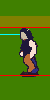
On your next update throw #1 on a bit of game BG. I can't tell how distracting that zombie hop really is.
------------- |
Posted By: M.E.
Date Posted: 06 July 2007 at 11:24am
|
Hello Jalonso, Here is a little youtube with the walking/running hero: http://youtube.com/watch?v=YDfE8yA5TFo - http://youtube.com/watch?v=YDfE8yA5TFo This is the one with the two upwards movements. Here are the two right walking cycles with the background: 1  2.  Hopefully you can help me in determine what is best?! Best regards from M.E. ------------- http://www.kunststukken.nl - KunstStukken.nl M.E. Art |
Posted By: M.E.
Date Posted: 07 July 2007 at 2:23am
|
Hello All, After some time watching and running in the game I decided to keep the two frame upward movement. No upward movement really looks weird like it slides on the grass. The shadow was way to black causing a 'cut-out' look. Also the arm movement was made a bit more dramatic which gives a better flow I think. Making the hand lighter made it better to see. What do you think? Best regards from M.E. ------------- http://www.kunststukken.nl - KunstStukken.nl M.E. Art |
Posted By: Metaru
Date Posted: 07 July 2007 at 7:16am
|
sorry if i haven't post in a while M.E.. to be honest, i'm always triying to come and see if you have posted something to help you in your game. you're the perfect example of what somebody should do when you come and ask for help. much, a lot much nicer. i would pick this as the definitive one. maybe make that yellow a bit more brown, but only in a very sutile way... just to make it fit the rest of the color palette, so they wont pop-out of the screen. and well, hoping to see more updates. you have a lot of work to do, and sir, let me say you're making an exelent work. ------------- I ate leel's babies |
Posted By: jalonso
Date Posted: 07 July 2007 at 8:04am
|
That last update looks good now to me ;) *So I visited your PJ gallery profile and noticed you have nothing, no pixels, no faves, no comments...you gotta spread the love, man. Give back to the community that gives freely to you on occasion ------------- |
Posted By: M.E.
Date Posted: 08 July 2007 at 1:52am
|
Hello Jalonso and Metaru, Thanks for the encouragement. I will be working on the other directions. @Jalonso: I can't login to the gallery , cannot comment on the gallery. I only managed to login to the forum. In the forum I sometimes offer some comments when I think I have some thing that I can offer. My appologize if I don't give back to the community. To be honest I don't think I have much to offer for others as I'm still learning very much myself! Best regards from M.E. ------------- http://www.kunststukken.nl - KunstStukken.nl M.E. Art |
Posted By: Metaru
Date Posted: 09 July 2007 at 1:25am
|
Originally posted by M.E. I can't login to the gallery , cannot comment on the gallery. I only managed to login to the forum. HAHAHA ... looks like Mr. M.E. is having the same problem with the login system that i had in the past. Originally posted by M.E In the forum I sometimes offer some comments when I think I have some thing that I can offer. My appologize if I don't give back to the community. To be honest I don't think I have much to offer for others as I'm still learning very much myself! That's not true, I'm sure that your comments are always recieved. you've made yourself a reputation here, and i'm sure that you can give a good advice or two (and not only technical issues -dithering, colors, animations and stuff like that-.) Originally posted by M.E. Best regards from M.E. and this is what i mean with 'not only technical issues'  . .------------- I ate leel's babies |
Posted By: M.E.
Date Posted: 09 July 2007 at 9:38am
|
Hi Metaru, What a bunch of flattering words! That is good for my ego How did you resolve your issue you had with the login of the gallery? I thought that there are way better persons to give critiques. The times I did give comments, the other, more experienced teachers here on PJ gave much better comments than I did. So I tend not to give comments unless there are some foster childs posts that have no comments... As soon as I will be able to login to the gallery I will definitely do favorites and give feedback on the gallery pieces. I might even try to participate in a weekly challenge .. you never know ... Back to the thread:     larger version: larger version:  I know: I should probably have worked on the color block WIP before attempting to color them with details.... I'm too eager!!! Do you think the little head movement on the frontwalk is working or is that kind of movement a little bold for such a small sprite? The most important comment I can offer myself is that the frontwalk is larger than the others. But I think it worked a little bit better. Maybe I should not do such a thing?!?! EDIT: I made the smaller version as well for you to compare with. Thanks in advance for your comments everybody! Best regards from M.E. ------------- http://www.kunststukken.nl - KunstStukken.nl M.E. Art |
Posted By: Metaru
Date Posted: 09 July 2007 at 11:24pm
|
solve? solution? i never got one of those. if i'm correct, you can't login to the gallery using the same password you use in the forums. what i did was to request a new password thru the password recovery system, and then it could log in to the gallery using that new password wich was sent to my email, and of course use all the features of the gallery(submit PAs, rate, comments). when i needed to log in to the gallery, i had to go to my inbox, copy the password, and so. after a couple of months, i learned the code and now its just part of... well, i know my password. the others? more experienced? hey! and where im supposed to be there? we ALL learn from each others. maybe some people had spent more time pixeling, and had one thing or two under their sleve, but im sure no one considers himself as a "master"(and my avatar is, ironically, a good example). i'm always wandering in the WIP forum because i try to learn from others attemps, it doesn't matter if they're newbies or seniors. ok ok... no more morale-rising dialogs, i dont want to sound like the William Wallace of the pixeling. back on thread: the front and back walk need an entire redesing. notice how the legs change during the animation of the backwalk? and in front walk, our hero looks a bit femenine... he walks like he only used his rigth leg to advance. about the size, why he would change his stature? the size of his body should always be the same. just think how abrupt would be the change when a player walks to the north and then walks to the south. the arms: in the backwalk one his left arm doesn't move. while the rigth one just moves his elbow. in the frontwalk the arms look fine, but for some reason they look as they were united to the body. but that is just a personal point of view. as always, looking foward to help you. slaudos ------------- I ate leel's babies |
Posted By: M.E.
Date Posted: 12 July 2007 at 12:32am
|
Hello Metaru, My main pixeljoint account seemed to have blocked by too many password tries. I have filed a form with a request to unlock it. Thanks for pointing it out. Now we wait .... Dear William Wallace of Pixeling, From now on I will attempt to give more comments to others, although I'm not sure if it will help or harm them! Back to the thread. Thanks for slapping me on my fingers. I KNEW that I should not have attempted colors before getting the color blocks spot on! How about this:  Is this one more man than the previous female walk? As always, looking forward for anybody who has something to comment on my work! Best regards from M.E. ------------- http://www.kunststukken.nl - KunstStukken.nl M.E. Art |
Posted By: M.E.
Date Posted: 18 July 2007 at 11:36pm
|
Hi Hi, Yet another update. This time I tried to broaden the walk to give it more mascularity. One with outline so that I could view it in the game. But I promised not to do details as long as I don't have the permission   Is this better? Best regards from M.E. ------------- http://www.kunststukken.nl - KunstStukken.nl M.E. Art |
Posted By: Metaru
Date Posted: 19 July 2007 at 1:04am
|
how he looks like the camera was following him from the ground. the rigth feet is ok, maybe his left one could madvance a bit more. could you post the original frontwalk in block mode? i think it's the way it should be made, it just need some fixes on small details. ------------- I ate leel's babies |
Posted By: M.E.
Date Posted: 19 July 2007 at 1:07pm
|
Hello Metaru, Well, I thought the general build of the previous one matched more the right/left walk. The old front walk was indeed much more dynamic, in case you were aiming for that one?!?! Here is what I came up with (a little shift here and there because I didn't know much about reference lines at first :) )  Do you want me to really work this one or go back to the previous one to edit what you thought was bad? Any other comments? Best regards from M.E. ------------- http://www.kunststukken.nl - KunstStukken.nl M.E. Art |
Posted By: M.E.
Date Posted: 22 July 2007 at 8:50am
|
Hello All, Thought a little while and personally I think the figure should not change width/height because you got a feeling that it is an entire different person. Since the rightwalk and leftwalk person is pretty satisfactory (maybe some color change) I decided to go back to the thinner / longer figure I had before. I however tried to match the style of walk from the first frontal walk. This is what I came up with:  And with outline:  I think the leg-movement is working well, but the dynamic arm movement is maybe too dynamic? What do you think? Thanks in advance for your feedback. I appreciate all comments and advices! Best regards from M.E. ------------- http://www.kunststukken.nl - KunstStukken.nl M.E. Art |
Posted By: Metaru
Date Posted: 22 July 2007 at 10:21pm
|
as you said, is exelent. its even more smooth that previuos version. congrats for such achievement. now i'll list some points that need revision in this edit:
on a side note, i'm glad to see that you've shared some comments with the rest of the users in the Wip forum. See? wasn't that hard. ------------- I ate leel's babies |
Posted By: M.E.
Date Posted: 22 July 2007 at 10:41pm
|
Hi Metaru, WOW, thanks a lot on those points! You are of course right on all of them! I laughed when you mentioned MC Hammer, I thought I would clean it up when doing the colors, but you are correct that I must pay a little more attention to those things. Likewise on the outline. The outline was made to test the sprite in the game in a quick way so that I can see the parts move. As for the comments. I did give them in the past you know. But the main problem I'm having is that I still cannot login to the gallery part of pixeljoint. So I cannot comment on the gallery items, cannot put my own stuff in, cannot vote for challenges, cannot participate in challenges. I left two messages already but I'm still waiting for an unlock of my login. There were too many tries which locked it  Again, thanks for your great comments. I will try to make the changes. Kind regards from M.E. ------------- http://www.kunststukken.nl - KunstStukken.nl M.E. Art |
Posted By: jalonso
Date Posted: 23 July 2007 at 6:36am
|
lol
------------- |
Posted By: M.E.
Date Posted: 23 July 2007 at 8:32am
|
Originally posted by Metaru
    Is this better? Best regards from M.E. ------------- http://www.kunststukken.nl - KunstStukken.nl M.E. Art |
Posted By: Kfuchoin
Date Posted: 23 July 2007 at 1:02pm
|
his left foot (our right) seems to show that he's kicking something suddendly, that last frame need another one just before.. coz it seems to jump out or maybe fix that.. it bothers me :S try to make it more natural =D ------------- may the pixels be with you.. ~Kfuchoin eMo looking for people for an RPG info: http://www.pixeljoint.com/forum/forum_posts.asp?TID=4903 |
Posted By: M.E.
Date Posted: 24 July 2007 at 12:11am
|
Hello Kfuchoin, Thank you for your keen eye! Very well spotted. After an hour of trying to fix it I used one of the tips presented to me earlier. The legs are most of the time doing the same movement. So I guessed that the other leg was OK and used that one for the other leg. Of course not on the same frame sequence.  How about this? Kind regards from M.E. ------------- http://www.kunststukken.nl - KunstStukken.nl M.E. Art |
Posted By: Metaru
Date Posted: 24 July 2007 at 10:48pm
|
It looks even more smooth now. congrats again M.E. for the achievement of a walk animation using 5 frames (something i thougth was almost imposible, not smooth at least). you could try to do the same thing with the arms maybe? they look fine, but maybe their movement needs another small revision.
------------- I ate leel's babies |
Posted By: M.E.
Date Posted: 25 July 2007 at 6:31am
|
Hello Metaru, OK, I worked on the arms. Strangely I found that the arms are flowing better when they have an outline. So therefore I include it (could not resist putting eyes on him )  Can I move on or am I still impatient and something needs to be fixed? Edit: Gave a shot at the backwalk ::  Best regards from M.E. ------------- http://www.kunststukken.nl - KunstStukken.nl M.E. Art |
Posted By: Metaru
Date Posted: 26 July 2007 at 2:26am
|
i think both animations (front and back) are donde. instead of using a black dot for the eyes, you use shading. those black pixels just pop out from his face and and really look more like a pair of 3D glasses. also, i would add another line of 1px to the torso's lower side, and also reducing the black line between the legs 1px too. ------------- I ate leel's babies |
Posted By: M.E.
Date Posted: 26 July 2007 at 4:24am
|
There has been some updates in all four directions. Mainly unifying colors. In the game I felt that the little guy has a bit of issue with the background. So I made some mockups to review. Do you think that the less saturated grass is of benefit to the hero? In the past I felt that the amount of saturation would be OK in the game, but now that there is a character that you control I'm not so sure anymore. Please give your comments on them!  OLD grass OLD grass Lesser saturation Lesser saturationMockups:   Youtube Saturated: http://youtube.com/watch?v=xgSQbJ49fZM - http://youtube.com/watch?v=xgSQbJ49fZM Youtube Less Saturated: http://youtube.com/watch?v=1hv6HNEAlmk - http://youtube.com/watch?v=1hv6HNEAlmk Thanks in advance for your time. Best regards from M.E. ------------- http://www.kunststukken.nl - KunstStukken.nl M.E. Art |
Posted By: M.E.
Date Posted: 27 July 2007 at 11:42pm
|
Hello All, So while I wait on the verdict on the colors I am working on the action that he does when he is faced with a rock.  He pushes it The point where he is pushing is fixed so I can't move his hand. I can move his arms if you think that is needed. And everything else that you think needs to be fixed. Thanks in advance for your thoughts. Best regards from M.E. ------------- http://www.kunststukken.nl - KunstStukken.nl M.E. Art |
Posted By: Metaru
Date Posted: 28 July 2007 at 12:22am
|
abot the saturation, less saturated... definitively. about pushing.its oke. just make its far leg a bit more thicker. (sorry, i'm on a hurry) slaudos ------------- I ate leel's babies |
Posted By: M.E.
Date Posted: 28 July 2007 at 7:42am
|
Thanks Metaru! I will work on the other elements of the game to use the parts that have the grass on it. So less saturated it is. Thanks DragonRC for your comment on youtube as well! OK. I work on the far leg and of course will take a look at the colors again! Edit: Mockup with changed elements (water is now also better I think) Used brown outline instead of black on the character. But not sure about the other colors on the hero yet....  Best regards from M.E. ------------- http://www.kunststukken.nl - KunstStukken.nl M.E. Art |
Posted By: M.E.
Date Posted: 31 July 2007 at 3:21am
|
Hello All, This is the latest version of the walking sprites. The black outline is back and I enlaged the sprites a little bit. Worked on colors as well. Maybe, just maybe they are finished? Best regards from M.E. ------------- http://www.kunststukken.nl - KunstStukken.nl M.E. Art |
Posted By: dragonrc
Date Posted: 31 July 2007 at 4:00am
|
This is making much progress!
I have a few points you might want to work on:
1. The front and back walking animation both have very short arms.
I made an edit of the front walking animation:
 What I did:
- Made the arms longer.
- I also made his shirt a bit longer.
- When an arm went back I made it darker.
2. the left walking animation looks ot of place, this is because it needs a black outline, like the other animations.
3. I still don't like the random changes, you should remove them or at least tone it down a bit.
The places that need most work:
- The hair on the left walking animation, if you look at it carefully you see what I mean.
- The shadow on the front walking animation
- The pants on the front and back walking animation, instead of the random placed brown you should make good use of those colors, if a leg goes further away you should put some dark brown in that leg, and if a leg comes closer by you should put some light brown in it.
- The hand closest by on the left and right walking animation, when it goes back it suddenly gets much larger.
I'm positive the sprite will improve much if you work on the things I said above.
Good luck!
|
Posted By: Metaru
Date Posted: 03 August 2007 at 6:47am
|
also, his croch should be at least 1 or 2px down. ------------- I ate leel's babies |
Posted By: M.E.
Date Posted: 03 August 2007 at 11:30pm
|
Hi All, Just dropping in to say that I absolutely have seen the comments. Boy what good comments they are! I was implementing them but I got frustrated with the editors. GIMP is not really a pixel program. Graphics Gale Free Edition doesn't handle GIF and I dislike the controls. When I thought of this, I rather would like the keyboard to put the pixels in. Maybe in combination with the mouse, but definitely using the keyboard to have more control over the placement of pixels. Also the color selection in Gimp is bugging me. I would like to have a keystroke that immediately puts the color down. So .. I decided to write my own editor with keyboard control and characters a-z,1-0 for color selection. So that you hit the 'A' key and it puts color A on it and so on. It will be nice to change the colors on all the frames with just one color change on the character 'A'....... If anybody knows of a FREE program that can do keyboard pixel control + animation I would like to hear it!! It will be sometime before I will have some updates. Best regards from M.E. ------------- http://www.kunststukken.nl - KunstStukken.nl M.E. Art |
Posted By: Metaru
Date Posted: 06 August 2007 at 8:44am
|
i'm not sure of what are you looking for, but as i read, if you're looking for a good animation freeware wich allows you to make color replacements on all frames, i would suggest you to use Animation Shop 3, wich is the one i use for my animations. i've posted a link to download it in the Resource Forum. try it and see if it is what you want. ------------- I ate leel's babies |
Posted By: M.E.
Date Posted: 06 August 2007 at 10:57am
|
Hi Metaru, Thanks for the tip. But I have allready checked that one out. The controls are not really how I would like them. Of course you should get used to a program before you can judge it. But I always like programs that are really simple and have just a few functions. The main issue I'm having is that I like to work with the keyboard instead of the mouse. As a bonus it would mean that by typing in characters I can select a color without having to move. I think I will use the mouse to jump to larger areas but most of the time I am just pushing pixels in a relatively small area and experiment with colors. Thanks for your thoughts anyway! Best regards from M.E. ------------- http://www.kunststukken.nl - KunstStukken.nl M.E. Art |
Posted By: Metaru
Date Posted: 06 August 2007 at 1:12pm
|
in that case, i've never heard of such program. and worst if you're looking something for free. the only option i could think about is a craked, paid GG version(mainly because of the custom hotkeys and the animation thing, and ofcourse, the "Free" fact) sorry for not being helpful at this time. maybe if you ask in the IRC? ------------- I ate leel's babies |
Posted By: M.E.
Date Posted: 14 August 2007 at 2:03am
|
Hello All, Finally I have some update. Removed most of the color shading and limited myself to < 10 colors. Is this the kind of shading that I should limit myself to? Or can there be more colors? Is there some golden rule on maximum colors on a sprite of this size? Any comments?  OT: Wrote the program which is not doing exactly what I need. The only real thing that works really nice is the color selection. The keyboard movement of the cursor is working well but only on relatively small areas. Graphics Gale is the program that matches what I need most of the times. If it would do the hotkey for a color and support the keyboard arrows to move it would be THE program to use... The lack of GIF support is really annoying so I decided to buy the real thing anyway. But I don't like to pay using a credit card and asked them of another payment method. Best regards from M.E. ------------- http://www.kunststukken.nl - KunstStukken.nl M.E. Art |
Posted By: M.E.
Date Posted: 29 August 2007 at 1:46am
|
Hello All, There is some update on the front walking animation. I have examined sprites from Chrono Trigger and Secret/Sword of Mana. They have a lot of colors. Sometimes not adding to readability. However my own latest version was too boring and I tried to use some more shading and other colors to make it more interesting. Is this any better or should I reduce the color count?  Thanks in advance for your comments and critiques. Best regards from M.E. Edit: Changed symbolic link on my provider ------------- http://www.kunststukken.nl - KunstStukken.nl M.E. Art |
Posted By: Metaru
Date Posted: 29 August 2007 at 9:11am
|
i think its a good idea to not overdo this sprite by adding more colors. you could remove the brightest one in each ramp, because he looks too shinny to me, specially in the pants. i don't think that the ligth source in your game is that strong. kept the rest of the colors. its don M.E., its done. ------------- I ate leel's babies |
Posted By: M.E.
Date Posted: 02 September 2007 at 12:51am
|
There has been another update. Removed the inneroutline around the hair. Played a little bit with softer highlight. And fooled around with some shadow. Any more to comment and/or critique on? Best regards from M.E. ------------- http://www.kunststukken.nl - KunstStukken.nl M.E. Art |
Posted By: Kfuchoin
Date Posted: 02 September 2007 at 11:24am
|
Hello M.E =)
long time since i last passed to your topic:
the right leg when it goes far.. it becoems WAY thick.. look to his left leg.. it doesn't make the same thing.. it's more natural...
also that last frame where the right leg goes farther looks jumpy..., coz the leg cuts and i think that there's a frame missing.. try to maek the same thing that you made with the other leg
Between: congratz for your archievement
------------- may the pixels be with you.. ~Kfuchoin eMo looking for people for an RPG info: http://www.pixeljoint.com/forum/forum_posts.asp?TID=4903 |
Posted By: -littledeviant-
Date Posted: 22 September 2007 at 5:59pm
| very nice walking |
Posted By: jalonso
Date Posted: 22 September 2007 at 7:23pm
|
Walking towards the viewer is great and almost funny in a good way. 'Leisure suit Harry' looking? Walking away from viewer the gap in between the legs looks to big, especially at the crotch/inseam.
------------- |
Posted By: M.E.
Date Posted: 23 September 2007 at 12:45am
Currently this is what I'm having: Do you think that the legs are still too far apart? Thanks in advance for your comments! Best regards from M.E. ------------- http://www.kunststukken.nl - KunstStukken.nl M.E. Art |
Posted By: jalonso
Date Posted: 23 September 2007 at 8:27am
|
Really looking at it it now seeems that its not the space between the legs thats wrong. Its the lack of a butt. The inseam goes to the belly giving that 'space' I saw before. I'd fix the shirt so that there are buttocks. Not a crack or nothing just volume. You're welcome in advance! Best regards from ME  Edit: added returns for your reading pleasure ------------- |
Posted By: M.E.
Date Posted: 17 October 2007 at 12:28pm
|
OK, I try to give him buttocks. Here are two versions:  and and  The difference between these two is just one pixel in the length. The width is about the same and is more than it was before. Not sure if the changes are for the better. What are your thoughts? For everyones reading pleasure: Best regards from M.E. ------------- http://www.kunststukken.nl - KunstStukken.nl M.E. Art |
Posted By: Metaru
Date Posted: 17 October 2007 at 6:56pm
|
even if his butt is covered by the shirt, you should add some black lines to give him the appearance of his legs connected to the body by hips..
still looks the same, needs a less 'subtle' change sir. ------------- I ate leel's babies |
Posted By: M.E.
Date Posted: 18 October 2007 at 12:41am
|
Tried to do a less subtle change. Added dark to the skirt.  and even more: and even more:  Is this better? Any other advices? Thanks in advance from M.E. ------------- http://www.kunststukken.nl - KunstStukken.nl M.E. Art |
Posted By: Metaru
Date Posted: 18 October 2007 at 3:32pm
since its a shirt, and not a "skirt", we should be able to see part of his "ass", so we could see some kinf of connection between the legs. may i suggest you to try two things. one, with the edit i show you below, is to exagerate the dark between the lines
 and the orther, to make this part of the shirt below the belt shorter. just remember the reference image you've put on the first post.
the thing about the 'feet' in the edit is just for fun. ignore that part. ------------- I ate leel's babies |
Posted By: M.E.
Date Posted: 20 October 2007 at 12:35am
|
Thanks Metaru. I have made the shirt one pixel smaller and try to fill the gap with more dark.  Is this better? Best regards from M.E. ------------- http://www.kunststukken.nl - KunstStukken.nl M.E. Art |
Posted By: Metaru
Date Posted: 20 October 2007 at 8:42am
 and how about this instead? best regards from M.E.taru ------------- I ate leel's babies |
Posted By: M.E.
Date Posted: 24 October 2007 at 7:07am
|
Hi M.E.Taru, Some scissor work and this is what was left:  Is this more to your liking? Personally I find it a bit too dark. Any more comments / advices, anybody? Best regards from M.E. ------------- http://www.kunststukken.nl - KunstStukken.nl M.E. Art |
Posted By: Metaru
Date Posted: 24 October 2007 at 10:45am
|
I find it dark too. I promise this wll be the last time i'll bother you with this, but could you add, again, that dark line between its legs? just one or two pixels, just to give his ass a bit more definition. damn, that last line doesn't sound really masculine. ------------- I ate leel's babies |
Posted By: M.E.
Date Posted: 24 October 2007 at 12:40pm
|
What is this??? You promise me that it will be the last time??? NOOOOOOOOOOOOOOOOO Please, please continue to give lots and lots of critism and comments, critiques and suggestions to M.E. WARNING : strangeness Let us talk ASS: Give him a seperation between the asses? This : _|_ Where the online thing that is done is a line to seperate the two softer bodies of flesh? Or 00 where the roundness of the ass is make by darkening the outer edges as well? Or [|] where outer and inside is dark? When viewing some references this is what I have found:  This is the back of hercules when he is full god instead of a half god. Eh .. Well .. Eh .. don't have much words for them but ( )I find it a bit messy ... I totally would understand if everybody is just ignoring this thread from now on. ( But I hope not, because I could use some help ) Best regards from M.E. ------------- http://www.kunststukken.nl - KunstStukken.nl M.E. Art |
Posted By: Metaru
Date Posted: 24 October 2007 at 1:36pm
|
ROFL "Ass-shading tutorial by M.E." ------------- I ate leel's babies |
Posted By: M.E.
Date Posted: 24 October 2007 at 9:18pm
These are the latest attempt of an ass: The highlights are flashing too much. The highlights are flashing too much. Still too much contrast. Looks like a rip in the crack?!? Still too much contrast. Looks like a rip in the crack?!? This time maybe a bit too light?? Needs more contrast This time maybe a bit too light?? Needs more contrastAdded a darker color:  Do you agree that the latest version is the best? Any other thoughts? Best regards from M.E. ------------- http://www.kunststukken.nl - KunstStukken.nl M.E. Art |
Posted By: Monkey 'o Doom
Date Posted: 25 October 2007 at 4:30am
|
I think it definitely shows improvement. But this will forever be the posterior view of the ass reference topic. :P ------------- http://pixelmonkey.ensellitis.com">
RPG is numberwang. |
Posted By: greenraven
Date Posted: 25 October 2007 at 8:44am
|
I have to agree with Monkey on this one. Maybe it's just me, but it looks like he's wearing a diaper in that fourth one. I like the third one. -------------  "pwnage comes with patience, practice and planning." ~ Jalonso "pwnage comes with patience, practice and planning." ~ Jalonso 
|
Posted By: M.E.
Date Posted: 28 October 2007 at 1:08am
|
Tried to remove diaper-look:  Enlarged the shirt a little bit more because I am going more for the belt-holding-shirt look than the shirt-in-trousers look. When looking at the reference it looks like the shade is below the ass instead of between it. So I have attempted to put the shade down. How does this look? Best regards from M.E. ------------- http://www.kunststukken.nl - KunstStukken.nl M.E. Art |
Posted By: M.E.
Date Posted: 19 December 2007 at 3:33am
|
Hello it is M.E. again. Since nobody objected on the last post, I guessed it was alright... Here are the four directions that I have at the moment. If someone spots something would they please be so kind to point me to it and I will do my best to adjust it.     And while I wait for any comments I am already starting with the next action: pushing     I think I could use some help on the back and front push. My guess is that the front push has incorrect placements of the legs. But I have trouble in estimating how much leg is visibible at the top.... Anybody have an idea about it? When I move the legs on the back push (north push) a bit to the top the guy becomes a midget. But I fail to judge the right amount of leg that is visible. Maybe someone has comments on the left/right push as well? As always thanks in advance for your time! Best regards from M.E. ------------- http://www.kunststukken.nl - KunstStukken.nl M.E. Art |
Posted By: greenraven
Date Posted: 19 December 2007 at 7:05am
|
The Hurcules butt thread is back. Anyway, the only thing I see wrong is the pushing animation when he is pushed down. 1. His feet are too small. 2. They appear only in front of him, that shouldn't be. Good luck with the rest of it. ------------- "pwnage comes with patience, practice and planning." ~ Jalonso
|
Posted By: Metaru
Date Posted: 19 December 2007 at 8:52am
|
Hey ME! long time no see you :D as far as I see, i belive that pushing back's abs are way too thin. a few pixels extra at both sides would fix this, but always having in mind that, by the perspective you are using, it should be sligthy like this \ / (so he wouldn't look like a bee :P) one simple question for pusing foward: will he be covered by the object while he pushes it? I have this doubt because, although it may be obvious, i don't know how objects will interact when placed behind(mean, if the character places behind a tree, for example, he will not be able to walk in the area were the stump touches the ground, and only there) happy to hear news from you. don't get lost sir! best regards from Metaru. ------------- I ate leel's babies |
Posted By: M.E.
Date Posted: 20 December 2007 at 1:29am
|
Hello All, Thanks a bunch for the comments metaru and greenraven. I will focus on the pushing front (south) animation first as both of you have commented on that one. First of all Metaru brings up a very good point about the visibility of the object. Didn't think of it while I was spriting. So the position of the feet are not as important as I thought it was. BUT .. it of course depends on the size of the object. For the perspective I have used a free 3d program (anim8or) to reproduce the right pushing object and turn the camera around. This is a screenshot of it:  So I rounded the back of the sprite and made the arms large at the front and thin at the back. Maybe the hands that I have been using aren't matching the perspective, but at least you would see the hands more clearly.  And for greenraven an enlarged feet version:  That brings me to the topic of visibility of the sprite. This is what happens when I put the sprite into the pushing action:  This is a small rock where the feet and hands will be This is a small rock where the feet and hands will be visible. Ok it is isn't perfect when you don't seem to push the right hand side of the rock, but hey it is a game. This is what happens with a slightly larger object:  Feet, hands are no longer visible. And .. when using the sprite on the largest object the hero vanishes all together, but hey ... the gamer knows that he is pushing .. or at least I hope that the gamer realizes this. I will be avoiding the largest objects in the first levels so that the user will be familiar with the pushing. Any comments? Best regards from M.E. ------------- http://www.kunststukken.nl - KunstStukken.nl M.E. Art |