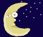
Moonie Man- WIP
Printed From: Pixel Joint
Category: Pixel Art
Forum Name: WIP (Work In Progress)
Forum Discription: Get crits and comments on your pixel WIPs and other art too!
URL: https://pixeljoint.com/forum/forum_posts.asp?TID=4991
Printed Date: 23 February 2026 at 9:41pm
Topic: Moonie Man- WIP
Posted By: l3m0n5
Subject: Moonie Man- WIP
Date Posted: 14 September 2007 at 11:36am
Not very exprienced in drawing larger scale pixel art so bear with my poor dithering on this work but ive been meaning to improve in this type of pixel art so any C & C would be much appreciated.  |
Replies:
Posted By: jalonso
Date Posted: 14 September 2007 at 11:39am
|
So you have NO dithering here at all. I will assume you mean AA. On this, if you first fix the moon's outline to its smoothest and then AA the left over jaggies, you'll be almost home. The color of the moon is ok but is slightly on the 'cheese' side of yellow. Maybe a more 'glowly' shade? E:typo ------------- |
Posted By: Hapiel
Date Posted: 14 September 2007 at 11:56am
|
Originally posted by jalonso So you have NO dithering here at all. I will assume you mean AA. On this, if you first fix the moon's outline to its smoothest and then AA the left over jaggies, you'll be almost home. The color of the moon is ok but is slightly on the 'cheese' side of yellow. Maybe a more 'glowly' shade? E:typo I dont think he means aa, if you look well you can see things you can call dithering @Lemons: But it could be some more! use it as it was another color! ------------- |
Posted By: jalonso
Date Posted: 14 September 2007 at 1:14pm
16 med color pixels and 1 dark color pixel is dithering 
------------- |
Posted By: l3m0n5
Date Posted: 15 September 2007 at 9:39am
well i did some more work on it, found a better color which i hope works much more than the "light-cheese" look of the moon itself,i also changed his entire expression...still need way more texture on it but im not sure how to add the crator's (excuse the spelling) on the moon's surface properly...
 |
Posted By: PixelSnader
Date Posted: 15 September 2007 at 11:29am
|
the moon isnt yellow. its warm or cold grey. maybe towards orange/brown. but not yellow. bananas are yellow.------------- ▄▄█ ▄▄█ ▄█▄ ▄█▄ |
Posted By: l3m0n5
Date Posted: 15 September 2007 at 12:39pm
|
thats what i was afraid would happen, my cheese evolving into a banana...so as instructed i googled some picture references and used the grey-ish look...and this is what i ended up with...  |
Posted By: Hatch
Date Posted: 15 September 2007 at 1:13pm
|
The moon is often represented stylistically as yellow, and this is clearly not meant to be realistic. I preferred it yellowy, personally, I just don't think you ever hit on the right shade of yellow. ------------- |
Posted By: l3m0n5
Date Posted: 18 September 2007 at 10:31am
|
i looked for a better color of yellow to use and i ended up with this, never realized how important color selection is to pixel art till now... 
|
Posted By: Aleiav
Date Posted: 18 September 2007 at 1:16pm
| The light source is missing from this newest one and I don't think it should be coming from the bottom left corner. Unless the earth is shining up on the moon. |
Posted By: Saint Minor
Date Posted: 18 September 2007 at 3:13pm
| Hello l3m0n5. In my opinon i think you should go back to basic and rework the shape of the moon. At the moment its rather mishaped and all though your going for a cartoon smile with the face its still not well shaped. Also the moon is round and you would still be able to see part of the moon where the black is. Take out the stars and just work on the lines first because i know how frustating it is to just keep recolouring with and end result of looking no better. Good luck and i hope to see some progress in your piece. |
Posted By: M.E.
Date Posted: 19 September 2007 at 12:52am
|
Hello L3m0n5. To be honest I liked your original work best. It has just the amount of cartoon that you need. The stylic choices and colors you tried later are not working as nice as the first one did. You initially stated you wanted to learn more on dithering. Maybe you should put aside this moon and try a rough object first. Stone or wooden object comes to mind. Best regards from M.E. ------------- http://www.kunststukken.nl - KunstStukken.nl M.E. Art |
Posted By: l3m0n5
Date Posted: 19 September 2007 at 5:24am
|
yeah, i think im busting my brain way to much on this, so if no one minds, im just gonna take a break from this "moonie man" and work on another piece, although its not a rough object either.
Lemoniciously,
-L3m0n5
|