Dodge-esque Car [Done]
Printed From: Pixel Joint
Category: Pixel Art
Forum Name: WIP (Work In Progress)
Forum Discription: Get crits and comments on your pixel WIPs and other art too!
URL: https://pixeljoint.com/forum/forum_posts.asp?TID=5435
Printed Date: 02 June 2026 at 10:20am
Topic: Dodge-esque Car [Done]
Posted By: BlackDragon
Subject: Dodge-esque Car [Done]
Date Posted: 22 November 2007 at 3:51pm
          Look, I found the original lines.
Holy crap, another WIP. I hope I finish this one ;)
Aaanyway, crits? Comments?
Also, I am going for the style of Varock's http://www.pixeljoint.com/pixelart/25563.htm - A Pixel With History .
Refs:
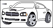
http://www.pistonheads.com/pics/news/10134/Dodge_Charger_Police-L.jpg - http://www.pistonheads.com/pics/news/10134/Dodge_Charger_Police-L.jpg
http://www.turyzconcepts.com/images/DSC00064.JPG - http://www.turyzconcepts.com/images/DSC00064.JPG (BIG!) ------------- "A little pain never hurt anyone." - Blueberry_Pie |
Replies:
Posted By: l3m0n5
Date Posted: 22 November 2007 at 7:37pm
| so far its looking real good, although i still think you could pull off some more realism in the tire texture (if your going for realism, that is) but other than that, i can't wait to see how the color and shading turns out... :P |
Posted By: BlackDragon
Date Posted: 22 November 2007 at 7:59pm
|
Nah, not going for realism here.
Update!
New ref:
http://www.sport-cars.org/site_img/large/dodge-charger-daytona-rt-2.jpg ------------- "A little pain never hurt anyone." - Blueberry_Pie |
Posted By: cthulhu
Date Posted: 23 November 2007 at 12:33am
Whoa, pixeling a car in perspective is tough enough, but with a fisheye lens effect... Good luck.  I'd suggest getting the normal perspective first, then tweaking the piece later to get the distortion. The way the left side bends up is distracting, and the back of the door jams right up to the rear wheel well. Bring it forward a few pixels, and it should be OK. I'd suggest getting the normal perspective first, then tweaking the piece later to get the distortion. The way the left side bends up is distracting, and the back of the door jams right up to the rear wheel well. Bring it forward a few pixels, and it should be OK.The front wheels look too large for the wheel wells, and the rear wheel looks too bulging, like it's overinflated. The color and shading is working, though. Keep us posted.  ------------- Artist formerly known as "herbert_west" |
Posted By: BlackDragon
Date Posted: 23 November 2007 at 8:55am
|
Hm, I was a little worried about the perpective. Thanks for the comment.
Anyway, another update. Its starting to get into shape. ------------- "A little pain never hurt anyone." - Blueberry_Pie |
Posted By: BlackDragon
Date Posted: 23 November 2007 at 4:56pm
|
Dither :D
I think I'm almost ready to submit.
Any C&C? ------------- "A little pain never hurt anyone." - Blueberry_Pie |
Posted By: cthulhu
Date Posted: 23 November 2007 at 9:55pm
This is coming along well. You might want to try some reflections and shadow under the car (refer to your green reference car). Others here are better at dithering, so I'll let them comment (of
course, most will probably tell you not to dither, as I seem to read often). Further comments (with
visual aid!  ): ): The front wheel (if turning) will be outside the wheelwell from this perspecitve. The rear wheel seemed like it was sticking out a bit much (I pushed it back in, and made some mark-up to fill the empty space). Also, you've showed the outline of the door, why not the hood? (also moved the edge of the door away from the rear wheelwell) The passenger side fog light looked out of place, and should be more in line with the opposite side. I outlined other details (maybe show interior, add lower grille back in, add a logo in the upper grille...). ------------- Artist formerly known as "herbert_west" |
Posted By: BlackDragon
Date Posted: 24 November 2007 at 10:17am
|
Very helpful edit, I'll be sure to give you special thanks in the car's description!
I did most of the things you suggested, some things I left out because they didn't look right or was a stylistic choice.
I am having second thoughts about the dithering, but I dunno. I will upload a version without dithering soon, and compare.
EDIT:
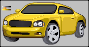 No dithering on this one.
 Animation to compare.
 Mmm, hueshift :D
Just playing around with things to make it look better, I think it does (a little bit). ------------- "A little pain never hurt anyone." - Blueberry_Pie |
Posted By: thedaemon
Date Posted: 24 November 2007 at 5:26pm
| I like the hueshift. I think the rear wheel looks odd being smaller and with more tire. If you were only drag racing the car I wouldn't think twice about it but if you drive it on the street or a track, it's not correct. Nice progress. I like the dithering rather than the no dithering image. |
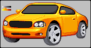
Posted By: BlackDragon
Date Posted: 24 November 2007 at 5:50pm
|
Newest one. Touched up a bit everywhere, Thanks for the crit, I wouldn't have noticed that.
------------- "A little pain never hurt anyone." - Blueberry_Pie |
Posted By: MashPotato
Date Posted: 24 November 2007 at 6:10pm
This looks neat, I like the colors you chose  Some things I noticed: -the hood on our left seem to be curved at the edge, while on the right it seems flat and there is a more defined edge. -this seems like a race-y car, so should the car be lower to the ground? (I don't know much about cars, but I think that's the usual) -the black bar under the grill seems to be a little to much to the right--I think it's because the slope above it indicates that it's a little more forward than the grill, but I'm not if I'm interpreting that correctly -maybe try using one of the darker shades of grey for the tires -the door seems to be lacking shading Hope this helps, good work so far! ------------- http://theindiestone.com - the INDIE STONE |
Posted By: BlackDragon
Date Posted: 24 November 2007 at 6:32pm
|
Don't worry Mash, it helped! I'm not using a darker shades on the tire, its a stylistic choice. ------------- "A little pain never hurt anyone." - Blueberry_Pie |
Posted By: BlackDragon
Date Posted: 25 November 2007 at 8:50am
|
Okay, I will submit in 24 hours if someone doesn't have any last critiques. ------------- "A little pain never hurt anyone." - Blueberry_Pie |
Posted By: Pridack
Date Posted: 25 November 2007 at 9:31am
| Make the back hubcap 1 pixel less wide so you can see the back of the tyre. Looks like there is half a tyre. |
Posted By: BlackDragon
Date Posted: 25 November 2007 at 9:45am
|
Better? ------------- "A little pain never hurt anyone." - Blueberry_Pie |
Posted By: bugsy
Date Posted: 25 November 2007 at 9:54am
| to me that front wheel looks a bit too thin, but dont take my word for it :P |