WIP- Mountain area
Printed From: Pixel Joint
Category: Pixel Art
Forum Name: WIP (Work In Progress)
Forum Discription: Get crits and comments on your pixel WIPs and other art too!
URL: https://pixeljoint.com/forum/forum_posts.asp?TID=5444
Printed Date: 16 January 2026 at 11:29pm
Topic: WIP- Mountain area
Posted By: Elwin
Subject: WIP- Mountain area
Date Posted: 24 November 2007 at 1:48pm
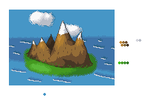 I know it doesn't have transparency, but You should be able to see what it llooks like without it. Please give me some crit and ideas for improvement ^^ ~Elwin |
Replies:
Posted By: thedaemon
Date Posted: 24 November 2007 at 4:56pm
| You show 4 shades of green in your palette but I only see 3 in the picture. Make them more contrasting. I like the shading on the mountains, they look nice. The water I don't like. Not sure what it is. Maybe it's the dithering? Also there are no beach front's at the ocean not very often do you see that. If you do it's usually rocks opposing the water. Grass would get washed away. I would also suggestion doing less dithering on the clouds. Overall it looks nice, waiting for the update. |
Posted By: Elwin
Date Posted: 24 November 2007 at 5:26pm
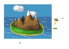 Better? ^^ Don't know how to fix the water though. Better? ^^ Don't know how to fix the water though. |
Posted By: thedaemon
Date Posted: 24 November 2007 at 5:38pm
| Yep, now maybe add a few trees and you will be in business. How about fading the sky into a lighter shade as it gets closer to the horizon? |
Posted By: Elwin
Date Posted: 24 November 2007 at 5:39pm
| Good idea ^^ I'll try it now ^^ |
Posted By: Elwin
Date Posted: 24 November 2007 at 6:00pm
Sorry for DP, but here's the new version ^^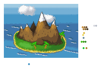 |
Posted By: thedaemon
Date Posted: 24 November 2007 at 6:20pm
| better, don't dither the horizon, makes it look like there is no sky just water. Also flip the sky colors upside down so that the brightest one is touching the darkest part of the ocean. It give it more contrast and is easier to see. Quck updates :) |
Posted By: Elwin
Date Posted: 24 November 2007 at 6:25pm
|
Heh, okay ^^ No dither? Thought it would make it smoother ^^ Edit: I tried removing the dithering, but it looked bad. So here it is, with dithering. 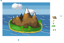 |
Posted By: thedaemon
Date Posted: 24 November 2007 at 6:53pm
| Great stuff. It seems like only I'm responding but you keep updating so I'm going to keep responding. It look much better now. How about some more details? Maybe a goat on the mountain? A hut? Birds in the tree? Sea monster? |
Posted By: Elwin
Date Posted: 24 November 2007 at 6:54pm
|
Heh, sea monster would be nice ^^ I'm going to make that now ^^ Edit: If I can xD Edit again: I made some birds, a sea monster, and a skeleton on the shore ^^ 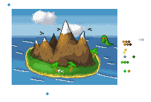 |
Posted By: Elwin
Date Posted: 26 November 2007 at 4:59am
| Noone other than thedaemon wants to comment and critic? |
Posted By: Fdupblindkids
Date Posted: 26 November 2007 at 8:17am
| nessy. I think this is adorable. |
Posted By: Wyverii
Date Posted: 26 November 2007 at 8:21am
|
Hello thar, the mountains are great thus far but you need to work on the water and island parts. The dark shading behind the white falls of water make it "pop" out a bit too much. Try looking at some island reference and keep up the good work! |
Posted By: Club Beuker
Date Posted: 26 November 2007 at 8:31am
| I would also make the beach in the front some bigger, cause it is closer to you (my advice, kill some of the green because the island looks like it's tilting a bit - while the mountains are not). It might give it some more depth. |
Posted By: Elwin
Date Posted: 26 November 2007 at 10:27am
| So, I'm going to kill some green, make the water better, and make the beach larger in the front ^^ Thank you all ^_^ |
Posted By: Metaru
Date Posted: 26 November 2007 at 11:40am
the line of the horizont is killing me. from the aerial perspective that i believe you're trying to achieve, it should look something like this ------------- I ate leel's babies |
Posted By: Elwin
Date Posted: 26 November 2007 at 10:42pm
|
Hmm you're right ^^ I'll try and fix that soon ^^ |