OddStar Girl complete : IIII
Printed From: Pixel Joint
Category: Pixel Art
Forum Name: WIP (Work In Progress)
Forum Discription: Get crits and comments on your pixel WIPs and other art too!
URL: https://pixeljoint.com/forum/forum_posts.asp?TID=549
Printed Date: 12 September 2025 at 10:21am
Topic: OddStar Girl complete : IIII
Posted By: Amythist
Subject: OddStar Girl complete : IIII
Date Posted: 18 July 2005 at 5:16pm
|
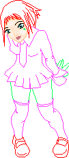
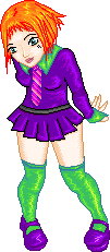
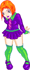
Ok, I'm trying to create this girl thats in my head. I got inspiration from a friend who did a collab sketch with me, and I just need to get it out. But I'm having troubles. I'd like to know what you all think of the outline so far, and the face/eye shading as well. I see a lot of my own mistakes, but I'm sure there are plenty more so.. C+C is more than welcome <3 Ohhhh.. and yeah I know she's missing a chunk of her hair.. I made it transparent on accident
edit I: updated with a bit of coloration and lineart fixations. edit II: a bit more shading, fixed the ugly turquoise <I'm not going for realistic though> and did a bit more tampering with the outline. edit III: uhh.. some shading. LOL, wanna make sure I've got this a bit better. Crit welcome editIII: muwhaha. Completed, though I'll still take cc i suppose ^_^ I did a bit of work on it as you can see, I hope I got it right >.< I really messed with the last one just to get the colors down to 35 XD |

Replies:
Posted By: sedgemonkey
Date Posted: 18 July 2005 at 6:08pm
|
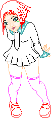
The lineart looks pretty much good to go. The only area that is a little confusing are the lines around the calf area. |
Posted By: Amythist
Date Posted: 18 July 2005 at 7:47pm
| thanks sedge, I've fixed the calve, and her hair.. well I fixed a bunch, I'll upload in a bit with some of my coloring on it >.< |
Posted By: Monstara
Date Posted: 19 July 2005 at 12:36am
|
Looks good. I only have a slight problem with the shape of the head. It seems tilted vertically a bit. |
Posted By: Amythist
Date Posted: 19 July 2005 at 5:32am
| it was meant to tilt ^_^' her whole body is slightly tilted and out of.. proportional view. |
Posted By: Monstara
Date Posted: 19 July 2005 at 5:33am
| In this case it's near perfect :D |
Posted By: blue
Date Posted: 19 July 2005 at 6:09am
|
Mrr. I love the lineart, but really am not fond of the shading you've
done so far. I think that this is partly because of that vibrant teal
you've used - it's not a realistic color. Generally palettes should be
LOWER SATURATION when they're darker and HIGHER when they're lighter;
your palette seems to stay at the same saturation the whole time. Plus, if that's meant to be a white palette, I'd suggest downing the saturation waaaay down low, and go for a grey-blue, not a bright flourescent blue. It also looks a bit pillow shaded, like you're mostly following the outlines with your shading...but fixing the palette might fix this some as well. Personally, I'd advise picking a more radical lightsource, make it come from one side of her body, not just from up top. Then make one side of her body darker than the other. This helps give things depth and flesh. |
Posted By: Amythist
Date Posted: 19 July 2005 at 6:13am
| Thanks Blue! And nah, it wasn't meant to be white, I was going for an odd colour. I've changed the shading on it some already, and I'll change the pallet right now actually ^_^' |
Posted By: Amythist
Date Posted: 19 July 2005 at 9:31am
| updated ^_^ Would like some more crit Blue.. or anyone <3 |
Posted By: Bear
Date Posted: 19 July 2005 at 11:01am
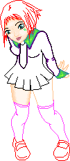
| darken some of the darker shades on the legs |
Posted By: blue
Date Posted: 19 July 2005 at 1:17pm
|
I really like the shirt part of the dress, the top part...but I'm not
sure about the pleated part. I feel like it might be helped by a belt
cutting across her waist, to break up the constant purple
and...well...how many dresses really do this? (: I also agree that your skin palette should have more contrast. Try making the shadows bluer and lower saturation and the hilights more yellow and lower saturation, with the highest saturationin the middle shades...did that make sense? I'm pretty sure that's how skin's supposed to work. |
Posted By: sedgemonkey
Date Posted: 19 July 2005 at 1:50pm
|
Have to agree that the skin could have the contrast punched up. It's really coming along nicely now. Btw, cool way to do a WIP thread. |
Posted By: Amythist
Date Posted: 19 July 2005 at 7:52pm
^_^ Wahoo, thanks so much blue I shall try that, I think I know what you mean.. like your harry potter dude right? And sedge, thanks! I thought it'd be nice for people to see how it started. Ohhhh and Blue.. yeah a belt! Maybe a studded one o.0 doop de do..
|
Posted By: Amythist
Date Posted: 24 July 2005 at 7:46pm
| dum de dum. CC on the new ones ^_^' sorry for the double post too I suppose. |
Posted By: Garage Inc.
Date Posted: 24 July 2005 at 7:50pm
|
I love it. As soon as you put it in the gallery I will make a better comment on it. ------------- For every second spent wondering if you can do something, you could spend 2 seconds doing it. |
Posted By: So-lou
Date Posted: 24 July 2005 at 10:08pm
|
Originally posted by sedgemonkey Have to agree that the skin could have the contrast punched up. ------------- -So-lou |
Posted By: Amythist
Date Posted: 25 July 2005 at 6:05am
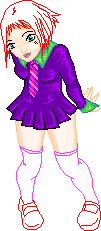
| well I did do more contrast for the skintone... o.0 i'll do more right now I suppose. |
Posted By: Aleiav
Date Posted: 25 July 2005 at 1:24pm
|
For the skin pallate, I'd suggest, as I usually do, going to Bisque's site and checking out one of her awesome skin pallates. I'm usually horrible with them so I've become addicted to Bisque's recently. Another thing is, you know where her bum meets her skirt? er.. the leg on the right? It's kind of... too straight up. I think it should be more curved. Her thigh that is. I'd suggest it being more curved. Also, given the perspective, I think the area where the color of the shirt is and the like around her neck should be a darker than the rest of the shirt. I'd go for something maybe dramatically darker. That might be fun. :) Maybe a hue change? Again, going with the perspective, IMO, her feet and everything going down should get darker and darker, brightest colors on the top of her head. That is, if you want to play it that way. You could always do something funky and make the light source from her feet up. That would defintely add something fun to it. I think her hair's a bit weird and for that I'd just suggest using reference pics. No tutorials really come to mind with me because alltogether, I'm horrid at hair. XD But, yes, look at reference pics and others' work to get a good grasp on hair shading. ------------- |