Mariya
Printed From: Pixel Joint
Category: Pixel Art
Forum Name: WIP (Work In Progress)
Forum Discription: Get crits and comments on your pixel WIPs and other art too!
URL: https://pixeljoint.com/forum/forum_posts.asp?TID=565
Printed Date: 12 September 2025 at 12:55pm
Topic: Mariya
Posted By: Monstara
Subject: Mariya
Date Posted: 20 July 2005 at 8:43am
Dis be me girlfriend, finally started doing that. and a cleaner version and a cleaner version 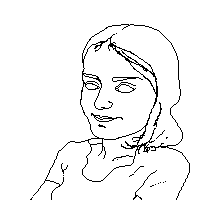 edit 3:  I plan on spending a while on that, cause I have few finished, detailed works. I have started cleaning out the outlines, but there is still a lot to fix. any comments are welcome. Here is the http://i12.photobucket.com/albums/a213/pestes/Pic047.jpg - ref. pic : |
Replies:
Posted By: Saiklor
Date Posted: 20 July 2005 at 9:35am
|
you might want to link that differently, I can get into your photobucket account as it stands.... anyways..... you seem to have forgotten the far section/nostril of the nose. In the reference pic it is shown by a gentle curve on the far side of the nostril. This is intrical to the perspective so you might want to toss it in. her jawline isn't as sharp as you have it shown, it's sort of layered and softer. her far eyebrow rises more than you have it shown, yours is a little straight and flat on the bottom, her's rises with the curve of the face. don't leave out her adorable dimples! they're so great! are you planning to just shade them in? the crease of her near-eye does not attach at the inside corner, just take off the 2-3 pixels attaching and it should be fine where is her ear? now for a fiddly little thing that I'm not sure how to address. Her nose is not sharp and does not have a prominent ridge down the middle so drawing one, in the form of a line, is going to have to be a style choice, and that's yours to make. I think the line, however, will be tricky, if you chose it, because unlike some poses where you can only see one side of the nose, in this case we can actually see both sides of it, near and far. If you want to keep the line I think drawing it more on the centre of the nose and disconnecting it from the lines around the nostrils/bottom would help keep the nose looking at the same angle as in the reference pic. here, I did a quick redline to show what I mean, and I retouched the bottom of the nose to show the far nostril  your other option is to leave off that line and just use shading to show off the shape of the nose, but that's a style choice and it's yours to make anyways, looking forward to further updates! |
Posted By: Monstara
Date Posted: 20 July 2005 at 9:43am
|
Thanks a lot for the exhaustive comments. Yah, I'm gonna shade in both the nose and the dimples.. and the smoothness of the jaw. The ear is.. erm, I guess hidden under the hair. I didn't choose the best possible reference photo, but the features were easy to see on this one... although a huge part is cut out. |
Posted By: Saiklor
Date Posted: 20 July 2005 at 4:08pm
|
if the ear is behind the hair then the hair probably wouldn't sweep
back from the face as it does, but rather hang more freely over the
forehead and cheek if the hair is behind, or partially behind, the ear, it ought to show, at least the top of it anyways, or the bottom somehow. |
Posted By: Bear
Date Posted: 20 July 2005 at 4:31pm
| i say you crop the picture, and shrink it down a little more :D |
Posted By: PixelSnader
Date Posted: 20 July 2005 at 4:32pm
|
her boob is weird, and your eyes&eyebrows are a tad off perspective her right eye&brow should be up higher, and the brow should have a stronger angle and the boobline should be allmost parralel with her arm ------------- ▄▄█ ▄▄█ ▄█▄ ▄█▄ |
Posted By: Monstara
Date Posted: 21 July 2005 at 12:43am
|
Thank you all, comments taken. Here is an intermediate update: old version (for comparison) I fixed the nose, the eyes and brows, added in the ear, cleaned up the hair, the boob, her shoulders. Comments are still appreciated :D It is funny that this is really beginning to look like her Trouble is, I never know when to end doing outlines and start shading. |
Posted By: Saiklor
Date Posted: 21 July 2005 at 5:53am
|
the nose again: she definitely doesn't have a sharp corner at the top
as you've shown with your lineart. Might want to smooth that down into
a less sharp turn up into the eyebrow. Actually, I would get rid of the
attached-to-the-eyebrow thing all together, it's not quite right for
this perspective and it makes her look a bit crooked. and nice job on the eyebrow, I think it needs to be a wee bit thicker and a wee bit shorter, but nice curve. |
Posted By: Monstara
Date Posted: 21 July 2005 at 6:15am
Think that any better?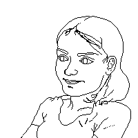 i.e. update 4 |
Posted By: Saiklor
Date Posted: 21 July 2005 at 9:36am
|
of course it's better :-) you're doing very well I toyed with the nose a bit, I think the issue is that there are really two curves going on down the bridge of her nose. First it curves out, away from the forehead and then it actually curves back in, down towards the nostrils. I've redlined it in the picture below using blue breaks to show where the curves separate from each other I also toyed with the outside line of her face, there's a soft curve beside her mouth you seem to have missed. and I played with the eyebrows further, remember, the right one sticks out past the profile! I also wrote something silly because I was too lazy to crop this all down >_< and wanted to use the space up. Your current version is on the left, my changes are on the right....  |
Posted By: Monstara
Date Posted: 21 July 2005 at 9:42am
|
Thanks a lot for being so complete and dilligent in your comments :D I see your points. I think the nose will look really good only after I do the shading. There won't be a line there. But your comments are really valuable. As for the cheek curve - I wasn't sure if that would make the drawing look awkard or make her look older... but I think I'll draw it in anyways. |
Posted By: Saiklor
Date Posted: 21 July 2005 at 6:48pm
| just gratify me with updates. |
Posted By: Monstara
Date Posted: 22 July 2005 at 12:18am
|
I think the photo creates a wrong impression though, cause her nose
doesn't actually curve downwards. rather, there is a small 'bump' So basically I agree with everything you mentioned, except the nose :D |
Posted By: Saiklor
Date Posted: 22 July 2005 at 7:26pm
|
I'm not sure what you mean, Monstara. I thought I showed with the lines
how it does curve up and then there is a "bump" I guess you could call
it which curves down towards the point of the nose. maybe you can take the same section I used and put a line to show us what you mean? ------------- www.semesteratsea.com |
Posted By: Monstara
Date Posted: 25 July 2005 at 2:17am
Nevermind. I fixed it using your comments + some real-life observation and I think now the likeness is better. Once again, your comments are quite valuable, thanks. |
Posted By: Aleiav
Date Posted: 25 July 2005 at 2:04pm
|
I think that the shirt's folds are a bit odd with the lines, as well as the general neckline. I'm not quite sure how to fix it though. 'm not very good with folds and the like. But alltogether, a peice of awesome lineart in the making here. Good show. :) ------------- |
Posted By: Monstara
Date Posted: 26 July 2005 at 12:38am
Thanks  Could you specify which folds you mean? Or all of them? |
Posted By: Aleiav
Date Posted: 26 July 2005 at 1:06am
|
The folds in between her arms and her chest which make the shirt bunch up. They seem odd and strangely placed.
------------- |
Posted By: Monstara
Date Posted: 26 July 2005 at 1:39am
| aha, I see. Thanks, gonna fix that. I'm going to shade in those parts anyways. |
Posted By: Monstara
Date Posted: 01 August 2005 at 9:09am
|
Update! I started coloring things. Now, I want to use a limited pallete, but I prefer the picture to turn out nice. I want this one to be as close to perfection as possible, although there is nothing perfect, you know  so I am not going to hurry with it. so I am not going to hurry with it.The dimples might be a hassle to do. Right now it seems washed out overall, but I'm not sure if I need more contrast. There is going to be NO black in the final picture whatsoever. I want it to be soft. At this point C&C is critical, so go ahead - tear it apart. BTW do you think I could draw in freckles? 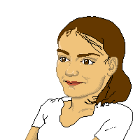 |
Posted By: Saiklor
Date Posted: 01 August 2005 at 4:16pm
|
maybe if you want it to look realistic you could not use outlines at
all and let the edges of shadows and highlights be the boundaries of
areas, like in real life? Example: how you did the top of the lips, you
let the colours simply touch, like in real life. Maybe work with that
along the edges of the jaw, the side where the face touches the white,
and along the edge of the nose. I'll post a redline if you want, but I
think you will be able to see what I mean. and I think now, looking at it coloured, that the eyebrows are different widths and need adjustment. and her hair seems kind of flat along the top of the head and yet VERY full of body around the back. I know I can't see the sides and the back in the reference pic, but I suspect the hair has more body around the crown. Also, her hair is showing on the lefthand (our left, her right) although it is very close in value to the background and hard to see, it does seem to be there and should be present in this picture. ------------- www.semesteratsea.com |
Posted By: Monstara
Date Posted: 03 August 2005 at 6:06am
Here is an update: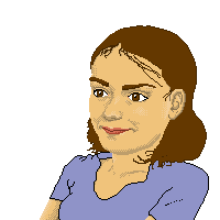 I tried to take all your comments (and btw thanks for sticking around all the time). I realised her jaw looked like Mickey Roorke's so I fixed this. I like the way it is coming out, but I'd like to put stress on the likeness. So if you see anything that spoils the likeness, that should be the first thing to comment. otherwise any comment is welcome. |